Our World in Data

2.7K posts

Our World in Data banner
Our World in Data

Our World in Data

@OurWorldInData

Our World in Data is a free, nonprofit website with a mission to increase understanding of the world’s largest problems and drive informed action to solve them.

Oxford, England انضم Nisan 2015
21 يتبع303.8K المتابعون
تغريدة مثبتة
Our World in Data
Our World in Data@OurWorldInData·
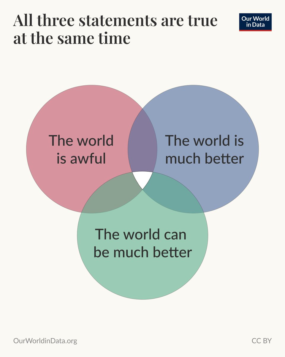
All three statements are true at the same time—
Our World in Data tweet media
English
40
377
2K
94.4K
Our World in Data
Our World in Data@OurWorldInData·
Many countries are “leapfrogging” landlines and going straight to mobile phones— The concept of “leapfrogging” is popular in development. It suggests that, as they develop, lower-income countries can skip intermediate technologies or systems and go straight to the modern equivalent. One example of this is the use of landlines and mobile phones. The landline telephone was invented in 1876 and became a dominant form of communication across Europe and North America. As you can see in the chart, it was increasingly adopted in the United States and the United Kingdom throughout the 20th century. However, mobile phone adoption increased rapidly in the 1990s, and landlines have declined since the millennium. Mobile phones have become a substitute. But many countries have almost skipped landline adoption entirely. Ghana and Nigeria are good examples: landline subscriptions have remained extremely low, and instead, mobile phone adoption has exploded. (This Data Insight was written by @_HannahRitchie and @parriagadap.)
Our World in Data tweet media
English
8
32
159
13.4K
Our World in Data
Our World in Data@OurWorldInData·
In each edition we also share some of what our team has been reading lately. This time: the BBC reports on India launching its first census in 15 years, and journalist Dylan Matthews makes the case that, instead of making us more polarized, AI chatbots might actually push us toward a shared set of facts.
Our World in Data tweet media
English
1
1
9
4.2K
Our World in Data
Our World in Data@OurWorldInData·
The latest OWID Brief newsletter is out! It delivers all our recent work plus curated highlights from across Our World in Data, right to your inbox twice a month. This edition: falling battery prices, new country profiles on population, increasing life expectancy, and much more.
Our World in Data tweet media
English
2
17
73
8.3K
Our World in Data
Our World in Data@OurWorldInData·
Our colleague needs your help keeping a 1,200-year dataset alive! If you have botanical expertise or are based near Arashiyama, Kyoto — DM her or email tuna@ourworldindata.org.
Tuna@antea04

I'm a data scientist @OurWorldinData and I need help from a botanist or someone local to Kyoto, Japan! 🌸 We present one of the world’s longest climate records: 1,200 years of peak cherry blossom dates in Kyoto. The researcher who maintained it, Professor Yasuyuki Aono, sadly passed away last year.

English
1
35
114
18.9K
Our World in Data
Our World in Data@OurWorldInData·
How much is the US spending on building data centers? Data centers are the backbone of AI, cloud computing, and other digital services — and spending to build them has increased rapidly in the United States. As of January 2026, US spending on data center construction was over $2.4 billion per month, roughly 16 times the level in early 2014. This growth has been especially rapid since AI chatbots have become very popular, starting in late 2022. Monthly spending has nearly tripled since then. It’s important to note that this only covers the cost of building the physical structures. Servers and other hardware inside are *excluded*, and they can make up a large share of the total cost of a data center. 📊 Our colleague Veronika Samborska recently updated our chart with the latest data from the US Census Bureau. We do this quarterly, so our next update will be around June 2026.
Our World in Data tweet media
English
5
32
129
9.6K
Our World in Data
Our World in Data@OurWorldInData·
Subscribe to our Data Insights newsletter to receive our bite-sized insights on how the world is changing, right to your inbox every few days: ourworldindata.org/subscribe
English
0
0
13
4K
Our World in Data
Our World in Data@OurWorldInData·
Banning particularly toxic pesticides is one effective way to reduce suicide deaths in low- to middle-income countries; Hannah looked at this in detail in a recent article: ourworldindata.org/pesticide-bans…
English
1
1
24
4.6K
Our World in Data
Our World in Data@OurWorldInData·
The global suicide rate has fallen since the 1990s, but the death toll is still high— Even after years of working with global health data, one statistic that I’m always struck by is the number of people who die by suicide every year. In 2023, it was estimated to be around three-quarters of a million. That means suicides account for more than 1 in every 100 deaths in the world. But a world where so many die from suicide is not inevitable. We know this because global suicide rates have fallen by an estimated 40% since the 1990s. You can see this in the chart: rates have fallen from 15 to 9 deaths per 100,000 people over the last thirty years. The large differences between countries also suggest that there are things that can be done to reduce this number even further. (This Data Insight was written by @_HannahRitchie.)
Our World in Data tweet media
English
6
52
197
48.6K
Our World in Data
Our World in Data@OurWorldInData·
It’s a common misconception that life expectancy has increased only because fewer children die. Historical mortality records show that adults today also live much longer than adults in the past. It’s true that child mortality rates were much higher in the past, and their decline has greatly improved overall life expectancy. But in recent decades, improvements in survival at older ages have been even more important. The chart shows the period life expectancy in France for people of different ages. This measures how long someone at each of those ages would live, on average, if they experienced the death rates recorded in that year. As you can see, life expectancy in France has risen at every age. In 1816, someone who had reached the age of 10 could expect to live to 57. By 2023, this had increased to 84. For those aged 65, it rose from 76 in 1816 to 87 in 2023. The data for many other countries shows the same. This remarkable shift is the result of advances in medicine, public health, and living standards.
Our World in Data tweet media
English
9
185
680
56.7K
Our World in Data
Our World in Data@OurWorldInData·
Brazil, India, Vietnam, and Russia hold large reserves of rare earth elements, but mine very little of them— Some technologies central to the clean energy transition depend on rare earth elements. The permanent magnets found in many electric vehicle motors and wind turbine generators rely on them. They are also used in some military hardware. China dominates global production of rare earths; in 2024, it accounted for nearly 70% of the global total. But the picture is not as concentrated when you examine which countries have rare-earth reserves. That is what the chart shows, plotting production and reserve shares side by side. China still holds the most known reserves, but at 49%, this is substantially lower than its production share. Brazil holds 23% of reserves and is barely mining them. India, Vietnam, and Russia also hold significant reserves, but only a small fraction of current output. The large gap between where reserves are located and where mining occurs partly reflects China's early investment in mining infrastructure and processing capacity, which other producers have not yet matched. Other countries hold the geological potential but have not yet developed the infrastructure to convert it into production at scale. (This Data Insight was written by @EOrtizOspina.)
Our World in Data tweet media
English
11
192
642
34.1K
Our World in Data
Our World in Data@OurWorldInData·
📊 Data update: Californians now travel nearly 10 million kilometers each month in driverless taxis— In December 2024, passengers in California's driverless taxis were traveling around 3.8 million kilometers per month. By the end of 2025, that figure had climbed to roughly 9.4 million — more than doubling in a single year. You can see this increase in the chart. This data comes from the California Public Utilities Commission (CPUC), which requires companies operating paid driverless taxi services to file detailed quarterly reports on passenger distance, safety incidents, and other operational data. (Only Waymo has been in operation since late 2023.) The reports are published on the CPUC's website, making it possible to track this fast-moving industry with publicly available, standardized data. Our colleague Veronika Samborska recently updated this chart with the CPUC's latest quarterly report and will continue to do so each time they publish one.
Our World in Data tweet media
English
1
15
69
14.4K
Our World in Data
Our World in Data@OurWorldInData·
Many charts in each profile automatically include comparisons to other countries — in the same geographic region, at a similar income level, or with a similar population size — so you can understand each country in context. Check it out: #country-profile-selector" target="_blank" rel="nofollow noopener">ourworldindata.org/population-gro…
Our World in Data tweet media
English
0
1
12
4.6K
Our World in Data
Our World in Data@OurWorldInData·
Each profile tells the demographic story of a single country: how many people are being born and dying, how migration is affecting the population, how the age structure is changing, and much more.
Our World in Data tweet media
English
1
1
17
5.2K
Our World in Data
Our World in Data@OurWorldInData·
How is your country's population changing, and what's driving it? We just published new country profiles on population and demography. Pick a country and explore its population, age structure, life expectancy, and much more, all in one place. → #country-profile-selector" target="_blank" rel="nofollow noopener">ourworldindata.org/population-gro…
Our World in Data tweet media
English
3
12
67
11.1K