Sabitlenmiş Tweet
Jessica | Starring You Marketing
3.2K posts


Jessica | Starring You Marketing
@StarringUSocial
💻Social Media Marketing & Consulting 📍Creative & Local & Small Business Focused 📨 DM to Learn More ⬇️Find Me⬇️
Fayetteville, NC Katılım Mayıs 2017
450 Takip Edilen143 Takipçiler
Jessica | Starring You Marketing retweetledi

Jessica | Starring You Marketing retweetledi

Jessica | Starring You Marketing retweetledi

Modern Growth in Social Media is down to:
- DISRUPTION
- DISTRIBUTION
- DIVERSIFICATION
- DECENTRALIZATION
Disrupt and attack anything static.
Distribute everywhere and be platform agnostic.
Diversify your business model and insulate from dependency.
Decentralize, stop aggregating for numbers on a single platform, be a content first company with an audience that is also decentralized across platforms and formats, even languages and locations.
English
Jessica | Starring You Marketing retweetledi

Happiness comes from progress.
Therefore, happiness requires struggle.
English
Jessica | Starring You Marketing retweetledi

"Be different" isn't motivational poster advice.
It's survival strategy.
If you're making the same content as everyone else, you're competing on algorithm luck. If you're making content only you can make, you're competing on resonance.
One of these scales. The other doesn't.
English
Jessica | Starring You Marketing retweetledi

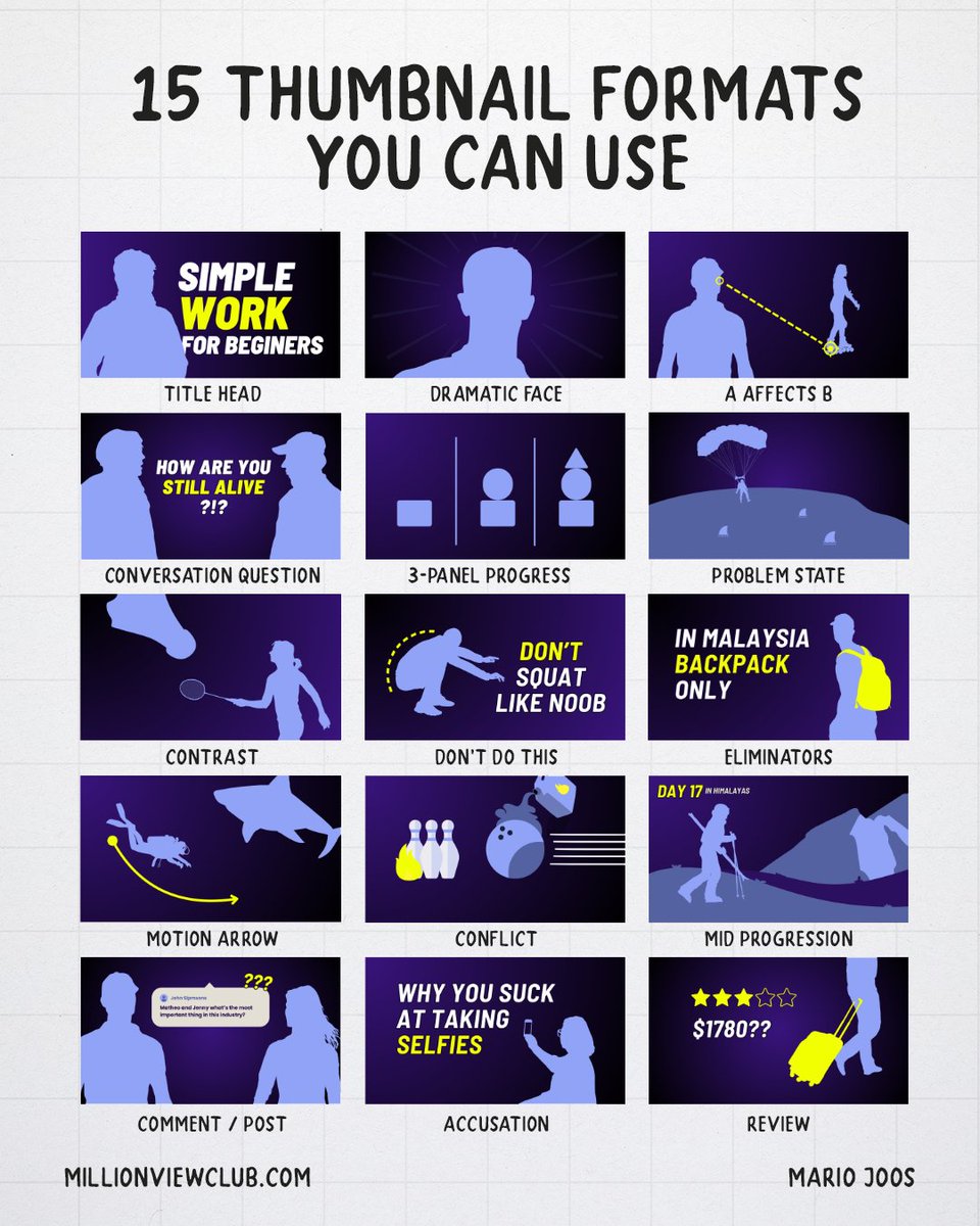
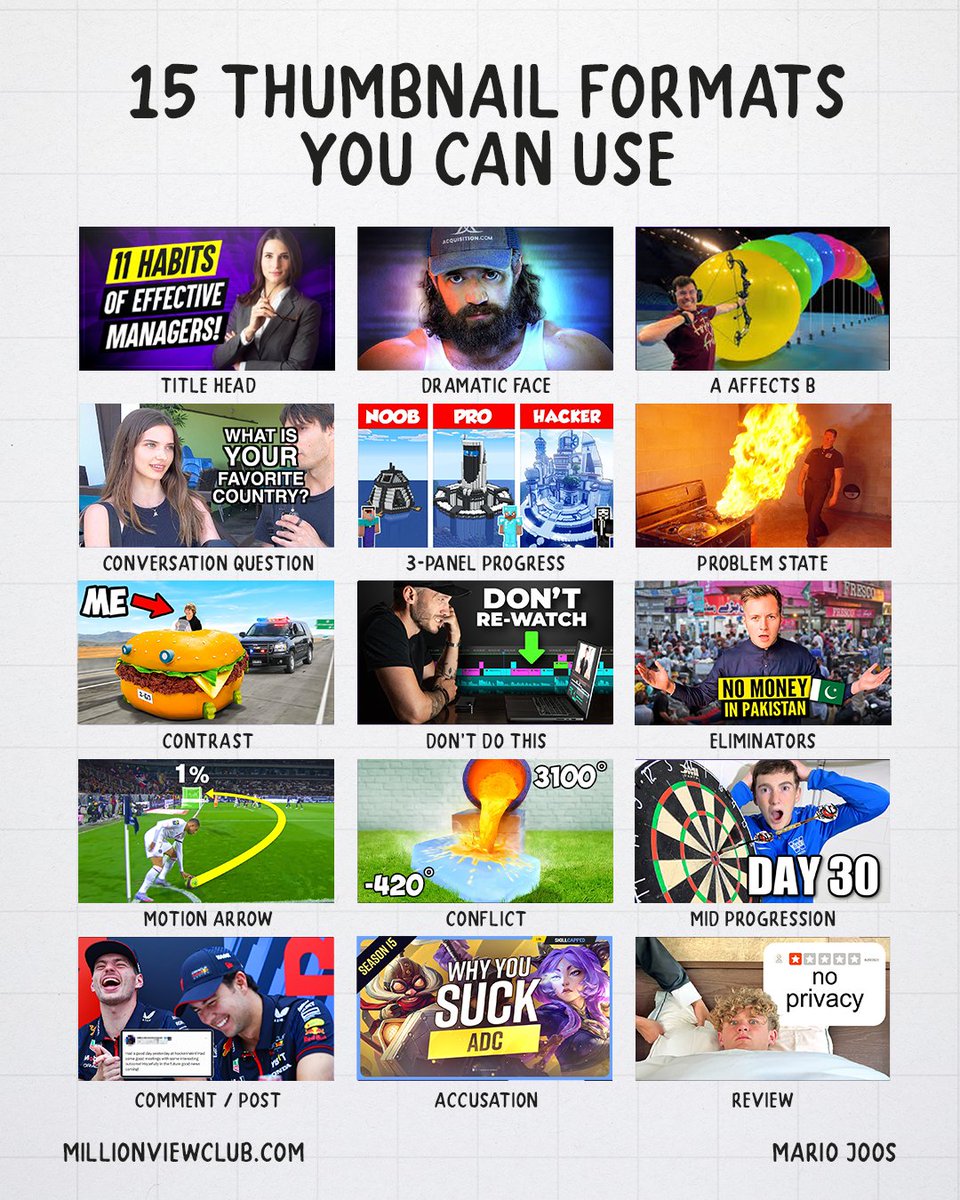
15 Thumbnail formats you can use this year.
Thumbnails are one of the most important elements for grabbing someone’s attention initially. They can create a promise, set a tone, or even give additional context that the title cannot provide. So my team and I analyzed thousands of thumbnails, grouping them by similarity. We found around 75 viral formats that are used consistently among top creators.
Here are 15 of those thumbnail formats you can confidently use, knowing there are many viral videos built on similar thumbnail compositions, along with a short explanation of why each one works.
1. Title Head
This is a very straightforward composition with a face on one side and simple text on the other. The goal is to establish a familiar face or authority figure, while adding context through text. The text usually complements the title, or adjusts the title to target specific viewer behavior. This composition is often used for content aimed at a search audience.
2. Dramatic Face
With the dramatic face, emotion is the main message. The goal is to be intentionally vague about what the video is about. Because there isn’t much variation possible with this composition, it’s often used for individual videos or one-offs. It usually relies on familiarity with the person, often a famous person, to draw attention. The dramatic look and focus on facial expression grab attention, but in this type of thumbnail the title carries the meaning, so it’s often paired with a very dark, more serious title.
3. A Affects B
This thumbnail composition is very common and used in many viral videos. It shows one person or object clearly about to manipulate or target the other. The viewer immediately understands what’s happening and can easily connect the two subjects.
4. Conversation Question
In this thumbnail composition, we show two people with a question in the middle, as if one person is asking the other. A statement can also be used, but most creators rely on questions. The curiosity comes from wanting to see how people respond. This composition is often used for street interviews.
5. 3-Panel Progress
This composition shows the same object or subject changing over time or moving through different stages. The idea is simple: from left to right, we show clear stages and promise growth, improvement, or general change.
6. Problem state
This is any image used to indicate that there is a problem. It usually doesn’t need much context, because the viewer can quickly understand that something is unstable. No solution is shown yet, we simply highlight that a problem exists. This uncertainty helps evoke curiosity.
7. Contrast
This is another common viral composition where we highlight a difference between two things. It usually relies on size, color, or two elements that look drastically different. The idea is to place two states side by side within the same frame. It’s not about good or bad, just about showing contrast, big or small, cheap or expensive, simple versus complex.
8. Don’t do this
This thumbnail shows an action that is clearly wrong. We signal that it’s wrong using a red X or simple text like “don’t do this,” “don’t rewatch,” or a similar warning tied to the action shown. It plays on the fear of making the same mistake for people interested in the topic, whether that’s chess, editing, singing, or something else.
9. Eliminators
This thumbnail shows the main rule of the video. Stories often become interesting because of limitations, and here the rule itself is strong enough to be placed in the thumbnail. It removes possibilities and sets a clear expectation fast, for example no money, no English, no weapons. The curiosity comes from wanting to see how these rules interact with the overall topic of the video.
10. Motion Arrow
In this thumbnail composition, movement is implied while the outcome stays hidden. The movement is shown through arrows, pointers, or anything that suggests where an object will move next. The arrow can even take an impossible shape to increase curiosity about what’s going to happen. This removes ambiguity about the direction, while keeping the result unknown.
11. Conflict
This shows two objects approaching or interacting with each other with no clear resolution. The tension comes from not knowing what the impact will be. Usually, the two objects don’t belong together, which creates curiosity through uncertainty. Unlike a contrast thumbnail, which focuses on size or visual differences, this one is about conflict and the tension it creates.
12. Mid Progression
This composition shows that the story is already happening. The viewer gets a snapshot from a later stage, with clear progress already made and an indication of what kind of progress to expect. There’s no clear beginning or end, which creates curiosity, but progress is guaranteed. Sometimes it overlaps with an end state when it’s unclear whether this is the finish or not. These thumbnails often use days or time markers to show how much has passed.
13. Comment / Post
While this thumbnail doesn’t work for all niches, it’s still very strong for certain creators. Reaction channels or celebrity interviews often show comments in the thumbnail so viewers know what kind of video to expect. It can also create a sense of conflict or set the tone for the type of comments being reacted to. It’s a solid composition, even with its limited appeal.
14. Accusation
In this thumbnail, the viewer feels directly targeted. We point at them, judge them, or provoke disagreement by playing on their emotions. This direct aim makes the video feel personal, which can increase clicks because it feels like it’s speaking to them. It’s a riskier composition though, because if the video lands wrong, it can lead to dissatisfaction, so it needs to be used carefully.
15. Review
This thumbnail shows a scenario, situation, or object with a clear quality signal. That can be stars, pricing, tiers, or a scale, often paired with the creator’s reaction. The rating does the talking, the opinion is implied, not explained. Clicks come from wanting to experience it for ourselves. Bad reviews spark curiosity about how bad it gets, while good reviews create excitement around something exceptional. It’s all about the extremes.
There are many types of thumbnails, and categorizing them into simple compositions or formats isn’t easy. Still, this framework gives us a starting point to understand what we can experiment with during thumbnail A–B testing.
English
@robertoblake do you have any book recommendations for color theory in relation to marketing/branding? (Assuming such a book exists 🤔)
English
Jessica | Starring You Marketing retweetledi

Jessica | Starring You Marketing retweetledi

Jessica | Starring You Marketing retweetledi

Jessica | Starring You Marketing retweetledi

Underrated life hack: Build a “no matter what” habit. One thing you do every day regardless of mood, chaos, or excuses. Ten minutes of writing. A short walk. A chapter read. These become your anchors. The habit isn’t the point; who you become by keeping it is.
English
Jessica | Starring You Marketing retweetledi

YOUR LIFE IS YOURS !!IYOURSSS!! not anybody else's!! not the ones disappointed not the ones talking shit not the ones that never sent an apology not the ones snickering or judging not the ones with stake in the game. THE COFFIN ONLY HAS ROOM FOR ONE. YOU. Live. fuck it
ً@prinkasusa
what opinion about ADULTHOOD will have you like this??
English
Jessica | Starring You Marketing retweetledi

If you're not careful, the life you don't want will slowly become the life you'll never escape.
English
Jessica | Starring You Marketing retweetledi

To Part Time Content Creators,
Sleep: 8hrs
Morning Routine: 30min
Fulltime Job: 9hrs
Physical Activity: 1hr
Total Commutes: 1hr
Dinner + Downtime: 30min
Maintain Home/Space: 30min
Total: 20.5hrs
So if you work at maximum efficiency every single weekday you only have 3.5hrs of “freetime” to create content or participate in any form of hobby/entertainment. You’re doing the best you can :) I promise
English
Jessica | Starring You Marketing retweetledi

Jessica | Starring You Marketing retweetledi

Luck as a YouTuber is real and this is how you get lucky:
- Post everywhere
- Learn from others
- Upload consistently
- Make better content
- Study people growing
- Study Titles that work
- Jump on newer trends
- Find working Thumbnails
By now, you probably understand that Luck is directly tied to you putting yourself in positions to receive it.
You get Luckier by actually doing things.
If you sit there doing nothing, you won't get lucky. It's that simple.
English
Jessica | Starring You Marketing retweetledi

Jessica | Starring You Marketing retweetledi

There's a specific kind of exhaustion that comes from doing work that doesn't matter to anyone, including you.
You eventually get tired in a way that weekends can't fix.
English
Jessica | Starring You Marketing retweetledi


Jessica | Starring You Marketing retweetledi