Habeebah Owojori
709 posts

Habeebah Owojori
@Hercoder556
Product designer || Framer developer || Anime / animation lover || love art and enjoy sketching
Remote انضم Kasım 2019
723 يتبع268 المتابعون

@Hercoder556 @digitalforus Congratulations, Habeebah.
English
Milestone unlocked 🎉
I’m now a Top Rated UX/UI Designer with a 100% Job Success score on Upwork.
Behind that badge are hours spent refining user flows, improving information architecture, and designing intuitive experiences.
For me, great design isn’t just about visuals, it’s about creating clear, user-centered product experiences that actually work.
The numbers reflect the commitment. And numbers don’t lie.
If you're building a product and need thoughtful UX/UI design, I’d love to connect.
#UXDesign #UIDesign #ProductDesign #Upwork

English

@SophiaAutomates Congratulations Sophia, really happy for you 🤗
English

I got the job!!
Dubai based startup
As their Operations Manager! God didddd 🤎
Month wey go soft, na from 3rd you go know 🥳😂
English
Today’s practice: Search component.
I designed the UI, then used @jittervideo to explore how motion can support focus, feedback, and clarity.
Small interactions. Real UX value.
#ProductDesign #MotionDesign #UIAnimation #Jitter #UXDesign
English
I got a contract on Upwork to redesign the flow and interface of an app, while still retaining the brand feel.
I restructured the experience to be more intuitive and user-friendly. It made sense. It worked.
Then we went ahead to do user research.
And that’s when we realised something.
The app felt too techy for the industry it was in.
So we went back to the drawing board.
This time, the structure was solid. The foundation was there. But the interface? It didn’t feel like where it belonged.
That phase gave me sleepless nights.
At first, I kept playing around with colours. Trying different palettes. Adjusting tones. Going back and forth. Hoping something would click.
Nothing did.
After a good number of front and back, I had to pause and rethink my approach.
Instead of asking, “What colours work?”
I started asking, “What kind of branding would truly resonate with this platform and its audience?”
That shift changed everything.
It felt like wandering in a desert and finally finding water.
Because once the brand direction became clear, the interface started designing itself.
Sometimes the problem isn’t the layout.
Sometimes it’s the identity.
#ProductDesign #UIUX #UXDesign #BrandStrategy #UserResearch #AppDesign #DesignJourney
English
Habeebah Owojori أُعيد تغريده


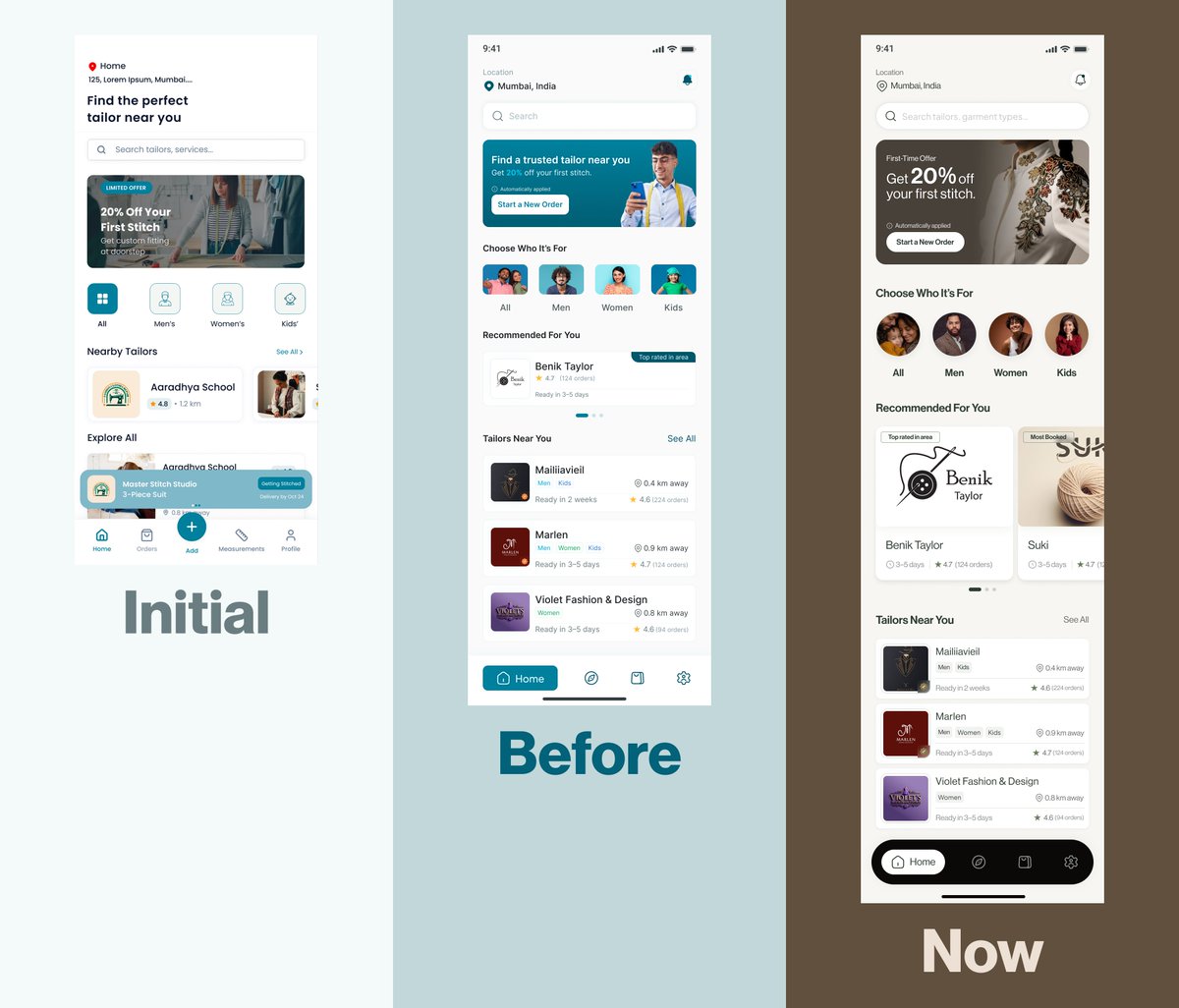
Reverse engineering world-class design to level up my UI skills. This weekend: Ogaki (beauty) and Groth (interior design). Replicated both in Figma, now moving to Framer to master their interactions. You can't fake understanding when you're rebuilding from scratch.
The Context:
While advancing my Framer skills, I realised I needed to go deeper into the fundamentals: typography hierarchy, colour psychology, layout composition, and visual design systems.
My strategy? Find conversion-driven designs and reverse engineer them. Study why elements are positioned the way they are. Understand how typography creates information hierarchy. See how layout influences user behaviour. Then replicate them completely to feel every decision.
This Weekend's Deep Dive:
Ogaki (Beauty Industry): Experimental layouts that break conventional grids. Groth (Interior Design): Typography as the primary design system.
What Makes Ogaki Fascinating:
Their layout approach is unconventional. They're creating visual rhythm through intentional asymmetry and negative space. But where they really shine is in interaction design.
I've replicated the designs in Figma first to understand the static layout choices. Now I'm taking them into Framer to break down each interaction, understanding what makes them work at both a technical and psychological level.
What Makes Groth Powerful:
They've built their entire visual system around typography. The restraint in their colour palette (mostly black, white, earth tones) forces your attention onto the type hierarchy and spatial composition.
When you rebuild a design first in Figma, then implement it in Framer, you can't skip the hard questions:
- Why does this font size create the right emphasis?
- How does this spacing affect visual flow and scannability?
- What makes this interaction feel intuitive versus gimmicky?
- How does this layout guide where users look first?
- Why does this colour choice influence decision-making?
The Figma phase forces you to understand the static design decisions: typography, layout, hierarchy. The Framer phase is where you learn how motion and interaction elevate the experience.
Both sites prove that minimalism is strategic, not stylistic. Every element earns its place. White space creates focus. Typography establishes hierarchy. Layout directs behaviour. Colour triggers emotion.
The Pattern I'm Seeing:
Conversion-driven design isn't accidental. These sites understand:
→ User psychology and cognitive load
→ Visual hierarchy and F pattern scanning
→ Colour theory in conversion optimisation
→ How micro interactions reduce friction
→ The relationship between aesthetics and trust
What's Next:
Taking both designs from Figma into Framer. Going especially deep on Ogaki's interaction system to understand how they've orchestrated animations to feel so cohesive.
English
Habeebah Owojori أُعيد تغريده
✨ Field Theory Studio — shaping immersive web experiences
English


@Hercoder556 Reverse-engineering to full build is inspiring — great progression!
English
Remember that hero section I was reverse-engineering in Framer last week?
I just finished building out the entire landing page: fully functional, animated, responsive.
What started as "let me rebuild this hero in Framer" turned into a masterclass in how everything connects when you're actually building it:
- How the hero animation sets the tone before users even scroll
- How section transitions in Framer can guide attention without feeling forced
- How to structure components so spacing and hierarchy scale across breakpoints
- How to use Framer's motion tools to support the story, not just add effects for the sake of it
This wasn't about pixel-perfect recreation. It was about understanding the technical decisions behind what makes it work, then implementing those patterns in Framer.
Reverse-engineering great sites and rebuilding them in Framer has been one of the fastest ways I'm leveling up. Not just as a designer, but as someone who can actually ship these ideas as real, working sites.
Still learning. Still building in Framer every day.
If you need a Framer developer who thinks about design and can build it, or want to collaborate on something, let's talk.
English


I’ve come across this post no less than 200 times, but I like it each time because it’s so true. 🙂
𝒶rα˚˖𓍢ִ໋@yslmammi
One thing I learned is no matter how big or small. Having your own space is a blessing.
English
@manuelogomigo So happy for your journal and nothing but inspirational and motivational. Always rooting for you and @madebyduo 🥰
English

2025 was fear and progress happening at the same time.
I was afraid of failing.
So I built quietly.
Stepped back from social media.
From building in public, lol.
Flowdrive grew slowly into something real.
Real brands.
Real users.
Real pressure.
Studio Duo took on a 3-month $100k challenge.
We hit ~70% in 3 months.
Markdrop got its first early customers.
Enough to prove the idea works.
I handled more customer complaints than ever.
It forced me to grow fast.
I doubted myself a lot.
Still showed up.
We took a team vacation.
Three countries.
After 2+ years building the studio.
2025 wasn’t easy.
But it was necessary.
I’m done building in silence.
I’m building in public again.
Sharing the wins, the mistakes, and the process.
Still not there.
But excited for what’s next.
English