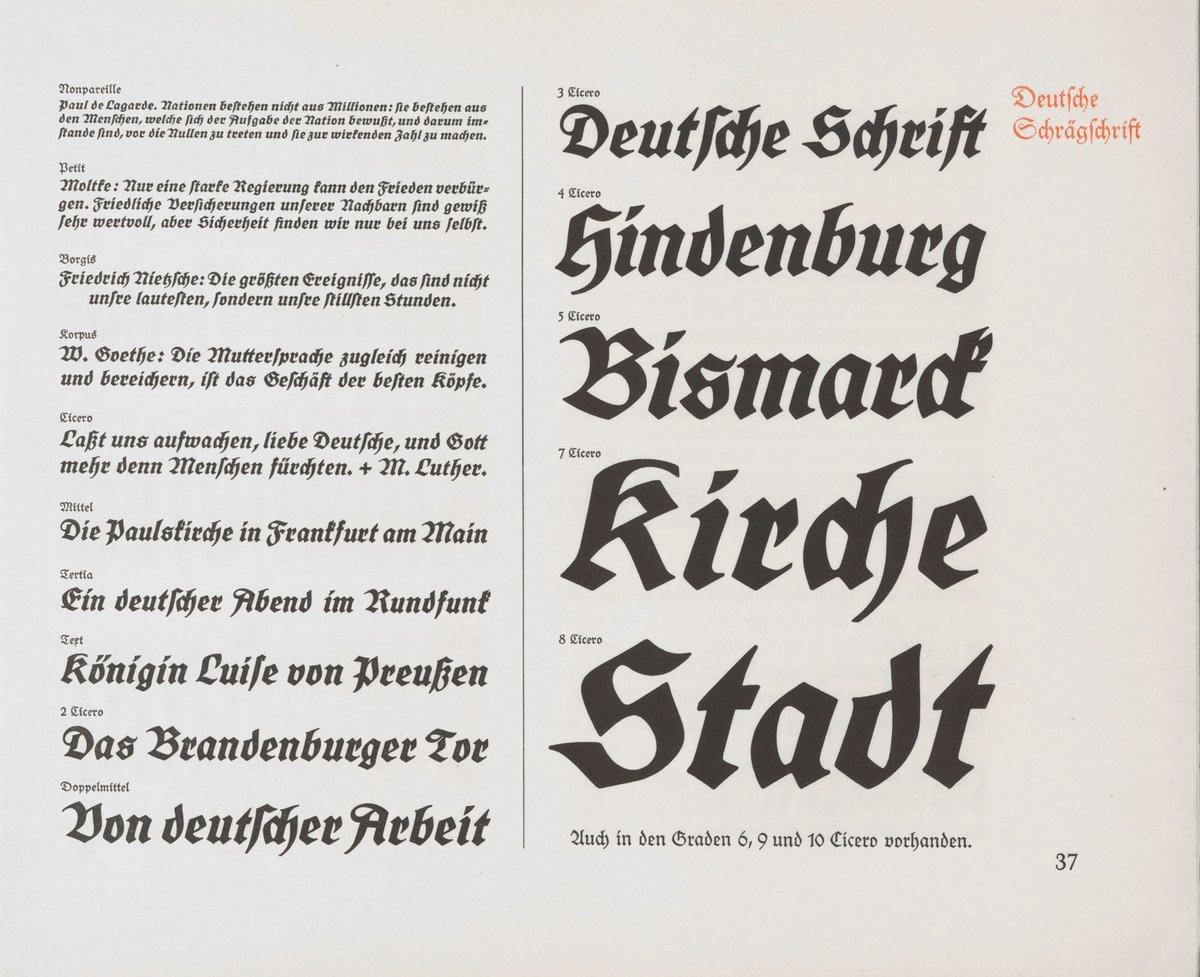
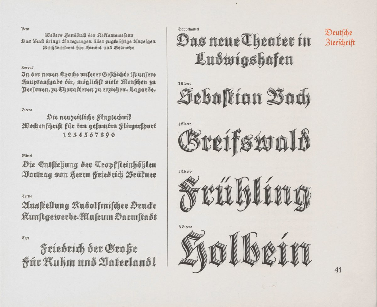
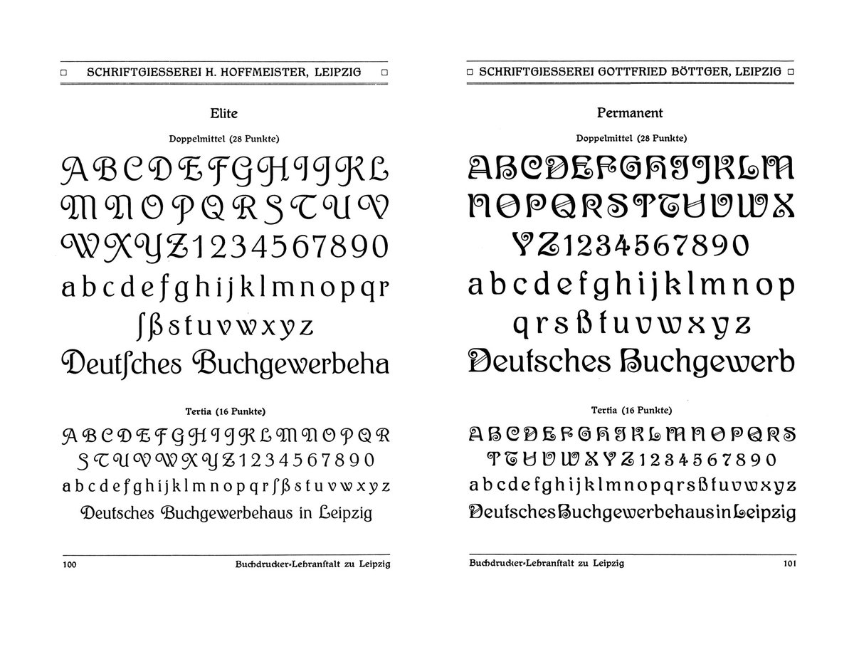
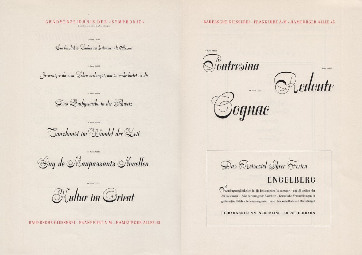
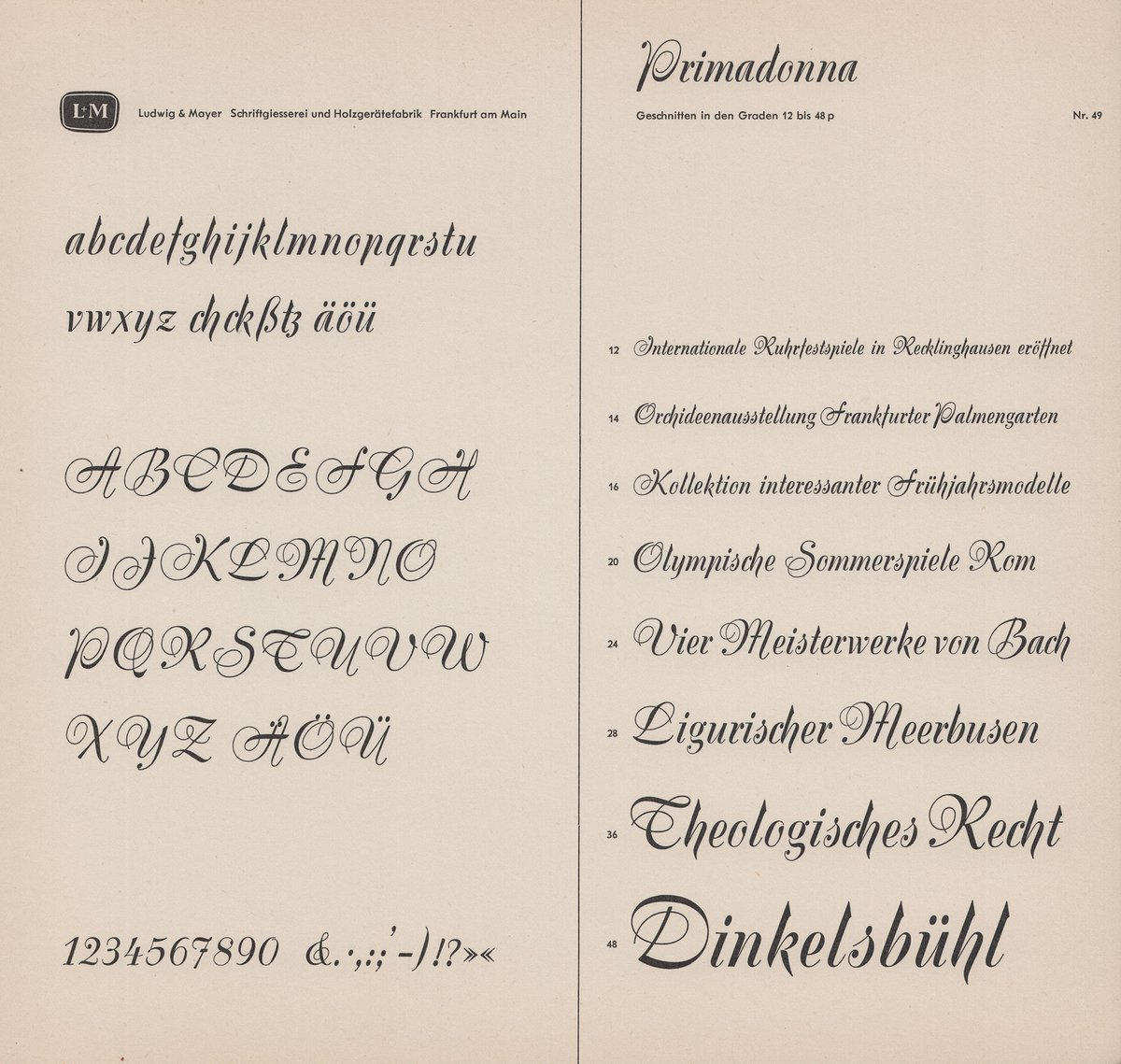
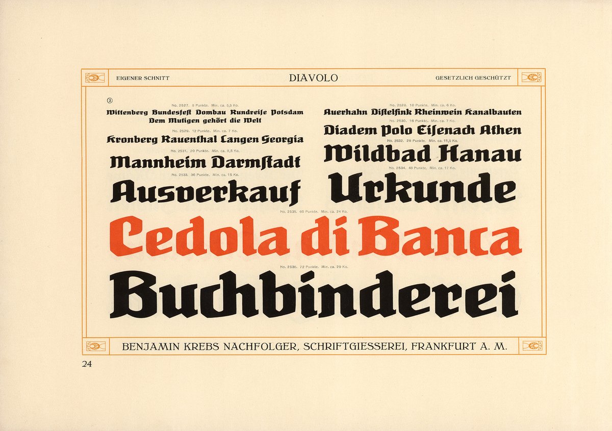
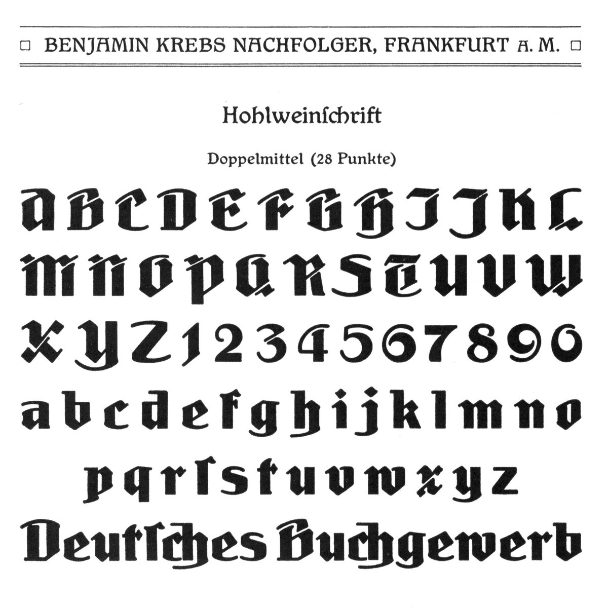
New hi-resolution scans from the book “Ausgewählte Druckschriften” showing German fonts from the early 20th century in 28 points (uppercase, lowercase and figures) ☞ letterlibrary.org/view/object/au…
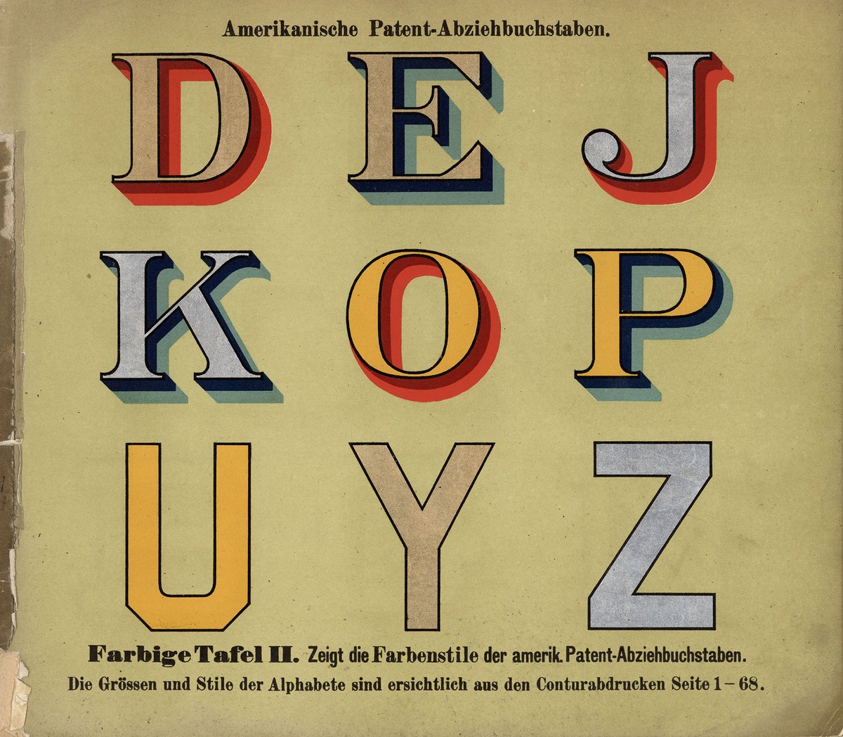
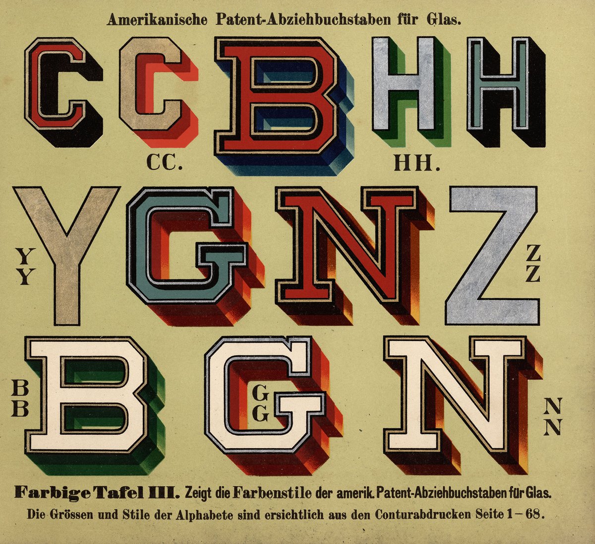
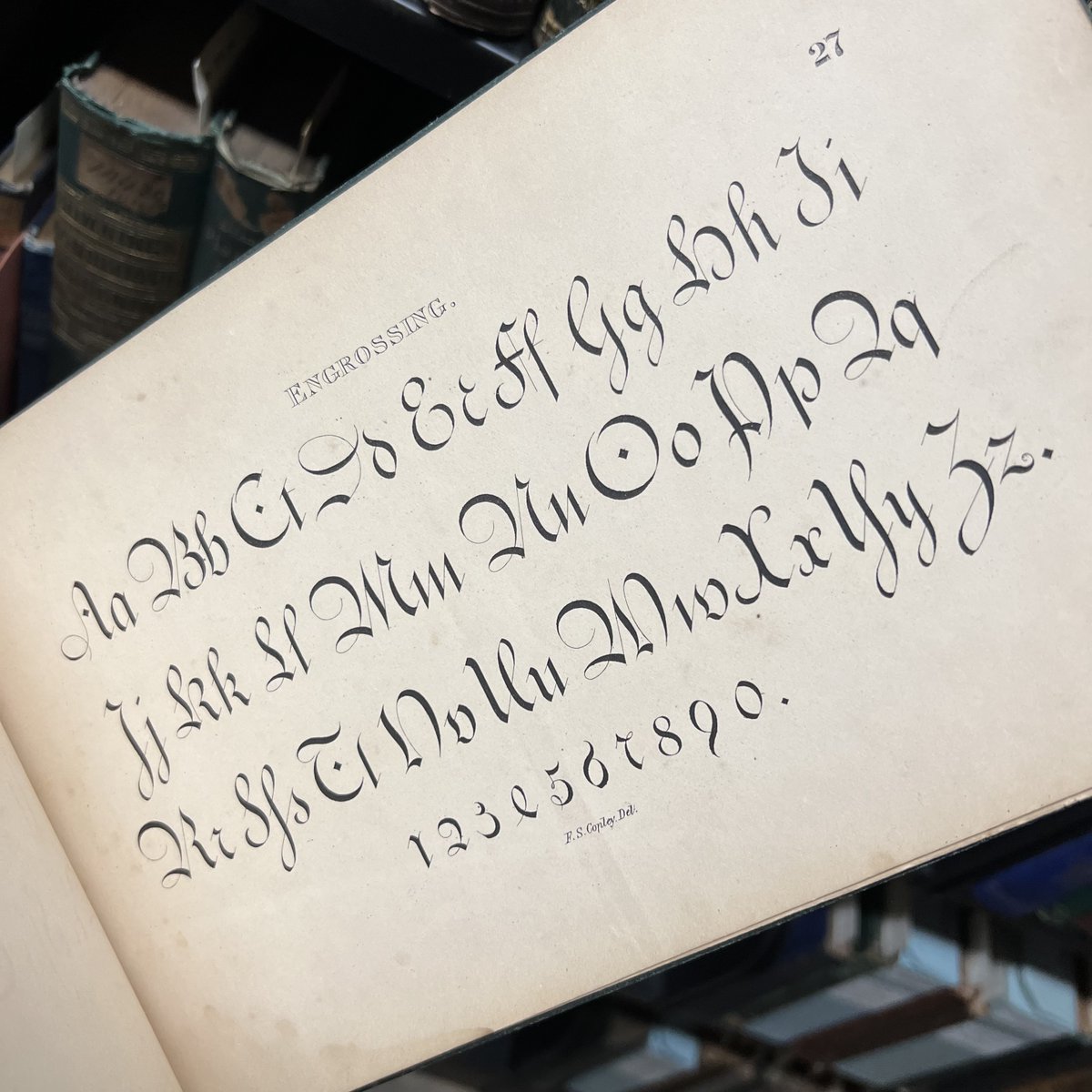
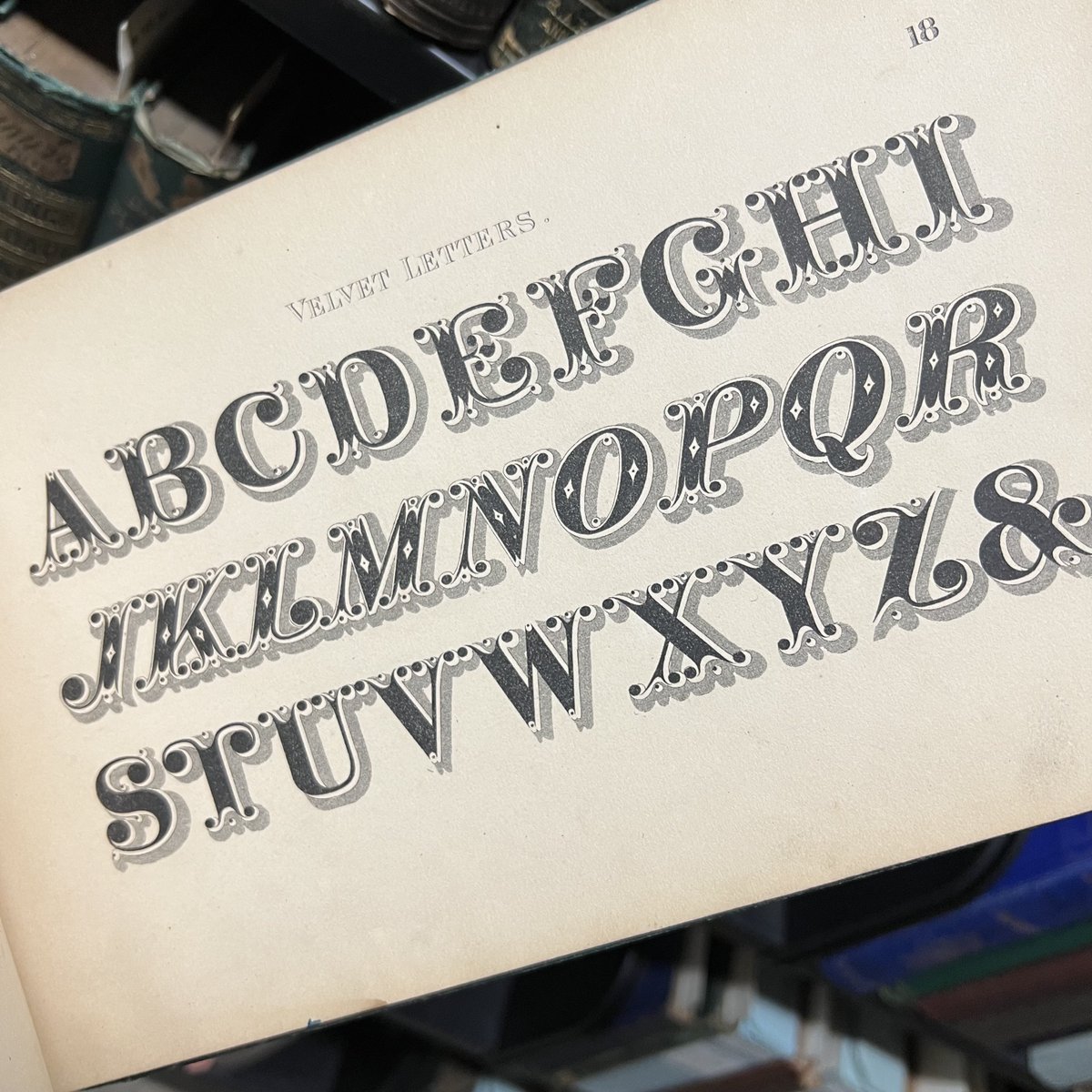
Alphabets from the very appropriately titled work, A Set of Alphabets (New York, ca. 1870) by Frederick Copely, intended to be used by architects, designers, sign painters, engravers, etc.
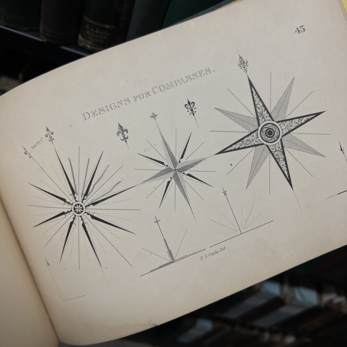
And we threw in the compass designs just in case you get lost.
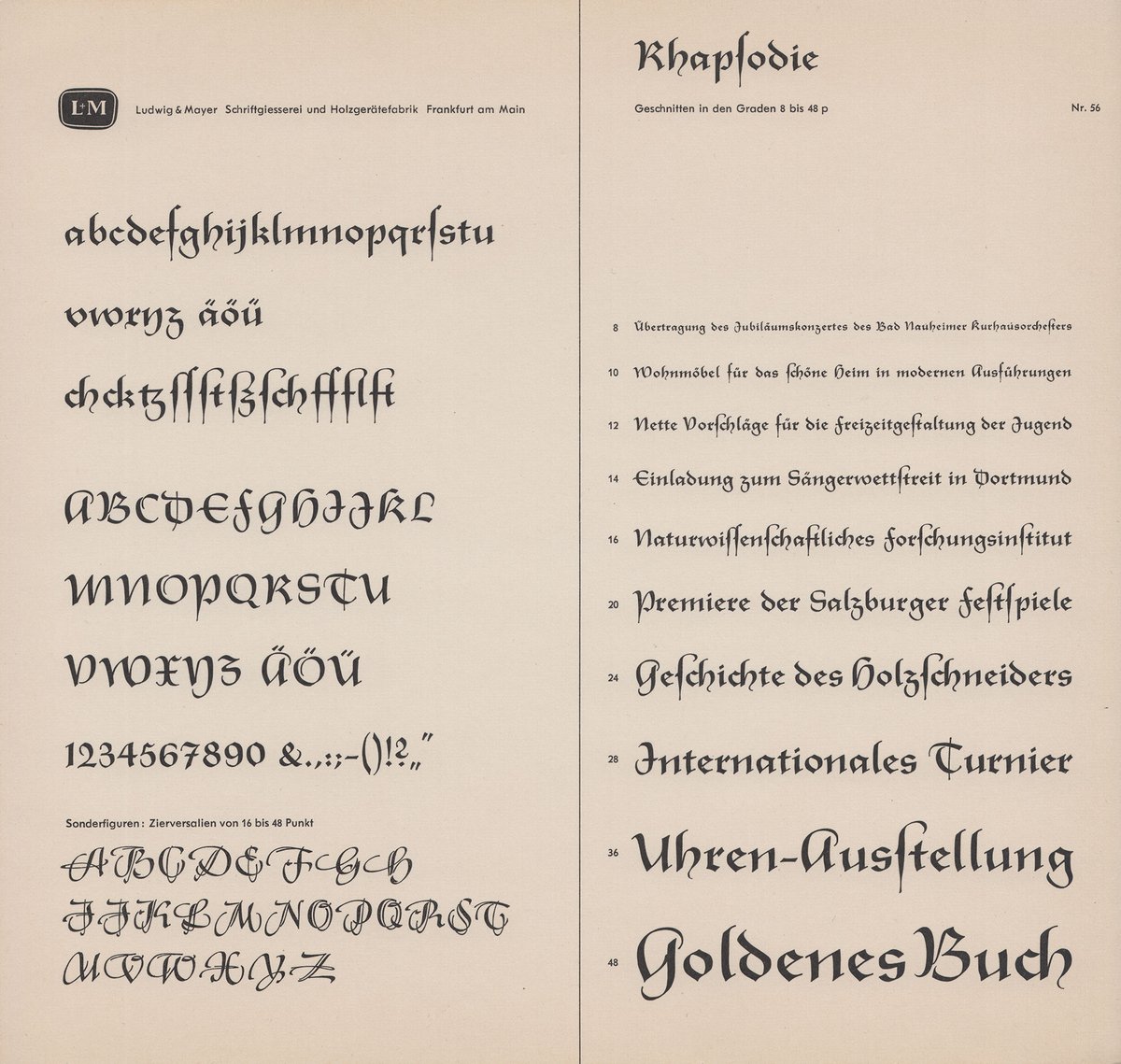
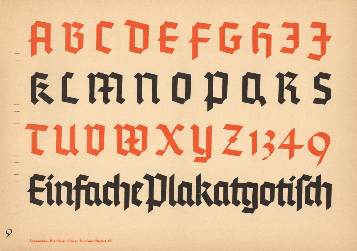
Soennecken-Schrifthefte Gotisch (c. 1930).
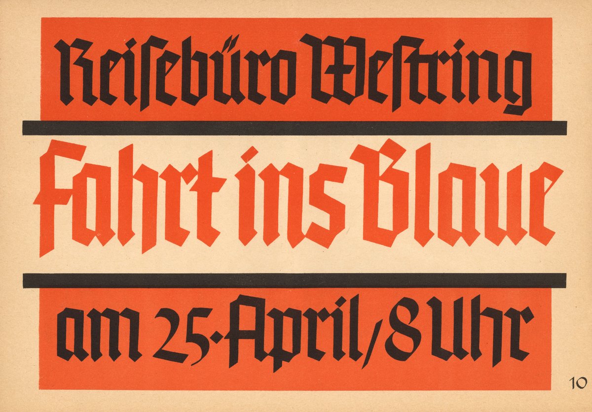
Wild, an ‘ſte’ ligature! And this typeface must feature so many ligatures, because in the second image, I see a myriad of ligatures, including ‘ei’, ‘ro’, ‘Fa’, ‘rt’, and ‘ſtri’!
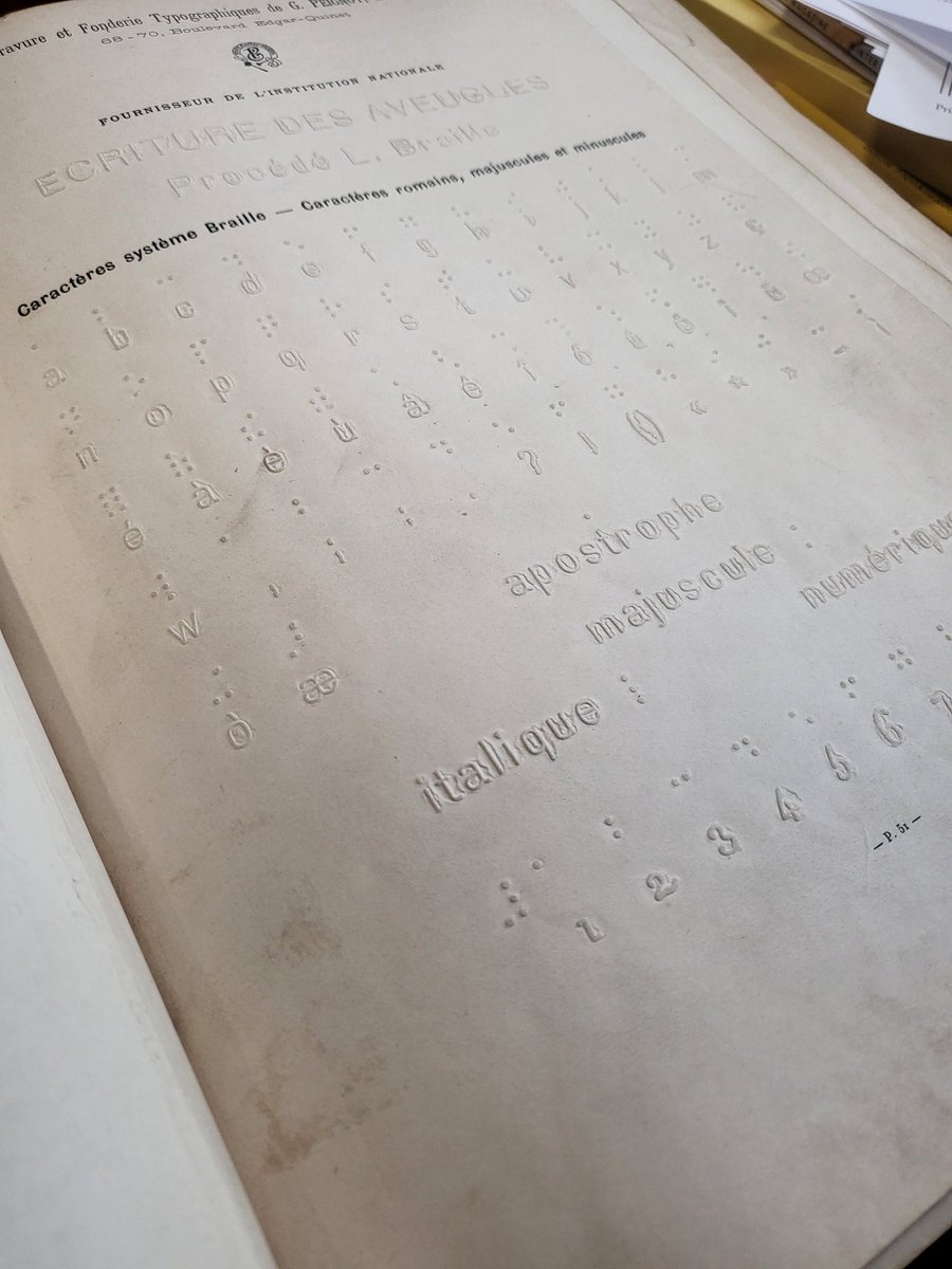
I couldn't resist pulling this Peignot type specimen (Paris, 1897) off the shelf, and it fell open to a braille page, which I've never seen before in a specimen book. #NewberryLibrary