Random_Nobody أُعيد تغريده

Invented in 1761 by Benjamin Franklin, the glass armonica was so eerie people thought it could drive you mad, yet Wolfgang Amadeus Mozart turned it into hauntingly beautiful music.
English
Random_Nobody
9.6K posts


@Random_Nobody_1
Heterodox unicorn: anti-woke and pro-Green.


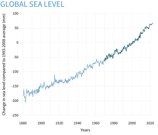
This again. I’ve complained about this exact chart design and this exact framing before, and I’m impressed by how often it gets recycled. To be clear up front: if you’re not in the energy sector and you're posting this, you’re not stupid, but you’re being misled. Unless you work in energy accounting, this chart seems quite intuitive. It's meant to. This is a primary‑energy (exajoule) data series from the Energy Institute. Since they have abandoned the controversial substituton method that dominated for so many years, fossil fuels are counted as upstream chemical energy inputs, while wind and solar are now counted as downstream electricity output with no conversion efficiency adjustments. Those are not comparable quantities. Mixing them guarantees that wind and solar will look small anywhere electricity is still a minority of total final energy use (which is basically every country in the world) That outcome is guaranteed by making a dishonest chart on a data series not meant to be used in this way. This is not just my interpretation. The IEA and data publishers like Our World in Data have both noted that summarizing energy systems with a single ‘primary energy’ metric is inherently problematic, because fossil fuels are counted as energy inputs while renewables are counted as electricity outputs, so the measures track different things. For context, wind and solar supplied roughly 22% of China’s electricity in 2025. This chart doesn’t contradict that per se. It just collapses everything into a metric that broadly minimizes electricity technologies. You’d get the same visual story for the U.S., Europe, or anywhere else. Primary‑energy charts are fine for tracking aggregate system demand trends. They are not valid for comparing fossil fuels to wind and solar contribution, and they are especially not a way to assess “renewable leadership” or lack thereof. If that’s what you care about, you can look at electricity generation mix, capacity additions, build rates, deployment speed, manufacturing scale...etc., metrics that correspond to something comparable. But if your argument depends on treating an EJ primary‑energy chart as a like‑for‑like comparison, then the conclusion you’re drawing is flawed. The people who make such charts sometimes don't know this, but often they do, and they do it on purpose because it's a very friendly narrative for their fossil fuel clients. :/