Bran+do Agency

55 posts

Bran+do Agency banner
Bran+do Agency

Bran+do Agency

@branplusdo

an experimental process into the purpose of brands and products. What does a bran+do for you?

New York, NY انضم Eylül 2025
1 يتبع0 المتابعون
Bran+do Agency
Bran+do Agency@branplusdo·
Mini #CaseStudy - #Gymshark: Community-First Branding In the early days, Gymshark was just another small fitness apparel startup competing in a crowded athleisure market dominated by legacy brands like Nike and Adidas. Traditional advertising didn’t work. The brand lacked recognition, its early visuals blended into the typical gym-wear aesthetic, and there was little emotional pull to separate it from dozens of other online fitness clothing brands. The messaging also risked missing the real audience, young fitness enthusiasts who were spending more time on social media than in traditional sports marketing channels. Without a stronger identity, Gymshark could easily have become just another generic apparel label in the crowded fitness category. 
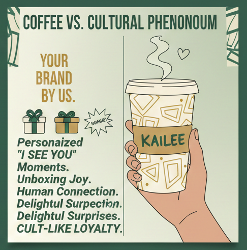
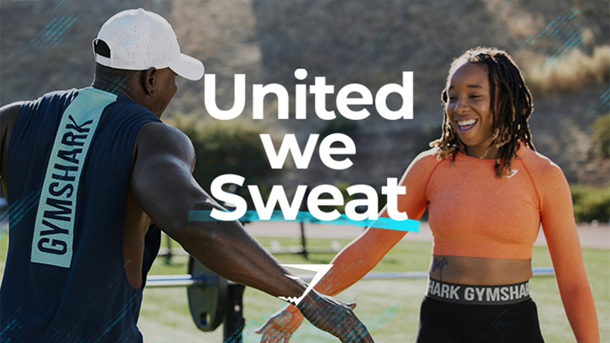
Gymshark flipped the script by focusing on community before product. Instead of expensive celebrity endorsements, the brand partnered with fitness creators and micro-influencers who were already building loyal audiences on platforms like Instagram and YouTube. The strategy was based on a simple insight: fitness is social, and people trust communities more than ads. Gymshark created experiences around that idea, hosting workout events, building athlete communities, and turning customers into brand ambassadors. The voice became more human, the visuals more authentic, and the brand positioning shifted from “selling gym clothes” to building a fitness movement people wanted to belong to. Source: forbes.com/sites/giacomot… BULLET MINI #SWOT ✅ Strength: Community-driven marketing built strong loyalty and turned customers into brand advocates. ❌ Weakness: Heavy reliance on influencer culture means the brand must constantly maintain authenticity. 🚀 Opportunity: Expanding community experiences—events, digital fitness platforms, and creator partnerships—can deepen brand engagement. ⚠️ Threat: Without its community-first strategy, Gymshark would likely have been overshadowed by larger athletic brands with bigger advertising budgets. Brand Lesson for Founders and CMOs Products don’t build movements, communities do. When people feel like they belong to a brand, marketing becomes amplification instead of persuasion. Follow our page for more mini brand breakdowns on how modern companies win attention in the social-media economy.
Bran+do Agency tweet mediaBran+do Agency tweet mediaBran+do Agency tweet mediaBran+do Agency tweet media
English
0
1
0
22
Bran+do Agency
Bran+do Agency@branplusdo·
#MiniSWOT Abercrombie & Fitch: Reputation rehab For years, Abercrombie & Fitch built its identity around exclusivity and a very narrow image of “cool.” But by the early 2010s, that strategy started to backfire. The brand faced criticism for exclusionary messaging, controversial leadership comments, and stores that felt dark, intimidating, and out of touch with modern shoppers. Younger customers wanted authenticity and inclusivity, but Abercrombie’s brand voice and visuals still reflected an older playbook. Sales dropped, public perception declined, and the brand felt disconnected from the culture around it (Business of Fashion, 2019). The company began a major brand reset focused on inclusivity, transparency, and a more welcoming shopping experience. Leadership shifted the voice of the brand to highlight diversity, body positivity, and everyday confidence. Stores became brighter and more accessible, marketing campaigns featured a wider range of customers, and product design focused on comfort and modern lifestyle needs. According to reports from the Business of Fashion and Retail Dive, this repositioning helped Abercrombie reconnect with Millennials and Gen Z, turning a declining brand into one of retail’s most talked-about comeback stories. MINI SWOT ✅ Strength: Clearer message built around inclusivity and modern lifestyle branding. ❌ Weakness: Past reputation damage created long-term trust issues to overcome. 🚀 Opportunity: Reintroduced the brand to Gen Z through social storytelling and relatable campaigns. ⚠️ Threat: Without change, the brand risked becoming irrelevant to a new generation of shoppers. Brand takeaway for founders and CMOs: Reputation damage doesn’t always mean the end of a brand. With honest positioning, better storytelling, and customer-focused design, even the most criticized brands can rebuild trust. Follow our NYC branding team for weekly brand breakdowns and marketing insights. Business of Fashion - businessoffashion.com/case-studies/r…
Bran+do Agency tweet mediaBran+do Agency tweet media
English
0
1
0
11
Bran+do Agency
Bran+do Agency@branplusdo·
BlackBerry #miniswot - When relevance slips away At one point, BlackBerry was the smartphone for business leaders and presidents. The physical keyboard was iconic. But when touchscreens and app ecosystems changed user behavior, BlackBerry moved too slowly. After the launch of iPhone in 2007, consumers wanted apps, entertainment, and a full-screen experience, not just email (The New York Times, 2009). BlackBerry’s software felt outdated, the visuals lacked excitement, and the brand voice stayed corporate while culture moved social and lifestyle-driven. The audience shifted, but the brand didn’t shift with it. Instead of competing head-to-head in hardware, BlackBerry reinvented itself as a cybersecurity and enterprise software company. The company invested in secure operating systems like QNX and repositioned itself around safety, privacy, and embedded technology (Harvard Business Review, 2015). The shift mattered because research showed the future wasn’t just phones, it was connected cars, enterprise security, and IoT infrastructure. The brand stopped trying to be “cool” and leaned into being trusted. It felt quieter, more focused, and strategically aligned with where long-term demand was growing. MINI SWOT ✅ Strength: Strong credibility in security and enterprise systems after pivot. ❌ Weakness: Late response to touchscreen and app-driven consumer behavior. 🚀 Opportunity: Expansion into automotive software, cybersecurity, and embedded tech. ⚠️ Threat: Without pivoting, the brand could have disappeared entirely from the tech market. Brand lesson for founders and CMOs: Relevance is not permanent. When culture shifts, your positioning must shift too. Sometimes the smartest brand move isn’t fighting for old market share, it’s redefining what business you’re in. Follow our NYC branding team for weekly mini case studies. Sources: The New York Times – “BlackBerry’s Struggle Against the iPhone” Harvard Business Review – “BlackBerry’s Turnaround Strategy” Reuters – “BlackBerry shifts focus to software”
Bran+do Agency tweet mediaBran+do Agency tweet mediaBran+do Agency tweet media
English
0
0
0
5
Bran+do Agency
Bran+do Agency@branplusdo·
A #MiniSWOT of the ‘Coach’ Brand By the early 2010s, Coach had a perception problem. The brand was known for quality leather bags, but it started to feel predictable and older. Too many outlet stores, repetitive designs, and heavy discounting made the brand feel less special (Business of Fashion, 2014; Forbes, 2013). Younger shoppers didn’t see Coach as aspirational, it felt like their mom’s handbag brand. The visuals lacked excitement, the storytelling felt flat, and emotionally, the brand wasn’t connecting with the next generation. Coach reset its voice, visuals, and positioning under new creative leadership. The brand leaned into fashion credibility, cultural relevance, and Gen Z behaviors, especially on social media. Campaigns featuring the Tabby bag, diverse creators, and pop culture moments repositioned Coach as expressive and self-aware. According to Vogue Business (2023), Coach ranked high with Gen Z shoppers after its reintroduction strategy focused on authenticity and nostalgia done in a modern way. The brand felt younger, more playful, and more emotionally connected, not by abandoning heritage, but by reframing it for a new audience. MINI SWOT ✅ Strength: Clearer fashion positioning and stronger Gen Z engagement. ❌ Weakness: Overexposure through outlets previously diluted brand value. 🚀 Opportunity: Cultural storytelling and social-first campaigns unlocked a younger luxury buyer. ⚠️ Threat: Without reinvention, Coach risked long-term aging out of relevance in a trend-driven market. Why this matters for your brand: If your audience is aging but your growth depends on younger buyers, the problem isn’t your product — it’s your positioning. Brands don’t fade because they’re old. They fade because they stop evolving. Follow us for weekly branding breakdowns from a New York social media agency perspective.
Bran+do Agency tweet mediaBran+do Agency tweet media
English
0
0
0
11
Bran+do Agency
Bran+do Agency@branplusdo·
#CaseStudy / #MiniSWOT — Gap — Identity drift and brand confusion Gap was once the uniform of cool, simple jeans, white tees, and clean American style. But over time, the brand lost its focus. The visuals became bland, the stores felt generic, and the message wasn’t clear anymore. Younger shoppers didn’t feel a connection, and older fans felt the brand had changed too much. The confusion peaked in 2010 when Gap suddenly launched a new logo without warning, and the backlash was so strong that the company pulled it within a week. Sales also showed the impact of this identity drift. Gap’s North America business fell from over $7 billion in the early 2000s to roughly half that size years later, showing how the brand slowly lost relevance. THE SHIFT (Rehab / Pivot / Reinvention) In recent years, Gap started rebuilding its identity by going back to what made it famous: simple denim, music, youth culture, and movement. Campaigns like “Better in Denim” used dance, social media, and pop culture to reconnect with younger audiences and make the brand feel fun again. The campaign generated hundreds of millions of views and helped boost sales, showing that clear storytelling and cultural relevance can bring a legacy brand back into the spotlight. The lesson: a brand doesn’t need to be louder—it needs to be clearer. MINI SWOT ✅ Strength: Return to denim, culture, and simple storytelling improved engagement. ❌ Weakness: Years of unclear identity and inconsistent visuals. 🚀 Opportunity: Reconnect with Gen Z through music, creators, and social content. ⚠️ Threat: Without a clear identity, the brand could fade behind faster, trend-driven competitors. Want your brand to avoid identity drift? Follow us for weekly mini case studies and branding breakdowns. Or DM us for a quick brand audit.
Bran+do Agency tweet mediaBran+do Agency tweet media
English
0
1
0
18
Bran+do Agency
Bran+do Agency@branplusdo·
Case Study — #Revlon: Legacy Beauty Trying to Stay Relevant Failure / Friction Once a dominating force in beauty, Revlon entered a slow decline driven by heavy debt, supply-chain issues, and rising competition from digitally native brands that built loyal social followings. The brand was active online but failed to fully leverage emerging platforms, allowing influencer-backed competitors to capture engagement and sales. Internally, its reliance on traditional beauty ideals clashed with Gen Z’s minimalist trends, creating a disconnect between brand identity and modern consumer expectations. Rehab / Pivot / Reinvention After bankruptcy, Revlon focused on revitalizing its core brands, emphasizing storytelling, innovation, and a return to “bold glamour” while modernizing products to align with current beauty trends. Leadership also prioritized consumer insight and tech-driven modernization—pairing heritage with data, omnichannel strategy, and innovation—to reposition the company for a new generation. Listening to customer feedback and acting quickly on complaints helped improve ecommerce performance and rebuild trust, signaling a more human, responsive brand experience. BULLET MINI SWOT ✅ Strength: Revitalizing heritage brands with modern storytelling helped reconnect the company with evolving beauty trends. ❌ Weakness: Slow adaptation to influencer culture and emerging platforms limited growth during the social-media boom. 🚀 Opportunity: Targeted expansion and innovation in high-growth categories like skincare and prestige fragrances open new market segments. ⚠️ Threat: Intense competition from digitally native beauty brands continues to pressure pricing and relevance.
Bran+do Agency tweet mediaBran+do Agency tweet media
English
0
1
0
15
Bran+do Agency
Bran+do Agency@branplusdo·
#MiniSWOT / CASE STUDY: Burberry — From dusty luxury to street-culture cool Failure & Friction For a while, Burberry seemed stuck. The brand was known, but not felt. The visuals were safe, beige, and forgettable. Younger audiences didn’t see themselves in the brand, and longtime luxury signals weren’t enough to spark emotion anymore. In a world where fashion lives on social media and culture moves fast, Burberry’s image felt out of sync, confusing, bland, and missing that “I need this” energy (Keller). It felt stale. Rehab & Reinvention Then Burberry flipped the script. The brand leaned into bolder visuals, streetwear influences, youth culture, and digital-first storytelling. Campaigns felt louder, more human, and way more current—blending luxury with music, art, and street culture. This shift mattered because consumer behavior had changed: younger buyers wanted brands that stood for something, not just brands with history. Burberry didn’t erase its past, it rebranded their heritage, and suddenly the brand felt relevant again (Holt; Business of Fashion). MINI SWOT — BURBERRY REBRAND ✅ Strength: A clear, modern visual identity that connects luxury with street culture ❌ Weakness: Risk of alienating traditional luxury customers 🚀 Opportunity: Stronger pull with Gen Z and Millennial buyers through social-first branding ⚠️ Threat: Staying “safe” would’ve meant fading out of cultural relevance The Lesson: Brand history doesn’t save you—adaptation does. Burberry shows that consistency, culture, and confidence are what turn a legacy brand into a modern icon. If your brand looks stuck in the past, your audience will scroll right past it. Sources: Keller (2013); Holt (2016); Business of Fashion (2018) Images Burberry/Vogue.
Bran+do Agency tweet mediaBran+do Agency tweet media
English
0
1
0
11
Bran+do Agency
Bran+do Agency@branplusdo·
#MiniSWOT - A simple guide to pairing two fonts for contrast, clarity, and mood. As a case study, look at #Apple. Apple’s brand voice isn’t loud, but it’s unmistakable—and typography plays a huge role. By consistently pairing clean sans-serif fonts with generous spacing, Apple creates a visual language that feels calm, premium, and confident across every touchpoint: product pages, packaging, keynotes, and ads. You don’t notice the fonts individually—you feel the brand as a whole. That’s intentional. Research shows that consistent visual systems, including typography, increase trust and reduce cognitive load, making brands feel easier to understand and more credible (Keller; Lucidpress). The same principle applies to social media advertising agencies, which succeed or fail on one thing clients notice immediately: cross-channel consistency. The strongest agencies look and sound the same everywhere—pitch decks, Instagram carousels, paid ads, websites, and case studies all share a unified visual system and voice. Where agencies struggle is scale. As teams grow and platforms multiply, visual drift sets in. Different designers, freelancers, and ad managers introduce new fonts, spacing, and styles. Studies on digital branding show that inconsistency weakens brand recall and perceived professionalism—even when performance metrics are strong. The agencies that win long-term treat branding as infrastructure, not decoration. SWOT Snapshot — Social Media Advertising Agencies - Strength: High visibility and authority when fonts, visuals, and tone align across all channels - Weakness: Brand dilution caused by rapid content production and multi-team execution - Opportunity: Strong font systems and brand guidelines increase trust, retention, and premium positioning - Threat: Platform changes and trend-chasing that push agencies away from their core visual identity If your agency doesn’t look consistent across ads, socials, decks, and proposals, clients assume your strategy won’t be either. Consistency isn’t cosmetic—it’s proof that you can manage brands at scale. Sources: Keller (2013); Lucidpress (2019); Apple
Bran+do Agency tweet mediaBran+do Agency tweet media
English
0
1
0
14
Bran+do Agency
Bran+do Agency@branplusdo·
Case Study / SWOT #InfluencerFatigue Influencer branding lives or dies by consistency. In a SWOT-style case study of the social media influencer model, the strongest brands succeed because their visual identity is instantly recognizable—whether you see them on Instagram, TikTok, or a sponsored landing page. Research shows that consistent visual presentation across platforms increases brand recognition and trust, which directly impacts engagement and monetization. When influencers treat each platform as a separate aesthetic experiment, audiences feel the disconnect—and brands lose credibility (Dipti Baghel). The weakness and threat side of influencer branding often comes from platform pressure: algorithm changes, trend-chasing, and over-editing can dilute a creator’s core look and message. Studies on influencer fatigue show that audiences disengage when branding feels inauthentic or visually incoherent across channels (Baecker, 2025). The opportunity, however, lies in building a clear visual system—color palettes, typography, filters, tone—that travels seamlessly from screen to screen, turning every post into a brand asset. SWOT snapshot for influencer branding: - Strength: High trust and relatability when visuals and tone stay consistent - Weakness: Brand dilution when aesthetics shift per platform or trend - Opportunity: Strong visual systems increase long-term partnerships and brand equity - Threat: Platform dependency and algorithm volatility Conclusion: If your visuals don’t match across platforms, your audience notices—even if they can’t explain why. Influencer brands that win long-term are the ones that treat consistency not as restriction, but as strategy. Your content shouldn’t just perform—it should recognize itself everywhere it shows up.
Bran+do Agency tweet mediaBran+do Agency tweet mediaBran+do Agency tweet media
English
0
1
0
13
Bran+do Agency
Bran+do Agency@branplusdo·
Case study: #Supreme Clothing (Streetwear) - Same look everywhere. Supreme didn’t become a global fashion icon by accident. The brand built its identity on radical visual consistency. Using grainy skate videos and raw social posts to the unmistakable red box logo stamped across hoodies, tees, and collabs. Whether you see Supreme in a short-form clip, a campaign image, or on the street, the visual language never changes. That repetition isn’t boring. Branding is doing its job. What makes Supreme a masterclass is how seamlessly its visuals travel across mediums. Commercials feel like extensions of its social feeds. It doesn’t even feel like Supreme advertises when its social feeds feel like look-books. And the clothing itself feels like a living, walking, moving, breathing billboard that embodies the brand’s attitude: bold, minimal, anti-polish. Nothing feels “off-brand” because nothing is trying to reinvent the wheel, just reinforce it. Why this works (and why brands copy it): - One logo, one vibe, everywhere → the red box logo hits the same emotionally on screen, in-feed, and on fabric. - Content + product speak the same language → gritty visuals match the culture the clothes come from. - Consistency builds trust and hype → fans know exactly what they’re getting, every drop. 📍NYC takeaway: if your brand looks different on Instagram than it does on your website or packaging, you’re breaking the spell. Consistency isn’t limiting—it’s how brands become unforgettable.
Bran+do Agency tweet mediaBran+do Agency tweet mediaBran+do Agency tweet mediaBran+do Agency tweet media
English
0
1
0
163
Bran+do Agency
Bran+do Agency@branplusdo·
Case Study: #BMW ✨ 'The Ultimate Driving Machine' - Your Brand, One Look Everywhere In the high-speed race of the New York business world, a "fragmented" brand is a broken machine. Think about it: if your LinkedIn profile screams "corporate precision" but your Instagram looks like an unplanned pit stop, you aren't just confusing your customers—you’re losing them. Real brand power doesn’t come from a logo alone; it comes from the radical consistency of your "Tone Transformation." When you align your visual identity with a singular, unmistakable voice, you stop chasing the market and start leading it. Look at BMW. For decades, they haven't just sold cars; they’ve sold a promise: "The Ultimate Driving Machine." Their global dominance isn't an accident of engineering; it’s a masterclass in brand cohesion. Whether you are walking into a glass-walled showroom in Manhattan, scrolling through their minimalist 2D digital interface, or seeing a high-performance M-series ad, the "vibe" is identical. They successfully pivoted from a traditional luxury manufacturer to a tech-forward, sustainable innovator without losing an ounce of their prestige. By ensuring every touchpoint—from their iconic roundel to their sleek typography—radiates precision and "Joy," they’ve built a brand empire that commands a premium in every corner of the globe. Why your "One Look" is your greatest business asset: - The Instant Identification: Consistency means a customer recognizes your "handwriting" before they even see your name; if you have to introduce yourself, your branding hasn't finished the job. - Psychological Authority: A unified look signals stability and mastery, giving high-ticket clients the confidence to trust your "engine" under the hood. - The "Club" Connection: When your tone is consistent, you stop selling a commodity and start selling a lifestyle that your audience is desperate to join. - Eliminating Friction: A singular set of brand rules removes the "creative paralysis" of second-guessing every post, allowing your marketing to run at full throttle. - The Premium Dividend: Brands that maintain a flawless look across all platforms are perceived as high-performance assets, allowing you to charge for the status of the experience. So, let’s be real: Is your brand firing on all cylinders with a cohesive look, or are you leaking oil with a collection of random ideas? If you’re ready to find your "One Look," let’s talk in the comments. 👇
Bran+do Agency tweet mediaBran+do Agency tweet media
English
0
1
0
34
Bran+do Agency
Bran+do Agency@branplusdo·
Case Study: #Montblanc. ✨ - Your brand should feel unmistakable at a glance. Montblanc is a masterclass in visual consistency. From the white star emblem on every pen cap to the black-and-white palette across packaging, website, in-store signage, and even airport ads, the brand tells the same story everywhere: refined, timeless, confident. Their Instagram, print catalogs, product boxes, and retail displays all speak the same visual language. That’s not an accident. That’s deliberate consistency creating instant recognition and trust. When brands get messy, one logo here, another shade of black there, random Canva fonts everywhere, customers feel it. Confusion. Doubt. “Is this the same brand?” Inconsistency costs conversions before the sales page even loads. Here’s what Montblanc does right, and what you can copy starting today: • Lock your color palette and actually stick to it across social, decks, packaging, and emails. • Choose 1–2 typefaces and stop “experimenting” every Tuesday. • Align product photography style (lighting, background, mood) so your feed and brochures look related. • Audit your brand touchpoints quarterly, website, proposals, social feeds, signage, invoices, everything a customer sees. Visual consistency isn’t about perfection, it’s about recognition. Montblanc doesn’t shout. It repeats itself beautifully. And that’s why people pay premium prices without blinking. 👉 Curious if your brand looks consistent… or chaotic? Tell me “AUDIT” in the comments or DM me your links. I’ll give quick feedback. 🔁 3 alternate hooks to A/B test: If your logo looks different on every platform… your customers notice before you do 👀 Montblanc doesn’t rely on luck, it relies on repetition. That’s why you recognize it instantly. Real talk: your brand doesn’t need a new logo, it needs consistency across everything people see. Images: Then vs Now
Bran+do Agency tweet mediaBran+do Agency tweet media
English
0
1
0
19
Bran+do Agency
Bran+do Agency@branplusdo·
Case Study: The #Marvel Method—How to Scale a Narrative Empire Before 2008, superhero movies were hit-or-miss solo acts. Marvel Studios changed the game by treating their films not as products, but as chapters in a multi-decade brand universe. By ensuring that every film, series, and merchandise drop feels like a piece of a larger puzzle, they’ve built a level of brand loyalty that transcends individual products. Their secret? The Golden Thread of Continuity. Fans don't just watch a movie; they invest in a world where storylines connect past, present, and future, making every release an "unmissable" event. This radical consistency has allowed Marvel to maintain its status as the most favored brand among Gen Z. They’ve mastered the art of "Marketing at Two Speeds": driving immediate hype for a single release while keeping a long-term narrative engine running for years. Whether it's the iconic flip-book intro or the strategic use of post-credit teasers, Marvel ensures that the "soul" of the brand remains stable even as they experiment with new genres and platforms like TikTok. 🛠️ What brands can steal from the Marvel playbook: - Design a Brand "Universe," Not a Product: Build an interconnected ecosystem where every new offering strengthens your core identity. - Master the Reveal Sequence: Use teasers and strategic scarcity to build anticipation and turn customers into detectives who market for you. - Scale Without Losing the Soul: Maintain clear visual and tonal rules (typography, imagery) so that even as you grow, your brand remains instantly recognizable.
Bran+do Agency tweet media
English
0
1
0
29
Bran+do Agency
Bran+do Agency@branplusdo·
#Casestudy: How #Airbnb Turned Couch-Surfing Energy into a Global Brand Before the glow-up, Airbnb was just “a cheaper place to stay.” Functional, but forgettable. The problem? People trusted hotels more. The experience felt transactional, not emotional. So Airbnb flipped the script and rebuilt everything around one idea: belonging anywhere. They didn’t just redesign a logo. They redesigned moments. From cozy photography and real-human host stories to a booking flow that feels calm instead of chaotic, Airbnb focused on how users felt at every step. Research consistently shows that emotional connection increases brand loyalty way more than price or features—and Airbnb leaned all the way in. The result? Stronger trust, massive word-of-mouth, and a brand people feel attached to, not just loyal to. 🛠️ What brands can steal from Airbnb’s experience playbook: 🧠 Design for feelings, not features — calm beats clutter 📸 Use real visuals that feel lived-in, not stocky 💬 Make every message sound human, not scripted 🔍 Audit every touchpoint (DMs, emails, checkout) for friction 🔁 Keep the vibe consistent everywhere, every time #Brando #branding #marketingstrategy
Bran+do Agency tweet mediaBran+do Agency tweet media
English
0
0
0
12
Bran+do Agency
Bran+do Agency@branplusdo·
Case study of Abercrombie & Fitch: Fierce cologne and bad decisions When you buy from a brand, you aren't just buying fabric; you are buying into a worldview. If your brand’s tone feels outdated, judgmental, or disconnected from your audience’s values, the quality of your stitching won't save your bottom line. Look at the "New" Abercrombie & Fitch. For years, their brand was built on a tone of aggressive exclusion. Providing dimly lit stores, loud music, and a "you can’t sit with us" attitude. We've all seen it, the selective gym rat models they used to coerce customers at the store front. Their signature scent pumping out from the ceiling to the front doors. As culture shifted, this tone became toxic, and sales plummeted. Their comeback didn't involve reinventing the t-shirt; it involved a total Tone Transformation. They shifted from an "Exclusionary & Elitist" tone to "Inclusive & Authentic." They brightened their stores, championed body diversity, and adopted a warm, mature voice on social media that spoke to the "millennial on vacation" rather than the "teen at the mall." By changing how they made customers feel, they turned a dying brand into a $4 billion powerhouse. Why Tone and Experience define your brand’s value: - The Belonging Factor: A great experience makes the customer feel like a member of a club, not just a number on a spreadsheet. - Narrative Premium: When your tone tells a story (like A&F’s shift to effortless nostalgia), customers stop price-comparing and start emotional-buying. - Digital Trust: In a non-linear journey, a consistent, welcoming experience across Instagram and your website acts as a "digital handshake." - Cultural Alignment: A tone transformation allows a failing brand to "apologize" and realign with modern values without saying a single word of regret. - Redemption Arc: As A&F proved, a shift in experience can take you from "most hated" to "wardrobe staple" by simply changing the conversation. We want to hear from the founders and creators: When you’re deciding between two similar brands, does the "vibe" of the experience win you over, or are you strictly a product-quality purist? Let’s talk in the comments. 👇
Bran+do Agency tweet mediaBran+do Agency tweet media
English
0
0
0
45
Bran+do Agency
Bran+do Agency@branplusdo·
Case Study ‘ The Old Spice Fix.’ The modern customer journey is no longer a straight highway; it is a chaotic pinball machine bouncing between apps, search bars, and inboxes. If your brand voice shifts wildly from platform to platform, you break the trust needed to convert those sporadic clicks into loyal clients. Real branding power lies in being a steady anchor, ensuring your core personality is instantly recognizable no matter where the interaction happens. Consider the legendary turnaround of #OldSpice. Before 2010, it was dying a slow death as the "scent of grandfathers." They didn't save the company with a new logo; they saved it with a radical tone transformation. They adopted a voice of absurd, over-the-top confidence that winked at the audience. Crucially, they didn't just run a funny TV ad. They maintained that exact surreal, confident tone across every touchpoint—replying to individual tweets and creating hundreds of personalized YouTube videos in real-time. They proved that a strong, unified voice can bridge the gap between dozens of messy digital touchpoints, turning a fading commodity into a cultural powerhouse. Here is why mastering radical consistency across the messy customer journey is your biggest competitive advantage: - Real-World Clarity: A consistent voice acts as a GPS for customers, helping them instantly recognize you amidst market noise. - Emotional Safety: Familiarity breeds comfort; when you sound the same everywhere, subconscious trust grows rapidly. - Operational Efficiency: You stop reinventing the wheel for every new platform; your defined tone becomes your decision-making filter. - Market Swagger: A cemented brand voice gives you the confidence to enter new channels without diluting your identity. - Conversion Catalyst: It turns passive scrollers who are "just looking" into active advocates ready to buy. Is your brand getting lost in the pinball machine? At Bran+do, we don't just design logos; we engineer the consistent voice that guides your customers home across every touchpoint.
Bran+do Agency tweet mediaBran+do Agency tweet media
English
0
0
0
32
Bran+do Agency
Bran+do Agency@branplusdo·
A CASE STUDY ON PIZZA? "We make high-quality products for people who care." Read that as a luxury brand, and it sounds exclusive. Read it as a disruptor, and it sounds rebellious. Read it as a caregiver, and it sounds warm. In the Reel above, you see how changing the tone completely alters the meaning, even when the words remain exactly the same. For a business owner, your "brand voice" is the invisible filter that tells customers whether you are a premium necessity or a bargain-bin option. If you are struggling to convert leads, the problem might not be your product—it might be that you are whispering when you should be roaring (or vice versa). Real-World Case Study: The Domino’s Turnaround In 2009, Domino’s Pizza was failing. Their stock price was hitting rock bottom, and customers claimed their pizza tasted like cardboard. A typical corporate brand would have ignored the hate or released a shiny, generic ad campaign. Instead, Domino’s executed a legendary tone transformation. They shifted from "Corporate Defensive" to "Radical Transparency." They ran ads actually showing the negative tweets and admitted, "We can do better." This shift in tone—from polished perfection to gritty honesty—didn't just save the company; it sparked one of the greatest comebacks in food history. They didn't just change the sauce; they changed the conversation. Find Your Voice, Find Your Fortune At Bran+Do, we believe your tone is your most undervalued asset. Many entrepreneurs copy the "professional" tone of their competitors and end up sounding like everyone else—boring and invisible. To attract your specific tribe, you need a distinct personality that cuts through the noise. Whether you need to be the bold jester, the wise sage, or the reliable neighbor, we help you dial in the frequency that makes your ideal client stop scrolling and start buying. Why Tone Transformation Matters: - Differentiation: In a sea of "professional" sameness, a unique tone (like Wendy’s on X/Twitter) makes you memorable instantly. - Trust Building: As seen with Domino's, the right tone (honesty) can repair damaged relationships and build deeper loyalty than perfection ever could. - Price Elasticity: A premium, confident tone allows you to charge higher prices because the perceived value of the brand rises with the quality of the communication. Emotional Resonance: When your brand speaks the language of your customer's internal monologue, they feel understood, not just sold to. - Marketing Efficiency: A clear tone acts as a filter; it repels the wrong clients (who consume your time) and attracts the right ones (who value your work). 👉 Which of the 3 personalities in the video resonated most with you? Let us know in the comments!
Bran+do Agency tweet mediaBran+do Agency tweet media
English
0
0
0
11
Bran+do Agency
Bran+do Agency@branplusdo·
Starbucks: That tiny second where you thought, “Dang… they actually cared”? Let’s look at Starbucks, the undisputed champion of micro-moments. The drinks are cool and all… but it’s the experience that built their whole empire. When they figured out that customers wanted a place that felt personal, consistent, and a little “main character vibey” they leaned all the way in. Not accidents. Pure strategy wrapped in vibes. And it worked, customers stopped buying coffee and started buying belongings. “Your name on the cup?” Starbucks didn’t just write your name for operational reasons; it created a moment. It made the experience feel personal, even if your barista spelled your name like they pulled letters out of a hat. Personalization makes you feel seen, and people remember that. “The custom drink?” Starbucks let customers build drinks like they were crafting characters in a video game. Customization = ownership. When customers feel like they made the drink, they’re emotionally invested and more loyal. It’s psychology and vibes working together. “The warm lighting?” Starbucks deliberately uses cozy, warm-toned lighting because humans stay longer and feel more comfortable in soft light. More comfort = more time = more purchases. Also, it just feels like a safe little bubble away from the chaos outside. So here’s the part most brands miss: people don’t remember your product first. They remember how you made them feel. That one friendly email. That tiny packaging detail. That moment when your brand actually sounds like a human. Those are the things that turn “random customers” into “I tell everyone about this place” fans. If Starbucks can turn a cup of coffee into a cultural event, imagine what your brand could do with the right touch. 5 Tiny Brand Experiences That Create Big Loyalty The “I see you” email (not the robotic confirmation one) - Packaging that feels like opening a present - A brand voice that sounds like an actual person, not a corporate voicemail - Micro-surprises — a bonus, a note, a message just for your audience - A presence that feels familiar and consistent everywhere
Bran+do Agency tweet mediaBran+do Agency tweet mediaBran+do Agency tweet mediaBran+do Agency tweet media
English
0
1
0
21
Bran+do Agency
Bran+do Agency@branplusdo·
From Chatbot to Chat Legend: #Slack’s Glow-Up Story You Need to See 👀 Ever wonder how Slack went from “just another productivity tool” to the app everyone actually wants to use? Their biggest problem: they were forgettable. Teams opened Slack, did their work, and… shrugged. The interface technically worked, but nothing sparked emotion. Notifications were boring, messages felt cold, and the app blended into the endless sea of corporate productivity tools. Their early branding was safe, sterile, and forgettable—perfectly functional, but zero personality. Essentially, Slack was a tool nobody wanted to use, even if they had to. The failure? Their bland approach meant users didn’t form emotional connections. Daily active users were okay, but adoption relied on necessity, not excitement. Word-of-mouth growth was limited. Slack’s leadership realized that if they wanted to stand out, they needed a total brand reinvention—not just tweaks. The solution: Slack went all-in on humanness and relatability. Their UX and marketing teams studied emotional responses, noticing how people reacted to color, tone, and microcopy. They replaced stiff tech language with warm, encouraging, and sometimes cheeky phrases like “You’re all caught up! 🎉”. They swapped bland greys and blues for bright pastels, making notifications and messages visually inviting. Even system messages got illustrations and characters, turning what could have been boring reminders into small moments of delight. Slack rolled out these changes across every touchpoint—from the app interface to emails, social media, and marketing materials—ensuring consistency in both voice and visuals. The result? Users loved using Slack, daily activity soared, and Slack went from “tool” to vibe. Here’s what you can steal for your brand glow-up: 🎨 Make visuals instantly recognizable—Slack’s color palette became iconic. 😂 Add personality—even if you’re B2B, your clients scroll memes too. 🧪 Test content styles—Slack tried dozens of tones before nailing their friendly voice. 🧠 Use research—Slack’s UX team studied emotional responses to copy and visuals. 🔁 Stay consistent—once Slack found their voice, they never wavered, and trust followed. Poll: Do you think B2B brands should show personality, or stay purely professional?
Bran+do Agency tweet mediaBran+do Agency tweet media
English
0
0
0
38
Bran+do Agency
Bran+do Agency@branplusdo·
Think Taco-Bell Ever feel like your brand is stuck in “meh” mode? Think Taco Bell pre-2014—same old ads, same old vibe, and kinda… forgettable. Then they decided to rebrand: new logo tweaks, bold social media campaigns, witty messaging, and a stronger personality. Result? Sales jumped, social engagement soared, and they became a pop-culture icon. That’s the magic of a brand rehab. 💬 Mini-lesson: “Your brand voice isn’t about what you say—it’s how you say it. Consistency builds trust.” Even small shifts—like updating your visuals or messaging—can make people notice, remember, and connect with you. Why a brand rehab works: ✅ Pros: -Refreshes your image to attract new audiences - Improves engagement and visibility online - Helps your brand stand out in a crowded market - Can boost sales and revenue with better positioning - Reconnects with lapsed or disengaged customers ❌ Cons: - Can confuse your existing audience if done too drastically - Requires investment of time, creativity, and sometimes money - Needs ongoing consistency—one-time changes won’t stick #Brando #Branding #Tacobell #brandVoice #BrandRehab
Bran+do Agency tweet mediaBran+do Agency tweet media
English
0
0
0
14