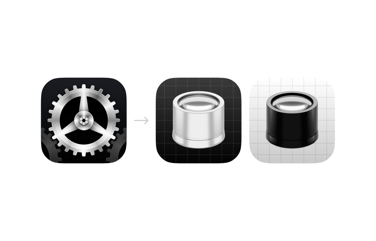
For the next version of 'Tinker' I spent some time reflecting on how I could incorporate more elements of watchmaking into the app.
Currently, the icon looks like a gear, well.. because.. watches.. have gears on the inside - but I wanted the icon to reflect more of the watch-making part.
I came across this incredibly mount-on-eye-magnifying tool, and it seemed like the perfect fit.
If you want to check out the brand ne version of the app it can be found here: apps.apple.com/dk/app/tinker-…
If you are a designer, watch this now! 👀
You only need one low-quality project to lose your client. Don’t risk it.
Want to try it? Comment "design" and I’ll send you the tool ⬇️
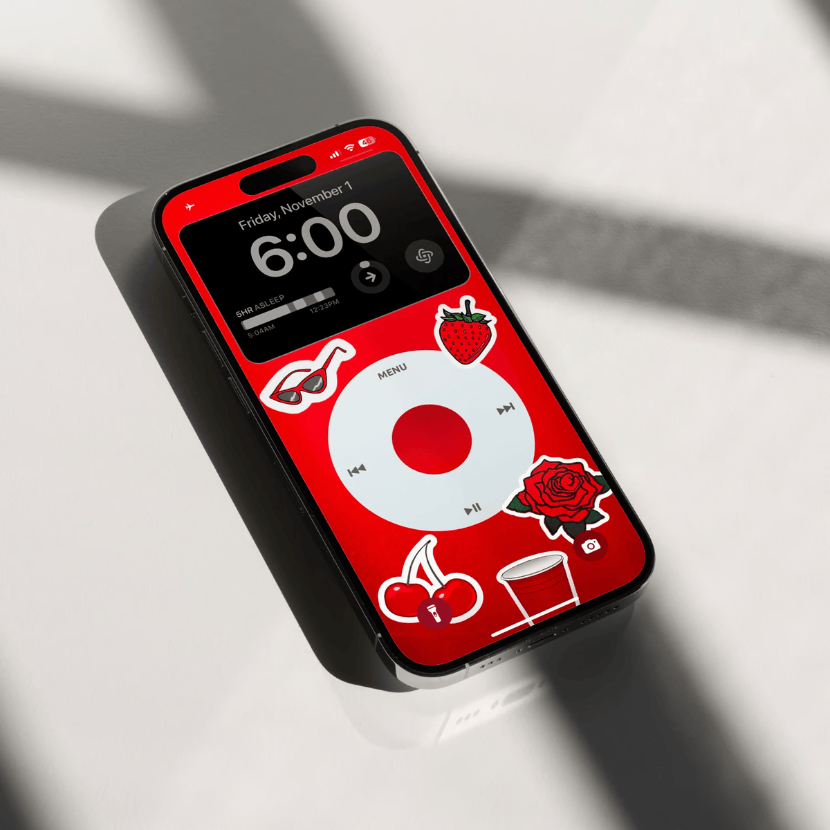
iPod Nostalgia Wallpaper Pack – a vibrant collection of 26 high-quality wallpapers celebrating the evolution of the iconic iPod. Transform your iPhone lock screen with stunning designs inspired by the original iPods.
bodega.supply/b/ipod-wallpap…
I'm not a huge fan of radical phone simplification, but I created these plain icons that I'm currently testing. Feel free to try them out if you want to declutter your phone a bit!
Free Download: bodega.supply/b/blank-icon