Lettermatic
179 posts

Lettermatic
@lettermatic_abc
We make fonts. 🔤 We made this for you.™
انضم Kasım 2020
28 يتبع834 المتابعون
تغريدة مثبتة
Lettermatic أُعيد تغريده

Did you know that the unique fonts from Pentiment are available to download? Our beautiful custom fonts were prepared by the amazing @lettermatic_abc! lettermatic.com/custom/pentime…
Check out the link below to get the fonts in the official Pentiment fan kit:
📜 pentiment.obsidian.net
GIF
English
Lettermatic أُعيد تغريده

I have been watching @noclipvideo documentaries for years – super cool to see them make one about a game I worked on!
My colleagues at Lettermatic and I designed the fonts for the game, with the talented team at @Obsidian. Our full case study is here:
lettermatic.com/custom/pentime…
Noclip@noclipvideo
🚨NEW DOCUMENTARY🕹️ We travel to @Obsidian to talk to the team behind Pentiment, the award winning historical RPG. Runtime: 82 minutes WATCH: youtu.be/ffIdgOBYwbc
English

@peregrine_coast Thank you very much for the kind words! It was a joy to work with the talented folks at @Obsidian!
English

Finally started Pentiment after buying it during the Steam sales last year and I absolutely adore all of the work @lettermatic_abc put into designing the type and all of its little imperfections. Also love how big a part eating around a table with people plays in the daily cycle
English
Lettermatic أُعيد تغريده

monaspace.githubnext.com
All code has been letters, on a grid, since the days of the teletype machine. How can we advance the state of the art to make code itself more expressive and powerful? How can we layer more meaning onto code?

English

@jesawyer Typeface designer @danellecheney on our team did spot some historical instances of these more 'diamond' shaped details, so she worked those in prominently as one of Marie's in-world choices.
lettermatic.com/custom/pentime…

English

Nothing would technologically prevent it. In fiction, the type was developed by Marie, Magdalene’s mother (hence, Druckeryn). Stylistic choices were made by the typographer at @lettermatic_abc who designed it with that in mind.
GIF
Nicolas Pinsonneault@NicolasPinsonn
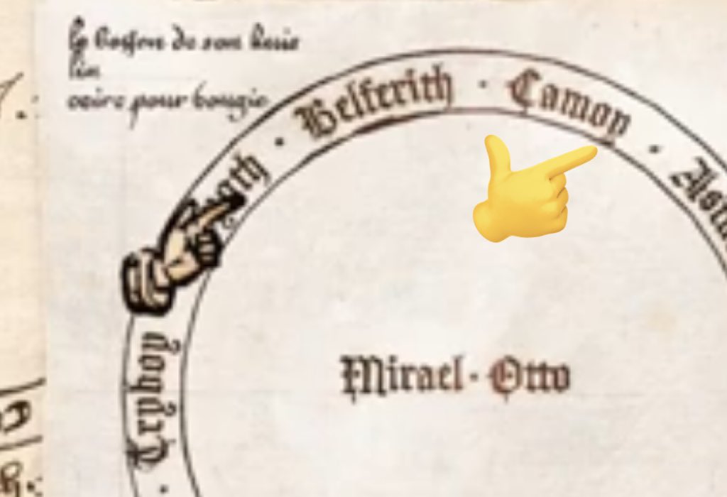
@jesawyer @lettermatic_abc Love it. Curious to know if there is a similar story to Magadlene's i's and j's star-shaped dots? I don't think that would've been on early metal typefaces?
English
Lettermatic أُعيد تغريده

In Pentiment there is a plot point about Brother Guy’s textura bookhand having a distinctive y tail because of his native Burgundian bastard script. We had @lettermatic_abc make a y variant for the textura font and Guy is the only character who uses it.
GIF

English
Lettermatic أُعيد تغريده

I'm very proud of Portamento, a new typeface designed for Google Developers by the team at @lettermatic_abc!
It has monospace fonts, and proportional fonts, all within one family. 🔤🔠
I wrote an in-depth case study about the design process, here:
lettermatic.com/custom/portame…
GIF
English
Lettermatic أُعيد تغريده

More than any other type family we’ve made, Portamento had a design process anchored in engineering. Naturally I didn’t want to get it wrong. Here’s the story of how I created a process that helped make sure I got it right:
lettermatic.com/custom/portame…
English
Lettermatic أُعيد تغريده

If you're curious to see more animations like this one, and a detailed description of the design process for Really Sans, you'll find that here:
lettermatic.com/custom/really-…
Dribbble@dribbble
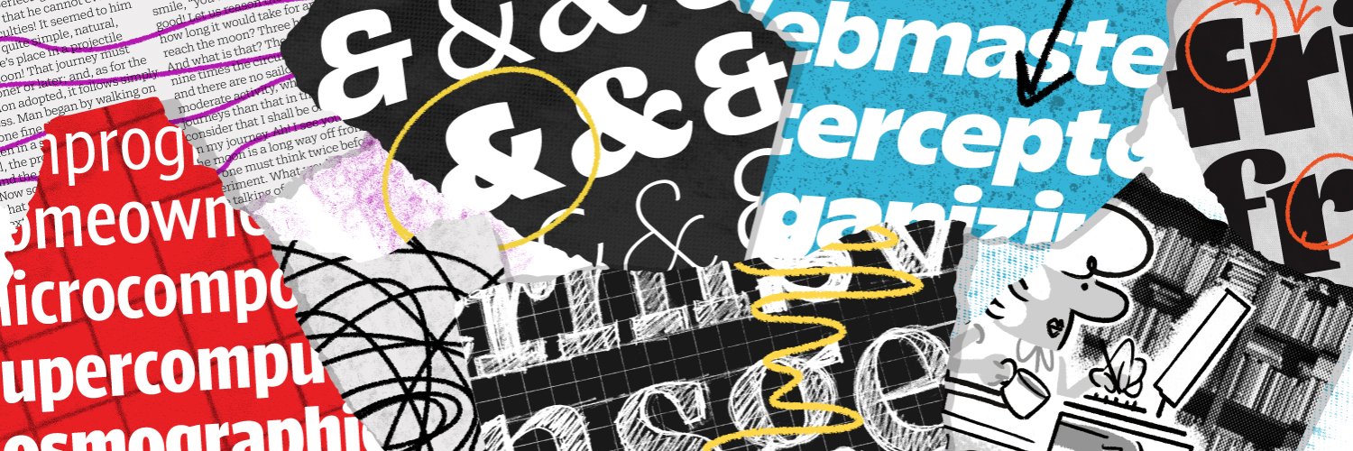
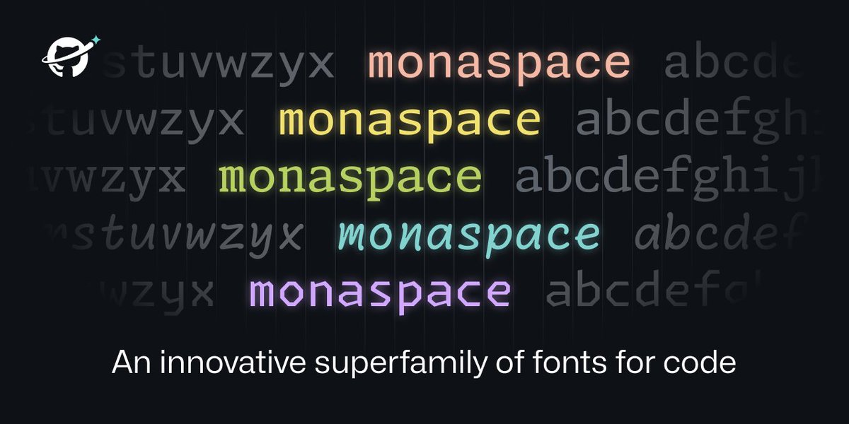
Really Sans Case Study by @rileycran – buff.ly/3Gd1n9o
English
Lettermatic أُعيد تغريده

A great use of Really Sans from @lettermatic_abc, on @haenschenhans's new website:
🔤
johannesecker.com


English
Lettermatic أُعيد تغريده

I recommend reading this case study if you are interested in:
• Animated Bézier curves.
• 1970s typography.
• Fonts designed to work at specific point sizes.
• A flexible sans serif typeface designed for contemporary use.
lettermatic.com/custom/really-…

English
Lettermatic أُعيد تغريده

New: A case study about Really Sans – a typeface in two halves.
In this case study you'll find info on the design process, historical inspiration, and a thorough look at the features of this very flexible typeface.
lettermatic.com/custom/really-…
🎨🆕🪄🔤✍️
English
