
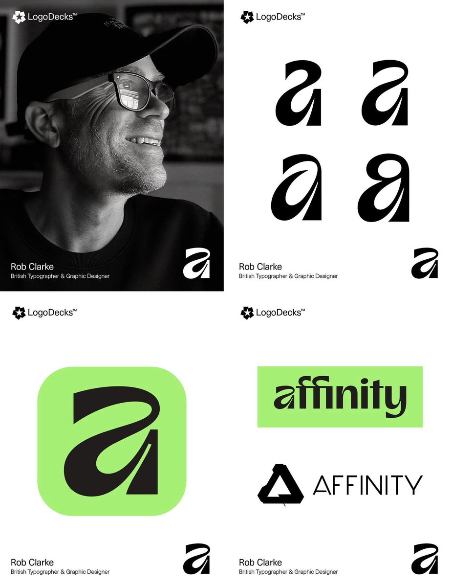
Meet the Type Designer Who Made Affinity’s Signature Mark Feel Human Again.
Rob Clarke is a specialist British type designer and lettering artist who was commissioned to craft the symbol and logotype for the Affinity rebrand following its acquisition by Canva. His primary contribution was the creation of the signature lowercase "a" mark, designed to be "wonky and approachable" while blending fluid, organic curves with technical precision. This mark was intended to represent the dynamic creativity and flexibility of the artists, illustrators, and graphic designers who use the software.
The development of the new identity was a highly collaborative effort directed by the Canva creative team and independent design studio Twist. Key contributors to the project included Tom Carey (Canva), who provided creative direction, and the type foundry Ohno Type Company, which developed a distinctive, offbeat custom typeface to complement Clarke’s symbol. Other partners included James Martin (known as Made by James), who created a suite of playful graphic assets, and the studio Man vs Machine, which handled the launch campaign animation. This diverse team worked together to move the brand away from traditional, rigid software aesthetics toward a "punk at heart" identity that celebrates creative freedom.
#logodecks
English