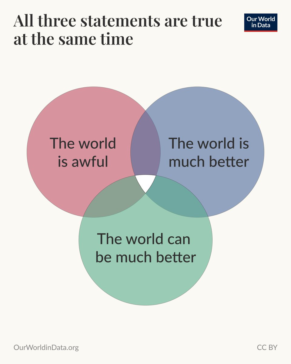
Angehefteter Tweet
Our World in Data
2.7K posts

Our World in Data
@OurWorldInData
Our World in Data is a free, nonprofit website with a mission to increase understanding of the world’s largest problems and drive informed action to solve them.
Oxford, England Beigetreten Nisan 2015
21 Folgt303.4K Follower

@HappinessRpt Explore all of the updated data in our interactive charts: ourworldindata.org/search?dataset…
English

📊 Explore updated data on self-reported life satisfaction around the world from the 2026 World Happiness Report (@HappinessRpt)—
How satisfied are people with their lives? Are they getting more satisfied over time, or less? How does this vary across cultures and life circumstances?
The World Happiness Report (WHR) is one of the key sources we have for answering these questions. Based on the Gallup World Poll, the WHR has published data on life satisfaction since 2012 and covers more than 140 countries worldwide.
Our colleague Tuna Acisu just updated our charts with the latest data (through 2025) from the 2026 edition of the report, released today.
The WHR is a partnership of Gallup, the Oxford Wellbeing Research Centre, the UN Sustainable Development Solutions Network, and the WHR’s Editorial Board.

English

Explore how other educational and literacy measures compare across countries, age groups, and gender in our work on global education: ourworldindata.org/global-educati…
English

In the 1980s, youth literacy was higher in Sub-Saharan Africa than in South Asia; it’s now the opposite—
Forty years ago, young people had higher literacy rates in Sub-Saharan Africa than in South Asia. You can see on the chart that the region had a 10-percentage-point lead in 1985.
But things have changed a lot since then. Sub-Saharan Africa now lags by more than 14 percentage points.
While literacy has improved in both regions, it has done so much faster in South Asia. There, almost all young people have basic reading and writing skills.
In Sub-Saharan Africa, most of them do, but there is still a significant lag behind other world regions.
In South Asia, the increase in literacy rates among young women has been particularly dramatic. In the mid-1980s, only around 40% had basic reading skills. That has more than doubled to over 90%, and the gap between young men and women has essentially closed.
(This Data Insight was written by @_HannahRitchie.)

English

Learn more in the article by @MaxCRoser: ourworldindata.org/malaria-introd…
English

Learn more about how we can tackle plastic pollution in the new article by @_HannahRitchie and Veronika Samborska: ourworldindata.org/why-cheap-wast…
English

✍️ New article: Why cheap waste management is key to stopping plastic pollution—
Of every 5 kilograms of plastic waste produced globally, 1 kilogram ends up polluting the environment.
This has serious consequences for people and other animals alike. It pollutes waterways, harms wildlife, and burning plastic generates toxic air that millions breathe.
But this terrible pollution is not inevitable.
In countries with good waste management systems, far less plastic pollutes the environment. Across high-income countries, plastic pollution per person is 100 times lower than in lower-income countries.
If every country managed its waste in this way, the world would cut plastic pollution by more than 98%.
Why is this gap so large?
In the chart here, you see two key metrics: how much plastic *waste* is generated and how much plastic *pollution* is produced, both per person. These estimates are taken from research by Joshua Cottom and colleagues.
Clearly, people in high-income countries don’t produce 100 times less pollution than those in lower-income countries because they use less plastic. Per person, they use much more.
The huge difference in pollution rates is a consequence of how waste is managed. In high-income countries, most waste is collected and sent to controlled landfills or to facilities that incinerate or recycle it.
In many low- and middle-income countries, people find themselves in a very different situation: less than half of solid household waste is collected. People often have little choice but to burn or dump it. But even the waste that is collected is often left in open dumps, where it’s at risk of leaking into the environment.
Most pollution, then, comes from uncollected waste and poorly managed disposal sites.

English

@EOrtizOspina Subscribe to our newsletter to receive Data Insights like this directly in your inbox: ourworldindata.org/subscribe
English

@EOrtizOspina Explore long-run data on GDP per capita for all countries: ourworldindata.org/grapher/gdp-pe…
English

Argentina was one of the richest countries in the world at the beginning of the 20th century—
(This Data Insight was written by @EOrtizOspina.)
When I first visited Buenos Aires some years ago, I was struck by how grand the city's historic architecture was.
This is something that strikes many tourists: parts of the city feel closer to Paris than you’d expect from a country whose income level today is more similar to my home country of Colombia than to France.
This chart helps put that observation in perspective. It shows the ten richest countries in the world in 1910, according to GDP per capita estimates from economic historians.
By this measure, Argentina was among the world’s richest countries in 1910, ahead of several Western European countries, including Germany and France. It also stood clearly ahead of its peers in Latin America at the time.
But over the course of the 20th century, Western European economies grew far faster, especially after the Second World War, and Argentina fell behind.
A long-run perspective like this shows how much of a difference economic growth can make within just a few generations.

English

Explore more data on how the age structure of populations is changing across the world: ourworldindata.org/age-structure
English

The median age in China has rapidly caught up with the United Kingdom—
In 1965, the median age in the United Kingdom was almost twice that of China. Half of the people in the UK were younger than 34 years, and half were older. In China, this midpoint was just 18 years.
Within just a few generations, that age gap has closed.
As you can see in the chart, the median age in both countries is now 40 years. Both populations have aged, but the increase was far faster in China.
In the 1950s and early 1960s, China’s median age fell partly because of a fall in child mortality: birth rates remained high, and more children survived.
After that, the rapid increase is largely explained by a steep fall in fertility, and therefore in births. Before then, high birth rates meant that large cohorts of children were continually entering the population, keeping it young. When births fell, fewer children were added each year, and the large, earlier generations grew older.
China’s median age is expected to continue rising quickly: under the UN’s medium projections, it will be 10 years older than the UK's by 2050.
(This Data Insight was written by @_HannahRitchie.)

English

Subscribe to our newsletter to receive Data Insights like this directly in your inbox: ourworldindata.org/subscribe
English

People often ask whether vaping is safer than smoking. Hannah tackled this question in a recent article — the short answer is “yes”.
Read more: ourworldindata.org/vaping-vs-smok…
English

Smoking has already killed far more people this century than in the entire 20th century—
Throughout the entire 20th century, about 100 million people died earlier than they would have because of smoking. That’s a lot, but it pales in comparison to the expected numbers for this century.
Between 2000 and 2023 alone, smoking-related deaths are estimated at 163 million. You can see this comparison in the chart.
Some epidemiologists project that unless there is a substantial change in smoking uptake and rates across the world, there could be as many as one billion smoking-related deaths in the 21st century.
In the 20th century, most of these occurred in today’s high-income countries. In the 21st century, most will come from low- and middle-income countries.
Many of the people who are expected to die are smoking today, but even more are expected to be future smokers.
Finding ways to help people stop smoking and prevent them from starting matters for keeping this huge figure in the millions, not billions.
(This Data Insight was written by @_HannahRitchie.)

English

Edouard Mathieu explains this method in more detail in an article: ourworldindata.org/age-standardiz…
Français

The number of cancer deaths worldwide has more than doubled since the 1980s. Does that mean we're losing the fight against cancer? Not necessarily, because it depends on how you measure it. On this chart, you can see three ways to look at the same data.
The red line shows the total number of cancer deaths. It has increased by about 120%, but this measure doesn't account for the fact that the world's population has also grown enormously over this period.
Another approach is to look at the death rate: the number of cancer deaths divided by the total population. That's the brown line, called the crude cancer death rate. It has increased too, but much less — around 20%.
But there's still a problem: the world's population has been getting older. Cancer is mostly a disease of old age, so even per capita, we'd expect more cancer deaths simply because there are more older people than before.
That's where the method of “age standardization” comes in. It's a way of asking: what would the cancer death rate look like if the age structure of the population hadn't changed?
The blue line shows this age-standardized rate: it's fallen by about 25%. At any given age, people are now less likely to die of cancer than they were in the 1980s.
The same underlying data gives us three different pictures. The absolute number of deaths is up; the crude rate is up slightly; the age-standardized rate is down. None of these are inaccurate, but they answer different questions.
Age standardization is one of the most important statistical methods for making sense of health data. Without it, population aging can hide progress or mask problems.

English

Read @MaxCRoser’s article, “The end of progress against extreme poverty?”, which goes into this question in much more detail: ourworldindata.org/end-progress-e…
English

At the turn of the millennium, 2.2 billion people in the world lived in extreme poverty. In international statistics, this means they survived on less than $3 per day (in today’s money).
In the two decades that followed, this number more than halved. You can see this decline in the chart.
This huge reduction was driven by rising incomes and poverty alleviation across East and South Asia. In Sub-Saharan Africa, the opposite happened: while the share living in extreme poverty declined, the total number increased.
Looking ahead, based on the latest available projections from researchers at the World Bank, this reduction in global extreme poverty is expected to end. In fact, numbers in 2040 might be higher than they are today.
This is because most of the extremely poor today live in countries with stagnant economies. If these do not see much stronger economic growth, the world will have nearly one billion living in dire poverty for decades to come.
Note that these projections are based on the latest growth projections from the World Bank and the IMF. From 2031 onward, poverty projections are based on the average growth rates observed from 2015 to 2024.
(This Data Insight was written by @_HannahRitchie)

English

