Blaq Coder
491 posts


Beginners don’t lack effort.
They lack direction.
Jumping from one tutorial to another…
No clear path.
That’s why progress feels slow.
Clarity changes everything.


English

Keeping a consistent character was honestly pretty difficult, not gonna lie, but I eventually figured something it out.
It doesn’t look AI-generated, right?


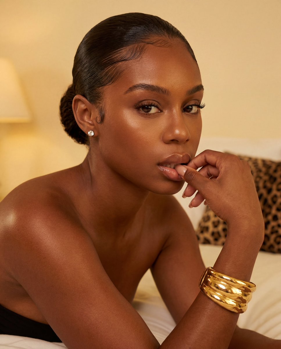
Zazzy@zazzygfx
my first try at creating an ai ugc person how'd i do? open to tips
English
From windows to Mac, new chapter unlocked.
Thank you JavaScript 🌚


English
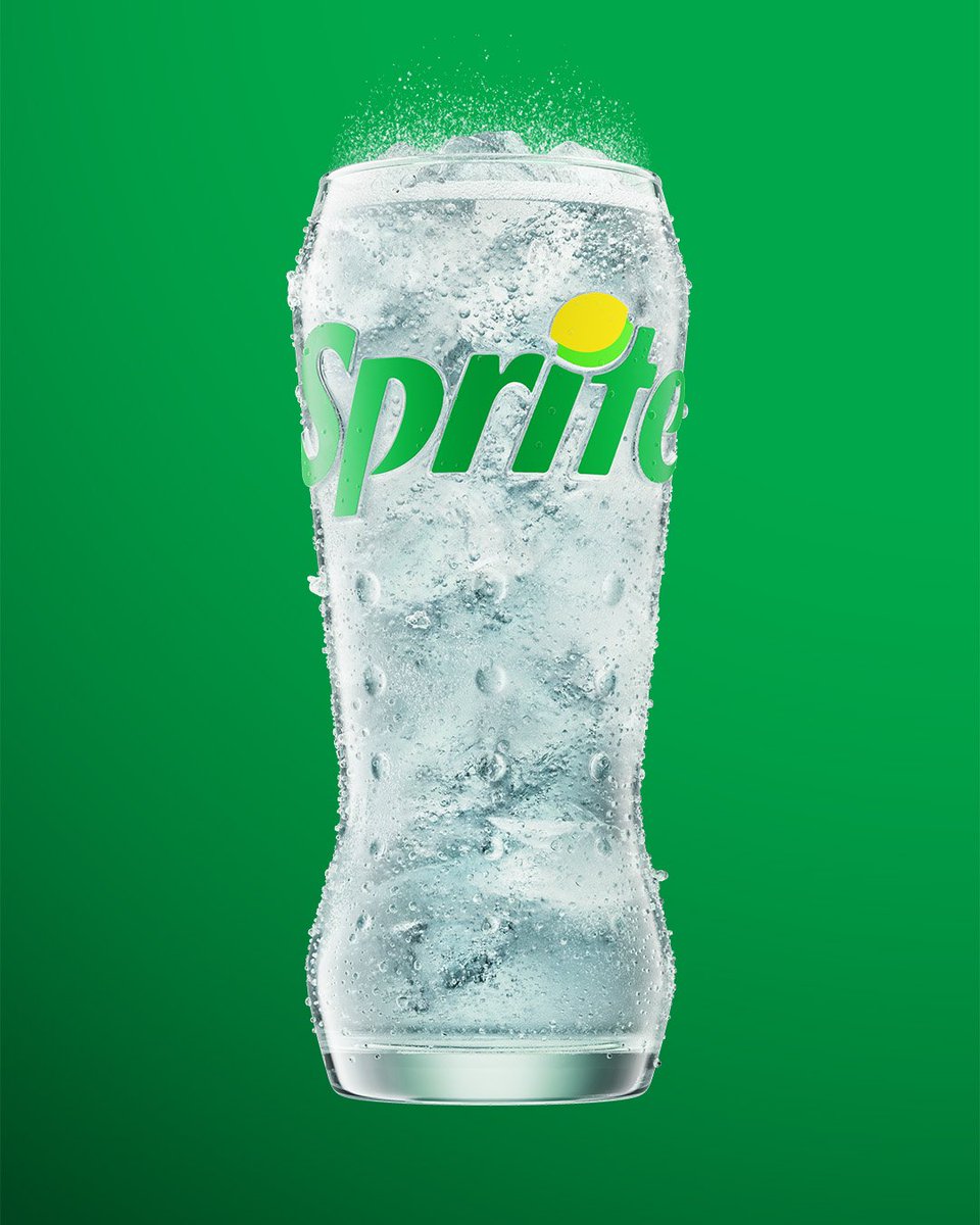
Sprite just dropped a new brand identity and brought back the Lymon, now living as the dot on the 'i' in the wordmark. Clever. The green is punchier, contrast is cranked up
Honestly? The Lymon integration is the right call, it's ownable, nostalgic, and does real work in the logo rather than just floating as a decorative asset.
cc: @weareforpeople - IG
English
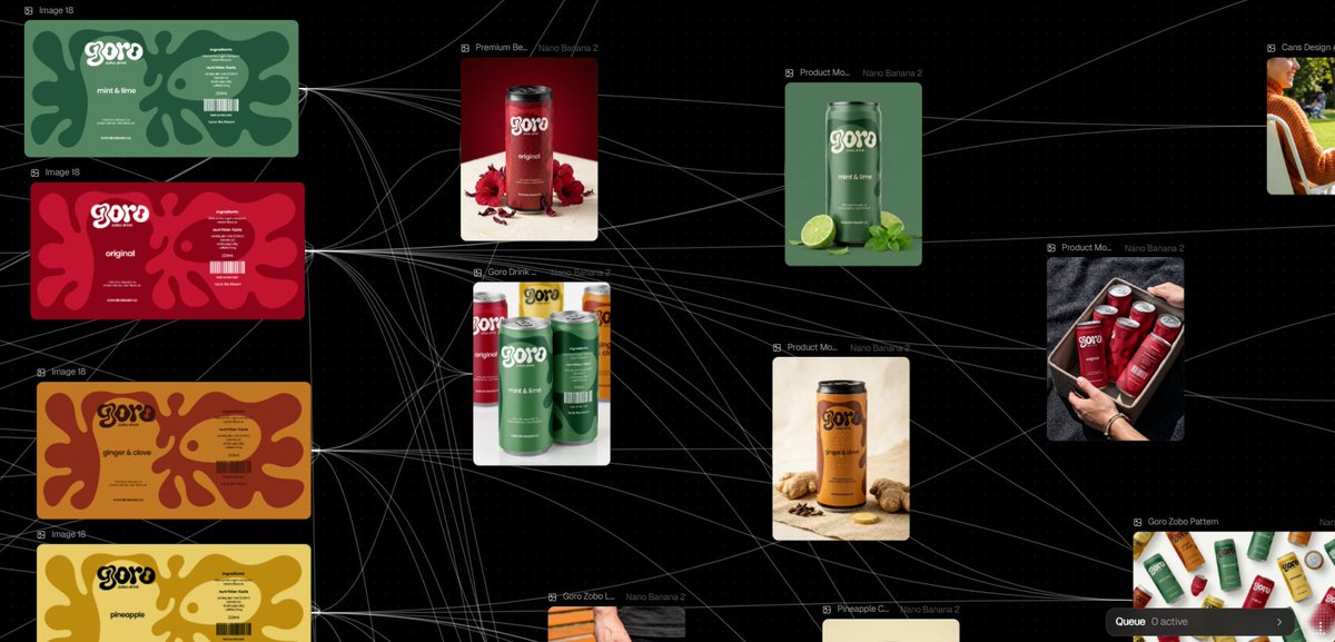
the Goro AI mockup prompts are live.
29 detailed prompts i used to generate all the goro canned drink mockups, built for Nano Banana Pro 2 on Flora AI.
what's inside the Google Doc:
— 29 prompts across 8 scene categories
— beach, car, fridge, group shots, flat lays, splash scenes, bottle + more
— full-wrap design instructions in every prompt
— quick start guide + troubleshooting tips
how it works: attach your product design dieline, paste all prompt into Flora AI, and it places your design on the can exactly as provided.
nestuge.me/zazzy
if this is useful to you, repost so other designers can find it.
Zazzy@zazzygfx
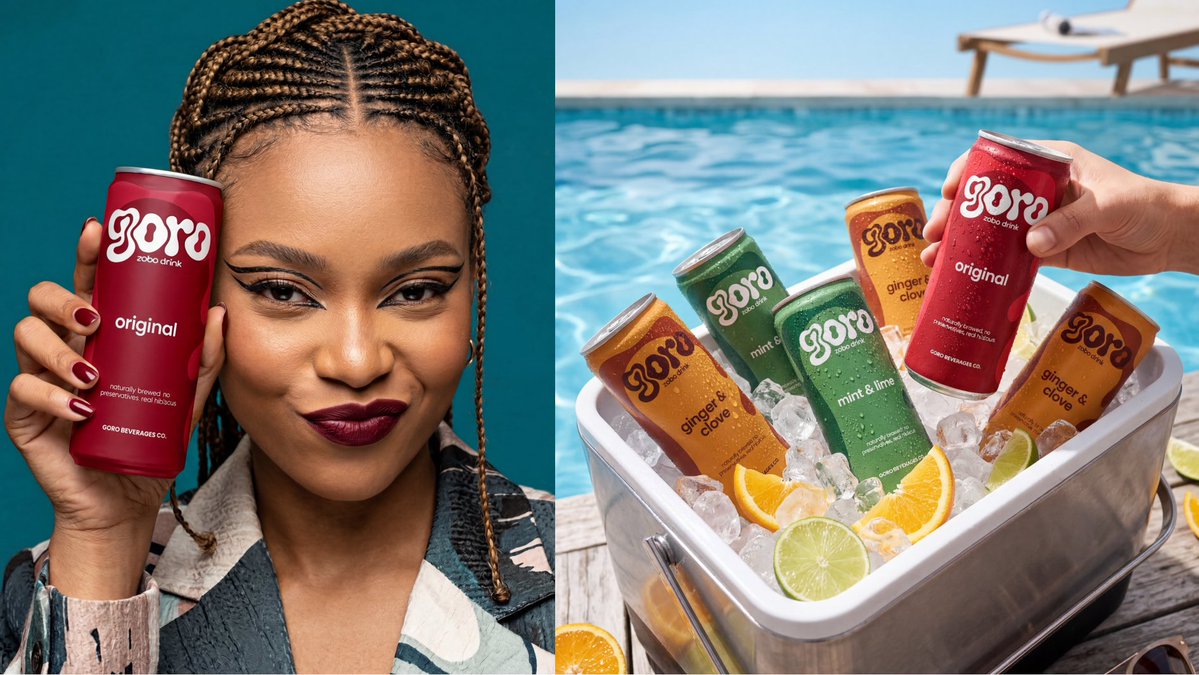
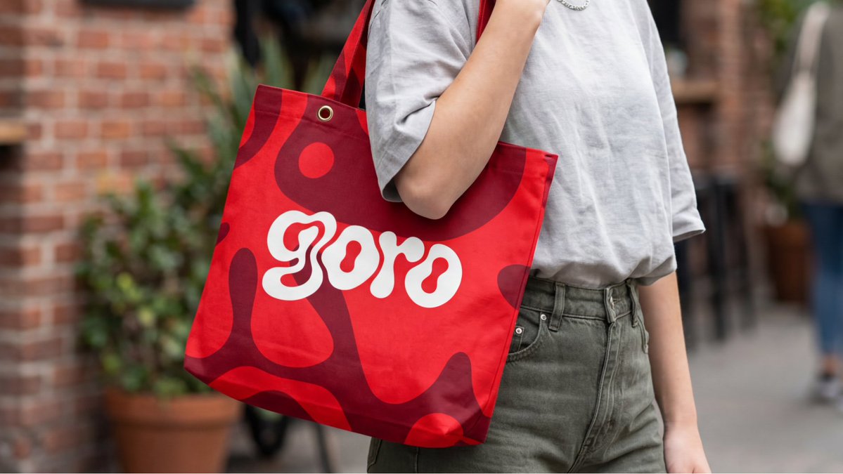
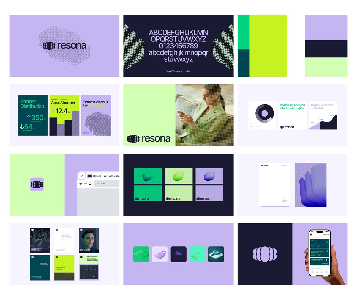
a friend bet me i couldn't make zobo look like it belongs on a shelf next to coke and pepsi. i took that personally. So i built goro, a canned hibiscus drink brand. here's how i thought about it as a brand designer 🧵 First question i asked myself: why does local packaging look local? it's not the product. zobo is genuinely one of the best drinks on the planet. deep red, tart, hibiscus-forward, spiced with ginger and cloves. the packaging just never matched that. So the brief i gave myself: build a brand that could hold its own on a premium shelf anywhere. lagos. london. new york. no asterisk. The logo came first. i built around a fluid organic "g" mark, a bold blob letterform that mirrors hibiscus petals. soft, rounded, grown not manufactured. i posted two directions here and you all voted. the open airy version won and honestly the people were right. Lesson: your audience is a free focus group. use them. Colour system was flavour-first. every hex code justified by the ingredient. crimson red for original, amber for ginger & clove, butter yellow for pineapple, sage green for mint & lime. no random choices. For the illustrations i went abstract. fluid blob shapes echoing the logo mark, tonal only, one shade off the background. character without noise. that's the difference between decoration and design. For the case study visuals i used nano banana within flora ai. fridge shots. tote bags. hands clinking cans. all rendered without a single photoshoot. you can now take a packaging concept from die-line to full campaign imagery without leaving your desk. you just need to know how to prompt with intention. Ai didn't design Goro. i did. Ai just helped me show it to the world. tagline: "taste the bloom" two words. botanical. experiential. works everywhere. zobo is not a local drink. it's a world-class drink that's been waiting for a world-class identity. full visual on my instagram - @zazzygfx
English
a friend bet me i couldn't make zobo look like it belongs on a shelf next to coke and pepsi.
i took that personally.
So i built goro, a canned hibiscus drink brand. here's how i thought about it as a brand designer 🧵
First question i asked myself: why does local packaging look local? it's not the product. zobo is genuinely one of the best drinks on the planet. deep red, tart, hibiscus-forward, spiced with ginger and cloves. the packaging just never matched that.
So the brief i gave myself: build a brand that could hold its own on a premium shelf anywhere. lagos. london. new york. no asterisk.
The logo came first. i built around a fluid organic "g" mark, a bold blob letterform that mirrors hibiscus petals. soft, rounded, grown not manufactured. i posted two directions here and you all voted. the open airy version won and honestly the people were right.
Lesson: your audience is a free focus group. use them.
Colour system was flavour-first. every hex code justified by the ingredient. crimson red for original, amber for ginger & clove, butter yellow for pineapple, sage green for mint & lime. no random choices.
For the illustrations i went abstract. fluid blob shapes echoing the logo mark, tonal only, one shade off the background. character without noise. that's the difference between decoration and design.
For the case study visuals i used nano banana within flora ai. fridge shots. tote bags. hands clinking cans. all rendered without a single photoshoot. you can now take a packaging concept from die-line to full campaign imagery without leaving your desk. you just need to know how to prompt with intention.
Ai didn't design Goro. i did. Ai just helped me show it to the world.
tagline: "taste the bloom" two words. botanical. experiential. works everywhere.
zobo is not a local drink. it's a world-class drink that's been waiting for a world-class identity.
full visual on my instagram - @zazzygfx


Zazzy@zazzygfx
been staring at these two for 30 minutes and i still can't pick like… they're the same but they're NOT the same?? Left feels more open and airy. Right feels tighter and more confident. This is for a canned zobo( hibiscus drink) brand btw. Which one are you reaching for off the shelf?
English
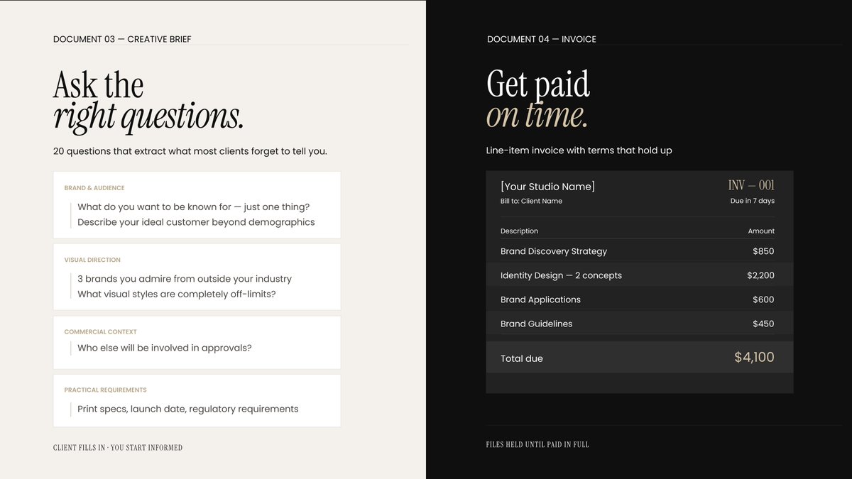
tomorrow i'm dropping something i genuinely wish existed when i started freelancing.
it's a contract bundle built specifically for brand designers.
not a generic template. not dense legal language nobody reads.
5 documents written in plain english, structured around how brand identity projects actually work.
document 01 is a full services agreement — 12 clauses covering everything from kill fees to what happens when a client tries to change the brief after you've started.
document 02 is a proposal template — 4 phases, scope tables, timeline, investment breakdown. send this and clients stop asking "but what am i paying for?"
tomorrow. ₦10,000 on Nestuge

Zazzy@zazzygfx
year one of freelancing i had no contract, no proposal, no brief. just vibes and verbal agreements. spent the last few weeks fixing that, for myself and every designer after me. my first ever digital product drops this friday. here's what's inside 👇
English
been staring at these two for 30 minutes and i still can't pick
like… they're the same but they're NOT the same??
Left feels more open and airy. Right feels tighter and more confident.
This is for a canned zobo( hibiscus drink) brand btw.
Which one are you reaching for off the shelf?
English
Can we come to a conclusion that full stack developers are developers that are average at both front end and back end development?
English
If they can show up daily to learn one thing, they can apply that same consistency to learning AI, adapting, and improving across different areas. That’s what actually keeps developers from becoming obsolete.
Zinny 🎀@Zinny_Edmund
Senior developers face pressure from AI, and there’s you posting “day 63 of learning CSS” 🥹 Keep going champ👏👏
English