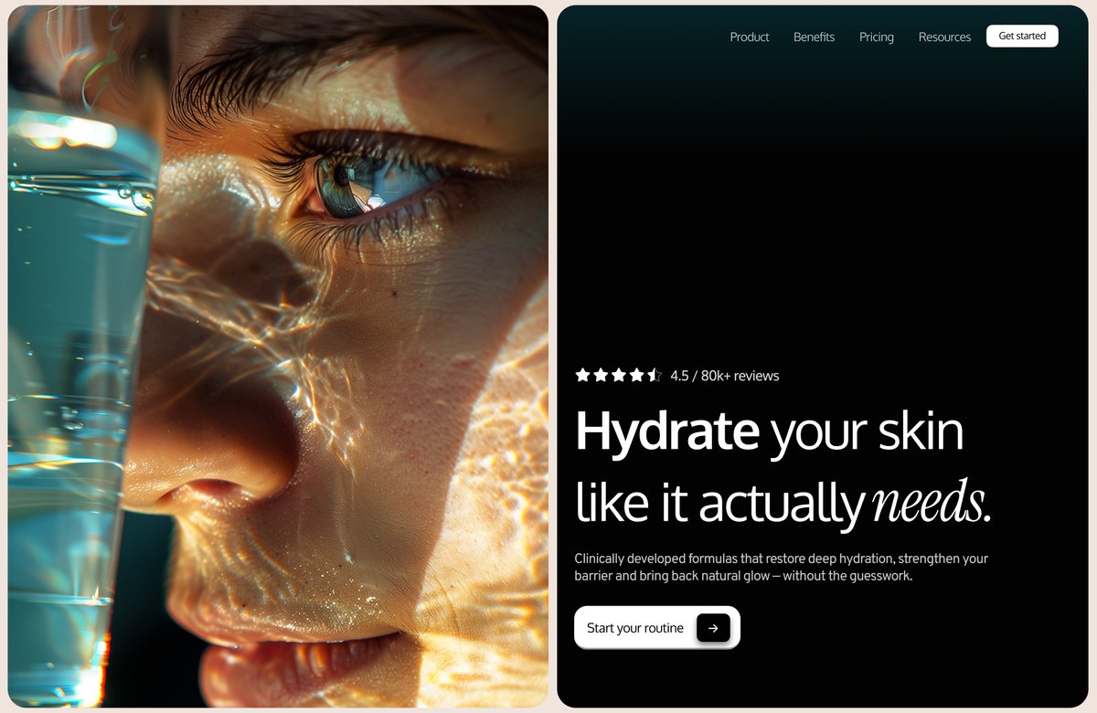
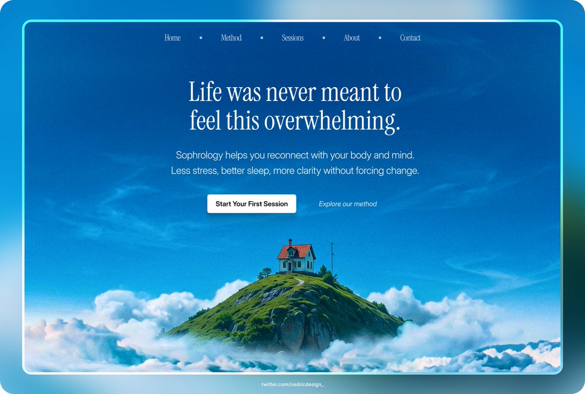
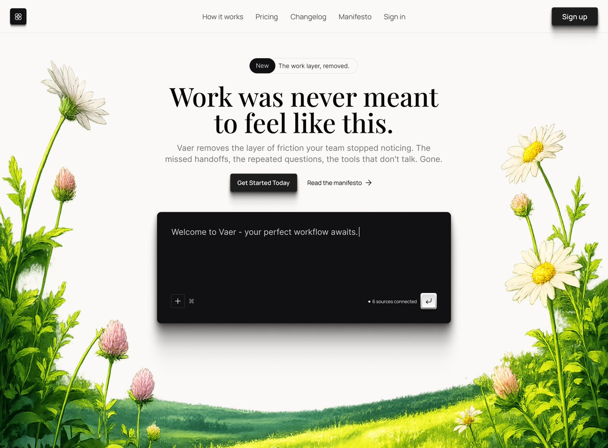
@UIUXSumbul Quick tip: the subject should always look or point toward the CTA to guide the user’s eye. For example here, simply swap the two sections—put the text on the left and the image on the right—and it will feel much more natural and cohesive.
English