Fedor
471 posts


Fedor
@fedorivanenko_
Design Engineer / Freelancing { stealth startup } https://t.co/4koDukF3ET
Earth Beigetreten Eylül 2019
1.2K Folgt101 Follower


@caidanwilliams @wwwjim Halfway through I realized it should actually be an engine, and it’s kinda harder than I thought it would be 😂
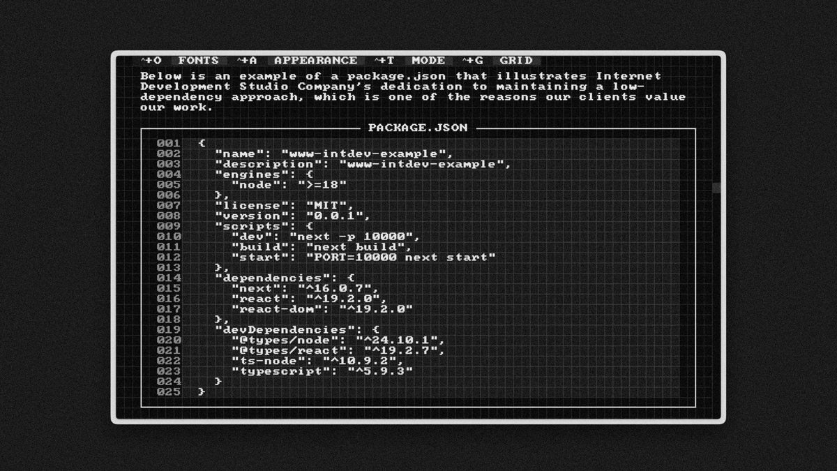
I can’t build directly on top of visx → it needs an abstraction layer, and I need a bit more time to think it through
English

@fedorivanenko_ @wwwjim Ooh yes please! No rush on it but message me when it's up and I'll take a look.
English

@caidanwilliams @wwwjim I still owe you a PR for the charts for the Sacred Computer 😅
English
@wwwjim @fedorivanenko_ We also accept PRs back into the core repo.
I looked at creating a proportional version but it would take a lot of work to back port it. It’s easiest to start by creating it with intention to be proportional.
Though modern browsers do a good job at faking it for fonts.
English
“Printing demands a humility of mind”, The Crystal Goblet, Beatrice Warde
I feel like this almost 100-year-old essay is still valid
A working instrument doesn’t need ornamentation. It can have it, but never where ornament blurs function
The clarity and elegance of a wine glass come from the pure utility of its parts. So, the elegance of the Aqua style comes from a pure need for night contrast, solved beautifully
Nowadays, with all these brilliant technologies—WebGL, 3D, animation—we risk becoming like the poor glassmaker who hides the natural color of the wine behind tinted glass
readings.design/PDF/The%20Crys…
English

consistency ≠ uniformity:
for those who haven't lived through this era – we used to have beautiful, precision interfaces. now they're replaced by a design language that originated from the Apple Watch, with icons that only fit in squircles. but that's not even the point.
the point is we used to design the whole stack – the technology, the concepts, the interfaces. when designers only care about superficial consistency, platforms lose their uniqueness.
apple used to design systems. skeuomorphism wasn't just about leather textures – it was about teaching people new mental models. the trash can empties because you understand what a trash can does. aqua's lickable buttons and sheets had depth because the OS had layers you could understand. the old apple designed the whole stack – from metal to pixels to concepts. teams weren't just shipping features in the same box, they were building coherent platforms each with opinions about what computing should feel like for the medium.
liquid glass is fine on a phone. but on macOS it's unusable – lack of precision, visual noise everywhere. this is what happens when UI language designed for fingers bleed into macOS. we went from interfaces designed for a 27" cinema display with a precise cursor to interfaces designed for a 1.5" screen you tap with one finger.
the Mac is for creation and precision work. it needs information density. it needs chrome you can grab. it needs UI that gets out of your way but gives you power when you need it. instead we got padding and whitespace and translucent blurs optimized for touch targets nobody's touching.
the squircle icon mandate is a symptom. when you force every icon into the same shape, you're saying "brand consistency" matters more than "each app icon needs to communicate its function instantly." we traded clarity for uniformity. we traded precise design for cross-platform sameness.
consistency means your system has coherent rules within itself. uniformity means everything looks the same regardless of context.
the hardware team still gets it – that macbook pro + M-series chips, chef's kiss. but software design feels like it's chasing fat fingers instead of remembering what people do on a Mac.
Ryo Lu@ryolu_
@jitl terrible regression on macOS
English
Fighting for <2s LCP on Slow-4G throttling
Currently at 2.3s (~top 5% of all websites)
Chapter: Font optimization
→ I use the gorgeous Iosevka quasi-proportional sans-serif
Default hinted TTF → 2.2 MB
Strip OpenType hintage → 1.4 MB
Strip non-Latin chars subsets → 23 KB
Compress with WOFF2→ 10 KB (!)
The font loading time is ~220 ms, which is practically non-existed
English
Could it be that economic growth is increasingly captured by people who already exist? Primarily through accumulated wealth and extended lifespan
Long-run economic growth has stayed remarkably stable since the Industrial Revolution (~1.75% annually)
If most of the newly created economic value flows to existing individuals, rather than creating opportunity for new entrants, then producing new people becomes economically irrational
The relative cost of raising a child rises while the relative advantage of incumbents grows → that would naturally put downward pressure on birth rates
English

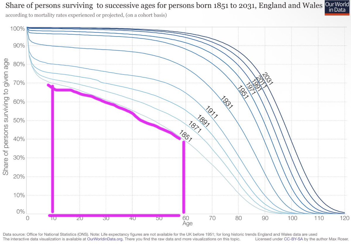
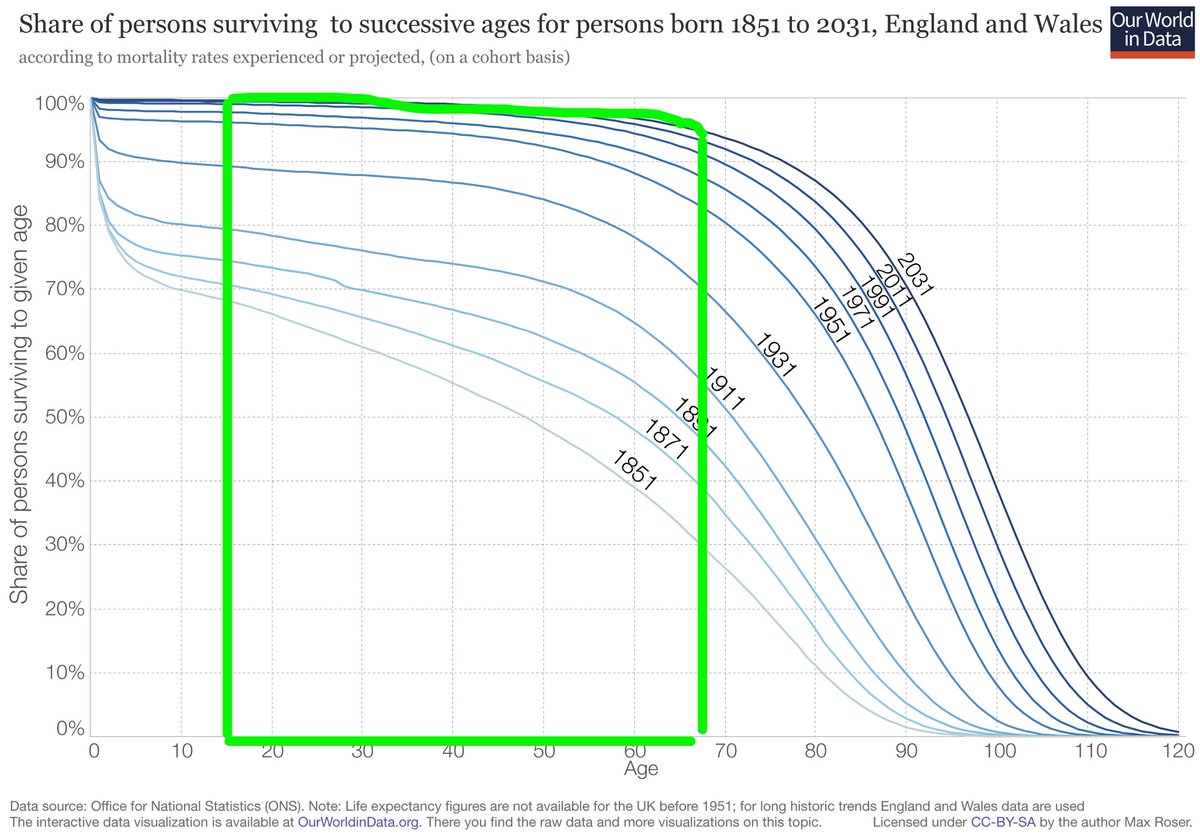
Birth Rate Collapse & Economic Utility of a Birth
This is really weird, but I suspect it’s overlooked in socio-economic research literature.
Below I present 2 zones on the same chart.
The pink zone on the left chart shows the useful economic life of 1 human birth in the year 1851.
The green zone on the right chart shows the useful economic life of 1 human birth in 2011.
Now because of medical advances, sanitation, public health, etc, etc we have significantly improved life expectancy and reduced infant mortality. This means that a birth in 2011 has vastly more hours of economic output than a birth in 1851. Historic mortality rates really cut down the expected economic lifespan of a birth, but how much?
The pink area on left = 40 years * 40% + ( 40 years * 30% )/2
= 22 years of economic work per birth (yikes!)
The green area on the right = 51 years * 98%
= 50 years of economic work per birth.
These numbers are massively different.
The expected working lifespan of a human at birth has increased by 127% over 160 years. Even though we work to approximately the same age.
This means that in economic terms 1 birth in 2011 is worth 2.27 births in 1851. How does that gain in economic utility per birth compare to the collapse in volume of births?
Today there are 2.31 births per woman worldwide.
In 1850 there were 5.82 births per woman.
5.82/2.31=2.52
So we have 2.27x gain in utility per birth and a 2.52x fall in the volume of births? These ratios are within 10% of one another, they almost perfectly track inversely to give a fixed amount of ‘human economic utility birthed per woman’.
I find this to be a staggering coincidence.
Is the collapsing birth rate just supply and demand? Did longevity gains simply create a temporary oversupply of units of human utility?
The population crisis might just be market forces. Or rather, it’s just macro-ecology.
English
@iamsahaj_xyz Never get tired of sharing this incredible work from Joe Liccini
webperf.tips
English

if you're working on the frontend and haven't explored web performance (or you think "frontend is easy") - you definitely should
It's vast and it's complex. figuring out what's making a page slow feels like a puzzle. scratches that itch that mindlessly writing react can't.
If you need a starting point, google has great docs on CWV and strategies to improve them. I personally love image optimization.
What's also fun is learning how you can apply those strategies in your framework of choice
English
@AdamDraper >how are we going to make bio and health better
Obviously, expressing responsibility, commitment, and care and providing clear data and an open methodology
Theranos has poisoned the industry for decades, and it’s a reasonable concern to not let it happen again
English

If we cry “Theranos” every time an innovator tries something, how are we going to make bio and health better.
Adam Draper ⏻@AdamDraper
I’m not an investor in @KianSadeghi5, but my hot take is that he’s a great founder trying to figure out how to deliver a new service to a market. It doesn’t feel like he has cut corners and it sounds like the biggest push back is on his marketing which was supposed to provoke people — so in that they got more than they bargained for. He must be on to something, because people seem pissed about it.
English
Glass Button progress
Normally you’d need 3D in JS for this, but this is pure CSS. The trick is understanding the material’s physics, how the 2D projection changes on rotation, and then recreating it
Made with mask() and transform()
Next step is proper reflections and edge highlighting
English
if you need to build an extremely performant and beautiful website with great user experience, and you need it to be built fast —
— I am open for projects as a developer+designer combo:
4+ years of dev experience, 8 years in UX.
Highly autonomous, can build end-to-end
TypeScript, React, Next.js applications + websites, CMS integration (Sanity), Shopify, AI SDK, motion and 3D in web
We'll get along if you care about experience, performance, and beauty
My rates:
daily — $400/day
per project — from $3,500
subscription — from $2,000/month
Open to full-time offers if there is a strong fit
→ DM
or f@fedor.studio
fedor.studio
If you are not looking for help,
→ 🔃 Repost or 👍 Like to spread the word
English
When animating transitions between distant colors, like yellow and cyan, always use OKLAB
Cylindrical projections like OKLCH and HSL sweep through every intermediate color, which looks unnatural
OKLAB uses Cartesian coordinates, so the shortest path between two distant colors passes through a neutral gray region, which feels natural and coherent
Powered by a custom OKLCH interpolation function
English

been thinking of making this since i saw @SebCornelius's post.
the static hover book is a pure css approach. no javascript used here. each page has a fixed rotation defined to it.
pages are stacked with absolute positioning and all rotate from `origin-left` (the spine).
Seb Cornelius@SebCornelius
Always be iterating
English
A hover micro-interaction
Keep the whole component shifting hue together — background, border, text, shadow
That’s how real objects change color in light, and this makes the animation feel coherent
When the background warms up but the text and decoration stay neutral, you get a temperature mismatch that feels off
Powered by a custom OKLCH interpolation function
English