luca

663 posts

luca banner
luca

luca

@lsodesign

founder @skarlo_ 🇬🇧 🇩🇰 🇳🇿 @framer agency partner & pro expert

london / copenhagen Beigetreten Şubat 2024
406 Folgt449 Follower
luca
luca@lsodesign·
the most iconic logos of all time: part 4 this time the dutch railways logo. the NS (nederlandse spoorwegen) logo is incredible. almost on par with the national rail logo they're actually very similar, with two arrows going in opposite directions and the piece in the middle representing the track. it came out 3 years after the aforementioned british counter part in 1968 and was designed by the dutch designers - gert dumbar and gert-jan leuvelink. first time i've ever heard that name, but clearly crucial to cooking up a stunning logo. 
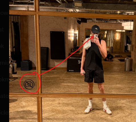
photo of me at the incredible rotterdam centraal station i should probably rename this to be called public transport logo admiration series and i haven't even done the tube logo yet...
luca tweet media
English
0
0
0
4
luca
luca@lsodesign·
@emsparx now I wanna see this guy vs clippy
English
0
0
0
2
Emily Sparshott
Emily Sparshott@emsparx·
apple's lil finder guy went viral this week and honestly it's one of the best branding moves i've seen in a while. they didn't design a new mascot. it was sitting in their OS for 40 years. they just gave it legs and its so cuteee
Emily Sparshott tweet mediaEmily Sparshott tweet media
English
1
0
3
7
luca
luca@lsodesign·
@emsparx Summer is here
English
0
0
3
29
luca
luca@lsodesign·
i spent 36 hours in rotterdam to kick-off a client the first thing i do when i get to a new city is go for a 8-10k run to take in the sights - here are my thoughts and what stood out. rotterdam was famously flattened during the war. as it was the busiest port in europe (still is), but also because a lot of spy networks were based here it was rebuilt in a post-war architecture style - easy to hate the brutalism - but if you look beyond the béton brut there is some incredible architectural nuance. here is what stuck out for me: 1: the euromast - looksd like something out of the clockwork orange or 1984. scarily imposing - big brother is watching you from the unsettling off centred observation deck and the slanted windows. 2: hotel new york - the buildings that are still standing are incredibly beautiful. on the outside reads HOLLAND AMERIKA LIJN. no one does typography better than the dutch. although unfortunately a rather average hotel, the exterior is incredible 3. water taxis - just so much fun, my dutch friend said i had to try them. it was worth it. beautiful going past all the fantastically tall and imposing buildings from the incredible harbour.
luca tweet medialuca tweet medialuca tweet media
English
2
1
5
118
luca
luca@lsodesign·
if you actually do this shit it’s so obvious you’ve seen some linkedin tiktok career coach influencer, and you literally lose all credibility i was on a call once with some bloke who clearly loved diary of a ceo and would make long deliberate pauses before answering the most anodyne questions just actually be authentic and grow up
luca tweet media
English
0
0
3
61
luca
luca@lsodesign·
@rcharl03 can’t stop looking at it 🤩
English
0
0
1
9
luca
luca@lsodesign·
i’m off to rotterdam to do an in-person branding session i live in islington/shoreditch from my front door, to sitting in my train seat (including going through customs and security) took 28 minutes train travel might look longer on paper, but eurostar trips from london are much shorter after factoring in 3-4 hours of airport faff either side of any flight it can also look more expensive - but after factoring in travel to and from the airport, and steep baggage prices, you almost break even coupled with a much comfier journey and a reduced carbon footprint - if you have the option, take the train
English
1
0
4
155
luca retweetet
bao to ᝰ.ᐟ
bao to ᝰ.ᐟ@baothiento·
my portfolio duck pond
English
212
3.4K
42.2K
759K
luca
luca@lsodesign·
@rcharl03 Only way to get attention at soho house
English
0
0
1
12
luca
luca@lsodesign·
sunday morning in london and copenhagen planning the skarlo merch collab
luca tweet medialuca tweet media
English
1
1
5
164
luca
luca@lsodesign·
people be like here are the 3 underrated fonts then just go satoshi instrument serif inter (-2% spacing)
English
5
1
9
445
Jennifer
Jennifer@JennieLunis·
I just lost a sale because of Contra’s checkout experience. After trying @contra for a week, I’m switching back to Lemon Squeezy for now. A customer requested a refund because they couldn’t access the template without creating a Contra account and going through the onboarding process. I honestly didn’t even realize this was required. I tested it myself. You can access the order right after payment, but if you close the page and come back later, you do have to create a full account with profile details. That’s way too much friction for a simple template purchase. Contra’s fees are lower, but the checkout flow creates unnecessary barriers. Hoping the team can improve this in the future.
English
20
3
82
4.3K
Orin
Orin@orinfitzgerald·
okay guys @framer + @claudeai is scaring me... 1. uploaded 92+ hours of tutorials to knowledge[.]md > it's a framer expert now 2. fed it high quality visual refs + extracted design taste > it's also a visual design expert now and rn, it just built me this website. wtf?
English
98
35
891
98.1K