Distinctive BAT

378 posts

Distinctive BAT banner
Distinctive BAT

Distinctive BAT

@DistinctiveBAT

Cultivating distinctive brands through a global showcase of best practices & best in class Distinctive Assets, while providing tools to evaluate & measure DBAs.

Inscrit le Ocak 2021
838 Abonnements1.6K Abonnés
Distinctive BAT
Distinctive BAT@DistinctiveBAT·
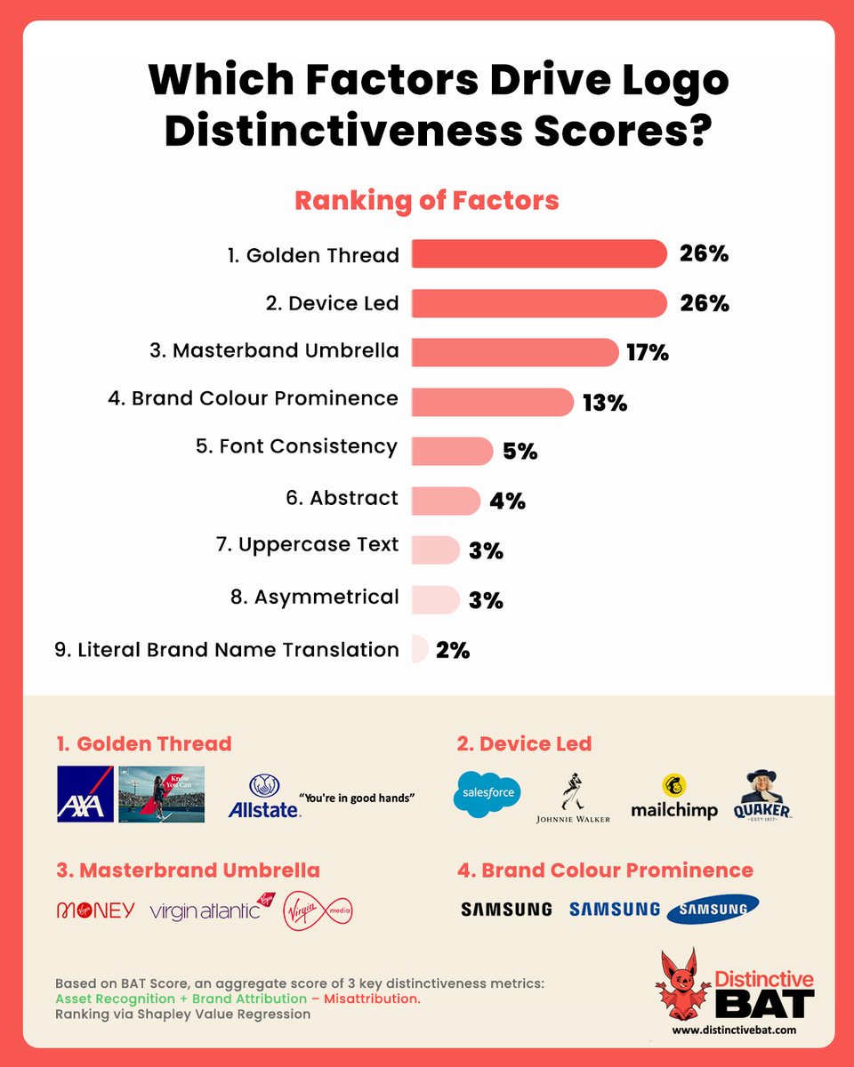
A meta-analysis of 1,000+ logos within the Distinctive BAT database reveals which features most strongly drive distinctiveness. 
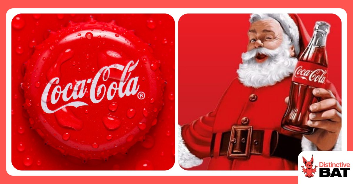
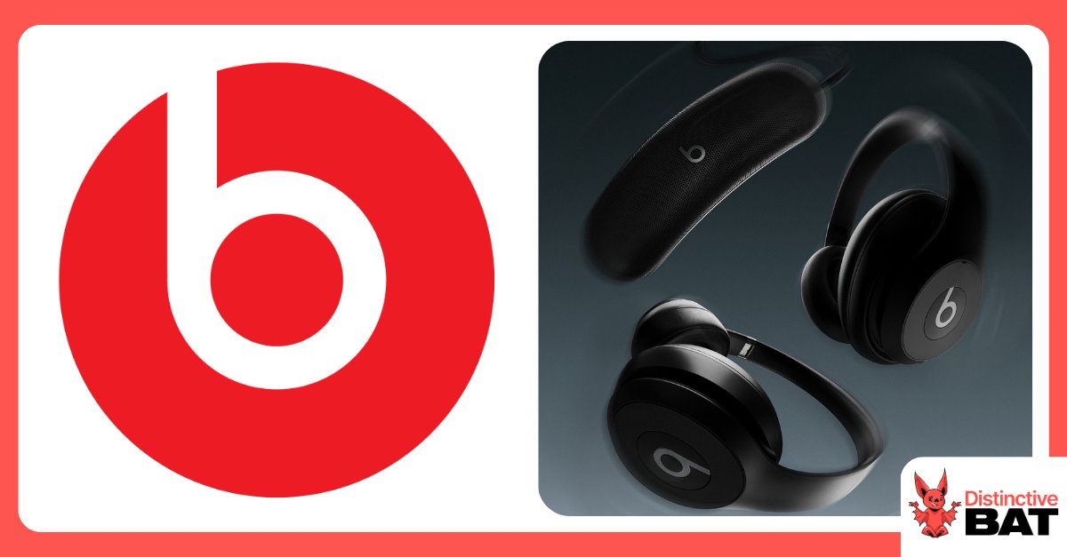
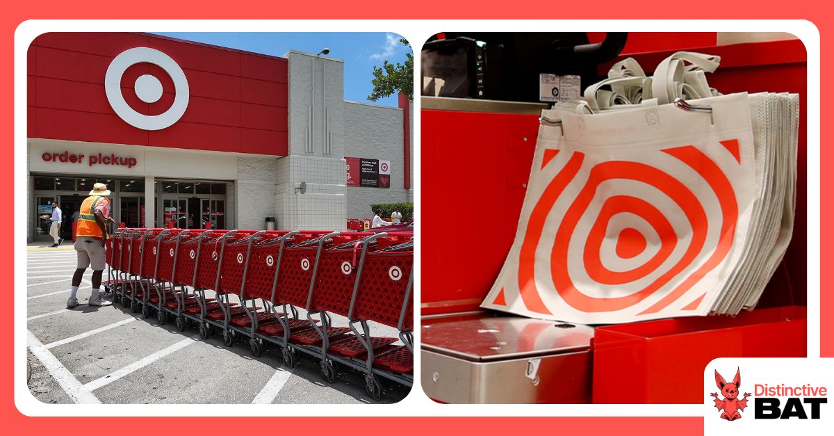
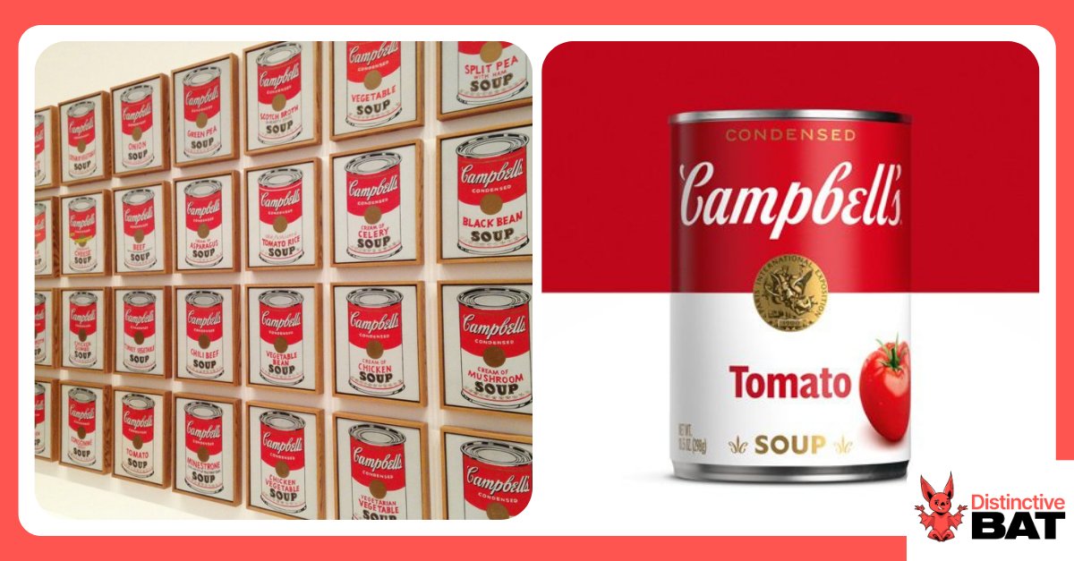
Creating a clear golden thread from the logo through to other key assets comes out on top, with device-led logos (e.g. those featuring an icon or character) marginally behind. In our latest article, we break down the specific logo features tested, share the supporting data, and connect the findings to broader scientific principles around how brands are encoded and retrieved from memory. Read more in Beyond Aesthetics: The Science, and Data, Behind a Memorable Logo distinctivebat.com/blog/beyond-ae…
Distinctive BAT tweet media
English
0
0
0
16
Distinctive BAT
Distinctive BAT@DistinctiveBAT·
Distinctiveness that survives the drip. Streets’ latest out-of-home campaign in Australia is a strong example of Distinctive Brand Assets doing the heavy lifting. Created with Thinkerbell and oOh! media, the work features iconic products such as Golden Gaytime, Bubble O’Bill and the Rainbow Paddle Pop… completely melted. As Kalli Swaik, Marketing Director at @MagnumIceCream , explained: “Even when our ice creams melt and do weird, wonderful things to our distinctive assets, they remain iconic and instantly recognisable.” A bold creative move, grounded in asset strength. Embedded DBAs continue to signal the brand, even when stretched beyond their usual form.
Distinctive BAT tweet media
English
0
0
0
33
Distinctive BAT
Distinctive BAT@DistinctiveBAT·
Good Will Dunkin’ is the latest Super Bowl outing from Dunkin’, building on its long-running partnership with Ben Affleck (and a few other familiar faces). It’s a strong example of how celebrity can evolve beyond cameo status to function as a Distinctive Brand Asset. In a recent piece, we revisited the Dunkin’ x Affleck partnership to explore whether, beyond capturing attention, it’s also driving distinctiveness measures. Read here: distinctivebat.com/blog/celebriti…
Distinctive BAT tweet media
English
0
0
1
63
Distinctive BAT
Distinctive BAT@DistinctiveBAT·
🐊 This crocodile doesn’t hibernate. Lacoste opened a Le Café Lacoste pop up in Cortina d’Ampezzo as part of its Winter Olympics presence and in promotion of their Olympic Heritage Cortina d’Ampezzo 1956 capsule collection. What immediately catches the eye however are the consistent nods to the crocodile the brand is so well known for. In one of the world’s most controlled marketing arenas, Lacoste shows up authentically by anchoring around its most recognisable Distinctive Brand Asset.
Distinctive BAT tweet mediaDistinctive BAT tweet mediaDistinctive BAT tweet media
English
0
0
0
29
Distinctive BAT
Distinctive BAT@DistinctiveBAT·
What makes the Las Vegas Raiders logo distinctive? We tested various iterations of the logo with individual elements removed. This approach of recessive isolation allows us to see which visual components of the puzzle are driving or stalling distinctiveness scores. With the Raiders, the shield shape itself carries inherent distinctiveness, which improves further when the colour black is added. The swords contribute relatively little, with the real uplift coming when the Raider character is included, highlighting just how important that element is to the overall asset. We also apply recessive isolation testing to advertising campaigns and packaging. It’s a valuable way to triangulate the impact of your assets in situ, and a worthwhile addition to your next DBA study. Read our full NFL analysis here 👇 distinctivebat.com/blog/who-is-th…
Distinctive BAT tweet media
English
0
0
0
34
Distinctive BAT
Distinctive BAT@DistinctiveBAT·
Rumours are circulating of an imminent logo change for the NFL’s Tennessee Titans. While nothing has been officially unveiled, multiple outlets report that a new Titans logo appeared in a product listing on Fanatics. Fan reactions have been mixed. Many point to the potential move towards minimalism and the removal of the flames and sword “T”, elements that have defined the brand since 1999. If the leak proves true, will the Titans have forfeited any distinctiveness in this logo upheaval? In our recent NFL distinctiveness study, we tested the Titans’ logo and jersey. The debranded logo sat on the cusp of what we term a “Hero asset” — over 50% recognition and 50% correct brand attribution. The jersey recorded high misattribution, with 18% of recognisers assigning it to another team. Our broader research shows that moves towards simplification can sometimes reduce distinctiveness if unique visual cues are stripped away. Time will tell if this is true for the Titans. Read more about the oversimplification of brands: distinctivebat.com/blog/blands-th…
Distinctive BAT tweet media
English
0
0
0
114
Distinctive BAT
Distinctive BAT@DistinctiveBAT·
Not the Super Bowl, but still a win for Miami 🐬 The Seattle Seahawks may hold the title on the field, but when it comes to distinctiveness, it’s the @MiamiDolphins who lead the league. We tested all 32 NFL franchises using assets like logos and jerseys. The Dolphins ranked #1 overall. Why? A uniquely ownable colour palette in a league dominated by red, white and navy blue. A dolphin icon that stands apart from the NFL’s sea of birds, big cats and letterforms. And decades of consistent application across touchpoints. Some heritage teams performed strongly. Others cued competitors. Think your team would top the list? Take a look... 🔗 distinctivebat.com/blog/who-is-th…
Distinctive BAT tweet mediaDistinctive BAT tweet media
English
0
0
0
128
Distinctive BAT
Distinctive BAT@DistinctiveBAT·
And the NFL distinctiveness champion is…........ Not the Patriots, nor the Seahawks. The real winner is the @MiamiDolphins. We surveyed 1,600 sports fans, and the Dolphins came out on top in the logo and jersey stakes. The use of a character with clear, obvious links, along with a (somewhat) unique colour, all contribute to the franchise standing out. See how your team fares here: distinctivebat.com/blog/who-is-th…
Distinctive BAT tweet media
English
0
0
0
61
Distinctive BAT
Distinctive BAT@DistinctiveBAT·
A short jingle has been recognised as a trademark by the EU General Court. A Berlin public transport operator, Berliner Verkehrsbetriebe (BVG), applied to register a four-note sound, around two seconds long. The EUIPO initially rejected it as too simple to be distinctive, but in September the EU General Court overturned that decision, confirming that a sound doesn’t need to be long, complex or lyrical to function as a trademark if it can signal commercial origin. From a distinctive brand asset perspective, this ruling reinforces the value of short, repeatable audio cues. When used consistently, they can act as brand identifiers — and are now increasingly capable of securing legal protection. Listen here: euipo.europa.eu/trademark/soun…
English
0
0
0
37
Distinctive BAT
Distinctive BAT@DistinctiveBAT·
Can you identify the brand from this Bloomingdale’s takeover? Running through January 5th, 2026 at Bloomingdale’s 59th Street flagship in New York, the iconic check pattern is all the branding needed for fashion-savvy shoppers to instantly attribute the façade to British luxury house Burberry. Read more about the storied history of The Burberry Check: row.burberry.com/c/burberry-wor…
English
0
0
0
60
Distinctive BAT
Distinctive BAT@DistinctiveBAT·
Sephora is a brand that doesn’t miss a beat at Christmas. Their signature black-and-white stripes show up everywhere — holiday windows, festive pop-ups, even public transport. If there’s a surface to decorate, they’ll put a stripe on it. It’s a masterclass in staying loyal to a core DBA when many brands are tempted to deviate for the season. That unwavering visual consistency means shoppers recognise Sephora in an instant, in any market, even in the busiest holiday rush. Here are some of our favourite Sephora holiday activations from around the world.
Distinctive BAT tweet mediaDistinctive BAT tweet mediaDistinctive BAT tweet mediaDistinctive BAT tweet media
English
0
0
0
75
Distinctive BAT
Distinctive BAT@DistinctiveBAT·
Holiday storefronts offer more than just seasonal sparkle; they’re prime real estate for reinforcing Distinctive Brand Assets. As the high street fills with Santas, many brands blend into a blur of red, green and glitter. In this sea of seasonal sameness, retailers risk becoming unrecognisable. When done right holiday décor shouldn’t dilute a brand, it should reinforce it. Chanel illustrates this well - past holiday displays borrow from seasonal cues, but are grounded firmly in its own brand assets: oversized black bows, pearl strands, a strict monochrome palette, and the unmistakable double C. These elements turn a temporary display into a repetition of the brand’s most recognisable memory structures.
Distinctive BAT tweet media
English
0
1
1
35
Distinctive BAT
Distinctive BAT@DistinctiveBAT·
Coca-Cola’s distinctive red colour dates back more than 130 years. When first introduced, Coca-Cola was sold in barrels at American drug stores and pharmacies, alongside alcohol. The Coca-Cola Company painted its barrels red to help customs and tax officials distinguish them from the taxed barrels of alcohol. This distinguishing marker has stuck. And it’s not just cans of Coca-Cola that are instantly recognisable from their red colour now, but another true icon, Santa Claus. Featured in one of the company’s adverts in the 1930’s, wearing his now famous red suit and holding a bottle of Coca-Cola, the Coca-Cola company is credited with shaping the distinctive image of Santa Claus we know and love today.
Distinctive BAT tweet media
English
0
0
1
47
Distinctive BAT
Distinctive BAT@DistinctiveBAT·
Beats is boosting distinctiveness with a single letter. The Beats by Dre logo is deceptively simple: a lowercase “b” inside a circle that doubles as a pair of headphones. That visual pun gives the mark a clear tie to the category and makes it easier to remember. It’s applied consistently across all touchpoints: headphones, speakers, artist collaborations, retail packaging, and high-profile sports sponsorships - reinforcing recognition with each use. See more Great Logo Designs here: distinctivebat.com/blog/great-log…
Distinctive BAT tweet media
English
0
0
1
31
Distinctive BAT
Distinctive BAT@DistinctiveBAT·
Before it was a brand, Doritos was just a clever way to use up leftover tortillas. In 1964, a Disneyland restaurant began frying surplus tortillas into chips. They proved so popular that Frito-Lay took them national and the now-iconic triangle shape became the foundation for Doritos as a brand. That sharp, ownable form does more than house flavour. It’s become a central Distinctive Brand Asset: visible in the chip itself, echoed across pack design, and embedded in decades of campaign creative. Read more in: The History of Some Iconic Brand Assets distinctivebat.com/blog/the-histo…
Distinctive BAT tweet media
English
0
0
0
42
Distinctive BAT
Distinctive BAT@DistinctiveBAT·
An Apple a day… builds distinctiveness. In use for over four decades, the Apple logo shows up consistently across every key touchpoint: glowing on devices, etched into packaging, anchoring ads, storefronts, and global launch events. It’s familiar, instantly recognisable, and always visible. Crucially, it also creates a direct link to the brand name - a simple, literal cue that makes recall easy. See more great logo designs here: distinctivebat.com/blog/great-log…
Distinctive BAT tweet media
English
0
0
0
30
Distinctive BAT
Distinctive BAT@DistinctiveBAT·
The Chick-fil-A logo turns the letter C into a chicken’s head — a neat bit of embedded design. That small visual twist is used relentlessly across packaging, apps, restaurant signage, and wider touchpoints. Logos are often the most visible Distinctive Brand Asset a company has. Chick-fil-A makes theirs do more: embedding a second cue (the character) within the first (the logo). It’s a smart distinctiveness hack, executed with clarity. Take a look at The Overlooked Touchpoints That Build Brands: distinctivebat.com/blog/the-overl…
Distinctive BAT tweet media
English
0
0
0
55
Distinctive BAT
Distinctive BAT@DistinctiveBAT·
In 1928, Gerber held a contest to find a face for its new baby food range. The winning sketch drawn by artist Dorothy Hope Smith, was a charcoal portrait of Ann Turner Cook (1926-2022), submitted without polish or colour. It was never meant to be final art, but it stuck. What followed was nearly a century of unbroken exposure on packaging ranges and enduring through logo refreshes. A fixture for the brand, there have been continued Gerber baby photo contests – a winner crowned as recently as 2024. Read more in The History of Some Iconic Brand Assets: distinctivebat.com/blog/the-histo…
Distinctive BAT tweet media
English
0
0
0
65
Distinctive BAT
Distinctive BAT@DistinctiveBAT·
Target’s bullseye has been around since 1962 and enabled through this continued use, it is one of the rare logos that works without a single letter of copy. You’ll find the bullseye used across most touchpoints. It's a great example of a brand full leveraging owned channels - from storefronts to shopping bags, apps and more. Take a look at the overlooked touchpoints that build brands: distinctivebat.com/blog/the-overl…
Distinctive BAT tweet media
English
0
0
0
24
Distinctive BAT
Distinctive BAT@DistinctiveBAT·
The red-and-white Campbell’s label didn’t just sell soup, it became art. Andy Warhol’s famous silkscreens pushed it into cultural icon status. And while the pack has been refreshed in the years since, the brand has been smart to retain what makes it distinctive. Where many CPG brands chase design refreshes to signal “new,” Campbell’s plays the long game: show up the same, everywhere, for as long as possible and let memory do the work. Learn more about packaging in Key Factors in Distinctive Packaging Design: distinctivebat.com/blog/key-facto…
Distinctive BAT tweet media
English
0
0
0
37