पिन किया गया ट्वीट
evidence
400 posts


evidence
@evidence_dev
https://t.co/Gn735YnbMP is an open source framework for building data products with SQL and markdown
शामिल हुए Mayıs 2021
308 फ़ॉलोइंग2.3K फ़ॉलोवर्स

evidence रीट्वीट किया

Love getting messages like this.
We consider customer feedback to be an extension of our product experience. The faster we can fix issues, the more delightful the experience of working with us.
It's an unbeatable feeling to see it working for customers.
English

evidence रीट्वीट किया
Most product bugs don't get reported. They're just small enough that customers work around them and move on.
We built our AI assistant to flag these automatically. It sits in customer workflows, sees where things break down, and opens issues for us without anyone asking.
English
evidence रीट्वीट किया
AI can easily handle tedious but necessary work - like keeping analytics well documented.
In Evidence, our AI assistant can join data from multiple sources, calculate metrics like conversion rates, and document the logic as it goes. Since Evidence already has strong
English
evidence रीट्वीट किया
Dense tables are sometimes overlooked in favour of charts, but they’re often the fastest way to understand complex data.
We put a lot of effort into making our tables feel publication-quality and easy to scan. One small but high-impact thing we just shipped is column groups.
You can now group related columns under a shared header (like Revenue or Volume in this example), which makes wide tables much easier to read at a glance. Adding a column to a group is intentionally simple and doesn’t require any extra layout work.
It’s a small feature, but it makes dense data feel way more approachable when you’re actually reading it.

English
evidence रीट्वीट किया
We’ve been working on a cleaner way to make reports interactive, and added variables you can insert anywhere in @evidence_dev.
Inputs like sliders or dropdowns generate a variable you can reference in SQL, charts, or even plain markdown.
Change an input, and anything using that
English
evidence रीट्वीट किया
We recently had a sales call with a Fortune 500 company, expecting to give them an intro to Evidence and BI-as-code.
Instead, they told us they’ve been using our open source software - and loving it - for years.
They even made a few modifications and created a patch to solve
English
evidence रीट्वीट किया
A week ago, we rebuilt our AI assistant from the ground up, and the results so far have been pretty amazing.
From a customer:
“Massive upgrade. I recommend all Evidence devs try it out for edits now.”
What changed:
- A new Evidence docs MCP
- Claude Opus 4.5 as the primary
English

RT @seanhughes92: Logos instantly make reports feel more polished.
We just shipped a super simple way to add company logos to tables and m…
English
evidence रीट्वीट किया
A few years ago, if we shipped a bug, we might not hear about it for days.
Now we hear about issues almost immediately - because customers rely on us for critical workflows.
Friday was a good example. A few customers reported an urgent issue, so we jumped on it, spent several
English
evidence रीट्वीट किया
Most BI and analytics tools struggle with something I think about a lot: use case frequency.
They give you tons of controls, but it’s hard to make even basic dashboards that look good and perform well. Often because the tools treat every possible action as equally important.
In reality, reporting isn’t evenly distributed. Something like 90% of reports are built from the same small set of ingredients.
It’s easy to assign the wrong weight to features when the people building the product haven’t spent much time building reports themselves. Without that experience, it’s hard to know what’s common, what’s rare, or what the default behaviour should be.
At Evidence, the product is built by a team of ex-analysts and data leaders, and we actively use Evidence ourselves. That gives us strong opinions about the right user experience, and a shared understanding of which patterns show up constantly versus occasionally.
We bake that directly into our product development process.
When we discuss feature ideas internally, we’ll say things like "this is a 95% use case" or "this is a 2% use case". That framing drives a lot:
- How much priority it gets
- Whether it becomes a default or an advanced option
- How much surface area it earns in the product and in docs
High-frequency use cases become obvious and opinionated.
Low-frequency ones stay possible, but intentionally out of the way.
The goal is that by default, anyone using Evidence can produce the same outputs a top-tier analyst would - because the right choices and trade-offs are already baked into the product.
We get there by designing explicitly around use case frequency.
English
evidence रीट्वीट किया
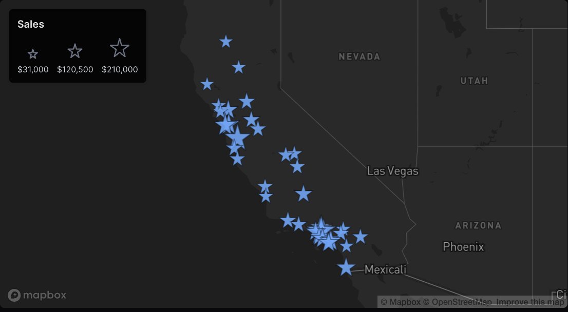
We're getting ready to release some major updates to our maps in Evidence Studio. I can't wait to share, so I'm just going to post some examples this week so you can see what we've built.
First up we've got a point map including a size scale and customizable shape.
Code for this example in the comments
English
evidence रीट्वीट किया
We're only 2 days into 2026 and already have a TON of new things ready to release to Evidence customers - including new options for maps, charts, tables, user management, data connections, and more.
Moving this fast is one of the best parts of building Evidence. I still remember
English
evidence रीट्वीट किया
Shipping some early Christmas gifts to @evidence_dev customers this week - like this map that lets you zoom in to see more granular areas
English
evidence रीट्वीट किया

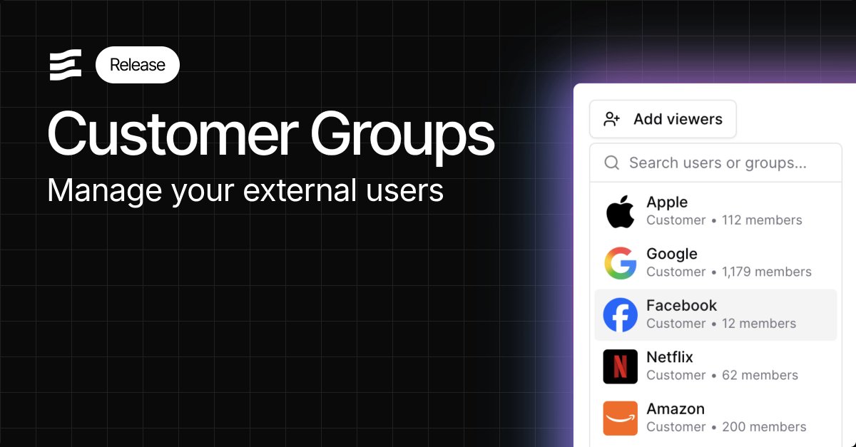
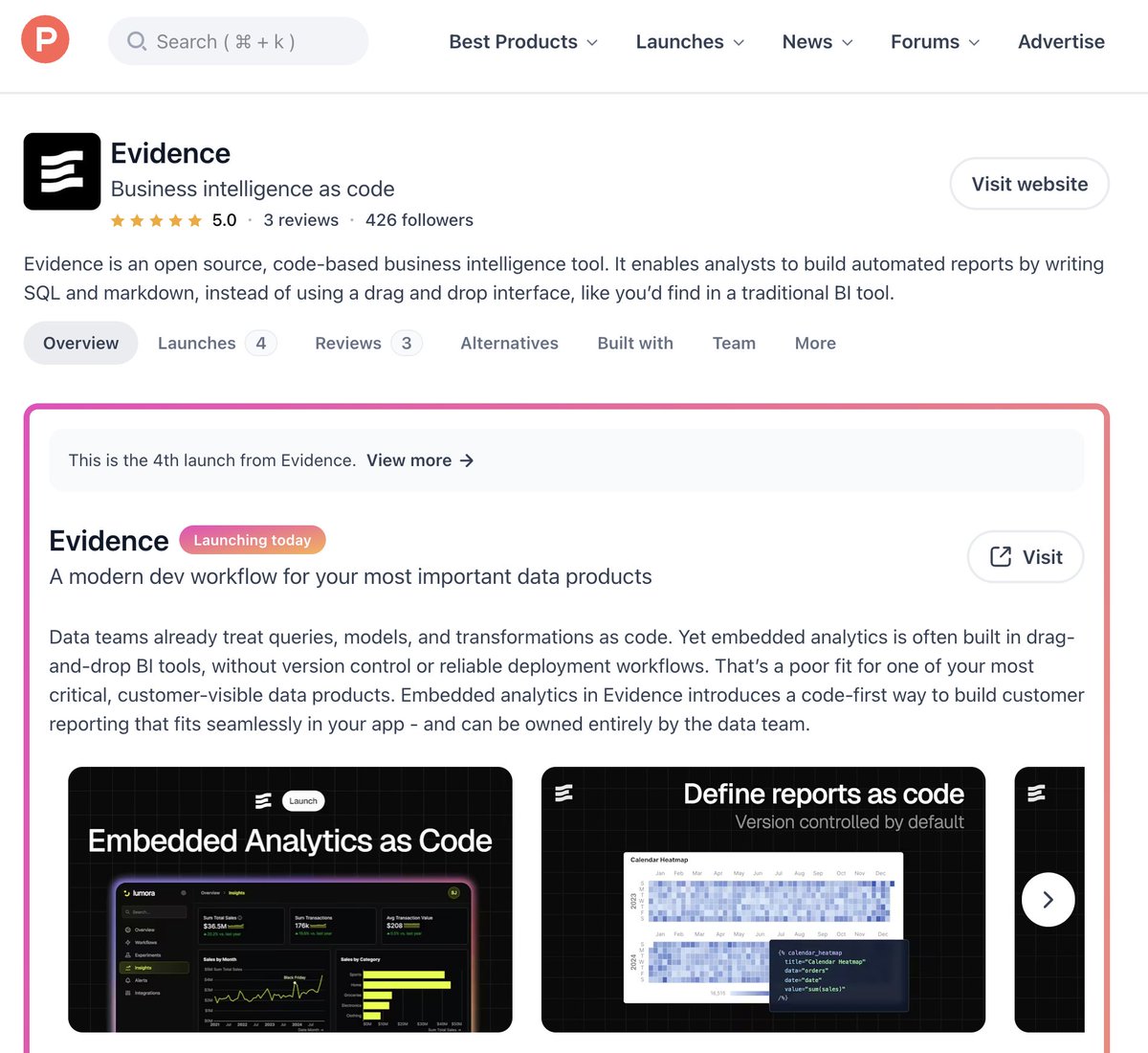
it's become clear to us there's a gap in embedded reporting
current options:
- "drag n drop" BI with no release management, limited customizability
- custom js the eng team owns
embedded analytics as code allows the data team to run customer reporting using SQL and markdown
English