@szetoinsitu @AsimovPress Is "cell wall to nucleus in 50 nanoseconds" more intuitive, or less intuitive? I think they both have their uses. Though "wall to nucleus" implies they can fly in a straight shot, which is very far from the truth.
English
Sam Clamons
646 posts
@ClamonsSam
Today I Learned: Every Tuesday, Thursday, and Saturday morning, three facts I learned the day before.


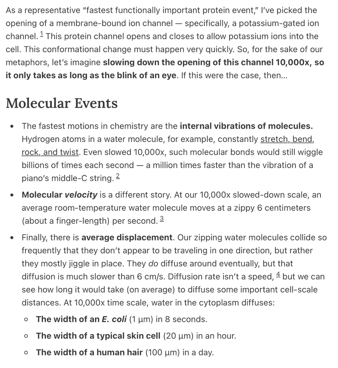
A cell is an incredibly crowded and quick place. Sugar molecules fly through at 250 mph. Each protein collides with ten trillion water molecules per second. It is difficult to understand biology, in part, because these speeds boggle the mind. For our column today, author Sam Clamons puts these numbers into context using a quantitative metaphor. Specifically, by setting the speed of a potassium ion channel opening to the blink of an eye, Clamons examines how quickly everything else in the cell happens in comparison. Here are some of our favorite metaphors: - A water molecule would diffuse across a skin cell in about one hour. - It would take about 6 days to translate a single protein. - A kinesin motor would take one step every 30 seconds. - Most proteins in the cell would have a median half-life of 300 days! Check out the full piece :)


My latest article for Asimov Press is out!
Most metaphors in biology are qualitative and vague. "DNA is the blueprint of the cell." OK but, like, how big is that blueprint? For our latest essay, @ClamonsSam gives a bunch of QUANTITATIVE metaphors to help you understand the sizes of biology, from molecules to cells. He imagined that each water molecule in a cell was blown up to the size of a grain of sand, and then calculated what that would mean for everything else. At this scale: 1. A typical protein would now be a knobby ball the size of a blueberry. 2. An antibody would consist of three blobby arms, each roughly the dimension of a grain of basmati rice, connected to a common center by a short chain. 3. A typical human chromosome would be a thread of double-stranded DNA about 100,000,000 bases long, which is just long enough to span the English Channel (34 km). 4. A human virus is now the size of a ping-pong ball. 5. A mitochondrion is as wide as a cow. And there are so many more metaphors in this essay. We think it could be a valuable resource for schoolteachers and students who are looking to "grok" the scales of things in biology.


C’est marrant de suivre ce débat dans deux pays. Tiré d’un papier d’octobre 2025 de David Splinter : en gris, le fameux graphique de Piketty, Saez et Zucman du taux moyen d’imposition par quintile de revenu dans sa version américaine. En rouge, la version corrigée des transferts, des crédits d’impôt et de la neutralisation de certains choix méthodologiques bizarres. Parmi ces choix bizarres, on retrouve le fait que, plus les ménages à faible revenu reçoivent d’allocations sociales ou de crédits d’impôt, plus la méthode de PSZ conclut que leur taux d’imposition est élevé. Je traduis : « Pour les ménages à faible revenu, les taux d’imposition PSZ sont surestimés, car ils incluent les taxes sur les ventes dans le numérateur mais omettent, au dénominateur, les revenus de transfert utilisés pour financer ces achats. Ils ne tiennent pas non plus compte des crédits d’impôt remboursables. »


A new quantitative essay from @ClamonsSam. Read & subscribe: press.asimov.com/articles/price…