saugat rajbhandari がリツイート
saugat rajbhandari
44 posts


saugat rajbhandari がリツイート

Woah. This is dope! 🔥
Dominik 🔮@TkDodo
📹So I got nerd-sniped into making a Trellix clone with @tan_stack React Query over the weekend. I think it works really well, but feel free to disagree. No framework, no backend - just the great msw, vite + RQ SPA. Nice side-effect: it works if you lose network connection 😱
English
saugat rajbhandari がリツイート

I'm LOVING using Zod to validate and transform data, especially data send from @nextjs actions!

English
saugat rajbhandari がリツイート

Tagged Tailwind CSS v4.0.0-alpha.8, with some insane performance improvements 🤩
English
saugat rajbhandari がリツイート

With RSC, we can refresh the server state of a page while keeping its client state.
English
saugat rajbhandari がリツイート
saugat rajbhandari がリツイート
saugat rajbhandari がリツイート
saugat rajbhandari がリツイート
saugat rajbhandari がリツイート
saugat rajbhandari がリツイート
Route transition animations in Next.js (App Router) with Framer Motion
English
saugat rajbhandari がリツイート
saugat rajbhandari がリツイート
Statically generated pages + useSearchParams in Next.js
English
saugat rajbhandari がリツイート

React-query problem: I fetched a list and I want to avoid needlessly refetching the same data on my detail page.
Solution: Use setQueryData to pre-populate the detail page cache. Now the detail page loads immediately. 🔥
Example below: This fetches a list of users, then stores each of the user's details in react-query's cache so that the fetch on the details page automatically has a cache hit.
Note: This pattern only works if the list page fetches the same properties as the detail page.⚠️

English
saugat rajbhandari がリツイート

// tsconfig.json
{
"compilerOptions": {
"moduleDetection": "force"
}
}
English
saugat rajbhandari がリツイート

CSS Tip! 🎠
You can create a responsive infinite marquee animation with container queries and no duplicate items 🤙
li{ animation: slide; }
@keyframes slide {
to { translate: 0% calc(var(--i) * -100%);}}
The trick is animating the items, not the list 😎
More tricks 👇
To get this one working, you need to animate the items and not the list (Watch the video first?). Each item needs to know its row index (--i) in the list and the parent needs to know how many rows are in the list:
ul { --count: 12; }
li:nth-of-type(1),
li:nth-of-type(2) { --i: 0; }
li:nth-of-type(3),
li:nth-of-type(4) { --i: 1; }
Once you have that, translate each item based on its row index in the list
li {
translate: 0% calc((var(--count) - var(--i)) * 100%);
}
Now for the animation. The key here is that each row has an animation-delay calculated from its index (--i). That number is offset to make it negative so the animation start is offset ✨
ul { --duration: 10s; }
li {
--delay:
calc((var(--duration) / var(--count)) * (var(--i) - 8));
animation:
slide var(--duration) var(--delay) infinite linear;
}
Make sure to wrap that animation in:
@media (prefers-reduced-motion: no-preference) { ... }
Lastly, the fun parts! 🤓
To create the "vignette" mask. Use a layered mask on the container 😷
.scene {
--buff: 3rem;
height: 100%;
width: 100%;
mask:
linear-gradient(transparent, white var(--buff) calc(100% - var(--buff)), transparent),
linear-gradient(90deg, transparent, white var(--buff) calc(100% - var(--buff)), transparent);
mask-composite: intersect;
}
To create the 3D skewed effect, use a chained transform (Try toggling it in the demo ⚡️):
.grid {
transform:
rotateX(20deg)
rotateZ(-20deg)
skewX(20deg);
}
As for the responsive part, use container queries! 🔥
article { container-type: inline-size; }
When the article (card) is narrower than 400px update the grid and animation settings 🤙 Double the rows means double the duration!
@container (width < 400px) {
.grid {
--count: 12;
grid-template-columns: 1fr;
}
li:nth-of-type(1) { --i: 0; }
li:nth-of-type(2) { --i: 1; }
li:nth-of-type(3) { --i: 2; }
li:nth-of-type(4) { --i: 3; }
li {
--duration: 20s;
}
}
CSS has the magic to be able to update those animations at runtime based on your custom property values 😎
An added bonus in this demo is that it doesn't require any JavaScript at all, for any of it 🤯 We can use CSS :has() for those toggles that update the styles, even the theme toggle! 🫶
Any questions, let me know! Make sure to check out the video. Will do a walkthrough one to follow-up 🤙
@CodePen link below! 👇
Steven Tey@steventey
Skewed infinite carousel w/ vignette effect ✨ Built entirely with @tailwindcss – zero JavaScript required. Live demo & code 👇
English
saugat rajbhandari がリツイート

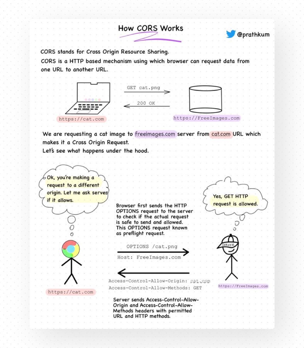
Two things developers hate the most:
1. Meetings that could've been an email
2. CORS
We'll talk about the first one later but let's see what CORS (not even a word) is.
• Stands for Cross-Origin Resource Sharing.
• It is a security feature implemented by web browsers that controls how web pages from one domain can request resources hosted on another domain.
• Browsers generally have a Same-Origin Policy, which means requesting data from the same origin is allowed but requesting data from another URL will throw an error.
• But why so? Due to security reasons.
This policy restricts the web page's ability to access data or resources from other origins to prevent potential security vulnerabilities, like cross-site scripting (XSS) attacks.
• How to make a Cross-Origin request?
When the browser makes a cross-origin request, it will add an ‘Origin’ header that states the scheme(protocol), domain, and port number.
• In return, the server responds with Access-Control-Allow-Origin — specifying the allowed origin(s). It can be set to a specific origin, "*", or omitted.
• However, HTTP requests other than GET, POST, and HEAD require a preflight request before making an actual Cross-Origin request.
• A preflight request is nothing but an OPTIONS HTTP request to check if the actual request is allowed.
• The server responds with an ‘Access-Control-Allow-Methods’ header which states the HTTP Methods allowed to be used by the origin.
CORS is confusing but necessary for security.
It's nothing but a combination of HTTP headers, preflight requests, and browser checks to control and allow safe cross-origin requests while maintaining the security of web applications.
English
saugat rajbhandari がリツイート
loading.js is just a Suspense that wraps the Page component from the same route segment
English
saugat rajbhandari がリツイート
Extra CSS Trick! 🚀
Use scroll-padding-inline with some calc on the track to make the indicator click JS free 🤙 (See video 🎬)
ul {
scroll-behavior: smooth;
scroll-padding-inline: calc(
50vw - (var(--card-width) * 0.5
);
}
You could color those indicators as requested by @AbelardoIT
.indicator::after {
background: hsl(var(--hue) 90% 70%);
}
@keyframes show { 50% { opacity: 1; }}
Combined with the same animation properties from the original demo ⭐️ Rad! 😎
jhey ʕ•ᴥ•ʔ@jh3yy
CSS Tip! 🚥 You can create these trending expanding scroll indicators with scroll-driven animations and flex 🤙 .indicator { animation: grow; animation-range: contain calc(50% - var(--size)...; animation-timeline: var(--card); } @keyframes grow { 50% { flex: 3; }} What's the trick? Put the indicators in a container using flex layout and set a width larger than the number of indicators 😉 .indicators { aspect-ratio: 7 / 1; display: flex; } Importantly, set no gap 🤏 To mimic the gap set a transparent border on each indicator and set the background using padding-box .indicator { background: linear-gradient(#fff, #fff) padding-box; border-radius: 50px; border: 4px solid transparent; } Now for the animation. You want to create a view-timeline for each card that moves across 🤙 li:nth-of-type(1) { view-timeline: --one inline; } li:nth-of-type(2) { view-timeline: --two inline; } Make sure they use the inline axis too! The trick is hoisting these view-timeline so the indicators can use them with timeline-scope 👀 .track { timeline-scope: --one, --two, ...; } All that's left is for you to create the animation piece using some calc with the card size ⚡️ .indicator { --size: calc(var(--card-width) * 0.9); animation: grow both linear; animation-range: contain calc(50% - var(--size)) contain calc(50% + var(--size)); } .indicator:nth-of-type(1) { animation-timeline: --one; } .indicator:nth-of-type(2) { animation-timeline: --two; } @keyframes grow { 50% { flex: 3; }} And there you have it, responsive scroll indicators using CSS scroll-driven animations 😎 Sprinkle a little JavaScript to make them clickable and scroll the the right card ✨ const shift = (event) => { if (event.target.tagName === "BUTTON") { const index = [...event.target.parentNode.children].indexOf(event.target); const item = document.querySelector(`li:nth-of-type(${index + 1})`); item.scrollIntoView({ behavior: "smooth", inline: "center" }); } }; As always, any questions or suggestions, let me know. I've put a JavaScript fallback in to use GSAP in browsers that don't have scroll-driven animations 🫶 @CodePen link below! 👇
English