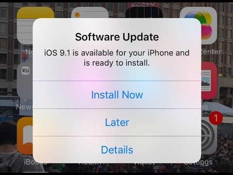
Randy Krum
7.4K posts

Randy Krum
@rtkrum
Data Visualization Designer, Infographics, Presentations, Author @coolinfographic, Keynote speaker, President @InfoNewt, Instructor @SMUCAPE, DFW DataViz Meetup
Dallas/Fort Worth, Texas 参加日 Nisan 2007
2.5K フォロー中9.2K フォロワー

Apple traditionally doesn't release any products during December, so all of my Apple Release Pattern #infographics are complete and up-to-date for 2025. Are you looking forward to any #Apple product updates in 2026?
infonewt.com/apple-release-…

English

The Planetary Society has a great collection of #infographics and data visualizations (#DataVisualization) about NASA and the state of the U.S. Space Program. coolinfographics.com/blog/2025/10/1…
English

For all of my fellow book authors, you can now positively determine if pirated copies of your book(s) were illegally used in the training of AI models. coolinfographics.com/blog/2025/10/6…
English

I'll be giving my updated talk on #dataviz in AR & VR in a free online Meetup event on Feb 13th. Join through your local DataViz Meetup group, or you can register here: us02web.zoom.us/webinar/regist…

English

Cultivating a creative community with Tina Roth-Eisenberg of Creative Mornings: ow.ly/zkJo50ONFal
English

Introducing Microsoft Fabric: Data analytics for the era of AI, integrating technologies like Azure Data Factory, Azure Synapse Analytics, and Power BI into a single unified product ow.ly/4MY750OGm8K
English

27+ (Secrets) on How To Create An Awesome Viral Infographic in 2023 - great content and tips, but not a great infographic (sadly) coolinfographics.com/blog/2023/2/6/…
English

Chart Reader: Accessible Visualization Experiences Designed with Screen Reader Users: ow.ly/SjK450OGm2I
English

The Complete Introduction to Survival Analysis in Python: ow.ly/Wy4450OGlWx
English


Check out the new page for the Open Climate Data project from Creative Commons which launched in Spring 2023, to facilitate the opening and sharing of climate datasets and data models available across the globe. ow.ly/v3UM50OAmIh

English

How to maximize your marketing content and reach every audience you want: ow.ly/3hBk50Ov2Xn
English

Visualizing Sick Days is interesting twist on quantified self charts: coolinfographics.com/blog/2023/3/14…
English

New paper from Robert Kosara: Notebooks for Data Analysis and Visualization ow.ly/7WnT50OsXyU
English

Why are six colors common in color palettes for data visualization? by Jon Schwabish ow.ly/UGI850Ol36o

English


