So the tax allocation is 5%.
3% is automatically burned to increase and create scarcity, thus increasing the price.
2% is for 30% rewards for holders, and 70% is for sacrifices at ProveX.info.
#PulseChain
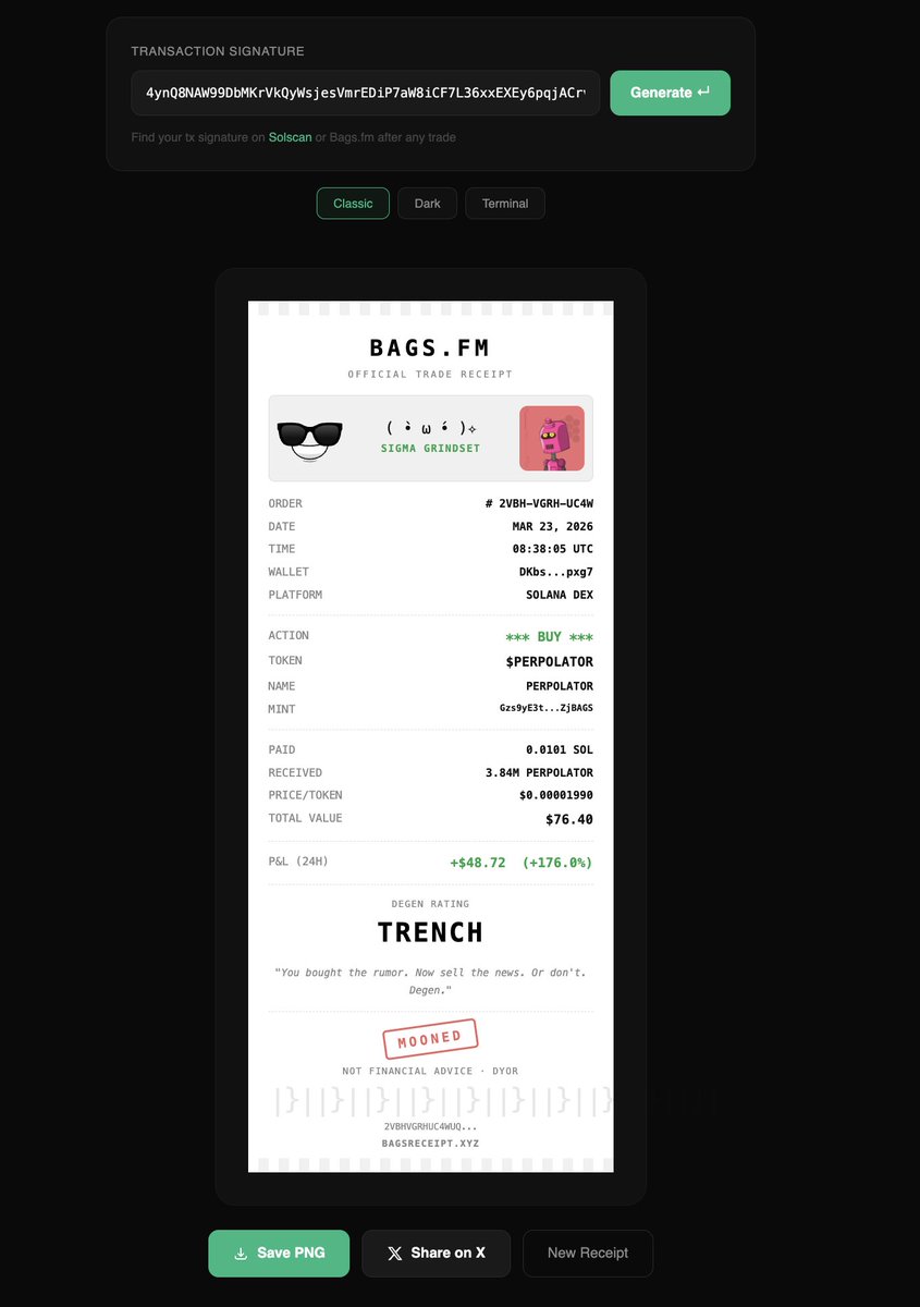
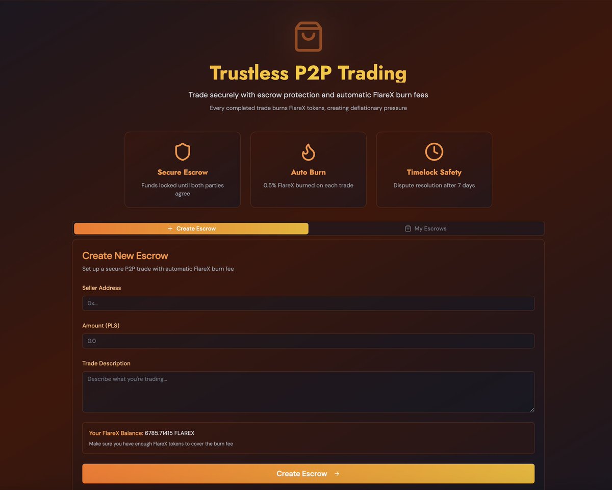
Escrow Marketplace
P2P platform for buying and selling NFTs, domains, and digital assets
burns fees on every transaction
Trustless settlement with no middleman
#PulseChain
Web design competition. ProveX.com (site's not up yet.) $15,000, winner chosen in 24 hours. By entering and winning, you assign all rights to the anonymous donor who's choosing the winner and paying.
No external dependencies. The site must load perfectly offline and not auto update. Logo text is Avenir Next Bold (not demibold).
Even if it's not used, it's fun to see all the engagement.
Content quite similar to what you see in this post: x.com/RichardHeartWi…
Not in the competition but free free to comment: What cool stuff would you like to see on a website that's really easy to do? What's the coolest web design you've seen recently?
Tonight Px402 will have a new tech update :
Private Payments: Anonymous payments using zero-knowledge proofs
AI Agent Economy: Designed specifically for automated transactions by AI agents
Unlinkable Credentials: Protecting agent identities and transaction history
#PulseChain
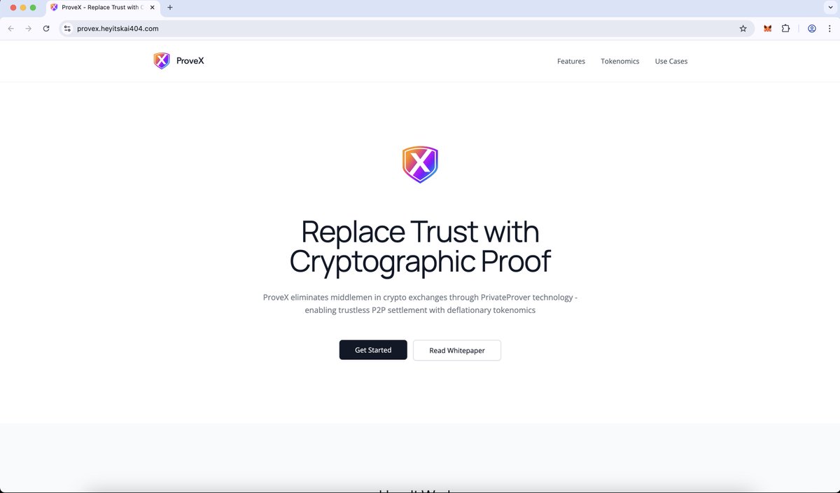
@RichardHeartWin Design Philosophy
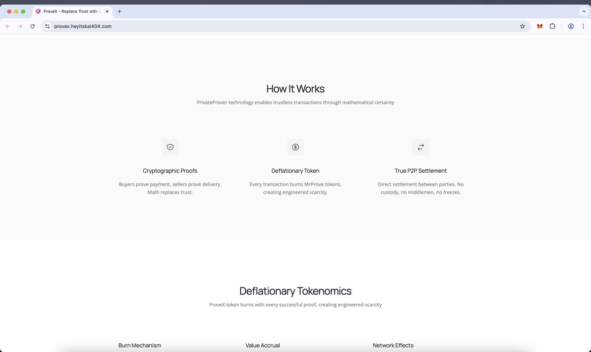
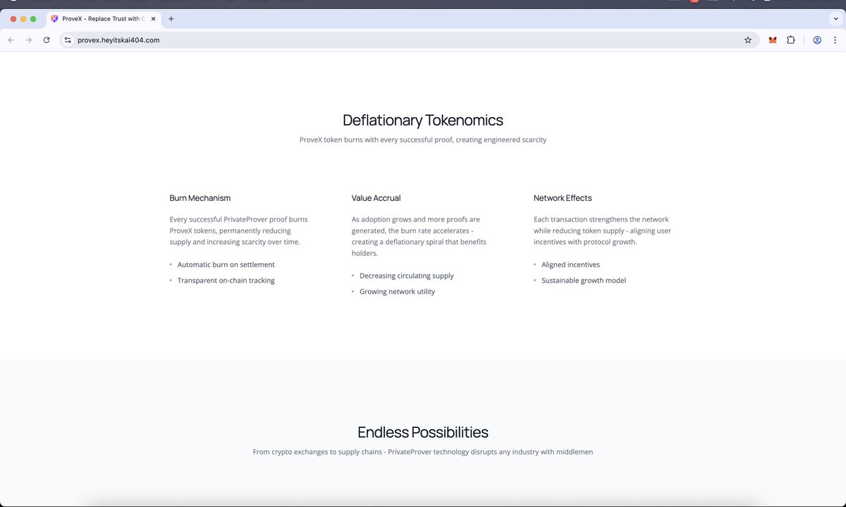
The ProveX website adopts a Swiss Design/International Typographic Style combined with Modern Minimalism—reflecting the product's core value: trust through mathematical simplicity.
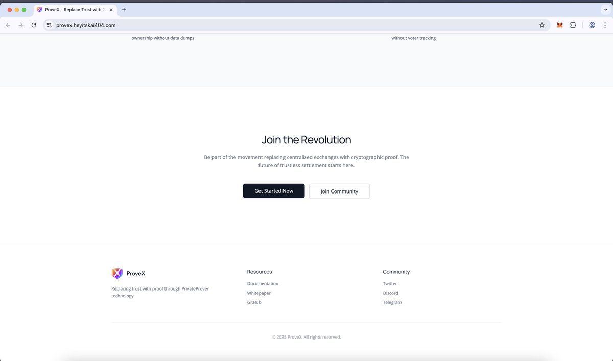
You can check it in detail here : provex.heyitskai404.com
3. Typography as Visual Hierarchy
Light (light/normal) font weight for an elegant impression
Extensive whitespace for breathing room
Large font size in the hero section for impact
Symbolizes clarity and precision of cryptographic proof
4. Subtle Interaction
Minimal and smooth hover effects
No excessive animations
Smooth transitions for professionalism
Symbolizes efficiency and speed of P2P settlement
Key Principles
1. Logo as the Only Colored Element
The ProveX logo is the only colored element on the entire website
Creates a strong focal point and instant brand recognition
Symbolizes that ProveX is "the only solution" needed
2. Pure Grayscale Palette
The entire UI uses gray and white
No gradients, no flashy colors
Creates maximum contrast with the colored logo
Symbolizes blockchain transparency and honesty
@RichardHeartWin The ProveX website is the antithesis of the “typical crypto website” – proving that simplicity is the ultimate luxury, and trust is built through transparency, not hype.