Khlaseek designer@Khlaseek_dsgner
WIP 🚧 Rethinking Google stitch AI-Generated Fintech Hero Section.
I asked myself a simple question:
Khlaseek If you were to redesign this, how would you approach it differently?
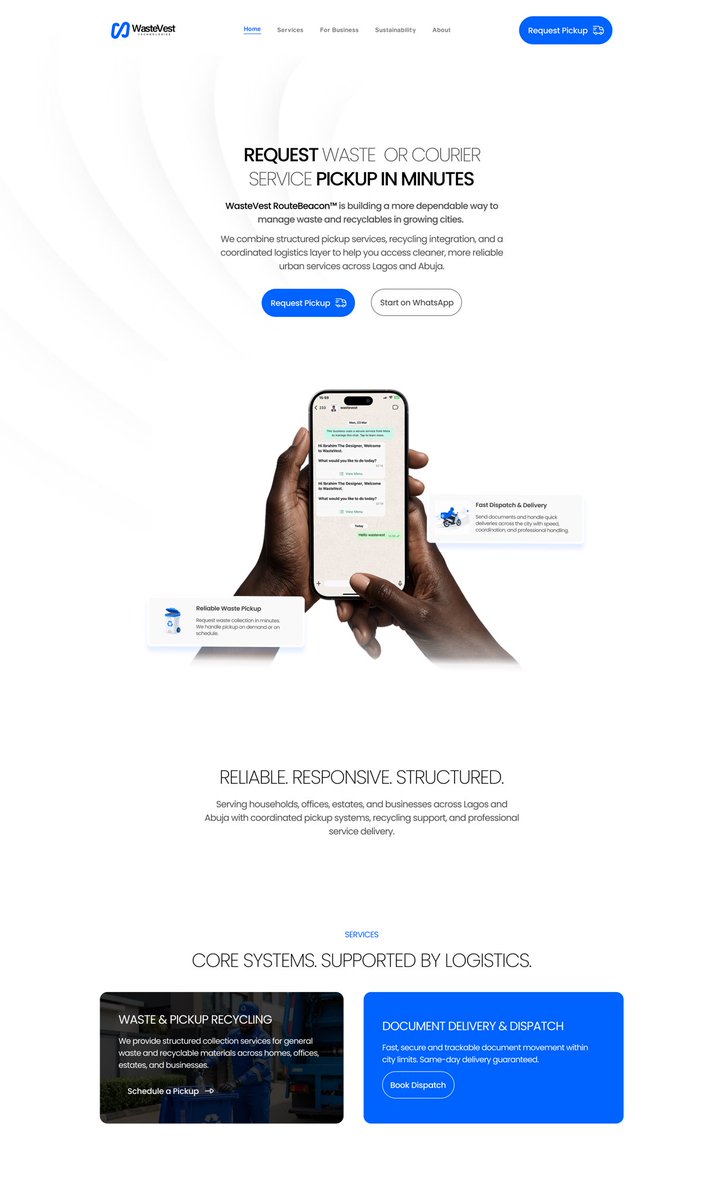
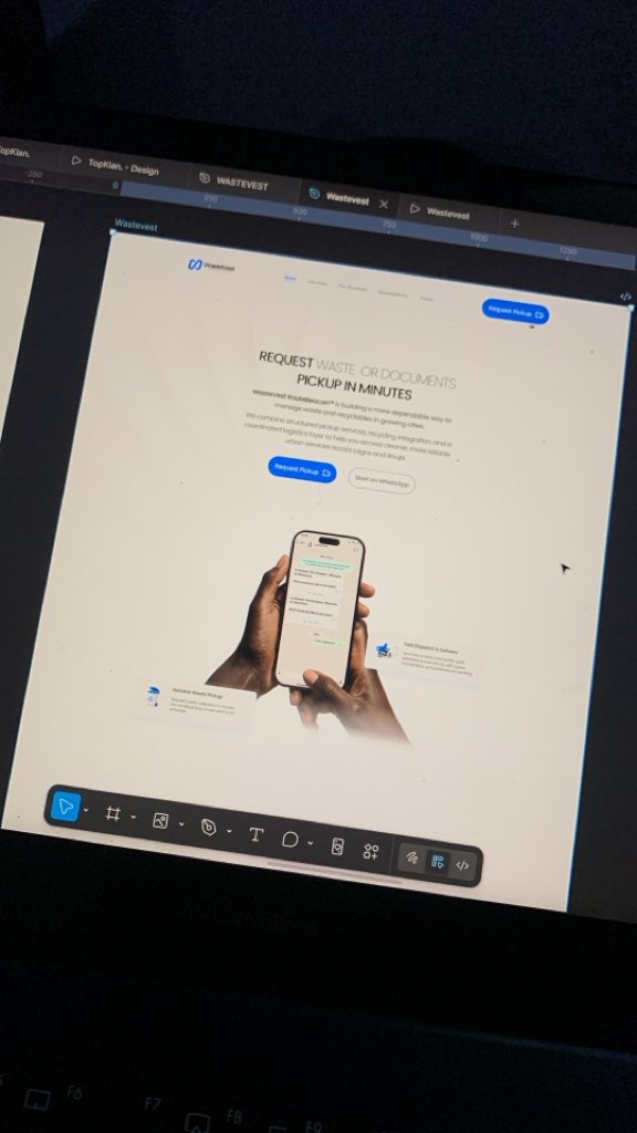
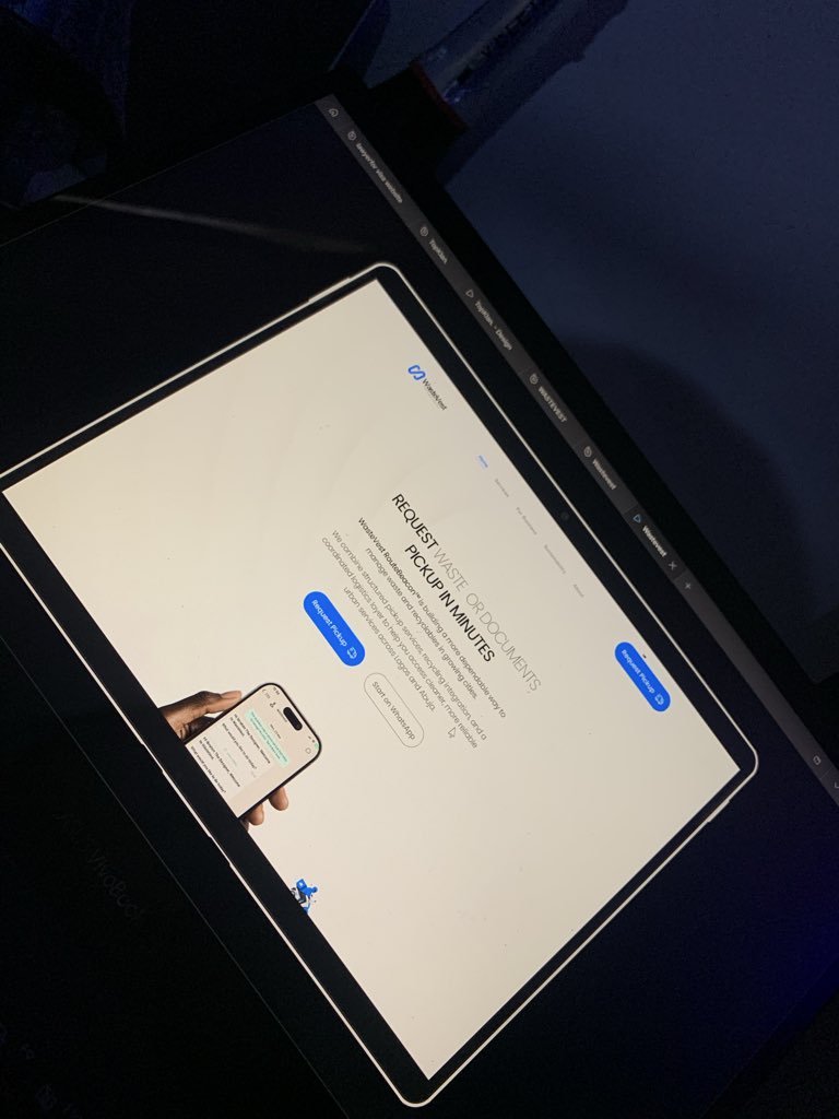
The hero section, much like a mobile onboarding experience, sets the tone. It answers one critical question within seconds:
“Is this product worth my time?”
My approach was intentional:
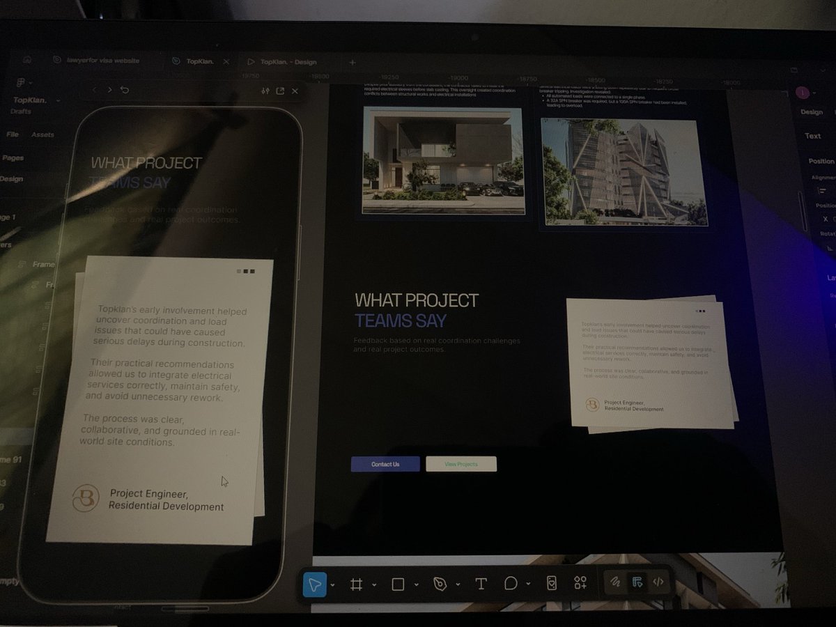
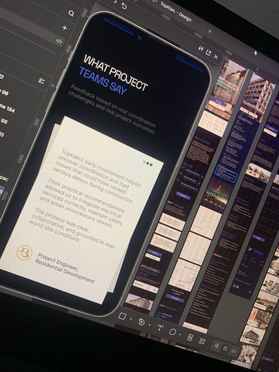
Instead of leading with a complex dashboard (as the AI-generated version did), I centered the experience around a mobile interface.
Why?
Because this isn’t an enterprise tool. It’s a consumer fintech product, used daily, primarily on mobile devices. Presenting a dashboard at first glance can feel dense and overwhelming, especially for new users.
So I designed for clarity and familiarity first:
- Show the product in its most natural environment (mobile)
- Reduce cognitive load at first glance
- Use subtle motion to guide attention, not distract
- Create an immediate sense of “I understand this”
The goal wasn’t just to make it look clean, it was to make the experience feel intuitive, accessible, and real from the first interaction.
Thanks to my gees @iam_bharry22 & @visualzbymike for their insightful feedback.
Still exploring this direction, but it’s been a great exercise in balancing AI-generated starting points with human-centered design thinking.
Open to feedback and conversations around designing with AI as an assistant.