Graci Digitals
53 posts

Graci Digitals
@GraciDigitals
A Graphics designer Photographer iCreate iBrand iHelp
가입일 Şubat 2025
65 팔로잉15 팔로워


There’s a level of Audacity and Shamelessness you need to have to succeed as someone trying to make money.
English
Yesterday, I taught beginner graphic design students typography and colour use in a memorable way.
Rice, beans, and pear weren’t random—they demonstrated the 60–30–10 colour rule: balance, hierarchy, and harmony in design.
Simple objects, powerful lesson.
#GraphicDesign


English


@amariagraphics This
Because it resonates with the mission
And yellow signifies hope, optimism, and warmth
As your fellow designer
I would definitely go from this
English


Creating something big for a brand✨
What are you working on?

English

Out of over 220 entries, your baby girl won a challenge from one of the biggest brands in Africa🥹💃🏽💃🏽💃🏽💃🏽
To think I didn’t want to do it o😭😭
I accept congratulations guys, this is big💃🏽💃🏽

English

Hello 21, you are here already
That young Mandy who started depressed and in 0 is sending greetings, He said he is proud of you.
Grateful to God for not just my life but for the many I have impacted
Happy Birthday Mandy 🎉
If you can see this, say a word of prayer for Mandy

English


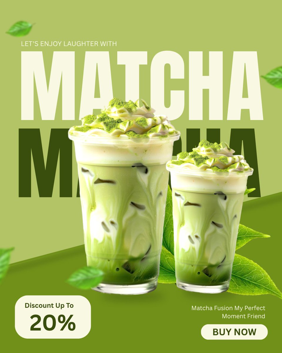
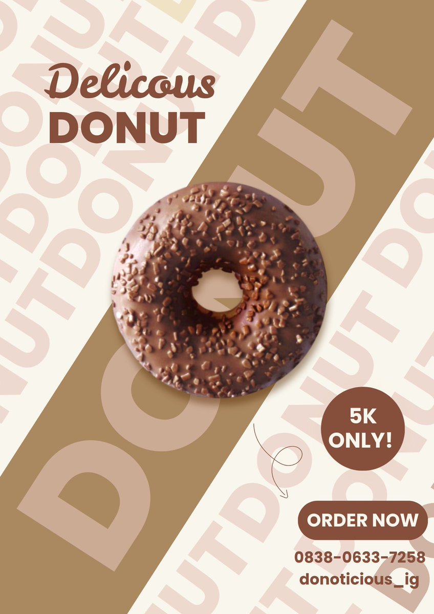
Design that looks good ≠ design that works.
Same flyer. Same product.
Green = fresh craving
Brown = rich craving
That’s strategy.
Which pulls you first — green or brown? 👇
#GraphicDesign #BrandStrategy

English


POST YOUR WORK!
POST YOUR WORK!
POST YOUR WORK!
English


Flat design—but with depth.
I’ve been experimenting with turning simple 2D assets into more immersive scenes using motion and layering.
This was a quick test.
Designers—how does the pacing feel? 👇
#DesignTwitter #MotionGraphics #gracidigitals
English
Your brand isn’t being ignored—
it’s just not being felt.
Colour isn’t decoration. It’s emotion.
If it doesn’t resonate, it confuses.
Confused brands don’t convert.
I help brands become memorable through intentional design.
#Branding #Design #Marketing

English