Chex
33.6K posts

Claude DESTROYS ChatGPT for building VSL funnels.
I put together the Claude VSL Prompt Vault (below)
I've booked 500+ calls for clients with VSL funnels. $1M generated.
These prompts are how I build every single one.
The same prompts behind every VSL funnel I've built since 2023.
Scripts, landing pages, offer stacks, everything.
This is the closest thing to hiring a funnel strategist for free.
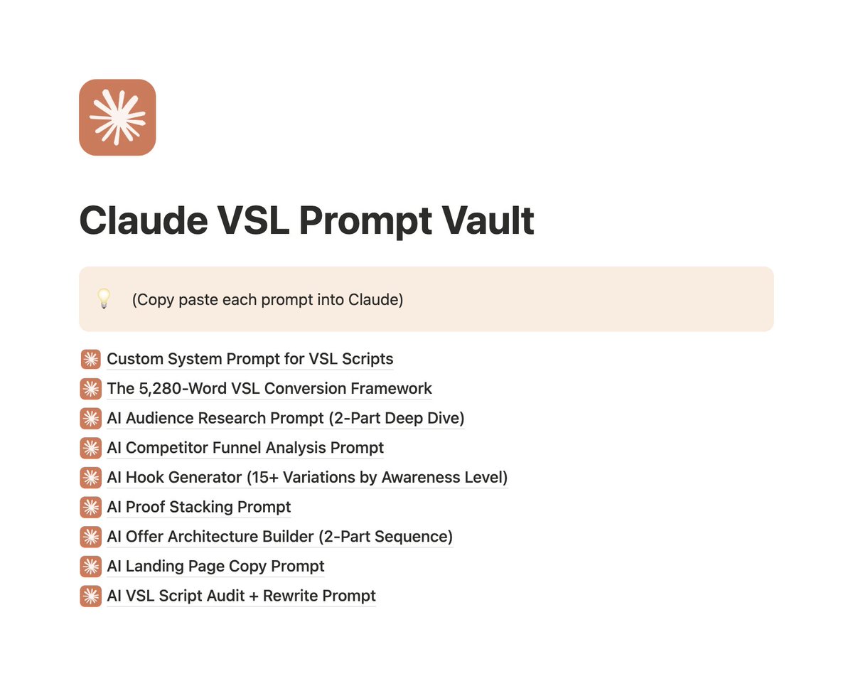
What's inside the vault:
→ Custom Claude System Prompt for VSL Scripts
→ The 5,280-Word VSL Conversion Framework
→ AI Audience Research Prompt (2-Part Deep Dive)
→ AI Competitor Funnel Analysis Prompt
→ AI Hook Generator (15+ Variations by Awareness Level)
→ AI Proof Stacking Prompt
→ AI Offer Architecture Builder (2-Part Sequence)
→ AI Landing Page Copy Prompt
→ AI VSL Script Audit + Rewrite Prompt
Want access to this vault?
→ Comment "CLAUDE"
→ Follow and I'll DM the vault!
English

$137k in 30 days
and it came from a page that looks like wholesome advice, not mass marketing
it’s framed like a grandmother exposing an ancient caribbean secret to lower cortisol
calm voice, garden background, “listen carefully” energy
every video feels organic and educational
but behind the scenes it’s a machine
same hook structure
same authority angle
different “ancient” story each time
herbs, rituals, morning drinks, stress resets
5–10 videos a day
different products plugged into the same narrative
the winners get scaled
the rest disappear
it’s not a creator
it’s an ai content engine dressed up as trust
rt + comment "cortisol" and i’ll send the breakdown
(follow for dm)
English

People dont like hearing it because we think everything is star wars and its the evil empire vs the rebels.
The descriptive truth is the United States is the single global hegemon. We can kill basically anybody we want whenever we want and nobody can do shit about it.
English


Just created a killer swipe file of 58 VSLs that are printing on Facebook rn (7-8+ figs).
This swipe has long VSLs, short, in-feed, on-lander, everything.
In over 12 of the best ecommerce niches.
If you want the swipe for free, comment "VSL" and I'll send it to you.
English

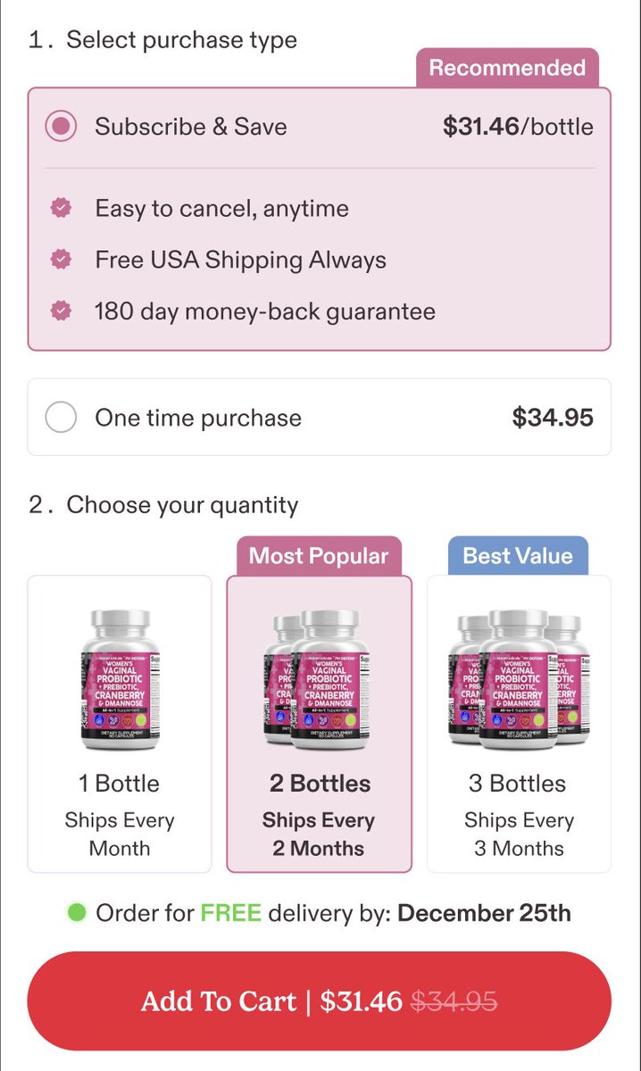
Subscribe & save should be the easiest conversion win for ecom brands, but most kill it with terrible PDP offer UX/UI.
You add a subscription option, offer a discount, and still see single purchase selected 80% of the time. The problem isn't your offer, it's how you're presenting it on the product page.
Here's what's actually stopping people from subscribing.
Buried subscription option. The subscribe & save selector is below the fold or tucked under the ATC button where nobody sees it. If it's not immediately visible next to bundles and variants, most people won't even know it exists.
Weak savings messaging. Your PDP shows "10% off" but doesn't translate that into actual dollars. People don't do maths. Show the exact savings: "Subscribe and save $8 per delivery." Make the value instantly clear.
No delivery frequency visibility. The subscription radio button exists but doesn't show delivery options until after selection. People need to see "Deliver every 30, 60, or 90 days" upfront so they can evaluate if this makes sense for their usage.
Missing trust signals. You're asking for commitment but there's no mention of cancellation policy right there on the PDP. Put "cancel or modify anytime" directly next to the subscription option. Reduce perceived risk or people won't click it.
Poor visual hierarchy. One-time purchase and subscription look identical, same size text, same styling. The option you want people to choose should be visually emphasised. Highlight the subscription block, show the savings badge, make it obviously the better deal.
Unclear commitment terms. Your subscription option doesn't explain what happens next. When will they be charged? How does delivery work? Can they skip orders? Without clarity, people default to the safer one-time purchase.
Terrible mobile UX. Subscription details are in tiny text, delivery frequency requires tapping to reveal, and the whole offer block is crammed and hard to interact with. Most traffic is mobile, so if your subscribe option isn't thumb-friendly and immediately scannable, you're losing conversions.
Most brands treat subscriptions as an afterthought toggle instead of designing the PDP to guide people toward it. Your job is to make subscribe & save feel like the obvious choice, not something people have to hunt for or calculate.
Visible placement, clear dollar savings, upfront delivery options, trust signals, visual emphasis. When these are in place on your PDP, subs become the default instead of the option people ignore.


English

Traditional product research is F*CKED
Everyone’s scrolling TikTok and copying whatever shows up on their feed.
That’s not research — that’s spiritually gambling.
This year alone, I uncovered multiple winners using a single AI workflow that cuts the research process down to minutes instead of weeks.
Hundreds of tests.
Hundreds of thousands in spend.
Months of refining.
Now the system is dialed in.
This AI framework helps you:
Pinpoint problems where buyers will spend aggressively
Filter for products with the perfect $50–$180 price range
Validate niche demand using behavioral traffic patterns, not vibes
Eliminate fulfillment headaches before they happen
Identify “algorithm friendly” products that scale without creative stress
Spot market saturation curves so you don’t enter too early or too late
Confirm buying urgency using engagement signals most people never look at
And yes — it works with Deep Research.
In fact, it gets even better when you pair the two.
It’s the exact framework high-spend brands use to consistently pull new winners without relying on trends or guesswork.
You don’t need more ideas to scale, you need the team to execute faster.
Comment “TEAM” and I’ll send you a full video breakdown on how to build a bada*s team of high performers! 👇
(must be connected)
English


Lets grow together this thursday evening
@rezman037
@surambili
@MwangiS10100
@paulomkenya
@DestroRazii
@MwangiS10100
@aroonnyongesa
@D_creator_ @solanaltd
@HarrysonOjiambo
@The_O_Austine
@realsniper1647
@Eartherist
@osoro_mabuka
@Mathias_don001
@westinvested
@BensonMunga8
English