고정된 트윗
𝑭𝑨𝑪𝑬
734 posts

@ZachCohenFB Why are the Texans using their secondary logo? This makes it possible that the new yellow LA logo may not be Rams primary.
English
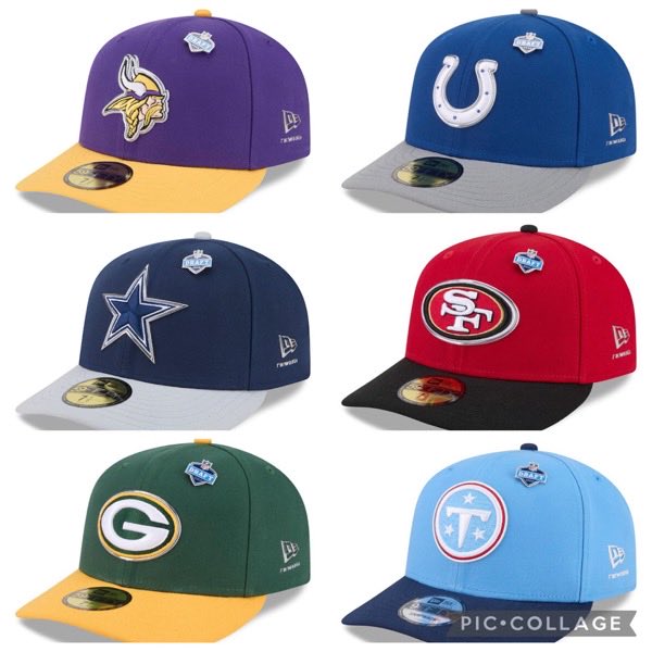
All the 2026 NFL Draft draft hats (except the Rams 👀) have been officially posted for sale


Zach Cohen@ZachCohenFB
Here are 24 of the 2026 NFL Draft hats The Titans were reportedly the only hat not available, while the other 7 were not leaked to the public
English
I really hope Rams don’t make this official. This looks awful tbh…gradient absolutely works on the logo…but that’s it.
Da'Mon Jackson@RamsDEJ
Saw this @RamsNFL @SoFiStadium one of New Logos @lids .
English
I beg all graphic designers to stop using this number font!
Ben@benandersondsgn
Back with the Rams. I actually think the Rams could make gradients their thing if they use them more subtly than they currently do, so I tried that here. Moving more towards their classic looks is definitely in their best interest.
English
@AllenSales Rivalry jersey number font is the same as our primaries. It feels too soft. Getting rid of the gradient made a very small different in my opinion.
What do you like about them?
English

@faceoffoos Whas wrong woth the number font? Its the same one on the rivalry jersey.
English
Can we stop using this number font on these mockups?
Allen Sales@AllenSales
Rams rumored to be using the rivalry jersey as the base for the new uniforms. Here’s what they could look like. Tyler Bearde took the liberty of getting rid of the highlighter yellow and brought back the traditional LA RAM sunset yellow. Tyler also threw in a throwback look as well. #RamsHouse
English
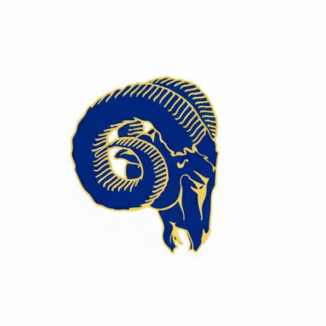
If the solid yellow LA logo is in fact our new logo, I would prefer one of these color ways for the skull if it’s going to be color-dominant. The white skull would make less sense unless we use our original LA gradient logo.
Thoughts on what aesthetically makes sense? #RamsHouse
English

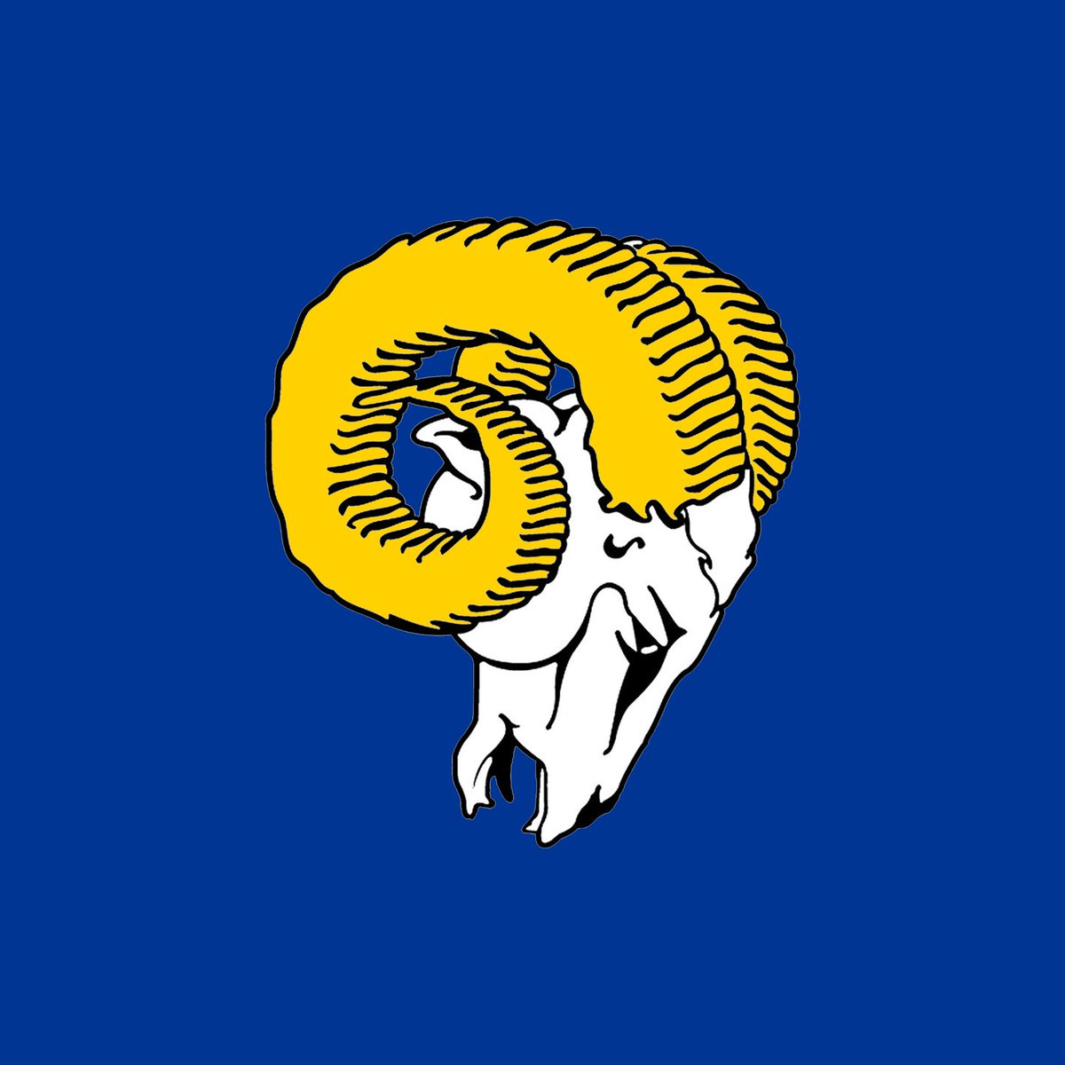
These are the two best Rams logos of all-time. 1951 to 2020. These should be the primaries for the Los Angeles Rams!!! #RamsHouse

English


@LAtahncritic Fans don’t understand branding and it shows. Whether we like the logo or not, they look like professional logos.
These mockups look like something you put on your folder in middle school.
English
@faceoffoos It's wild to me.
Like, I think the jerseys could use some minor tweaks, but some of these concepts that people drop are just flat out horrible.
English
I'm begging the Rams to just drop the rebrand already, because I can't take anymore of these trash fan edits.
jay__D@ProminentKingz
This would have been fucken PERFECT. Combining 2 eras would have been a good way to shut up the old heads in the fanbase that want old stuff (AKA ME)
English
I’m not sure I’m convinced. This just looks like a typical hat variation.
If these are supposed to be the official draft hats, then I understand the speculation. But I can’t see this being used as a primary or secondary logo.
THOUGHTS?
Zach Cohen@ZachCohenFB
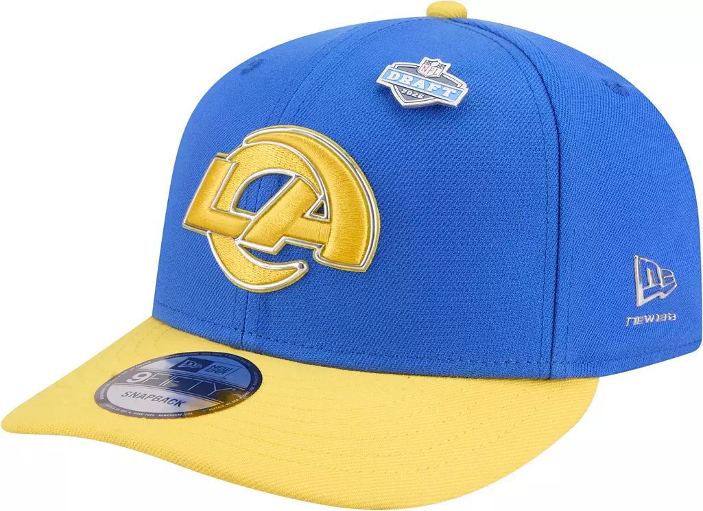
Confirmed & verified, just as I’ve been speculating for weeks: the Rams are ditching the gradient in their primary logo
English
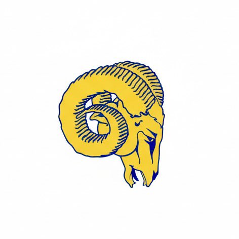
The only other version of the LA logo that makes sense would be this colorway. I don’t see a solid-color primary logo when it comes to branding.
It works with a white outline. It’s the only way it makes sense with a new skull logo assuming it would be white with yellow horns.


English
To add to this point:
If Rams fans expect a skull logo to be revealed, it would make 0 sense for the LA logo to be one solid color, assuming the skull logo is multiple colors. The logos wouldn’t match aesthetically so not sure why a solid colored primary logo is even a thought.
English
Rams would be the only team in the NFL with a solid color logo as a primary. Not sure I like this either. Think about how the primary logos would look on merch…not sure this works.
Thoughts everyone?
Bighorn Rah 🤠🐏 (The man in the hat)@WTRrah
I have a source telling me this will be one of the Rams logos. No word on if it’s primary or secondary.
English
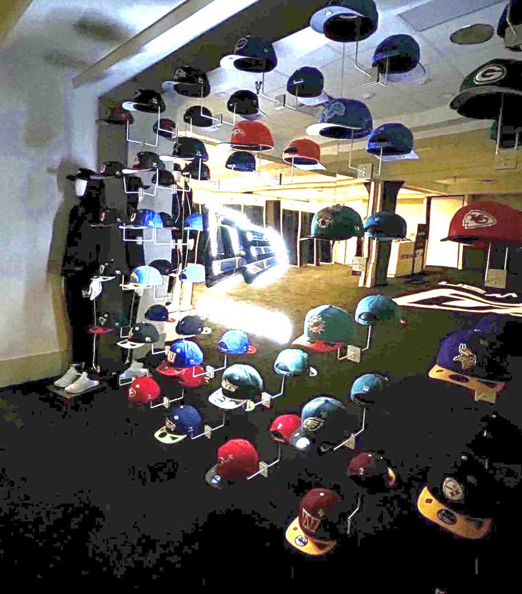
Only 3 teams are missing in the photo:
- Chicago Bears (I suspect were cut off on the top right as the hats are in alphabetical order)
- Los Angeles Rams (rumored to unveil new logo)
- Tennessee Titans (rumored to unveil a rebrand)
This is not a coincidence.
Cc: @ZachCohenFB
NFL Fashion Advice@fashion_nfl
2026 NFL Draft hats in the wild.
English