Sabitlenmiş Tweet

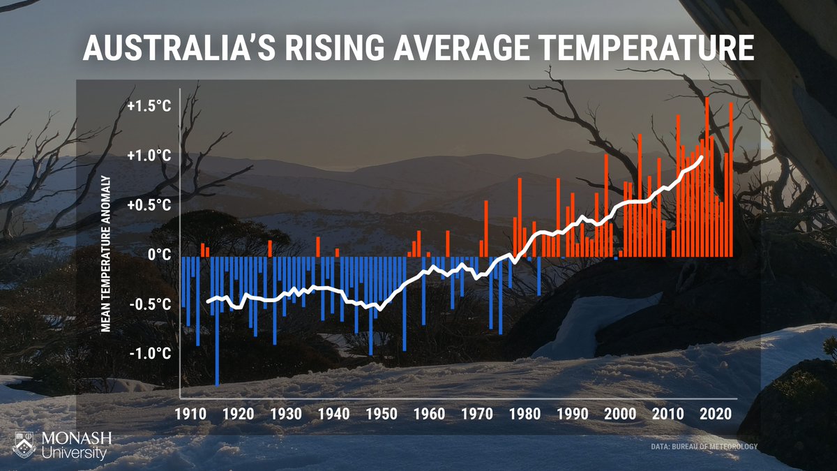
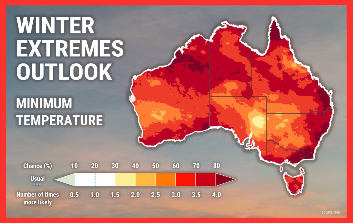
Data visualisation is a key factor in communicating climate change as it helps people better understand and interact with the science.
This is why we strive to provide our weather presenters and readers with reliable data that is visualised in a simple and clear way 📈📊
Monash University@MonashUni
Good communication is all about clarity. 🗣 That's why the team at @monashclicomm produces simple, long-term climate graphics for Australian weather presenters. Read more 📖: ow.ly/ob9l50NpHWy #MonashUni #ChangeIt
English