Sabitlenmiş Tweet

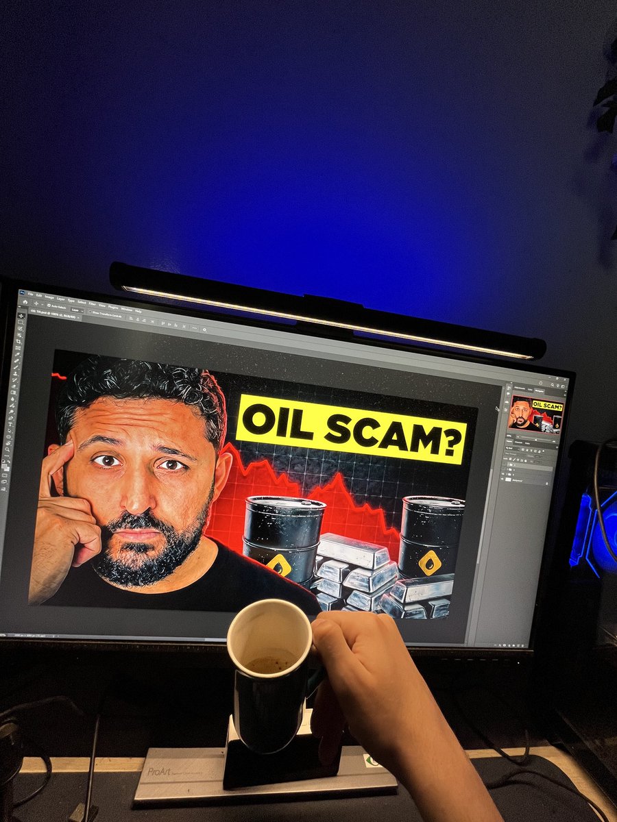
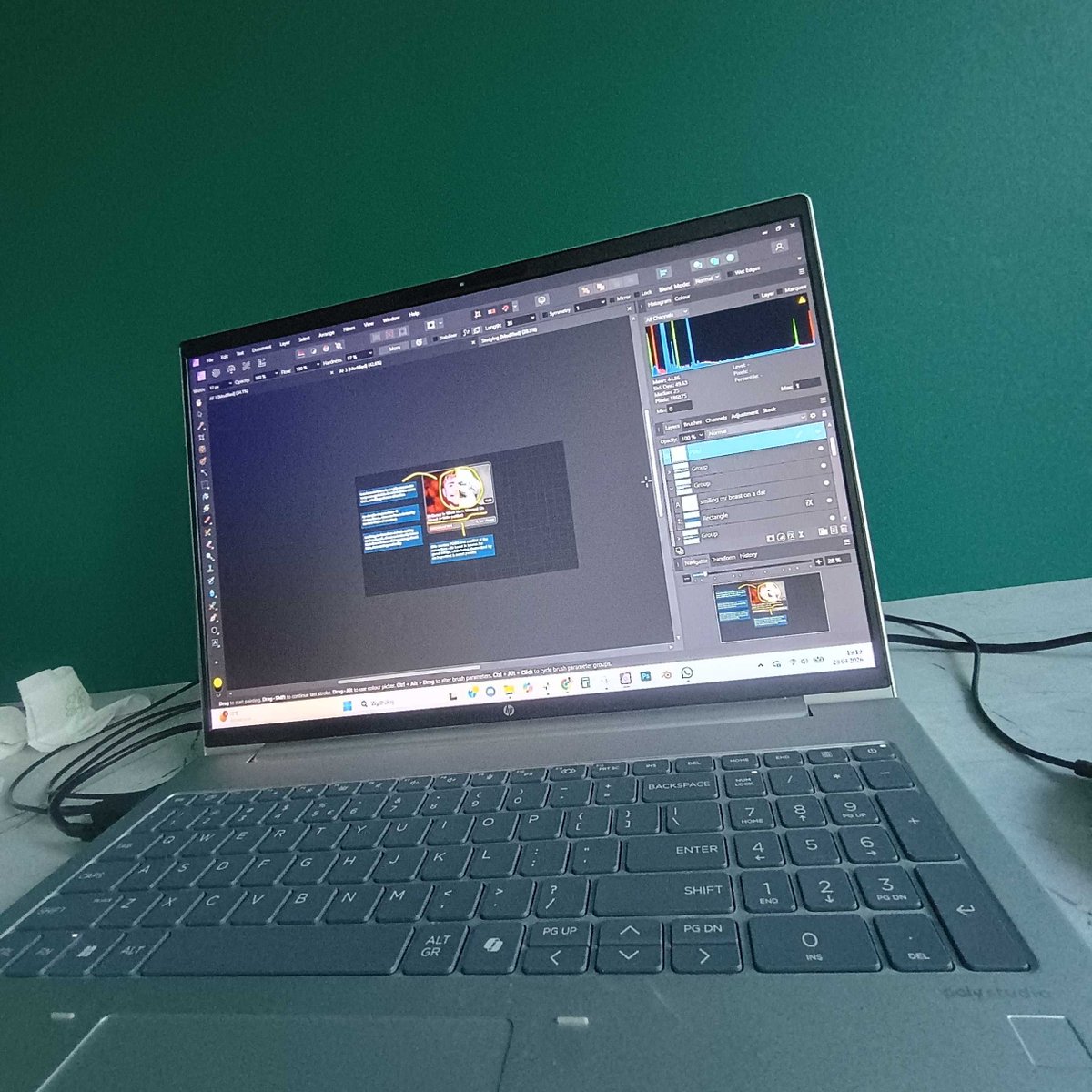
the recent client outlier with my work on it.
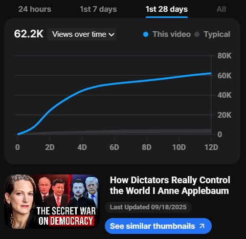
Brad Carr (43.4K) ft. Anne Applebaum
not acting like the DM's are open ;))

English
Oskar Studnicki
3.8K posts

@OSQARx
Thumbnail Designer ✝️ | +1M clicks around @hereus_io, @champtgram, @thewadehouston, @HensDBD | DM's open

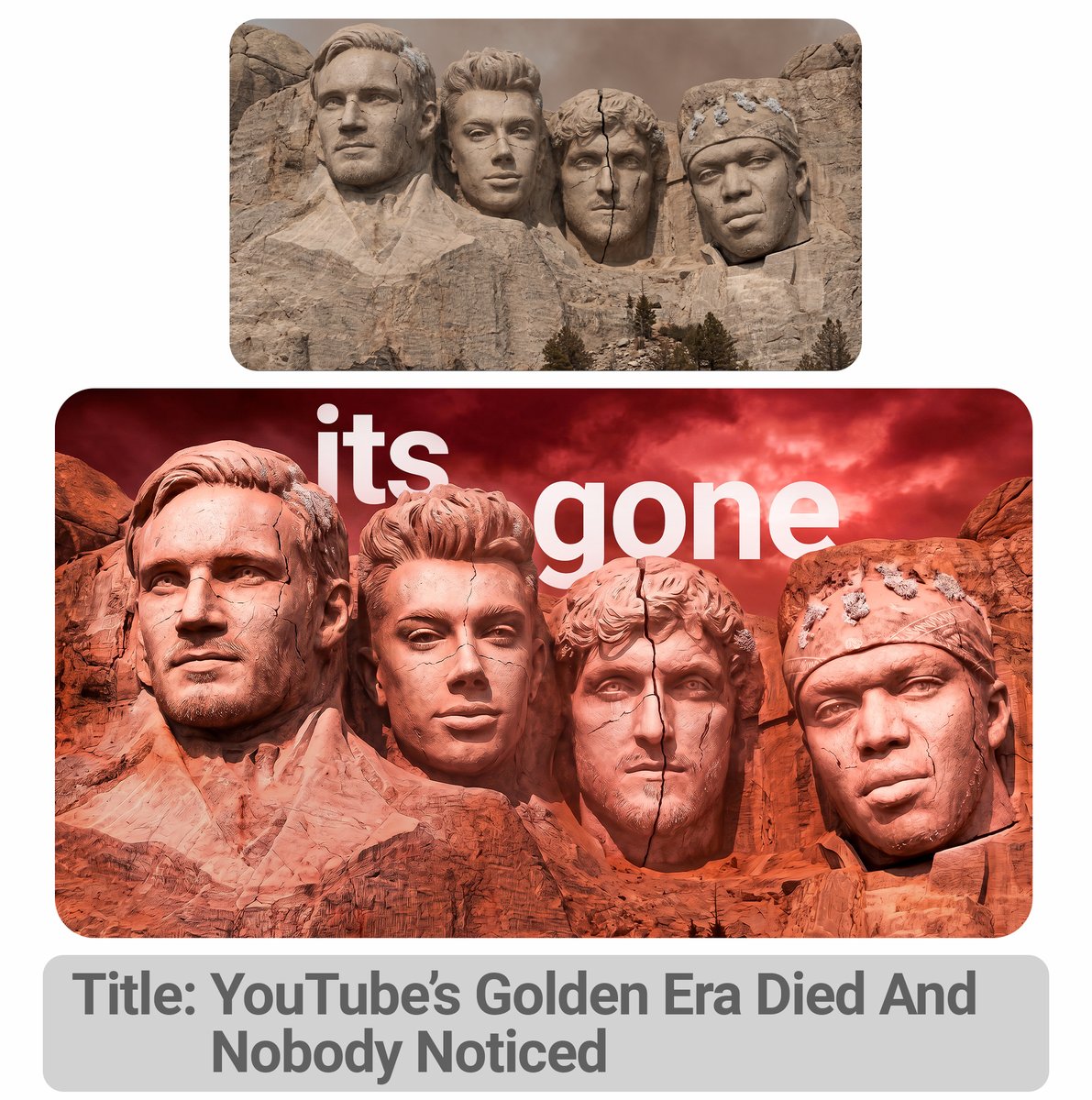

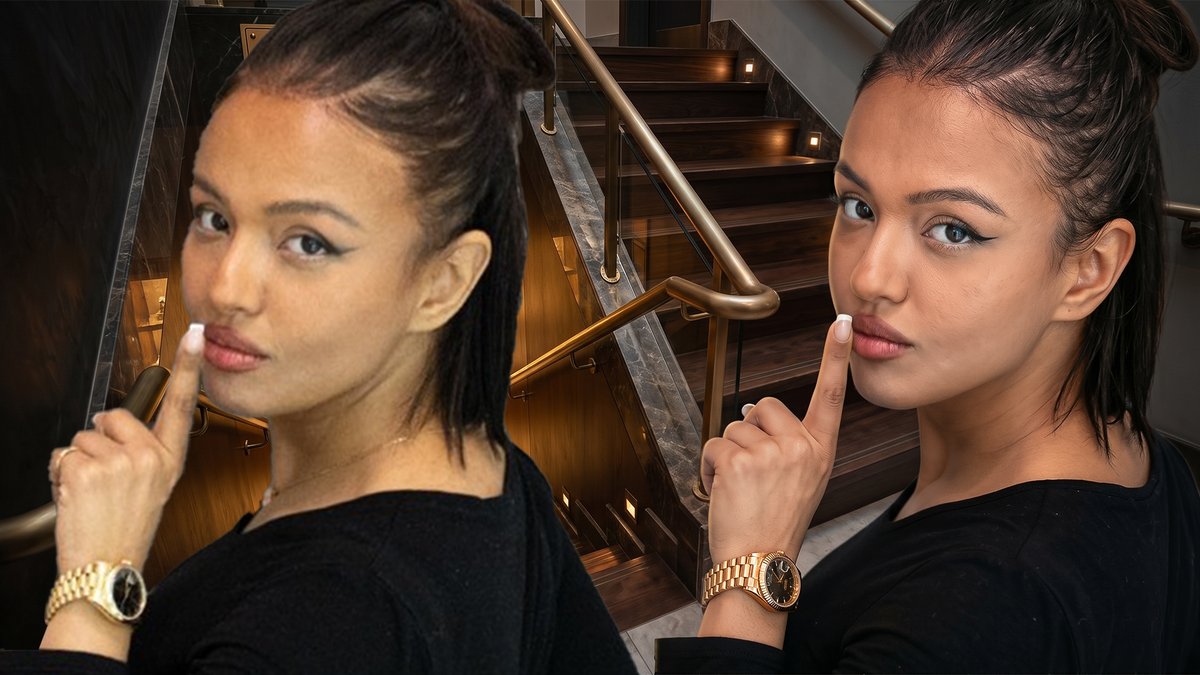


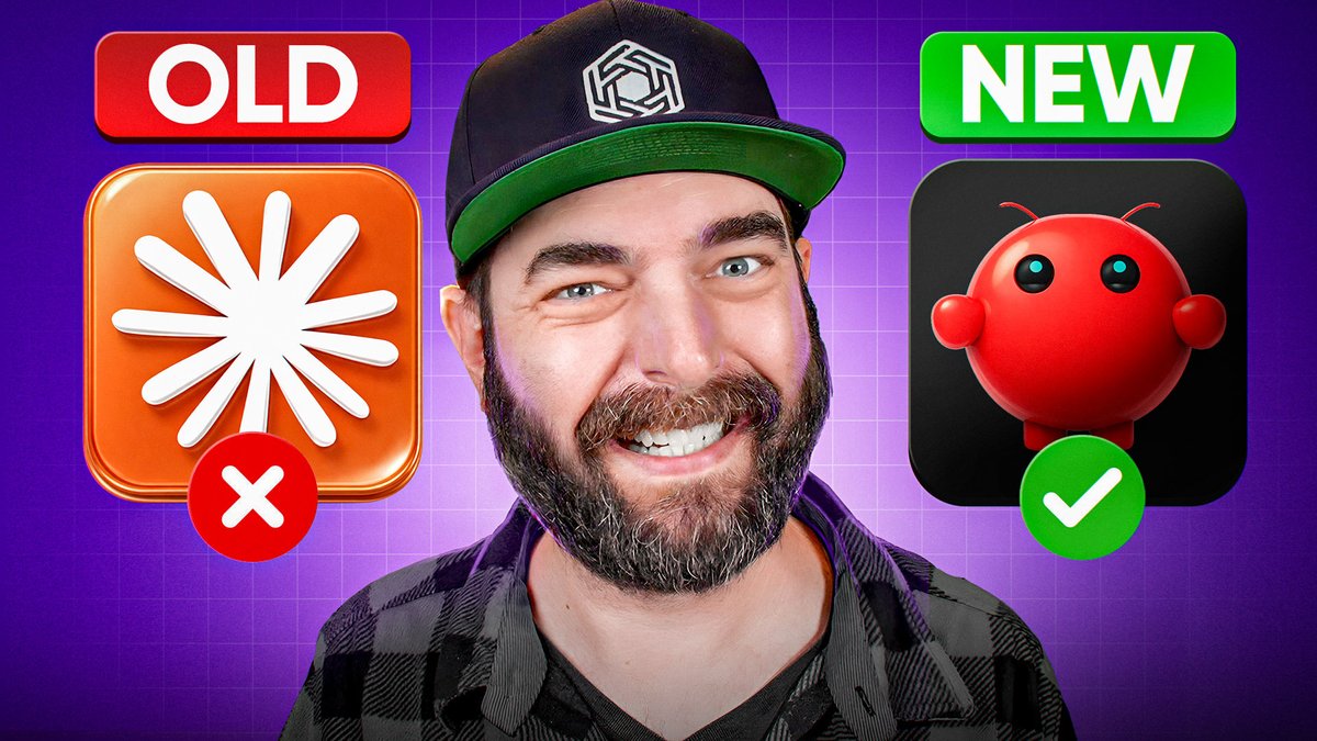


Just uploaded my favorite video to date Search "pngtyler" on youtube to watch 🫡