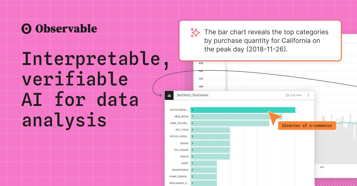
Verifiable, spatial AI can help you get you from big, complex data to trusted insights — faster. Learn about Observable's approach to AI 👉 buff.ly/tN3Z6Rq
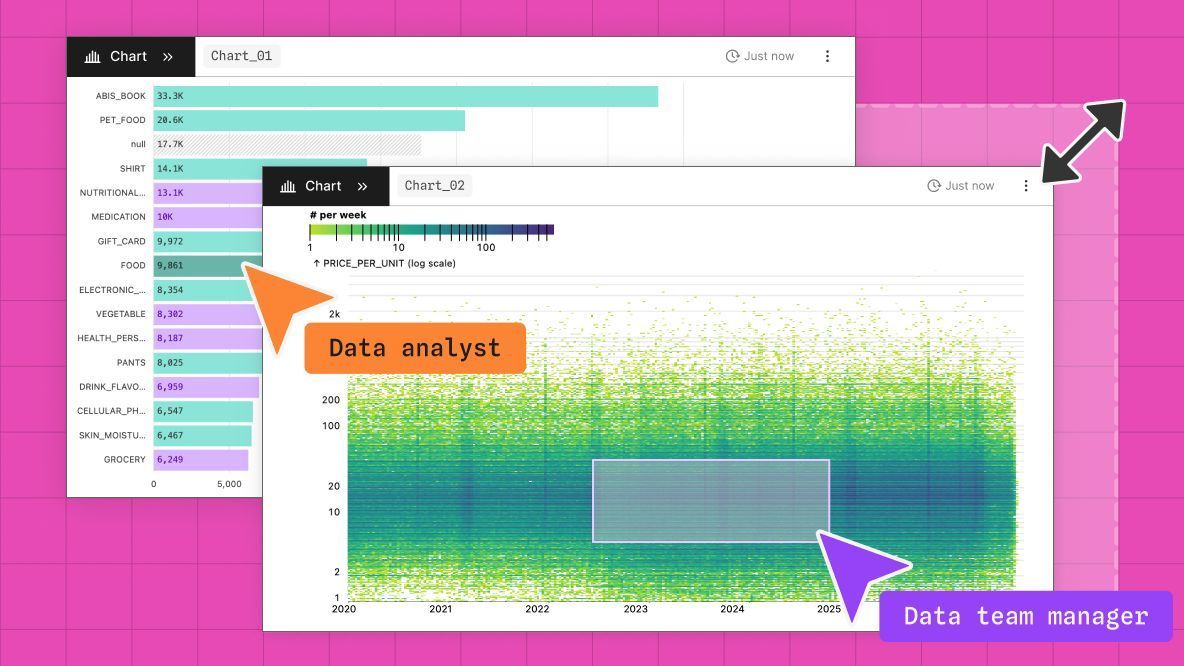
At Observable, we think rich, interactive charts shouldn’t be limited to expert developers. That’s why the Observable Canvases chart library includes advanced features like visual filtering, responsiveness, & extreme value handling by default. Learn more 👉buff.ly/NpzeXwH
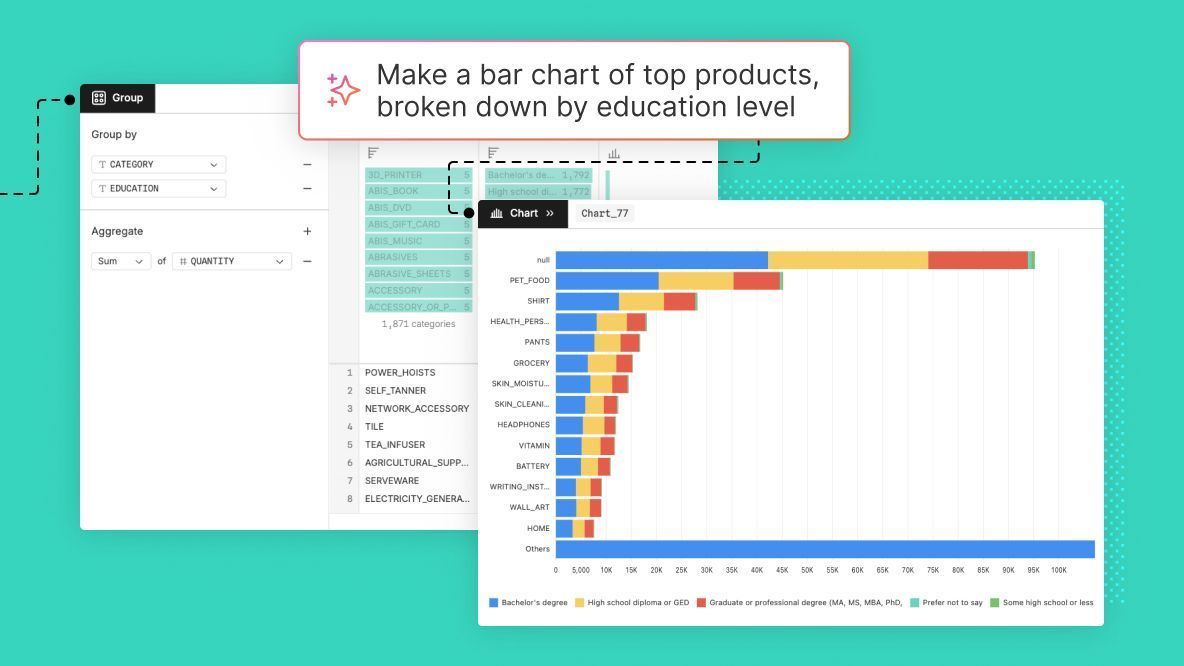
🚀 Now in Observable Canvases: AI-powered text-to-SQL, right in the SQL node. Generate and edit queries that you can inspect with clear visual diffs, so there's never a doubt about what's happening with your code. Learn more and see the updates in action: buff.ly/K2B5gOm
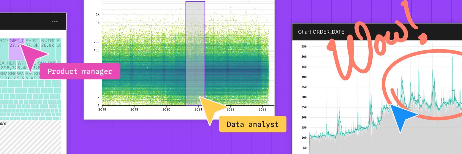
Visual data exploration can uncover patterns and questions in business data. But big data can bring charts to a crawl, which disincentivizes exploration and hinders insight discovery. Learn how we deliver rich, performant charts in Observable Canvases 👉 buff.ly/dAQbH1L
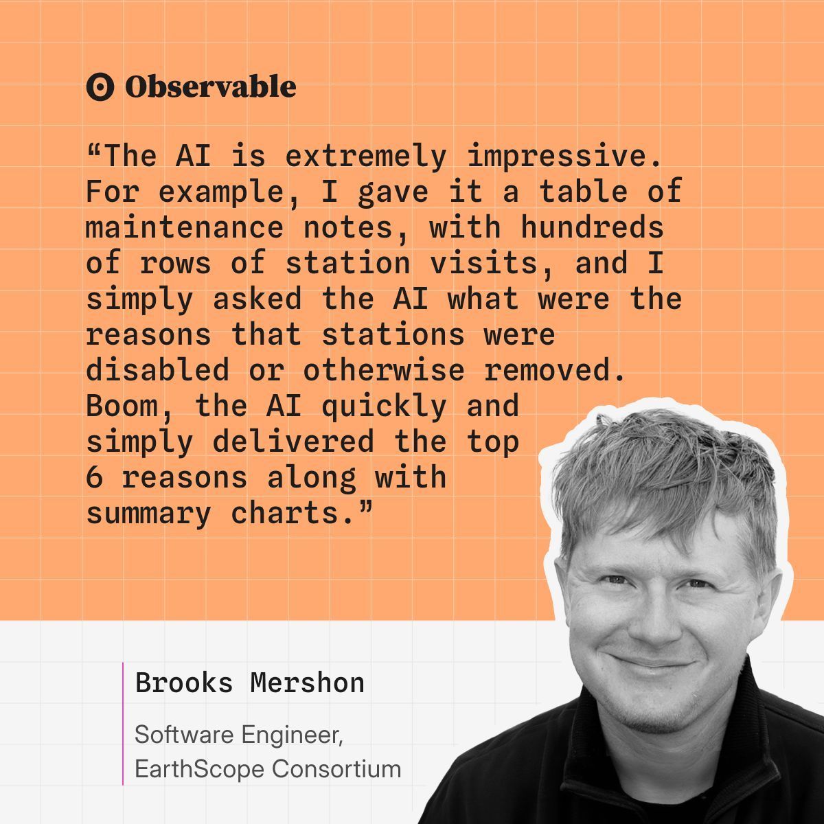
Agropatterns relies on AI to process & uncover insights in crop monitoring data. When small mistakes can be catastrophic for crop health, trust in AI outputs is critical. Learn how we keep analysts confident and in control with verifiable AI in Observable: buff.ly/tSofCVa
Features that define modern, high-impact data visualizations — like responsiveness, visual filtering, and extreme value handling — are often hard to build from scratch. In Observable Canvases, we’re democratizing advanced, interactive charts. Learn how👇 buff.ly/NpzeXwH
We sat down with Observable Data Visualization Engineer Fil Rivière to talk all about maps. Read our interview for Fil's perspective on what makes maps meaningful, where spatial data viz is headed, and why he's hoping for a "slow cartography movement." buff.ly/9VdsetY
The nature of data analysis and visualization is changing rapidly, and data teams are being asked to deliver more insights, faster than ever. Register now for a webinar on Feb 4 at 1PM ET / 10AM PT unpacking these changes, and how your data team can adapt: buff.ly/FfMhC0U
AI can fast-track data analysis and visualization, but only if you can trust its outputs. In Observable Canvases, AI is fully verifiable every step of the way. Learn more: buff.ly/XscWHgt
AI is reshaping how we work with data. But, as Ben Welsh (Data Editor, Reuters) shared in our December webinar, AI won’t replace the creativity behind great graphics anytime soon.
Watch the recording for more insights from top data journalists: buff.ly/Y8ZrG0a
We ❤️ this Observable Notebook from Ricky Reusser exploring yoga class attendance, with calendars and charts made in Plot! Read Ricky's reflections, and see how they use a notebook import to repurpose an existing Plot component: buff.ly/nRync53
Happy 2026 from the Observable team!
With the start of the new year, we're reminded that time flies and there's always a need to understand how things change as it does. Explore 8 charts that clarify patterns, reveal anomalies, and help you track metrics with time series data👇
✨ As 2025 comes to a close, we’re celebrating a big year at Observable — new product launches, inspiring events, and innovative work from our community.
Read our 2025 Year in Review for highlights, and to hear what we’re excited about in 2026 🎉 buff.ly/vZOqyrq
🥧 We're not saying you're sick of pie (charts) these days, but there are other appetizing ways to visualize parts of a whole. In Observable Canvases, it's just a few clicks to make advanced, interactive charts like treemaps, circle packing charts, & more: buff.ly/pI8mYII
🔎 Exploratory data analysis (EDA) is essential, but it can also be time consuming.
Learn how our transparent, verifiable AI speeds up EDA in Observable Canvases by quickly profiling data, automating data wrangling, & prototyping charts: buff.ly/QKtxm8T
✨ Observable’s Year in Review ✨
2025 was a big year at Observable, with new launches like Observable Canvases & Notebooks 2.0, inspiring events, & incredible work from the community. As we head into 2026, here's a look back at highlights from the year: buff.ly/vZOqyrq
Before diving headfirst into a new dataset, Jared Whalen (The Pudding) reminds us to first ask why the data exists, & how it’s already been used.
Catch more expert insights from top data journalists in our recent “Storytelling with Graphics” webinar 👉 buff.ly/6PmuD06
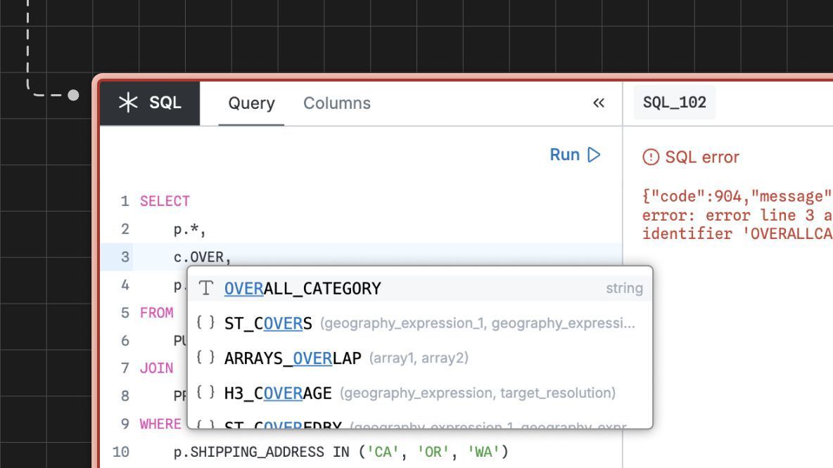
🚀 We recently rolled out improvements to the SQL node in Observable Canvases. Learn how dialect-aware autocompletion, better error handling, and UI refinements make it easier to write and iterate on custom queries, plus see what's coming in 2026: buff.ly/efkdQGr
Did you miss last week’s webinar featuring leading data journalists from Reuters, Axios, and The Pudding?
Check out our recap blog post for key takeaways from the discussion, and a behind-the-scenes look into impactful graphics by our panelists: buff.ly/cM9Yxwv
In last week's Storytelling with Graphics webinar, we went behind the scenes with leading data journalists to learn how they transform messy datasets into informative and impactful stories. Catch the full discussion here: buff.ly/6PmuD06