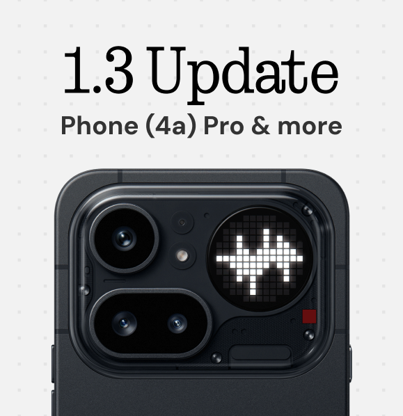
Glyph Museum v1.3 is out 🏛️
📱 Nothing Phone (4a) Pro fully supported
🎞️ New editor features + camera import
🔊 New volume-reactive glyph effect
🗓️ Community events are here
What's new 🧵👇
Performance, battery and display are solid as usual. Especially the display looks really good.
Nothing OS also feels much more mature now, Overall, Nothing feels more confident this time, positioning these phones to appeal to a much wider audience than before.
Essential Apps Drawer.
The Essential Apps section in the widget drawer now highlights recommended apps. Discover and add them to your home screen instantly, without opening Playground.
Phone (4a) represents Nothing at its finest.
- By far Nothing's best design to date
- Glyph Bar 🟥
- Great performance for typical daily usage
- Mostly good camera experience
- Nothing OS 4.1 is a joy to use
- Starting at £349
Full review 🔜 Feel free to drop your questions ⬇️
The fact that @YouTube knows what icon pack is on my device when the screen was shown for a few seconds throughout the entire video is shockingly impressive.
And a lil scary.
@raonehere And that's great.
I have no problem with Headphone (1) or ear (3) designs.
Those are iconic products.
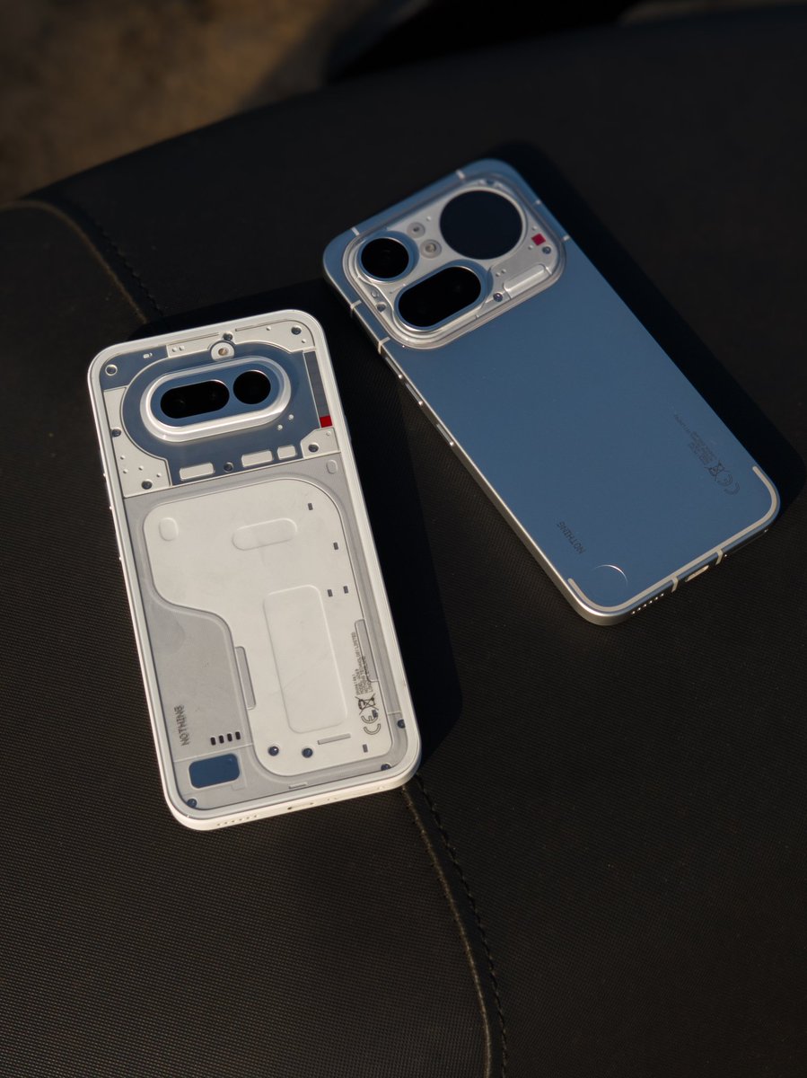
They failed the (4a) Pro design, and that's ok too. It happens.
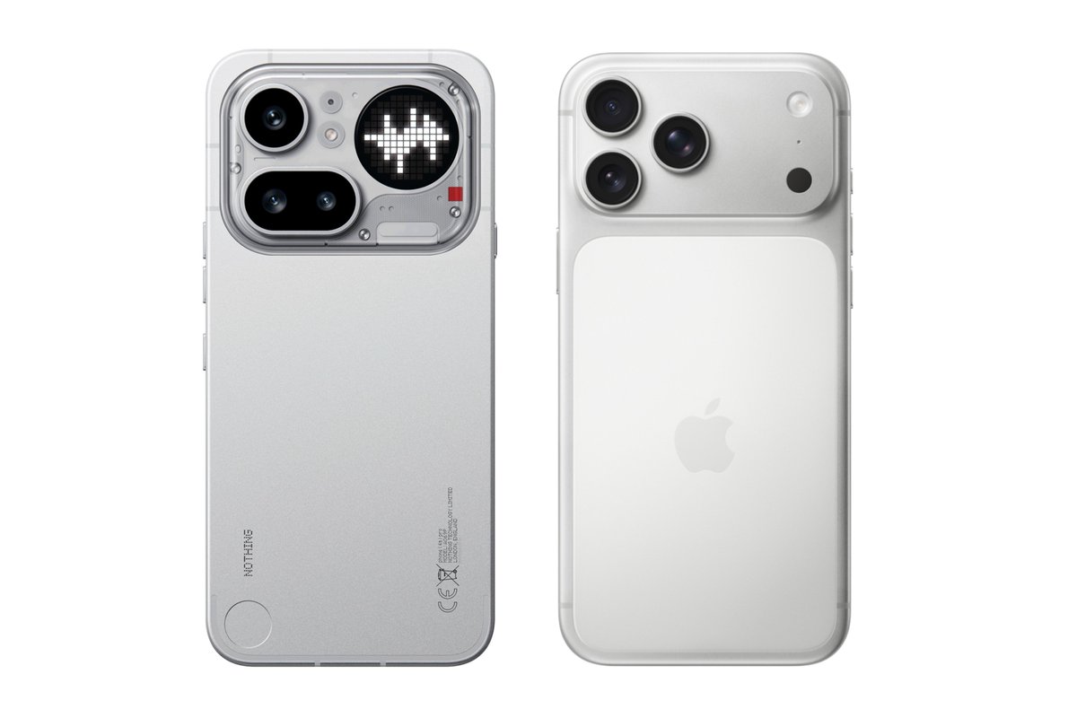
There is no competition design-wise.
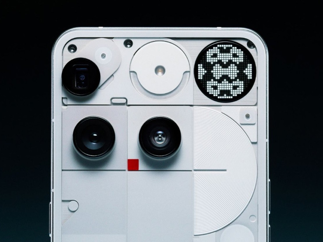
I’ll try to keep it as simple as possible:
1. The new rectangular window creates a top-heavy visual imbalance for any phone that has it.
2. To balance this slight "heaviness," Apple added that tone-on-tone rectangular shape that visually re-equilibrates everything.
And it works, of course.
3. Apple was able to managed this issue because they started from a "light/empty" window, whereas Nothing did the opposite, fueling the problem by using one that is:
a. Larger
b. Way more cluttered
4. There is a total lack of any visual counterweight.
[bonus] 5. Finally, I can’t wrap my head around the inconsistency between the corner radii of the upper edges. A basic detail that Apple (and anyone else) polished, while Nothing neglected it, making that window look completely out of place.
This is not an "alternative" design.
This is just bad design, plain and simple.
A defeat across the board.