Meditations in Color

381 posts

Meditations in Color banner
Meditations in Color

Meditations in Color

@MeditateColor

An archive of the color of art history. A drawing system that builds new work from its palettes. By @Pixel0Symphony

San Francisco, CA Присоединился Mart 2026
1 Подписки1.8K Подписчики
Закреплённый твит
Meditations in Color
Meditations in Color@MeditateColor·
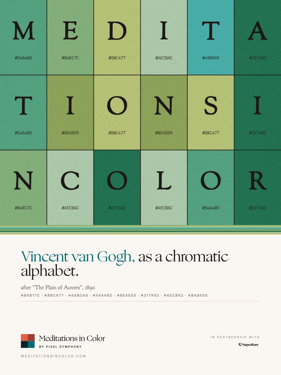
Introducing Meditations in Color. An archive of the color of art history. A drawing system that builds new work from its palettes. Visit meditationsincolor.com
Meditations in Color tweet media
English
4
17
70
6.8K
Meditations in Color
Meditations in Color@MeditateColor·
Peter Apian, Astronomicum Caesareum. 1540. The book contains some of the earliest interactive diagrams ever published. Its colored volvelles could be rotated to perform astronomical calculations. Here, color is functional rather than decorative, separating astronomical cycles, zodiac signs, calendars, and planetary paths.
Meditations in Color tweet mediaMeditations in Color tweet mediaMeditations in Color tweet mediaMeditations in Color tweet media
English
2
24
113
2.9K
Meditations in Color
Meditations in Color@MeditateColor·
Shin-Bijutsukai (New Oceans of Art). 1902-06. Published for designers and craftspeople, Shin-Bijutsukai transformed the traditional pattern book into a showcase for modern color. Flat, high-contrast palettes became as important as the motifs themselves.
Meditations in Color tweet mediaMeditations in Color tweet mediaMeditations in Color tweet mediaMeditations in Color tweet media
English
0
14
50
1.6K
Meditations in Color
Meditations in Color@MeditateColor·
Wassily Kandinsky, Farbstudie mit Rauten. 1913. Watercolor and ink on paper.
Meditations in Color tweet media
English
1
7
45
792
Meditations in Color
Meditations in Color@MeditateColor·
The Colors of the Venetian Renaissance. Venice became synonymous with colorito, the belief that color could shape form as powerfully as drawing. These palette studies in high contrast reveal both the shared chromatic language and the distinct signatures of its greatest painters.
Meditations in Color tweet mediaMeditations in Color tweet mediaMeditations in Color tweet mediaMeditations in Color tweet media
English
1
11
70
1.9K
Meditations in Color
Meditations in Color@MeditateColor·
Loretta Pettway Bennett, Forever (For Old Lady Sally). 2006. Bennett first arranged pieces of recycled clothing by color building a quilt, then transferred the design through etching, preserving the textures, seams, and color shifts of the original fabric.
Meditations in Color tweet media
English
0
10
42
1.2K
Meditations in Color
Meditations in Color@MeditateColor·
David Hockney's Color Constant. The people change, but the palette barely does. Across the Normandy portraits, Hockney repeatedly stages his sitters against luminous blue interiors, creating a controlled color environment where personality becomes the strongest variable.
Meditations in Color tweet media
English
1
12
51
1.1K
Meditations in Color
Meditations in Color@MeditateColor·
Claude Monet: Waters as Palettes. Monet's water paintings are really paintings of light. Compare them side by side and the palette follows the atmosphere, from cool ceruleans and greens to glowing oranges and violets at dusk.
Meditations in Color tweet mediaMeditations in Color tweet mediaMeditations in Color tweet mediaMeditations in Color tweet media
English
2
7
55
1.6K
Meditations in Color
Meditations in Color@MeditateColor·
The Colors of Hilma af Klint. A recurring chromatic vocabulary built around blue, yellow, pink, white, and black. For af Klint, color was not merely compositional but symbolic.
Meditations in Color tweet mediaMeditations in Color tweet mediaMeditations in Color tweet mediaMeditations in Color tweet media
English
3
45
254
5.6K
Meditations in Color
Meditations in Color@MeditateColor·
Robert Delaunay, Hélice. 1923. Influenced by Michel-Eugène Chevreul’s theories of simultaneous contrast, Delaunay treated color as an active force. The work’s movement emerges from the interaction between neighboring hues rather than from line alone.
Meditations in Color tweet media
English
0
10
48
1.3K
Meditations in Color
Meditations in Color@MeditateColor·
Color as Subject. In 1917, Olga Rozanova’s Green Stripe reduced painting to little more than a single chromatic event. Together, these works show how the Russian avant-garde transformed color from description into structure, making it the architecture of the painting itself.
Meditations in Color tweet mediaMeditations in Color tweet mediaMeditations in Color tweet mediaMeditations in Color tweet media
English
0
9
40
1.3K
Meditations in Color
Meditations in Color@MeditateColor·
Klimt and Schiele: Vienna Lost Them Both in the Same Year. Gustav Klimt recognized Egon Schiele's talent early, introducing him to patrons, models, and collectors while the younger artist developed a radically different visual language. Mentor and protégé became two defining voices of modern Vienna. Hope and Lovers (Self-Portrait with Wally) reveal that contrast. Klimt transforms the figure through ornament and symbolic color, while Schiele strips it back to raw emotion and psychological intensity. Klimt died in February 1918. Schiele followed eight months later during the influenza pandemic, bringing an extraordinary chapter of Viennese modernism to an abrupt end.
Meditations in Color tweet mediaMeditations in Color tweet media
English
1
6
31
1.2K
Meditations in Color
Meditations in Color@MeditateColor·
Grumbacher, Color Circle. c. 1953. Unlike traditional color wheels, this chart treats color as a three-dimensional space. Hue circles the perimeter, value runs vertically, and chroma fades toward a neutral gray at the center.
Meditations in Color tweet media
English
2
30
124
3.1K
Meditations in Color
Meditations in Color@MeditateColor·
The Diagonal That Ended a Friendship. In 1924, Theo van Doesburg introduced the diagonal into De Stijl. Piet Mondrian believed the movement should be built exclusively on vertical and horizontal lines. Their disagreement became so profound that it ended one of modern art's most influential collaborations. These two paintings show the split. Mondrian's grid pursues balance through strict geometry, while van Doesburg's rotated composition introduces movement and tension using the very element Mondrian rejected.
Meditations in Color tweet mediaMeditations in Color tweet media
English
3
13
75
2K
Meditations in Color
Meditations in Color@MeditateColor·
Félix Vallotton's Color Stages. Vallotton rarely modeled form through gradual transitions. Instead, he built from large, flat color fields, rejecting naturalistic color in favor of unexpected palettes that give ordinary scenes an uncanny psychological stillness.
Meditations in Color tweet mediaMeditations in Color tweet mediaMeditations in Color tweet mediaMeditations in Color tweet media
English
0
13
54
1.9K
Meditations in Color
Meditations in Color@MeditateColor·
Giovanni Pintori, Olivetti Elettrosumma 22. 1956. Designed for Olivetti's adding machine, this poster reduces the product to a few geometric forms and a restrained palette.
Meditations in Color tweet media
English
0
22
105
2.3K