Plotly

7.4K posts

Plotly banner
Plotly

Plotly

@plotlygraphs

Put data & AI into action by creating scalable, interactive data apps for your business with Plotly.

Montreal Присоединился Nisan 2013
8.2K Подписки41.4K Подписчики
Plotly
Plotly@plotlygraphs·
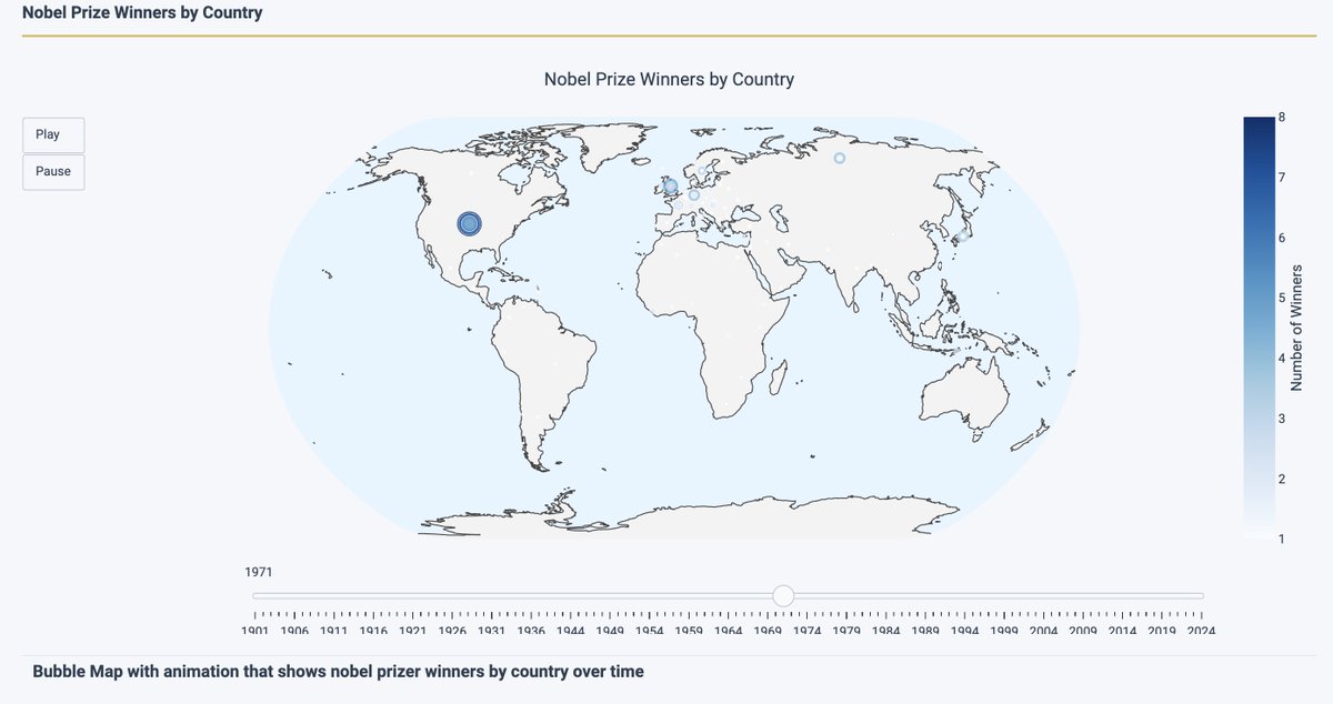
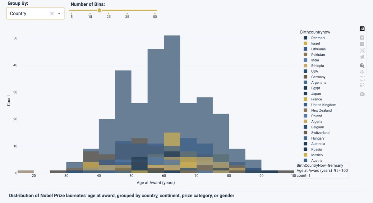
On March 24 at 11 AM EDT, we're analyzing Rob Calvin's Spotify history live, and building a data app to do it. Rob manages our Technical Account Managers. Sam Tripp, one of his team members, will connect to Spotify and build a fully interactive music analytics app in real time using plain English prompts in Plotly Studio. Then we'll move it into Dash Enterprise Workspaces and show how Claude Code integration transforms it from prototype to production-ready in minutes. Why attend (even if you don't use Spotify): You'll see the complete AI-assisted development workflow in action — connecting to data sources with natural language, building apps without manual coding, using Claude Code to accelerate production polish, and deploying in governed enterprise environments. Save your spot! bit.ly/4bl8YCT
Plotly tweet media
English
0
0
1
162
Plotly
Plotly@plotlygraphs·
Montreal data folks: Join us on March 26! 📊🇨🇦 Join us IRL where we'll build Python visualizations together using real Montreal datasets. No Python experience required. Just bring your laptop and curiosity! Thursday, March 26 | 6-8 PM local time Plotly HQ @ 5555 Av. de Gaspé Register: luma.com/reiz58fr
Plotly tweet media
English
0
0
1
227
Plotly
Plotly@plotlygraphs·
Missed our Power BI webinar? We showed how Plotly Studio connects directly to your existing Power BI semantic models, preserving your data investment while unlocking what Microsoft can't provide. 🌟 6 minutes. Key moments: → The limitations of traditional BI tools → How Plotly Studio solves them → Live demo: connecting to Power BI → Building with AI using plain English → Converting Power BI visuals to Plotly → One-click publishing Watch the full recording: bit.ly/4uzSIpd Catch our next webinar to see the full Plotly workflow from Plotly Studio to Dash Enterprise Workspaces to published app: bit.ly/4rCG85U
English
0
0
2
433
Plotly
Plotly@plotlygraphs·
What's the last dataset you'd want to analyze in front of a live audience? For Rob Calvin Calvin, our TAM Manager, it's his Spotify listening history. Specifically, from 2019. 🤭 On March 24 at 11 AM EDT, watch Plotly's Sam Tripp, Technical Account Manager, build a live analytics app to explore it, using nothing but plain English prompts in Plotly Studio and Claude Code integration in Dash Enterprise Workspaces. You'll see: → Real-time app development with AI (no coding required) → Claude Code accelerating the path from prototype to production → The complete Plotly workflow: Plotly Studio → Workspaces → deployed app This session is for data analysts, developers, and anyone who's ever been embarrassed by their Spotify Wrapped. Register now! bit.ly/4lwpsLZ
Plotly tweet media
English
0
0
0
332
Plotly
Plotly@plotlygraphs·
📸 Pictured: Plotly's Senior Solutions Architect Alex Hsu and Technical Product Manager Nathan Drezner at the Plotly office with our newest intern, Hattie! Come meet more of the team at our Plotly Community Gathering, Studio Launch & Decade of Open-Source Party! It’s happening on May 12th at Apna Chulha & Blondies in SF from 1 PM - 2 AM. Connect with other data scientists, community members, and the Plotly team: linkedin.com/events/7436914…
Plotly tweet media
English
0
0
2
315
Plotly
Plotly@plotlygraphs·
Since 1901, the @NobelPrize has honored discoveries and ideas that shape our world in Physics, Chemistry, Physiology or Medicine, Literature, Peace, and Economic Sciences. Founded through the will of Swedish inventor Alfred Nobel, the awards distributed by The Nobel Institute recognize contributions that “confer the greatest benefit to humankind.” Over more than a century, the prizes have been awarded hundreds of times to more than a thousand individuals and organizations. The winners demonstrate a timeline of scientific discovery, cultural achievement, and global progress. Using the Plotly Studio laureates dataset, we explored Nobel history through interactive visualizations: trends in laureates over time, geographic distribution across continents, the age of winners when they receive the prize, gender representation across categories, and how prize amounts have evolved. Together, these charts reveal patterns that are hard to see in raw data alone: the growth of collaborative science, the geographic concentration of awards, and how different disciplines recognize achievement at different stages of life. Dive into the full story and explore the graphs that bring over a century of Nobel impact to life, or make your own. This dashboard was made with no coding entirely from prompts, and took about 15 minutes. You can make dashboards like this and connect to any data source or database. 👉Explore the interactive app: …bf2-4368-ab10-1b6e5441a11c.plotly.app/?utm_source=tw… 👉Download the dataset: plotly.com/studio/benchma… 👉Read the blog: plotlygraphs.medium.com/nine-nobel-gra…
Plotly tweet mediaPlotly tweet mediaPlotly tweet mediaPlotly tweet media
English
0
0
0
362
Plotly
Plotly@plotlygraphs·
What makes AI analytics succeed or fail? The answer lies in data context. Robert Claus, Plotly’s Director of Engineering, breaks down how data context for LLMs impacts analytics quality, and why your pre-trained knowledge and organizational semantics matters for reliable analysis. Read the full guide: bit.ly/4b3w6G3 Want to join the discussion? Join us tomorrow (March 11 at 11 AM EDT) as Matt Brown and Adam Schroeder demonstrate how Plotly Studio uses agentic exploration and data context to turn Power BI semantic models into custom data apps, live. Register for tomorrow's webinar: bit.ly/4cBtzUF
Plotly tweet media
English
0
0
1
346
Plotly
Plotly@plotlygraphs·
Day 2 at Gartner Data & Analytics Summit! ☀️ Yesterday's conversations were incredible — thank you to everyone who stopped by to talk about AI-assisted analytics, custom data apps, and how to break free from dashboard limitations. If you missed us yesterday, we're back on the expo floor today with: ✅ Live demos of Plotly Studio & Dash Enterprise ✅ Fresh swag (yes, we restocked!) ✅ Our team ready to dive into your specific use cases Come find us at Booth 435! #GartnerDA
Plotly tweet mediaPlotly tweet mediaPlotly tweet mediaPlotly tweet media
English
0
0
1
234
Plotly
Plotly@plotlygraphs·
24-hour reminder: Tomorrow at 11 AM EDT ⏰ We're going live to show you how to break free from Power BI's limitations without abandoning your data investment. The Problem: Your organization has invested heavily in Power BI semantic models, but you've hit walls. ❌ Dashboards that can't be customized for your brand ❌ AI features you can't trust to show their work ❌ Per-viewer costs that make data democratization prohibitively expensive The Solution: See how Plotly Studio connects directly to your existing Power BI semantic models, preserving your investment while unlocking capabilities Microsoft simply can't provide. Save your spot! bit.ly/4aZCPRc P.S. Can't make it live? Register anyway and we'll send you the recording.
Plotly tweet media
English
0
0
0
346
Plotly
Plotly@plotlygraphs·
Montreal, we’re bringing the Plotly community together! On March 26 at 6pm EDT, join us at the Plotly HQ for an evening of hands-on exploration with Python, Plotly Studio, and Montreal-focused datasets. 😎✨ Come build, learn, and connect with fellow data enthusiasts over food, drinks, and great conversations. Register here 👉 luma.com/reiz58fr #PlotlyStudio #PlotlyCommunity
Plotly tweet media
English
0
0
0
290
Plotly
Plotly@plotlygraphs·
Happy Employee Appreciation Day to our incredible Plotly team. Today we celebrate the thinkers, builders, problem solvers, and collaborators who push us forward every day. Your creativity, dedication, and commitment to excellence strengthen our platform and our impact. Thank you for everything you do to help us shape the future of AI-native data analytics. ❤️ Learn more about our team here: bit.ly/46wfuUE
Plotly tweet media
English
0
0
1
290
Plotly
Plotly@plotlygraphs·
Even the best Power BI models can't deliver value if they’re stuck behind licensing paywalls or rigid interfaces. You’ve done the hard work of governing and prepping your data, but the final delivery remains the biggest hurdle. We call this problem the last mile challenge: lack of deep customization, AI that’s hard to explain, cost of broad distribution, great insights that sit idle or get rebuilt in a spreadsheet somewhere else. On March 11, we’re hosting a session to help you solve the last mile gap of BI. We’ll show you how to maximize the work you’ve already done and ensure your insights reach the whole org. Join Matt Brown and Adam Schroeder as they take a real Power BI semantic model and connect it live to Plotly Studio, building a production-ready data app on the spot, with AI that writes code, builds dashboards, and shows every step of what it did. bit.ly/4l8YWIf
Plotly tweet media
English
0
0
1
347
Plotly
Plotly@plotlygraphs·
Nathan Drezner, Plotly’s Technical Product Manager, just published a full breakdown of the easiest way to publish and host your Dash apps. Here are the highlights: 1️⃣ Drag-and-drop publishing: no containers, no pipelines, no YAML 2️⃣Real-time logs so you can debug errors with ease 3️⃣Best-in-class enterprise security practices so your whole team can share dashboards safely 4️⃣Granular access controls Read his full blog: bit.ly/3MzTSjz
Plotly tweet media
English
0
0
1
492
Plotly
Plotly@plotlygraphs·
Plotly's Senior Developer Advocate Adam Schroeder has spent years helping people get more out of their data tools. And his take on Power BI? You're leaving a lot on the table. 👇 If you're running Power BI semantic models but hitting walls on customization, AI you can trust, or viewer costs that don't scale — this session is for you. On March 11 at 11AM ET, Adam and Matt Brown will connect Plotly Studio live to a real Power BI semantic model and show you exactly what's possible on the other side: production Python, transparent AI, and data apps your stakeholders actually want to use. Save your spot! bit.ly/4sfbqAE
English
0
0
3
723
Plotly
Plotly@plotlygraphs·
Plotly is heading to Orlando for the Gartner Data & Analytics Summit on March 9-11! Stop by Booth #435 to meet our team and see live demos of Plotly Studio. If you're hitting walls with your current BI tools — rigid dashboards, opaque AI, or licensing costs that scale against you — come see what's possible when Python and AI meet production-ready data apps. Whether you're a CDAO, AI leader, or data and analytics executive, we'll have a lot to show you. #GartnerDA
Plotly tweet media
English
0
0
0
317
Plotly
Plotly@plotlygraphs·
Your Power BI semantic model is a real asset. So why keep it locked inside a closed BI environment? Join our own Adam Schroeder live with Havens Consulting on March 6 at 12:30pm EST to see how Plotly Studio connects directly to your existing Power BI semantic model — so you can build polished, production-ready data apps without migrating a thing. You'll walk away knowing how to: • Build fully customized apps with Python, beyond drag-and-drop limits • Scale distribution without per-user licensing costs crushing your budget • Own your branding, UX, and deployment end-to-end • Operationalize trustworthy AI on top of governed data youtube.com/live/KbC5FsLkU…
YouTube video
YouTube
Plotly tweet media
English
0
0
1
437
Plotly
Plotly@plotlygraphs·
Here’s a fun interactive data app we built with Plotly Studio featuring a dataset covering 193 countries and their drinking habits. This dataset tracks beer 🍺, wine 🍷, and spirits 🥃 consumption across every country on Earth Check out the interesting patterns it reveals: ➡️ Namibia beats Germany in beer consumption, while the Czech Republic is #2. ➡️ France drinks more wine than any other country on the planet at 370 servings per person per year. That's more than one glass a day, every single day. ➡️ The Caribbean island of Grenada, with a population of 100,000, leads the world in spirits consumption. The Plotly Studio app lets you iteratively explore these data points visualized with bar charts, rankings, multi-dimensional comparisons, and a bubble chart that maps all three drink types simultaneously. Modern BI is evolving towards living, interactive tools that lets stakeholders ask their own questions of the data. See the app → bit.ly/4kT9Pho Built in minutes with Plotly Studio → bit.ly/4rc6FXH Download the CSV and try it yourself → bit.ly/4tLRN4x
Plotly tweet mediaPlotly tweet mediaPlotly tweet mediaPlotly tweet media
English
0
0
4
523
Plotly
Plotly@plotlygraphs·
Thursday at 11am EST: Dash Enterprise 6.0 webinar! We're walking through the platform, showing real deployments, and answering your questions live. Dash Enterprise 6.0 automates the painful parts: containerization, deployment, security policies, scaling, monitoring. Your team focuses on building great applications. ​​Still time to register 👉 bit.ly/3OE6l6b
Plotly tweet media
English
0
0
2
293
Plotly
Plotly@plotlygraphs·
📊 We took a complex geological dataset from Western Australia and built an interactive data app to track the "DNA" of the Earth using Plotly Studio. The app generated a fully interactive experience containing sequence line charts, horizontal rankings, side-by-side lithology comparisons, and a spatial distribution map. The Australia Mining Survey app shows why interactive data apps solve exploration challenges: ➡️ Sequence storytelling: Toggling between $SiO_{2}$ (Silica) and Trace Elements like Copper to see how chemical "recipes" change sample-by-sample across the extraction sequence. ➡️ Four-dimensional analysis: A major oxide scatter plot mapping $SiO_{2}$ (X), $Al_{2}O_{3}$ (Y), $Fe_{2}O_{3}T$ (Size), and Lithology (Color) to instantly see how different rock types cluster together. ➡️ Comparative benchmarking: Using side-by-side vertical bar charts to compare mean concentrations of elements like Zirconium (Zr) and Barium (Ba) across different rock layers, such as Metagabbro vs. Granitic Gneiss. ➡️ Advanced horizontal rankings: Configurable element leaderboards with on-the-fly aggregation (Average or Sum) to identify the most dominant minerals in a region. ➡️ Spatial intelligence: A web-first map distribution that colors samples by Lithology, allowing geologists to see exactly where the high-silica quartzite or metal-rich gabbro is located on the Australian coast. You can now have the precision of a laboratory report with the user-friendly interactivity of a modern web interface. See the app → bit.ly/470XaTA Built in minutes with Plotly Studio → bit.ly/3MFNcjC Download the CSV and try it yourself → bit.ly/471Ia81
Plotly tweet mediaPlotly tweet mediaPlotly tweet mediaPlotly tweet media
English
0
0
2
609
Plotly
Plotly@plotlygraphs·
The old way of pushing data apps to production: Week 1: Write code Week 2: Containerize application Week 3: Security review Week 4: Infrastructure setup Week 5: Deployment config Week 6: Testing in staging Week 7: Production deployment Week 8: Monitoring setup The Dash Enterprise 6.0 way: Day 1: Write code and deploy to production What changed? Everything after "write code" is automated. Dash Enterprise 6.0 handles containerization, security policies, infrastructure provisioning, deployment orchestration, monitoring setup, and scaling configuration automatically. This means: • Data scientists spend time on analytics, not DevOps • Apps move from prototype to production in days, not months • Security and compliance are built in, not bolted on later • Teams can iterate rapidly without sacrificing production quality See the new Dash Enterprise 6.0 live + Q&A: plotly.com/webinars/dash-…
Plotly tweet media
English
0
0
1
435