The Tech-stack:
#pandas,
#NumPy,
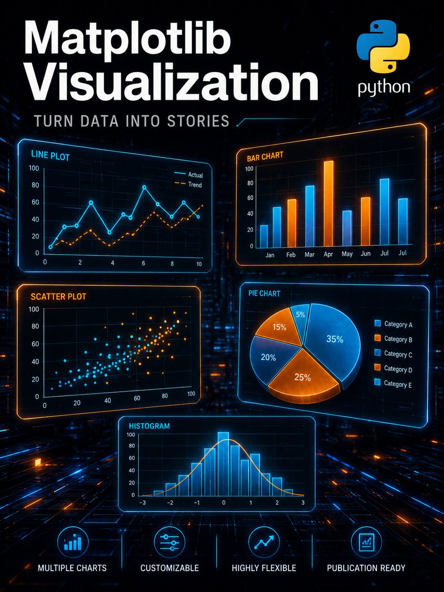
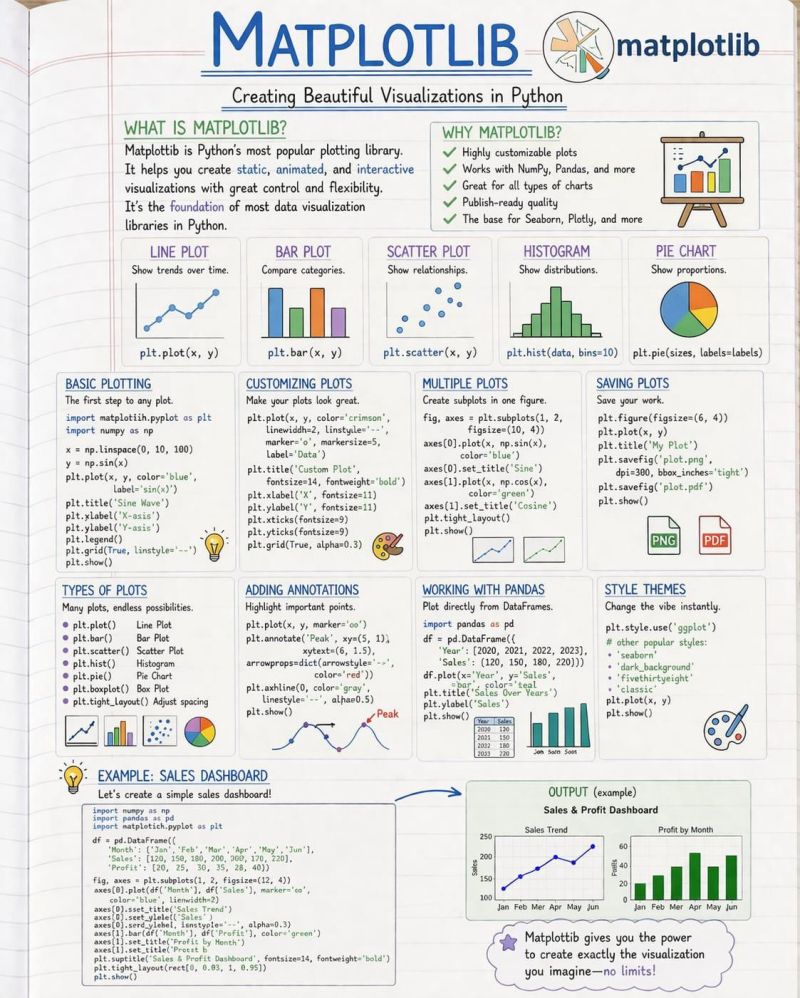
#matplotlib,
#seaborn,
#scikitlearn
Here is the breakdown. Aiming to push the final model on Day 15.
If you’ve built regression models before, what’s one rookie mistake I should avoid ?

English
Arama Sonuçları: "#Matplotlib"
20 sonuç