
Ed Mund
40 posts

I just started my motion design journey a few days ago, and this is one of the first things I came up with. Still learning, but it feels great bringing ideas to life frame by frame. Excited to keep improving and see how far this journey goes.
#MOTION #motionGraphics
English
@DesignWithEdd This is very smooth for first attempt bro ❤️
I could recommend a few youtube channels that helped my journey if u want
You're doing great bro
English

Full edit with sound! QUICK TIP: the edit becomes great when looks good but sounds becomes great when make u feel something extraordinary!
English


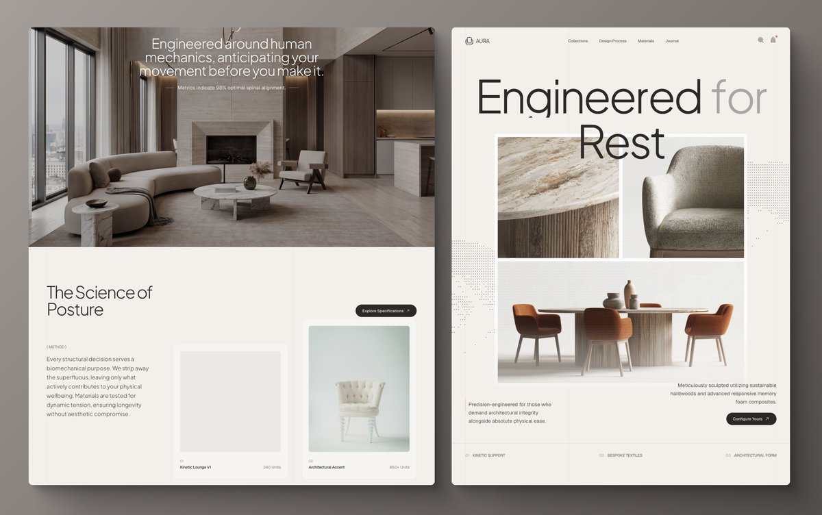
So I woke up to Gemini 3.1 Pro launch and played with it on aura.build, made 4 landing pages in that time.
Here are the templates:
luxury-furniture.aura.build
architecture-studio.aura.build
nexus-architecture.aura.build
plant-based-wellness.aura.build
I'm using references + the prompt builder. The trick is to capture your site design from hero to footer using something like the Arc browser. Then, you prompt:
"Use Iconify Solar Duotone Bold icons. For the site logo, use Iconify Solar Linear, plus lettermark using text with tracking-tighter. Use Iconify Simple Icons for company logos (Nasa, SpaceX, Uber, Visa, Grab, bose, Discover, dji, Nikon, craftsman, sony) 64x64 instead of text logos. Use instead of full SVG code. For avatars, testimonials, use headshot photos instead of placeholder letters. Add vertical container-size lines. Add 01 02 03 number details. Add a 1px border beam animation around the pill-shaped button on hover. Add a vertical text clip slide down animation letter by letter. Add sonar animation and decorations. Add a subtle flashlight effect on hover/mouse position to both background and border of the cards. Animate marquee in an infinite loop with alpha mask slowly. Change texts, names, numbers."
G3.1 is very good at webgl animations, so sprinkle some creative animations:
"Add 4-column clip animate sliding down for all the images in the page using webgl"
"Full-screen image sliced into 4 vertical columns. On scroll, columns move at staggered speeds—outer columns lag, inner race ahead—with motion blur trails. Snap to alignment when scroll stops."
After generation, do font pairings and replace images quickly. The images that AI generates are super bad. Finally, go to infinite canvas and create beautiful presentations for your covers.
I'm also using the ASCII from my app that I made, which I'll release soon.


English
@builtbyjack23 @VadimStrizheus @aryanlabde @KrisRChase @joaopaulots @urja_kohli Cos you said you are in need of a motion designer
English

@DesignWithEdd @VadimStrizheus @aryanlabde @KrisRChase @joaopaulots @urja_kohli You tagged me lol :) 😜
English

@builtbyjack23 @VadimStrizheus @aryanlabde @KrisRChase @joaopaulots @urja_kohli How may I assist you Jack
English
English

Finally, my new @framer template is online.
Get it for FREE now!
💛 Like this post
💬 Comment "Framer" & Repost
🤝 Follow Me (so I can DM it to you)
English
Ed Mund ری ٹویٹ کیا

Close, but it's not the actual solution.
Doing it this way, makes this effect crash on screens with vh over 1500px.
Mine is actually fully responsive and doesn't use scroll effects for clipped section effect (only to add subtle parallax)
Framer University@learnframer
i thought this effect was impossible in @framer, but finally cracked the code... watch how i used counter directional scroll transfroms to achieve this unique scroll animation: ↓
English
Found a solution. No code. @framer only. Fully responsive. Packed into a component.
Remix link in the comments. Enjoy! 👇
Framer University@learnframer
i thought this effect was impossible in @framer, but finally cracked the code... watch how i used counter directional scroll transfroms to achieve this unique scroll animation: ↓
English

the website that should not exist...
comment "BURN" and i'll send you this component for free of charge (once in a lifetime opportunity)
English
@Kalb_e_Haider @framer Can't seem to find it
Can you please tell the exact effect
English

@Kalb_e_Haider @framer Thank you, I completely forgot about that.
English
Thank you, Ed.
It’s simple in Framer. You just have to create a line, then turn it into a component. Make a variant and set the line’s width to zero. Now you have two variants: Full and 0 width. Next, go to Framer Effects and create an effect that triggers an animation from zero width to full width when the layer comes into view.
English
I recreated a music player widget to test my prototyping skills and discovered the real value of using components, they save time, reduce clutter, and make prototypes more efficient. Still experimenting with making the timer animation feel more realistic
x.com/bigg_taytay/st…
Tamara@bigg_taytay
Press Play. ⚪️ New music player design with a soft UI aesthetic. Tried to make those buttons feel real. Thoughts? #UIDesign #Figma #Music #ProductDesign #UIUXDesigner
English