RussRaynor
2.6K posts
RussRaynor
@RussRaynor
Russ Raynor
Baltimore, MD Tham gia Haziran 2009
88 Đang theo dõi63 Người theo dõi

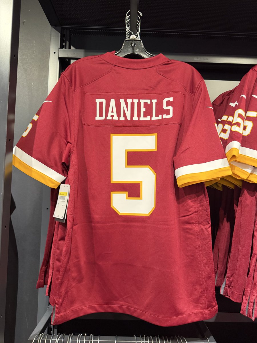
TEAM STORE IS OPEN FROM 12pm-8pm!
Come get your new jerseys 😁

English
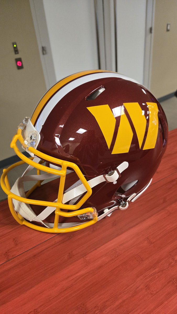
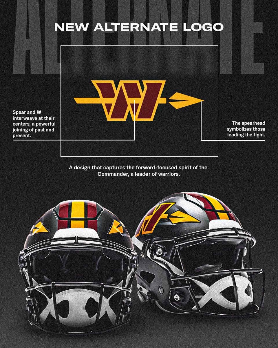
@DanSnydersYacht @Commanders No they don’t. Colors yeah but that logo. Ughhh
English

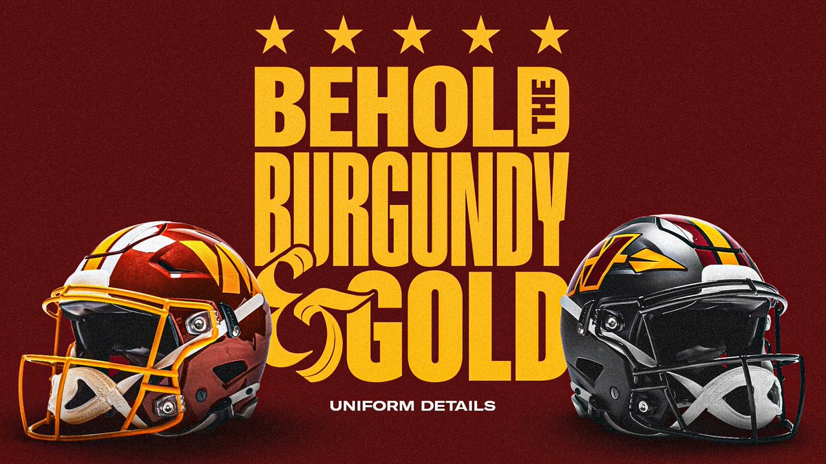
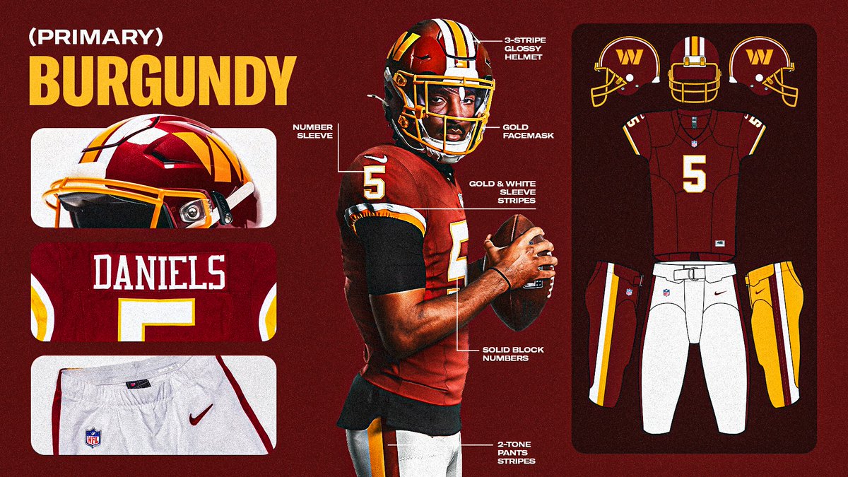


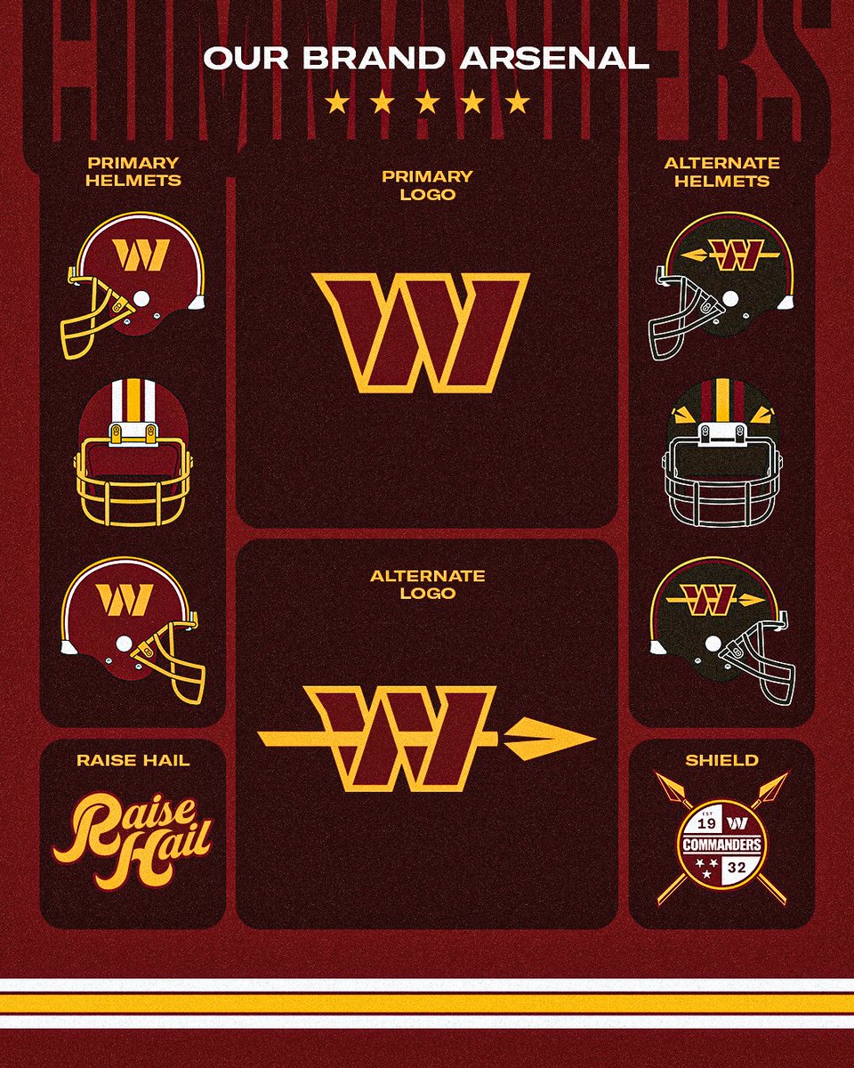
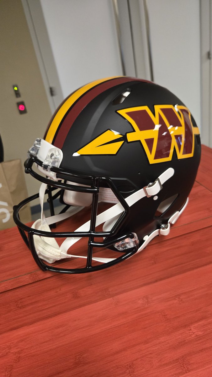
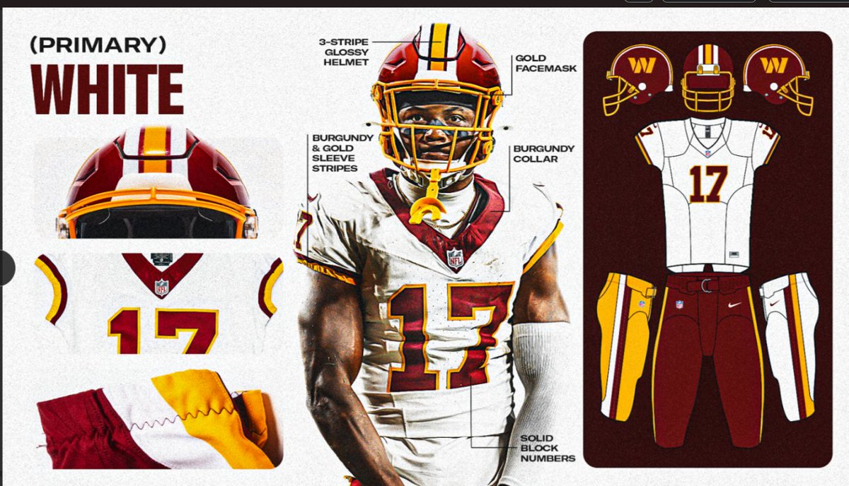
My initial Washington Commanders uniforms review! 🎥
- Not many surprises, but gold pants is a welcome one!
- Black Hail Raiser uniform may not be necessary, but it does look sharp
- Switch to a glossy shell the right call imo
Initial Verdict: a drastic improvement from the league’s-worst uniform set
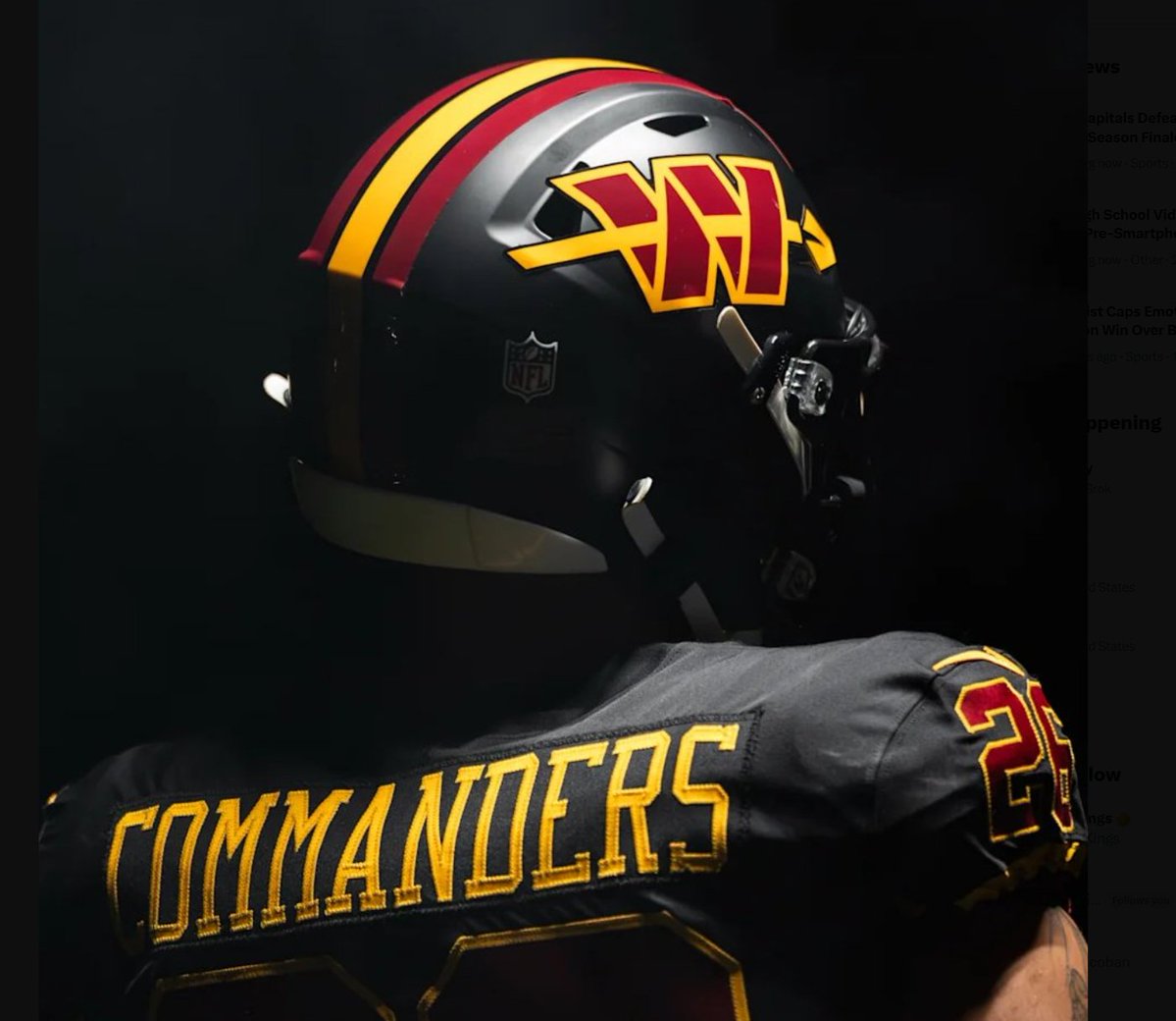
Zach Cohen@ZachCohenFB
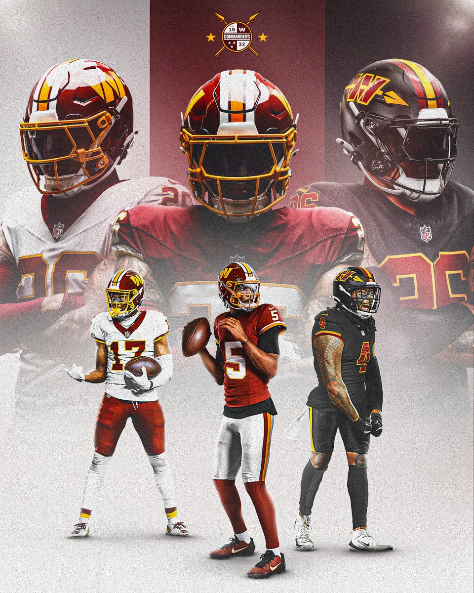
Everything we know about the upcoming Washington Commanders redesign so far… with new info & info from my report last October 🎥👇 - Exclusive: sources tell me a glossy helmet finish will replace matte - Permanent SB-Era “throwbacks” as primaries - 99% certainty of no new primary logo - Obvious speculation about alternate uniform details
English
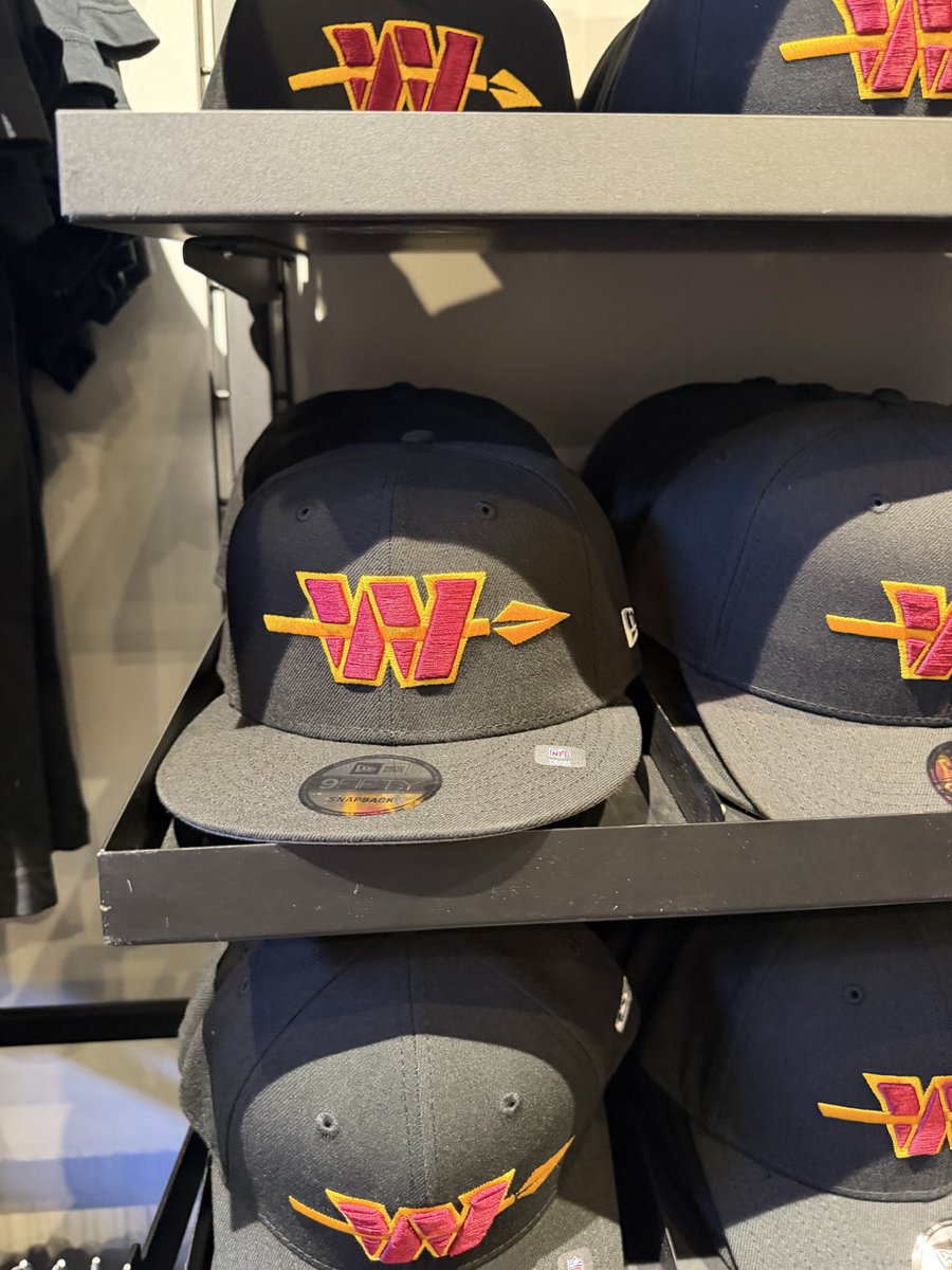
@JunksRadio They blew it.. got the colors right on the black uniforms but the spear W thing is terrible. I would have finally bought some merchandise if it wasn’t so dumb of a logo. Spear only .
English

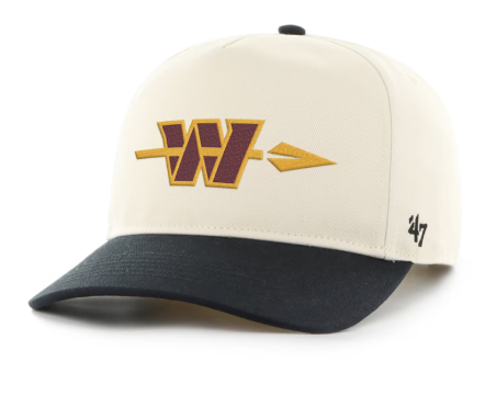
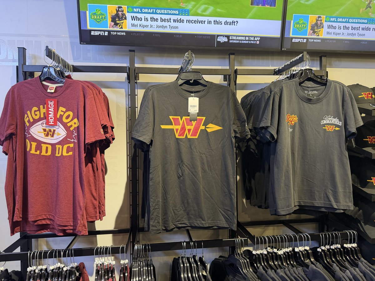
@EBJunkies Would have looked great without that terrible logo. They blew it again.
English


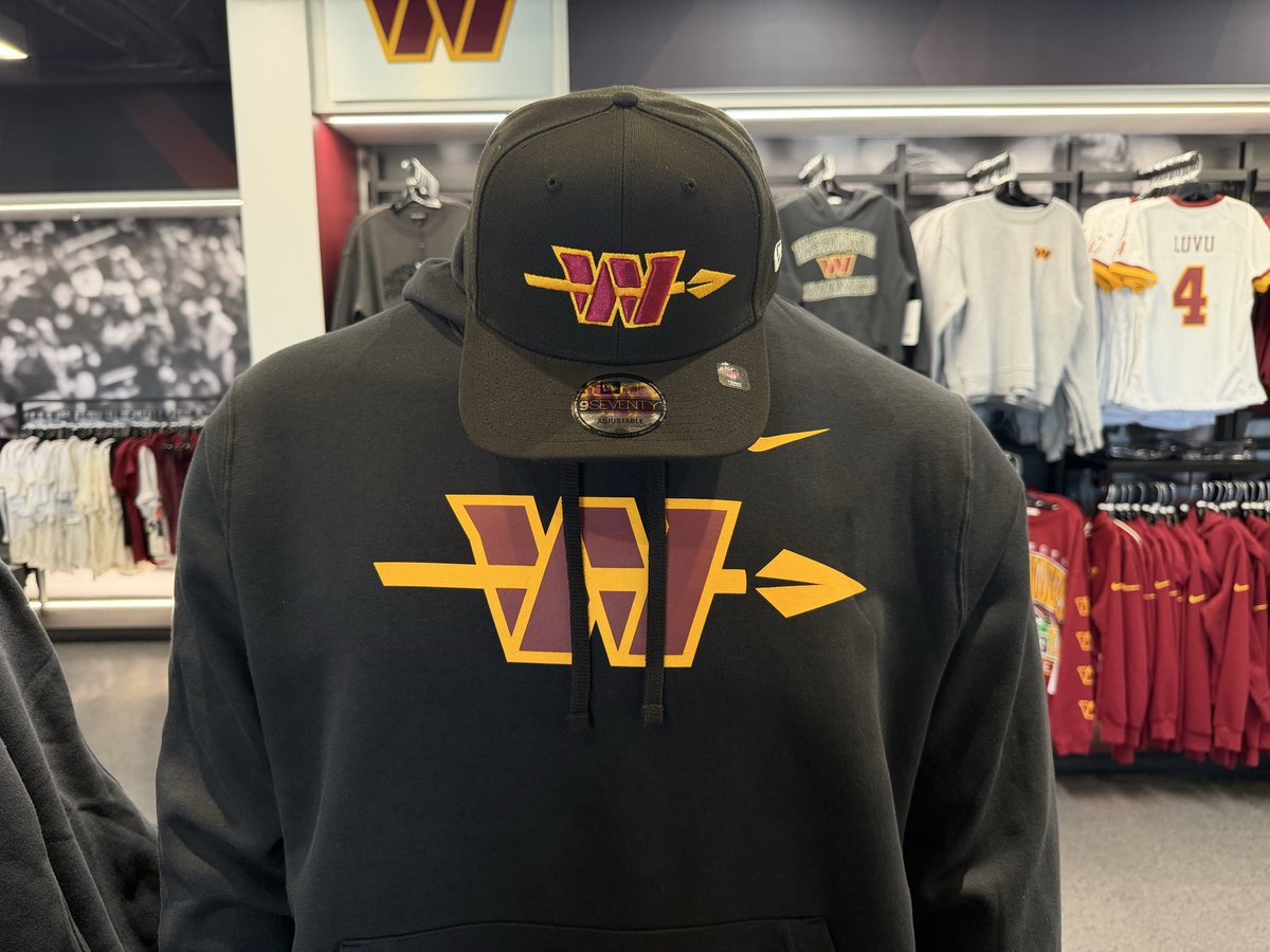
These black alternates are so much better than the ones the last group came out with.
Also, they are awesome. I love this.
English

@EBJunkies The alt logo def looks better on the helmet than on that sweater. It’s growing on me.
English
@JPFinlayNBCS @BMitchandFinlay @BMITCHLIVE30 @1067theFan @Ryanclary11 @Jeff2Funny Are you the biggest ass kisser in the world ? They look terrible.
English

@GrantPaulsen Brilliant? Grant, they blew it again buddy. That W ruins everything . And what sense does it make that there is a spear through our own logo ? We shoot ourselves? 😂😂😂
English
Not coincidentally: The uniforms do not say Commanders at all.
Brilliant.
English


@Commanders I thought Jason Wright wasn’t with the team anymore? Another logo failure ..
English
English

@Commanders @happycitizem To the people complaining..just switch teams man. I’m tired of the crying
English

@Commanders From a Bucs fan! These are fire! Simple and just right.
English

@Commanders Unnecessary hate, these jerseys are def top 5 in the league and such a massive upgrade from the trash they wore last season. People complain about the logo but its not that bad, although the original is 10 million times better
English