Radu Sferlic

59 posts

Radu Sferlic banner
Radu Sferlic

Radu Sferlic

@SferlicRadu

Helping Businesses Grow Through Modern Websites, SEO, Local SEO & AI Automation | Building Digital Systems That Turn Traffic Into Revenue

Romania Tham gia Haziran 2017
65 Đang theo dõi15 Người theo dõi
Radu Sferlic
Radu Sferlic@SferlicRadu·
Your product page is the only page that actually matters. And most founders treat it like an afterthought. Homepage gets the redesigns. PDP gets neglected. Then they wonder why CVR is flat. Audited a Shopify brand last week doing $310k/month. The PDP was costing them at least $40k/month in lost revenue. Here's what I found in 4 minutes: -The hierarchy was broken Product title was huge. Price was small. -Add to Cart was a thin outlined button that looked clickable but didn't feel urgent. The eye went everywhere except where it needed to. -Images were lazy. 6 photos. All white background. Zero in-use shots. Zero scale reference. Zero detail close-ups. Buyers couldn't picture owning the product. -The description was a wall -400 words of brand voice before a single bullet point. -On mobile, that's 8 thumb-scrolls before reaching specs. -Objections weren't addressed -No sizing logic. No "what's in the box." No "how does this compare to X." Every unanswered question = a closed tab. -Reviews were buried -Star rating at the top, but the actual reviews loaded at the bottom of the page via a slow third-party widget. Most users never saw them. What we shipped in one sprint: – Restructured the above-fold: title, price, star rating, 3 bullet benefits, sticky Add to Cart – Added 4 new image types: in-use, scale, detail, packaging – Broke the description into scannable chunks with icons – Built a "Common Questions" block right above reviews – Replaced the slow review widget with a native solution PDP CVR moved from 1.6% to 2.9% in 23 days. Same traffic. Same product. Same price. The PDP isn't a page. It's the entire sales pitch compressed into one scroll. Treat it like that, or keep paying Meta to send buyers to a page that won't close them. When was the last time your bestseller's PDP got a real audit?
English
0
0
0
7
Radu Sferlic
Radu Sferlic@SferlicRadu·
"If you don't write it, someone else will. And AI will use their version, not yours." That line should make every founder uncomfortable in a productive way. The brands that have been quietly building detailed comparison pages, use case breakdowns, and objection-handling content are sitting on an AEO asset most businesses are only now realizing they need. Really important framing here.
English
0
0
0
8
John Ozuysal
John Ozuysal@john_ozuysal·
If you aren't willing to invest in owned content, all the AEO tactics in the world won't matter. I see this pattern every month. A founder reaches out. They want AI search visibility. They've heard the buzzwords. They're ready to "do AEO." So I ask: "What content do you have on your site that answers the questions your buyers are asking AI?" Silence. No comparison pages. No use case breakdowns by industry. No content addressing the objections their sales team hears every single day. No help center content covering specific integrations, features, or workflows. Nothing. And they want to jump straight to getting mentioned on Reddit and listicles. (which is not bad for short-term wins) Here's what I tell every founder who comes to me: Your content is your narrative. If you don't write it, someone else will. And AI will use their version, not yours. Off-site mentions amplify whatever narrative already exists. If you don't have one, you're amplifying nothing. Or worse, you're amplifying what a competitor said about you two years ago. You need content and mentions. For fast wins, you can start with mentions, but don't forget about your owned content library.
English
1
0
2
135
Radu Sferlic
Radu Sferlic@SferlicRadu·
"Structure for LLMs. Win with speed. Ship results." sounds compelling but the businesses seeing real AI citation results aren't winning through speed — they're winning through depth, consistency, and earned authority built over time. The same shortcuts that didn't work in SEO don't work in AEO either. The surface changed. The trust criteria didn't.
English
0
0
0
1
Colter Mahlum | AI Master Builder
SEO is dead. If ChatGPT isn’t citing your brand, you’re invisible. Stop writing for Google keywords. The AI Silent Committee is making buying decisions without you. You need AEO: Answer Engine Optimization. Structure for LLMs. Win with speed. Ship results.
Colter Mahlum | AI Master Builder tweet media
English
1
0
1
11
Radu Sferlic
Radu Sferlic@SferlicRadu·
This is one of the most practical AEO workflows I've seen shared publicly. The insight that distributed bios are an under-managed source signal is something most people haven't thought through — but it makes complete sense. LLMs verify expertise by cross-referencing what's written about you across the web. If those sources still describe the old version of you, the AI builds the wrong picture. Really clever systematic approach to fixing that.
English
1
0
1
36
Kaleigh Moore
Kaleigh Moore@kaleighf·
In 2026, I pivoted my business to focus on AEO for B2B SaaS after 12+ years writing about ecommerce, freelancing, and bylines in the world of retail journalism. The problem here is that my historical bios across the internet still describe the OLD me. How I'm getting LLMs to recognize my *new* expertise (the unsexy way): I built a tool with @ahrefs' Agent A that does the following: 1. Pulls every site where my bio appears 2. Ranks by Domain Rating 3. Identifies the right contact at each site 4. Auto-drafts a polite outreach email requesting the bio update From there, I chip away at my list by sending 3–5 emails per week. Results so far: ✓ 4 bio updates on DR 90+ sites ✓ Already shifting how LLMs verify my expertise ✓ Compounds every week with minimal effort If you’re also working to pivot your online presence, you can do this, too. Your team's distributed bios (guest posts, podcast pages, conference speaker profiles, contributor pages, etc.) are an under-managed AEO surface. The source signals™️ they send about your expertise show up in AI answers about your category. Steal this idea, or build your own solution with Agent A: ahrefs.com/agent-a?utm_so… #AhrefsPartner
English
2
0
20
1.7K
Radu Sferlic
Radu Sferlic@SferlicRadu·
The AI Mode query length point is the one most people walked past. 3x longer queries means search intent is becoming dramatically more specific and conversational. Content built around short keyword phrases is already losing relevance in that environment. The brands that structured their content around real questions — not just keywords — are quietly sitting in a much better position heading into summer 2026.
English
1
0
1
8
Mark | SEO & AI Visibility Strategist
Every Google I/O 2026 recap covered the same five bullets: — Gemini 3.5 Flash — New Search box — Information agents — Agentic booking — Generative UI in Search That's the news. It's not the strategy. The two things that actually change SEO and AEO over the next 6 months are buried in two other posts on Google's blog: 1) AI Mode queries are now 3x longer than traditional Search. 1 in 6 U.S. searches uses voice or images. Image search is +40% MoM. 2) Search can now detect AI-generated content. SynthID and C2PA are becoming the trust layer. What to Watch Next (Summer 2026) A few things to keep on the radar as the rest of I/O ships: 1-Information agents roll out to Google AI Pro and Ultra subscribers this summer (source). They sit in the background and surface updates.Another category of search activity that doesn't generate a click to your site. Generative UI in Search goes free for everyone this summer . 2-Agentic booking expands to home repair, beauty, and pet care in the U.S. (source). If you're in local services, the traffic-to-booking pipeline is about to compress. 3-The AI Content Detection API launches on Google Cloud with trusted partners (source). Expect more provenance signals to surface inside business tools you already use.
English
2
0
3
70
Radu Sferlic
Radu Sferlic@SferlicRadu·
DM if you want to be early instead of late.
English
0
0
1
8
Radu Sferlic
Radu Sferlic@SferlicRadu·
ChatGPT Shopping is about to flip how people discover products. Most Shopify stores aren't ready for it. Soon, buyers will skip Google entirely. They'll ask ChatGPT for "a warm wool sweater under $80" and get product cards with prices, photos, and buy buttons in the chat. No ads. No SEO games. Just conversation → purchase. The window to position your store is open right now. Most founders haven't even heard about it yet. Here's what I'm setting up for clients before this becomes mainstream: 1. Let ChatGPT actually see your store Open robots.txt and make sure OAI-SearchBot isn't blocked. I've seen stores accidentally locking out millions in future traffic. User-agent: OAI-SearchBot Allow: / Test it. Configurations vary. 2. Rewrite product titles like a human asking a question Weak: "Linen Shirt – White" Strong: "Men's Relaxed Fit Linen Shirt | Breathable Summer Fabric | Pre-Washed | Off-White" ChatGPT pulls specifics. Fit, fabric, use case, finish. Vague titles get skipped. 3. Reviews aren't optional anymore I use Judge.me on every client store. Real reviews = visibility in conversational search. No reviews = invisible. 4. Schema markup is the bridge Structured data is how AI reads your products. Apps like StoreSEO help, but don't trust apps blindly — verify the markup actually outputs correctly. 5. Track it Add utm_source=chatgpt.com filters in GA4. One client's yoga mats were getting traction, water bottles weren't. We rewrote the water bottle PDPs based on that signal. Conversions moved within a week. What I'm NOT doing: – AI-written descriptions across the board – Copy-pasting competitor content – Removing the human layer AI surfaces products. Humans convert them. The brands that win will pair both. Common mistakes I keep seeing: – OAI-SearchBot blocked – Generic product titles – No review system – Low-effort product photography – ChatGPT traffic untracked All fixable. Most in under an hour. While everyone's burning budget on Meta and fighting Google updates, a brand new discovery channel is opening up. Zero ad cost. Organic placement. And almost nobody is preparing for it. Is your Shopify store visible to ChatGPT, or invisible by default? At Zeniqfy, we get Shopify stores ready for AI-driven discovery — robots.txt setup, product data optimization, schema markup, and review systems built for the conversational search era. DM if you want to be early instead of late.
English
1
0
0
48
Radu Sferlic
Radu Sferlic@SferlicRadu·
This is such a clean example of the difference between problem-led copy and outcome-led copy. The before is asking the visitor to work — read the long headline, process the symptoms, figure out if this is for them. The after just says "Clean Gut Supplements. Zero BS Ingredients." and the right person immediately knows they're in the right place. Really nice work on this one.
English
0
0
0
11
Osh | CRO & Landing Pages
What do users see in the first 3 seconds? If it’s not your product, a strong headline, and impactful benefits… You’re not giving them a reason to stay.
Osh | CRO & Landing Pages tweet media
English
7
0
49
1.4K
Radu Sferlic
Radu Sferlic@SferlicRadu·
"Nobody knew this was a subscription business." That single line explains the entire conversion problem. If a visitor can't tell what they're buying or how it works in the first few seconds, they don't ask questions — they just leave. The redesign didn't change the product. It changed what the visitor understood about it. That's the whole job.👏👏
English
0
0
1
7
Tom | Shopify & CRO
Tom | Shopify & CRO@Frontend_Prince·
A homepage has 5 seconds to answer one question: "What do you actually sell?" Olfactif old homepage failed that test. Here's how I rebuilt it: 1. Brand-aligned announcement bar Black bar → soft gold. Same message. Premium feel. Stops looking like a default Shopify install. 2. Instant value prop strip "365-Day Scent Discovery | Curated Monthly | Pause Anytime" Visitors now know what the business IS before they scroll a single pixel. 3. Outcome-first headline "Premium Niche Fragrance Without the Guesswork" The old version led with a single bottle of Dirty Vanilla. Nobody knew this was a subscription business. 4. A subhead that frames the offer "Discover rare scents from independent perfumers, delivered to your door." One line. Entire business model, explained. 5. One clear CTA "Shop Subscriptions Now" replaces clever but confusing buttons like "Let's Get Dirty" and "Heretic Is Here." Cute copy doesn't convert. Clarity does. 6. Hero shot of the actual product The subscription box, the bottle, the test strips all in frame. You're selling the experience now, not a single SKU. 7. Trust row with icons Expertly Curated · 3 or 6 Scents · Member Perks Answers the 3 questions every first-time visitor silently asks before they trust you with a card. 8. "As Featured In" press logos Borrowed authority. Lowers friction on the first purchase. Free credibility most brands forget to use. The old page sold a perfume. The new one sells a subscription. That's the difference between a $40 one-off AOV and a $400+ LTV. If your homepage looks like the "before" DM me. That's literally what I fix. #CRO #Shopify #EcommerceDesign #DTC #UXDesign #ConversionOptimization #WebDesign
Tom | Shopify & CRO tweet media
English
3
0
28
404
Radu Sferlic
Radu Sferlic@SferlicRadu·
Your homepage is confusing buyers and you think it's "branded." Most Shopify homepages fail the 5-second test. I run it constantly: Open the homepage. Count to 5. Close it. Can you answer: – What do they sell? – Who is it for? – Why should I buy this one vs the 50 other options? – What's the offer? If the answer to any of those is "uhh…" the homepage is broken. Last month I tested this on a brand doing $140k/month. Their hero said: "Crafted for the modern lifestyle." That's not an offer. That's a candle company tagline pretending to be strategy. We rewrote it to: "Sleep masks made for side sleepers. 4.8★ from 2,400+ buyers. Free shipping over $40." One sentence. Product, audience, proof, offer. Homepage CVR moved from 1.1% to 2.3% in 9 days. The product didn't change. The clarity did. "Elevate your everyday" doesn't sell anything. Specificity sells. Proof sells. A clear offer sells. Vibes don't. Is your homepage selling, or just decorating? At Zeniqfy, we rebuild Shopify homepages around offer clarity — hero messaging, value props, and proof stacks that turn cold traffic into buyers. DM if your homepage looks beautiful but doesn't convert.
Radu Sferlic tweet media
English
0
0
0
21
Radu Sferlic
Radu Sferlic@SferlicRadu·
"Static ads are still the cheapest CRO lever in DTC. Most brands just under-design them." This deserves more attention than it gets. Brands obsess over video creative and leave their static ads looking like they were made in 20 minutes. A well-designed static that stops the scroll and communicates clearly in 3 seconds will quietly outperform a lot of expensive video production.
English
0
0
2
49
Tom | Shopify & CRO
Tom | Shopify & CRO@Frontend_Prince·
You can spot a lazy supplement ad in half a second. Same green. Same flat-lit bottle. Same bullet list. I redesigned a DIM Complex concept to break the pattern: Moody product photography so the bottle reads premium, not pharmacy-shelf Benefits formatted as pills you can scan in under 3 seconds Paired frames. One for cold traffic. One for retargeting. Static ads are still the cheapest CRO lever in DTC. Most brands just under-design them. Open for redesign and CRO work. DMs open. #CRO #StaticAds #DTC #ShopifyDesign #AdDesign #SupplementMarketing #ConversionDesign
Tom | Shopify & CRO tweet media
English
3
2
32
511
Radu Sferlic
Radu Sferlic@SferlicRadu·
A 20% add-to-cart improvement on existing traffic is the kind of result that reframes how store owners think about where to spend next. That lift didn't require a single extra ad dollar. Every future traffic investment now lands in a store that converts meaningfully better. That's what makes CRO compound in a way that paid acquisition never quite does.
English
0
0
1
4
Bojesomo Samson Whizwaydigit
Bojesomo Samson Whizwaydigit@bojesomo_samson·
Most Shopify brands chase more traffic. But growth comes from improving conversions. For this CRO redesign project: ✔ Better UX ✔ Stronger messaging ✔ Smarter CTA placement ✔ Mobile-first optimization Result: 📈 Add-to-cart rate increased 16% → 19.2% (+20%)
Bojesomo Samson Whizwaydigit tweet mediaBojesomo Samson Whizwaydigit tweet media
English
1
0
2
22
Radu Sferlic
Radu Sferlic@SferlicRadu·
"Products attract attention. Strategy creates long-term sales." That's the whole game compressed into one line. The brands that scale aren't always the ones with the best products — they're the ones with the clearest positioning, the most consistent customer experience, and a store that converts the attention they're paying to acquire. Product is just the starting point.
English
0
0
0
3
Blazemart Marketing agency
Blazemart Marketing agency@blazemart37749·
Most people think ecommerce success comes from a “winning product”… But successful brands focus on: ✔ Branding ✔ Trust ✔ Store optimization ✔ Marketing ✔ Customer experience Products attract attention. Strategy creates long-term sales 📈 #eCommerce #Shopify #DigitalMarke
English
2
0
2
10
Radu Sferlic
Radu Sferlic@SferlicRadu·
The "check your LCP in Google Search Console right now" call to action is the most useful thing in this post. Most Shopify store owners have never opened Core Web Vitals data and have no idea what Google is actually seeing. The gap between a passing LCP and a failing one is often one unoptimized hero image or a single render-blocking script that nobody noticed.
English
1
0
0
48
Ecom Batman
Ecom Batman@ecombatman·
something shopify won't tell you: your store speed score means nothing if your largest contentful paint is above 3 seconds. LCP is what google actually measures. a beauty brand was sitting at a 68 shopify speed score feeling fine. LCP was 4.2 seconds. google was suppressing their organic listings. fixed the LCP. organic traffic up 34% in 6 weeks. no new content. no new backlinks. just a faster first load. check your LCP in google search console right now.
English
5
0
9
614
Radu Sferlic
Radu Sferlic@SferlicRadu·
This is the cycle so many store owners go through and it's painful to watch from the outside. More ad spend into a store that doesn't convert just means losing money faster. The order of operations matters more than most people realize when they're starting out — and almost nobody talks about it clearly enough upfront.
English
1
0
1
3
Zilay Huma Awan
Zilay Huma Awan@ZilleHu72333127·
Most Shopify stores fail because they do things in the wrong order. They run ads before fixing conversion. They add apps before fixing positioning. They chase traffic before building trust. If I started from $0 today, here’s exactly what I’d focus on first 👇
English
3
0
2
44
Radu Sferlic
Radu Sferlic@SferlicRadu·
The mobile optimization point deserves more weight than it usually gets on lists like this. Most Shopify stores are still designed with a desktop mindset and then adapted for mobile. But the majority of traffic and a growing share of purchases happen on phones. A checkout that works beautifully on desktop but has friction on mobile is quietly losing sales every single day.
English
0
0
0
10
Adoghe Daniel
Adoghe Daniel@Skilolo6·
A beautiful Shopify store means nothing if it does not convert. High-converting stores focus on: • Mobile optimization • Fast loading speed • Clear product pages • Trust building • Simple checkout experience Design should drive sales, not just look good. #600btc #shopify
English
3
0
5
54
Radu Sferlic
Radu Sferlic@SferlicRadu·
Your store looks untrustworthy and you don't even know it. Audited a Shopify brand last week doing solid traffic but converting at 0.9%. The product was great. The ads were great. The store screamed "sketchy" within 3 seconds. Here's what cold visitors saw: – No reviews above the fold on the PDP – Generic stock photos in the hero (reverse image search showed them on 40+ other stores) – "Contact Us" page with only a form, no email, no address – Shipping policy buried in the footer, written in legalese – Trust badges from 2014 that nobody recognizes – Zero UGC, zero founder presence, zero "real human" signals Cold traffic doesn't give brands the benefit of the doubt. They scan for reasons to not buy. We shipped 6 trust fixes in one sprint: – Review count + star rating moved next to the product title – Replaced stock photos with real customer shots – Added a founder video on the homepage (90 seconds, phone-recorded) – Rewrote shipping + returns in plain English, surfaced on the PDP – Removed outdated badges, replaced with real press logos – Added "ships from [city]" near the buy button CVR went from 0.9% to 1.7% in 18 days. Nothing changed about the product. Trust isn't a badge. It's the absence of doubt. Is your store giving cold visitors reasons to trust you, or reasons to second-guess? At Zeniqfy, we audit Shopify stores for trust gaps, rebuild PDPs around real social proof, and turn skeptical visitors into buyers. DM if your CVR doesn't match your traffic quality.
Radu Sferlic tweet media
English
0
0
0
21
Radu Sferlic
Radu Sferlic@SferlicRadu·
$10,493 difference from rearranging what was already there. That's the part that should stop every store owner in their tracks. The content wasn't wrong. The hierarchy was. Most stores are sitting on conversion lift they can't see because they're too close to their own page to notice what a first-time visitor actually experiences.
English
1
0
1
74
Goldi Kambale | Shopify CRO 🚀🚀🚀| Shopify Expert
ran a homepage A/B test for a client. same traffic. same 783 visitors to each version. control: 1.15% CR. $3,626 revenue. our version: 1.66% CR. $14,119 revenue. +44% conversion rate. +289% revenue per visitor. $10,493 difference. from one test. on one page. the 4 changes that drove this: → clear value prop replacing a lifestyle headline → trust signals moved above the fold → navigation simplified from 12 links to 5 → social proof pulled into first scroll none of this was a redesign. it was a rearrangement. the content was already on the page. it was just in the wrong order. most stores don't need new content. they need better hierarchy. what does the first screen of YOUR homepage show?
Goldi Kambale | Shopify CRO 🚀🚀🚀| Shopify Expert tweet media
English
3
1
8
208
Radu Sferlic
Radu Sferlic@SferlicRadu·
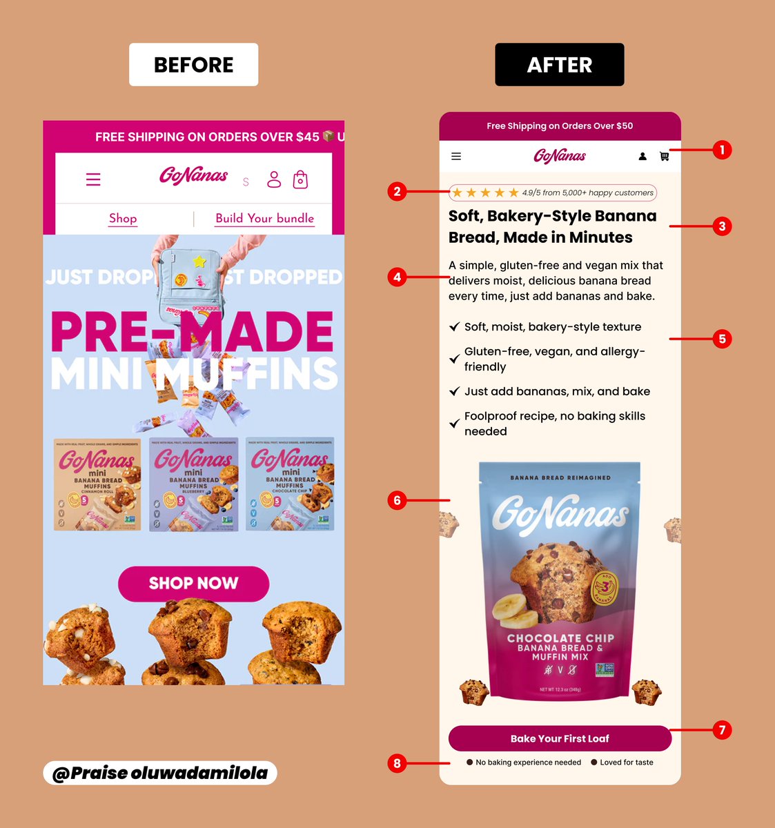
The before feels like it's trying to create excitement. The after is just making it easy to say yes. That shift from "look at this product" to "here's exactly what it does and why you'll love it" is where most CRO work actually lives — and it's rarely about design, it's about clarity of thought.
English
1
0
0
7
Radu Sferlic
Radu Sferlic@SferlicRadu·
What stands out on the after is how much trust is established above the fold without feeling cluttered. 30 day guarantee, verified review count, recognizable press mentions — all visible before a single scroll. Most brands bury that information. Putting it front and center is what separates a store that looks good from one that actually converts.
English
0
0
0
4
Vikrant Chauhan
Vikrant Chauhan@Vikrant_0797·
Daisy before the redesign: cute but no aura. Daisy after the redesign 🌼 high-converting. fast. clean. dangerously add-to-cartable. Built the whole Shopify experience around CRO instead of “just make it aesthetic.” because vibes are cool. but conversions eat harder.
Vikrant Chauhan tweet media
English
1
0
1
15