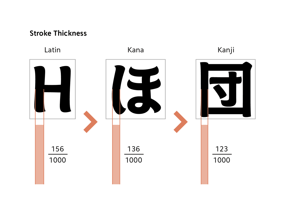
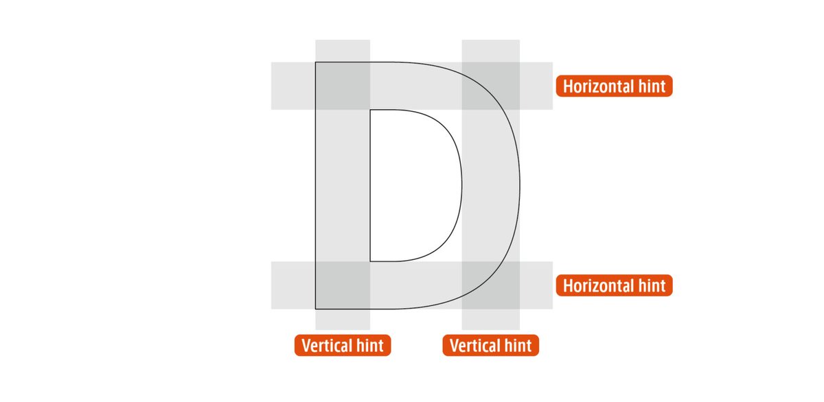
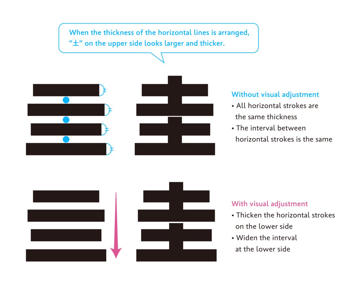
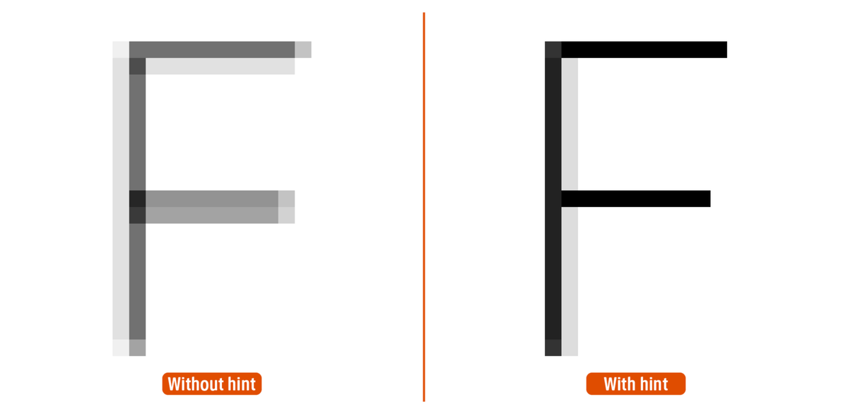
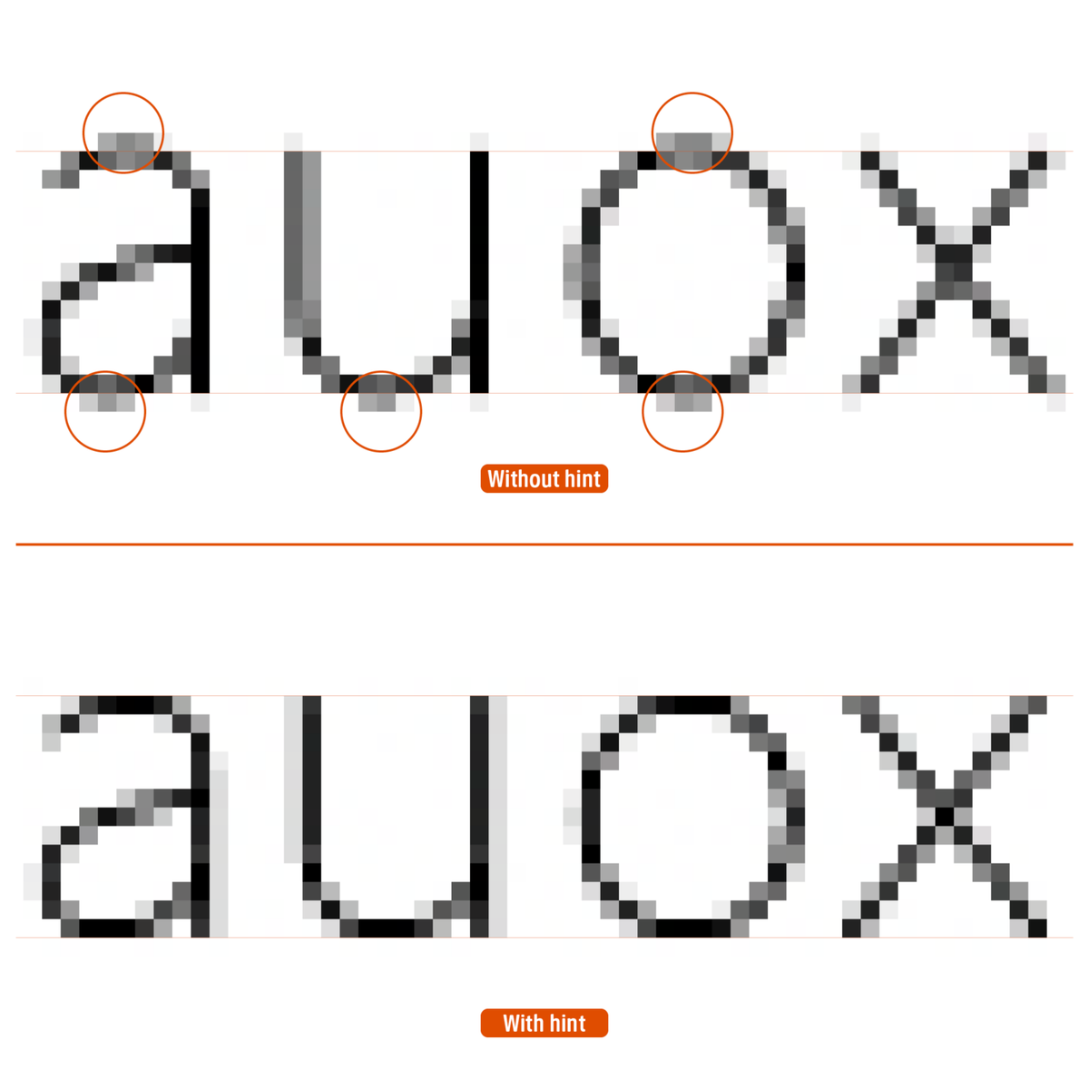
‘In the previous article, I explained about how horizontal and vertical hints work to control stroke thickness and position. Another major role of hints is to “arrange heights.”’
staffblog.typeproject.com/en/4870
English
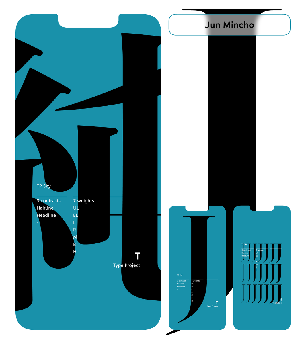
Type Project (EN)
131 posts

@typeproject_en
Type is face, Type is voice. For Japanese posts: @typeproject Instagram: @typeproject_official