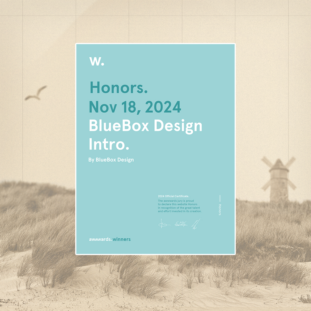
BlueBox Design

99 posts

BlueBox Design banner
BlueBox Design

BlueBox Design

@BlueBoxDesignCH

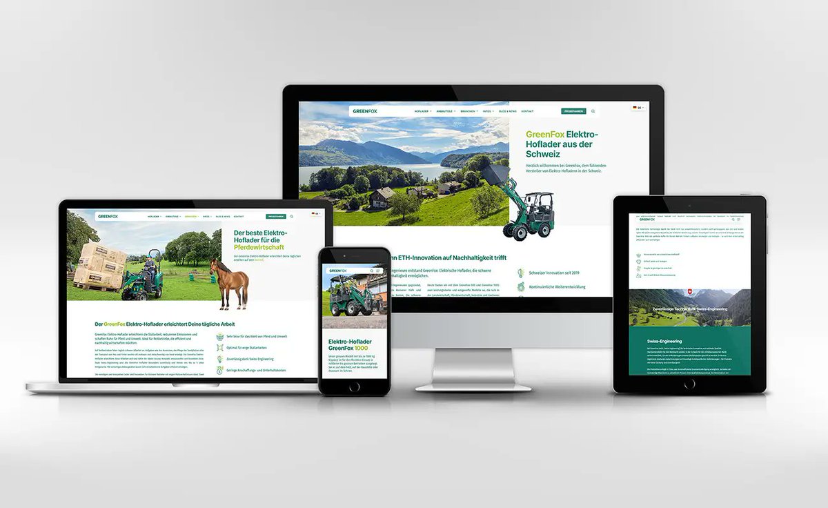
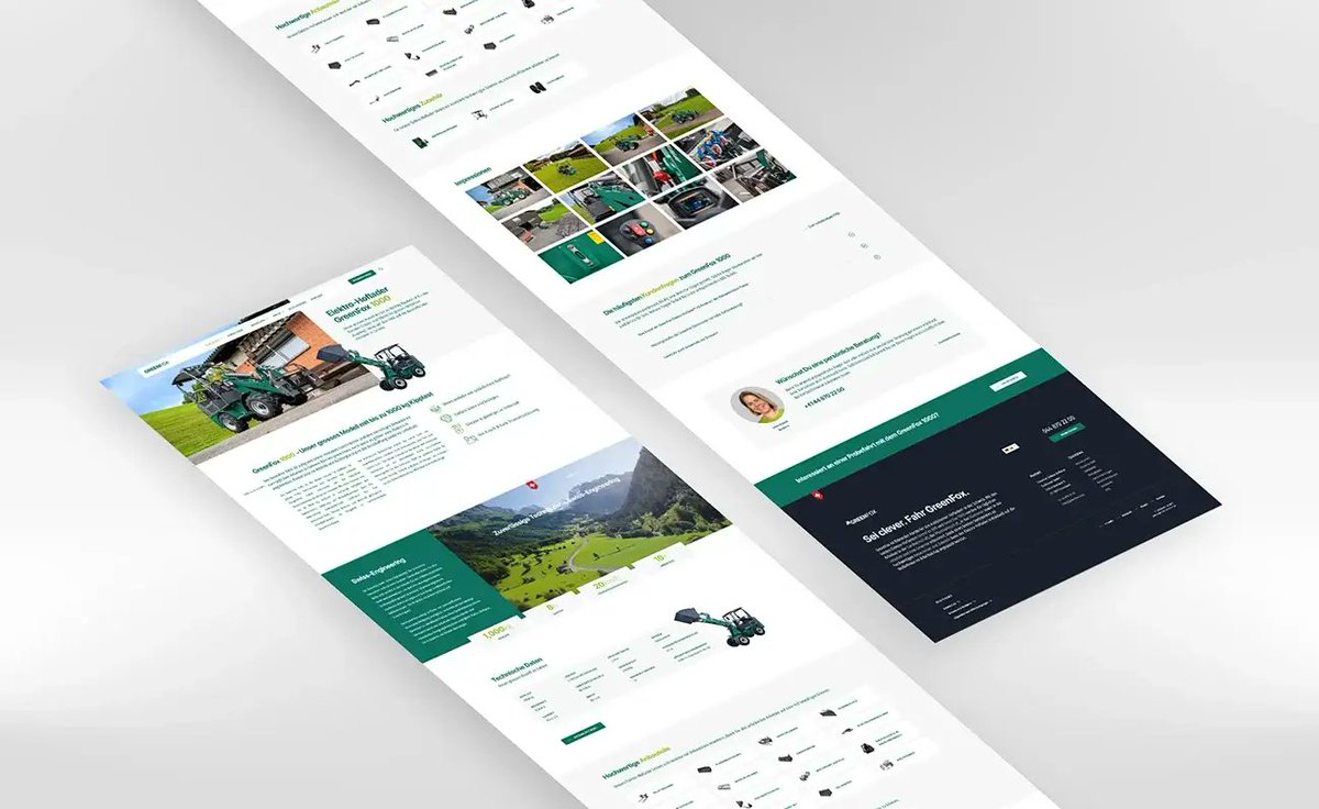
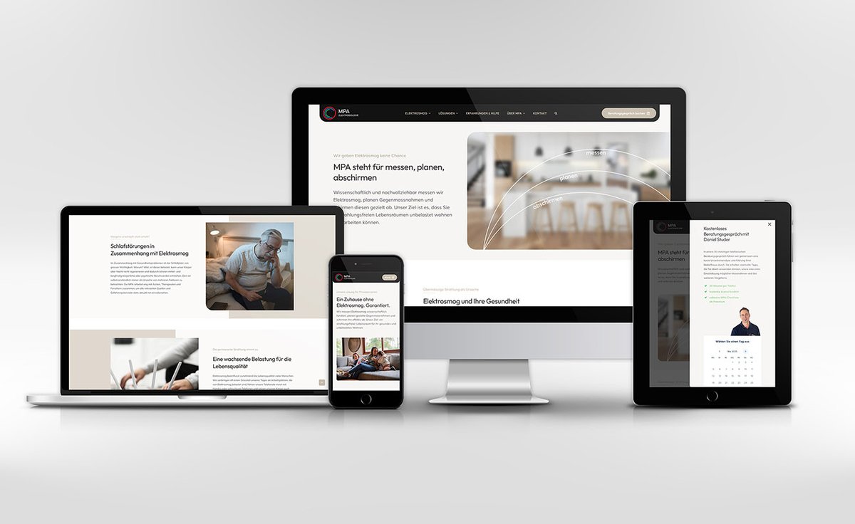
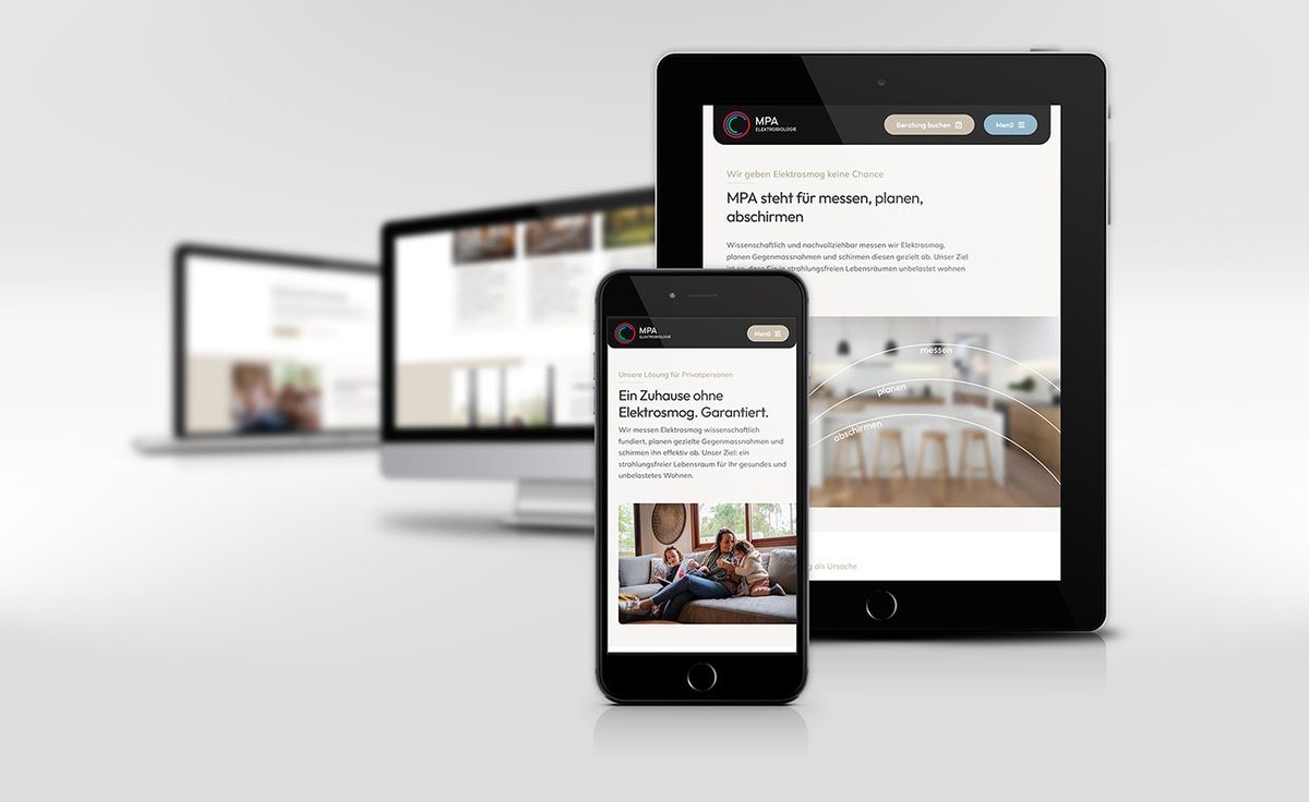
Kleine Webdesign Agentur aus Zürich mit einer unverkennbaren Liebe zum Detail.

Weisslingen, Schweiz 加入时间 Şubat 2016
76 关注70 粉丝
BlueBox Design
BlueBox Design@BlueBoxDesignCH·
@bruno_simon Yep, same here. Not sure about the shadow update, I had it also 5 hours after the launch. Chrome 143.0.7499.52 Relame GT6 (RMX3851) Android 15 Render is WEBGPU Quality low and high
English
1
0
1
102
Bruno Simon
Bruno Simon@bruno_simon·
Anyone else having bug on their phone with the new shadows? Something looking like this 👇 If so, please tell me your device/browser, and if you can check the Console that would be top 👉 bruno-simon.com
Bruno Simon tweet media
English
6
1
51
6.8K
Lusion™
Lusion™@lusionltd·
Akari - Our 2D light tracing experiment just goes live!! It comes with a few mini light demos for you to explore!! Light must go on!! ✨🌈 ↳ akari.lusion.co #threejs #webgl
English
19
109
841
90.3K
Eduard Bodak
Eduard Bodak@eduardbodak·
Added adjustments on the minimap at the bottom on mobile. While the logic already work for the progress highlighting I needed only to adjust the enter/leave animation which I had done with CSS. I already posted the styling for desktop. For Mobile it's mostly the same, only the translate Y axis is set to zero and I added the values for the translate X axis, so the minimap enters from left and leaves to the right. Also the clip-path is adjusted to this leaft/right behaviour. When I have CSS animations like this which can gets quite complex with mobile/desktop styles I just use a breakpoint for the desktop version and a breakpoint for the mobile/tablet version. (at) → @ (at)media screen and (min-width: 992px) { .bg { clip-path: inset(0% 0% 90% 0% round 1.375rem); scale: 0; translate: 0 64px 0; transition: clip-path .4s var(--smooth-ease), scale .4s .03s var(--smooth-ease), translate .5s .03s var(--smooth-ease); transform-origin: top center; } } (at)media only screen and (max-width: 991.9px) { .bg { transform-origin: center left; clip-path: inset(0% 90% 0% 0% round 1.375rem); scale: 0; translate: -80px 0 0; transition: clip-path .4s var(--smooth-ease), scale .4s .03s var(--smooth-ease), translate .5s .03s var(--smooth-ease); } } But that's not mobile first. And we have actually duplicated code. In mobile first it would look like this: .bg { transform-origin: center left; clip-path: inset(0% 90% 0% 0% round 1.375rem); scale: 0; translate: -80px 0 0; transition: clip-path .4s var(--smooth-ease), scale .4s .03s var(--smooth-ease), translate .5s .03s var(--smooth-ease); } (at)media screen and (min-width: 992px) { .bg { transform-origin: top center; clip-path: inset(0% 0% 90% 0% round 1.375rem); translate: 0 64px 0; } } When it only would be this code, I would probably use the mobile first approach. But really, I never had the situation where mobile first made any difference on loading or whatever. I'm animating way more elements on this minimap than only this one. And in my experience it's way easier to handle the animation with a breakpoint for desktop and one for mobile/tablet. Especially when you come back later and need to fix/change things for mobile. It's also more directly understandable because it's seperated. So, the first approach I showed here, I'm using quite often when it comes to CSS Animations. But like always it's depending on the case. When it's complex I split it for desktop & mobile. When it's simple and less code, I'm going the way up or down based on where I generate less code or overwrite less code.
English
4
1
50
1.8K
ᴇᴅᴀɴ ᴋᴡᴀɴ
ᴇᴅᴀɴ ᴋᴡᴀɴ@edankwan·
[Day 21] My vibe coding journey: Initial prompt: "Create a 3D website where, as the user scrolls, an astronaut flies through space, passes through a 4D tunnel to another universe, breaks through a monitor screen, and then returns to a normal web experience." I can't believe it works! I am hooked! Planning and Code: @grok 3. Of course @threejs. Hater is going to hate. Live link in the comment!!
English
73
37
882
128K