austromorph

146 posts

austromorph

austromorph

@austromorph

putting Austria into perspective | by @chrxf and @metropop_eu

Austria 加入时间 Mayıs 2016
91 关注267 粉丝
置顶推文
austromorph
austromorph@austromorph·
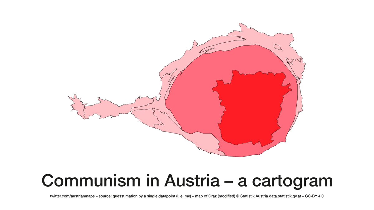
Territory vs population: Two geographies of the Austrian election results #bpw16 More maps: austromorph.space
GIF
English
0
16
55
0
austromorph 已转推
Flooh Perlot
Flooh Perlot@drawingdata·
Ich hätt ja noch eine andere Karte zu den Klimabonus-Klassen überlegt, da mE ein gutes Beispiel zum Thema Bevölkerung und Landkarten (von der Farbwahl nicht zu sprechen), aber ok, war die Innenpolitik halt schneller. Anyhow:
Flooh Perlot tweet media
Deutsch
1
3
32
0
austromorph 已转推
austrianmaps
austrianmaps@austrianmaps·
Communism in Austria – a cartogram
austrianmaps tweet media
Română
2
25
251
0
Armin Wolf
Armin Wolf@ArminWolf·
Aus unerfindlichen Gründen werden bei Präsidentenwahlen in Ö. nicht nach Quadratkilometern entschieden.
Armin Wolf tweet media
Deutsch
82
104
3K
0
austromorph 已转推
tinafrank
tinafrank@tinafrank·
Vienna elections 2020 vs 2015. city council and district council results – district by district
GIF
English
0
3
4
0
austromorph 已转推
ramon bauer
ramon bauer@metropop_eu·
Changes in the political landscape of #Vienna: 2015 and 2020 elections – district by district. #wien2015 vs #wien2020 winning party plus 2nd place city council ⬅️🗳️➡️ district council
GIF
English
1
2
3
0
austromorph
austromorph@austromorph·
@datagvat 1000Dank für die Bereitstellung der Daten. Die Visualisierung haben wir eingereicht.
Deutsch
0
0
1
0
austromorph
austromorph@austromorph·
Great to see our #austromorph cartogram in the current issue of @archplusnet accompanying Andreas Rumpfhuber’s analysis of spatial representation and structures of the populist right in #Austria
austromorph tweet mediaaustromorph tweet media
English
0
1
7
0
austromorph 已转推
Topi Tjukanov
Topi Tjukanov@tjukanov·
Visualizing Finnish elections [thread] 1/n: Finnish population cartogram showing the most popular party in each municipality. #vaalit2019
GIF
English
1
13
52
0
austromorph 已转推
Topi Tjukanov
Topi Tjukanov@tjukanov·
Persons with higher education qualifications, aged 15+, as % of total population of same age. First on a normal coropleth map and then on a population cartogram. Neither of them is optimal to deliver the message on their own, but an animation is quite helpful. Data: @THLorg
GIF
English
4
25
107
0