Post

Python Maps
Python Maps@PythonMaps·
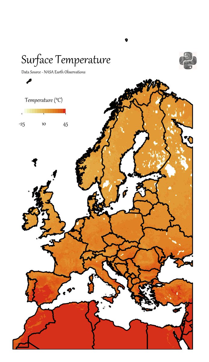
These are maps of surface temperature in Europe from July 2023. One of the hottest months ever recorded. You can tell very very different stories by just changing the colourmap. The data and plotting method are identical and yet the two maps cause very different reactions.
Python Maps tweet media
English
3
9
54
8.9K
Python Maps
Python Maps@PythonMaps·
You can also just change the intensity of the colours in order to soften the imapct of your visual.
Python Maps tweet media
English
1
0
12
4.2K
Giancarlo Di Donato
Giancarlo Di Donato@doncarlo29·
@PythonMaps Ofc, that's why should be using conventional colours. Reds are commonly associated with warmth and should be used as such
English
0
0
0
34
Teilen