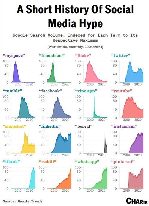
Tweet fijado
AnyChart
7.6K posts


AnyChart
@AnyChart
Cross-Platform Data Visualization Tools 📊 JavaScript charts 📈 Qlik extensions ➕ more for #DataViz and #Analytics ✨ #qlik #javascript #frontend #webdev
Se unió Nisan 2009
3.1K Siguiendo6.4K Seguidores
👀 Check out the new DataViz Weekly edition:
anychart.com/blog/2026/03/1…
English
Looking for data visualization done well?
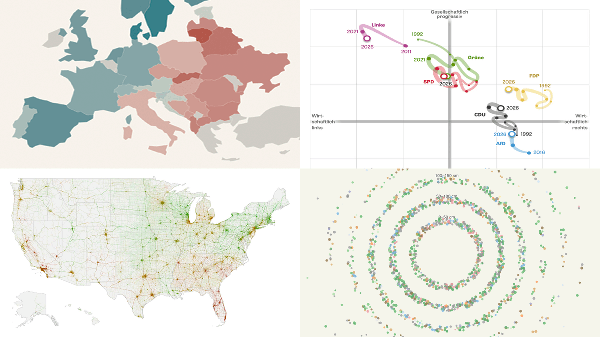
Welcome back to #DataViz Weekly 📊🙌
A new edition is here, showing how charts and maps can make complex data easier to grasp:
🔸 Gender views in Europe
🔸 Freiburg urban forest
🔸 U.S. road risk
🔸 Party positions in Baden-Württemberg
English
AnyChart retuiteado
Excel is still a daily tool for analysis.
Qlik Sense is built for governed analytics.
📝 We published a comprehensive guide to using both, and when each approach makes sense:
→ Exports & imports
→ Automation
→ Live connections
→ Embedded spreadsheets
Read it on our blog.

English
Stare at a spreadsheet long enough, and the numbers stop meaning anything.
A well-built graphic lands the point in seconds 📊
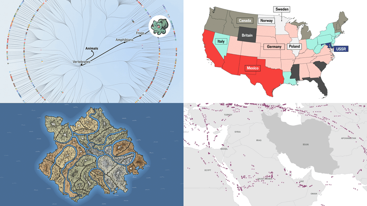
See this power in action in the latest #DataViz Weekly, with projects covering:
📍 Iran crisis
📍 Pokémon taxonomy
📍 U.S. immigration
📍 Human happiness
English
Data comes to life when the visuals are right 📈
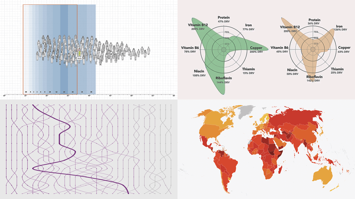
#DataViz Weekly is out with new examples worth a look, where charts and maps do a great job:
📌 Corruption worldwide
📌 College degrees since 1970
📌 Women's clothing sizes
📌 What's in liver
Check it out: anychart.com/blog/2026/02/2…
English
@Xyz_1557 Thanks for reaching out. Non-commercial licenses are requested via this form: anychart.com/buy/non-commer…
If you've already submitted it, please email support@anychart.com (or use live chat on our website) with the email you used, and our Support Team will check the status and help.
English

@SamEshaghoff Great project! Glad to feature it in the latest edition of DataViz Weekly:
x.com/AnyChart/statu…
AnyChart@AnyChart
A good visual makes a complex world feel navigable 📊 New #DataViz Weekly is live with fresh examples: ◆ Bird search trends across the U.S. ◆ NYC rent prices ◆ GDP vs. air pollution in world cities ◆ Shifts in U.S.-China alignment through UN votes ➡️ anychart.com/blog/2026/02/2…
English

I mapped every 1BR rental on StreetEasy from the past 4 months to see what NYC rent actually looks like.
13,942 market-rate listings. One interactive heat map.
eshaghoff.github.io/nyc-rent-map
GIF
English
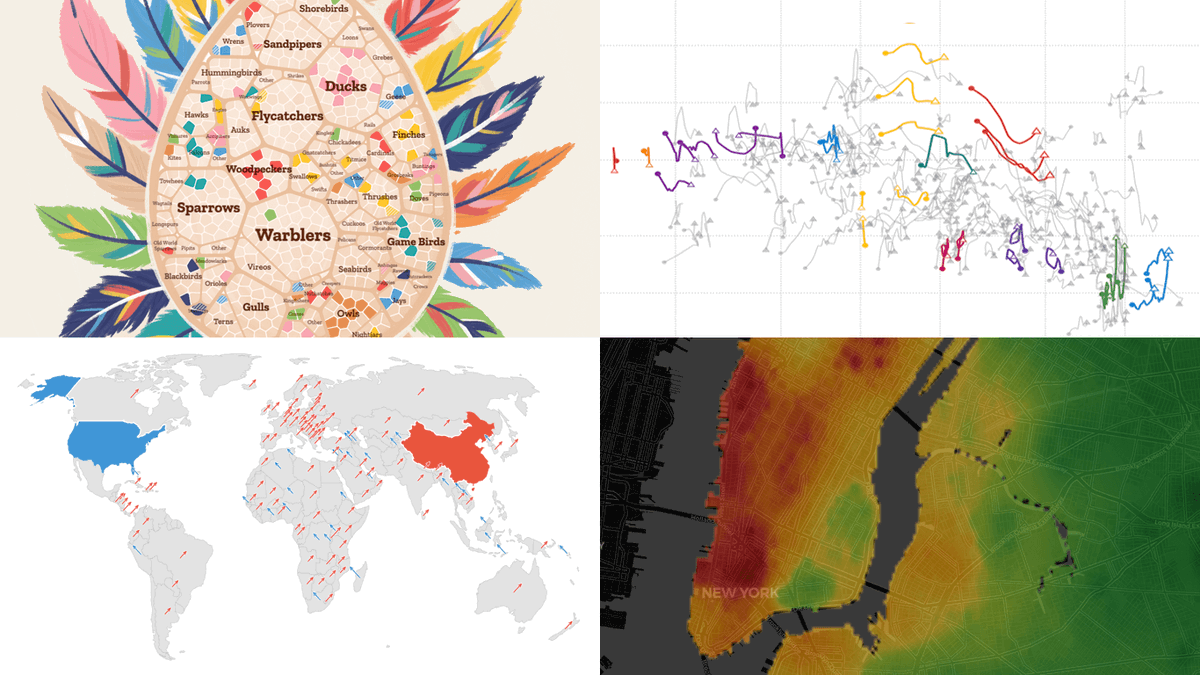
A good visual makes a complex world feel navigable 📊
New #DataViz Weekly is live with fresh examples:
◆ Bird search trends across the U.S.
◆ NYC rent prices
◆ GDP vs. air pollution in world cities
◆ Shifts in U.S.-China alignment through UN votes
➡️ anychart.com/blog/2026/02/2…
English
Data is everywhere.
📈 Good visuals make it easier to read.
Welcome to #DataViz Weekly for strong new examples of data visualization in action:
• Bluesky clusters
• Quad axel
• Winter sports access in 🇺🇸
• Climate vulnerability vs. social protection
👉 anychart.com/blog/2026/02/1…
English
📌 Tutorial:
How to Import Excel Templates into Qlik Sense
qlik.anychart.com/news/import-ex…
(Showing the setup with the Spreadsheets extension, with step-by-step screenshots and video.)
English
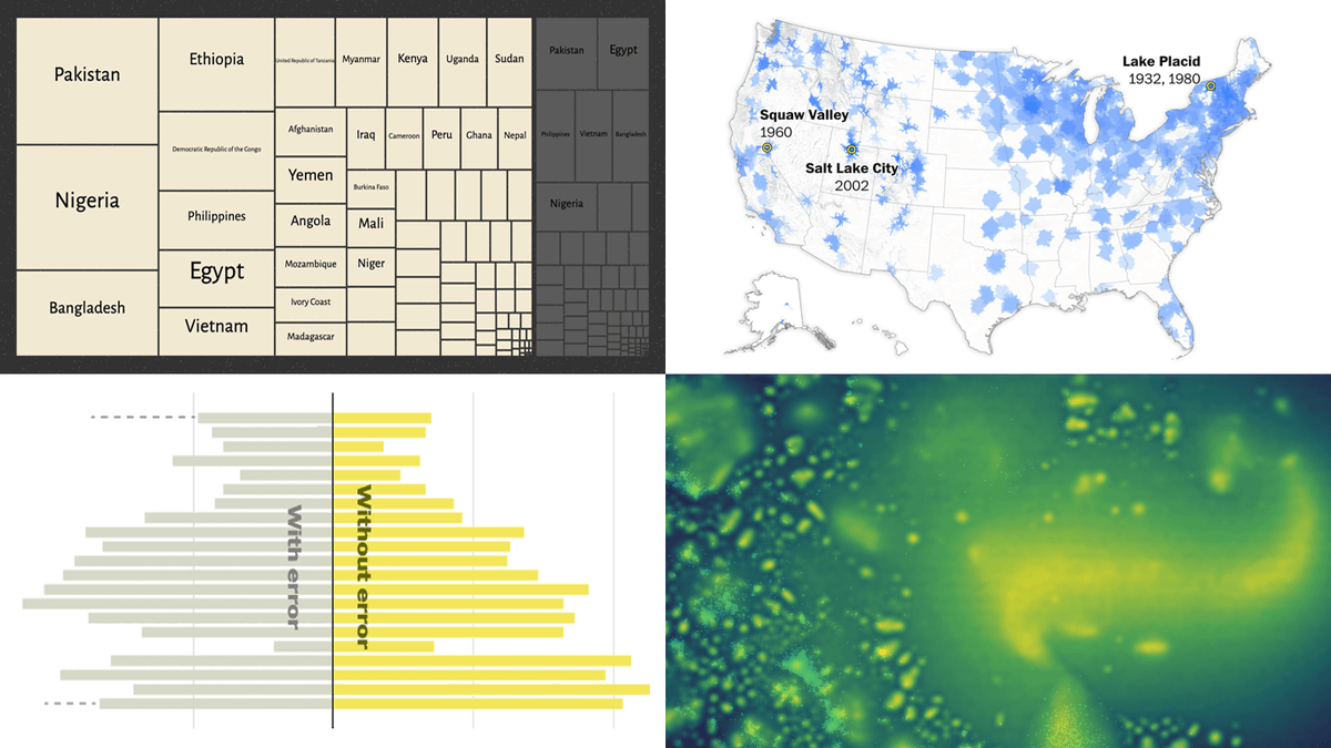
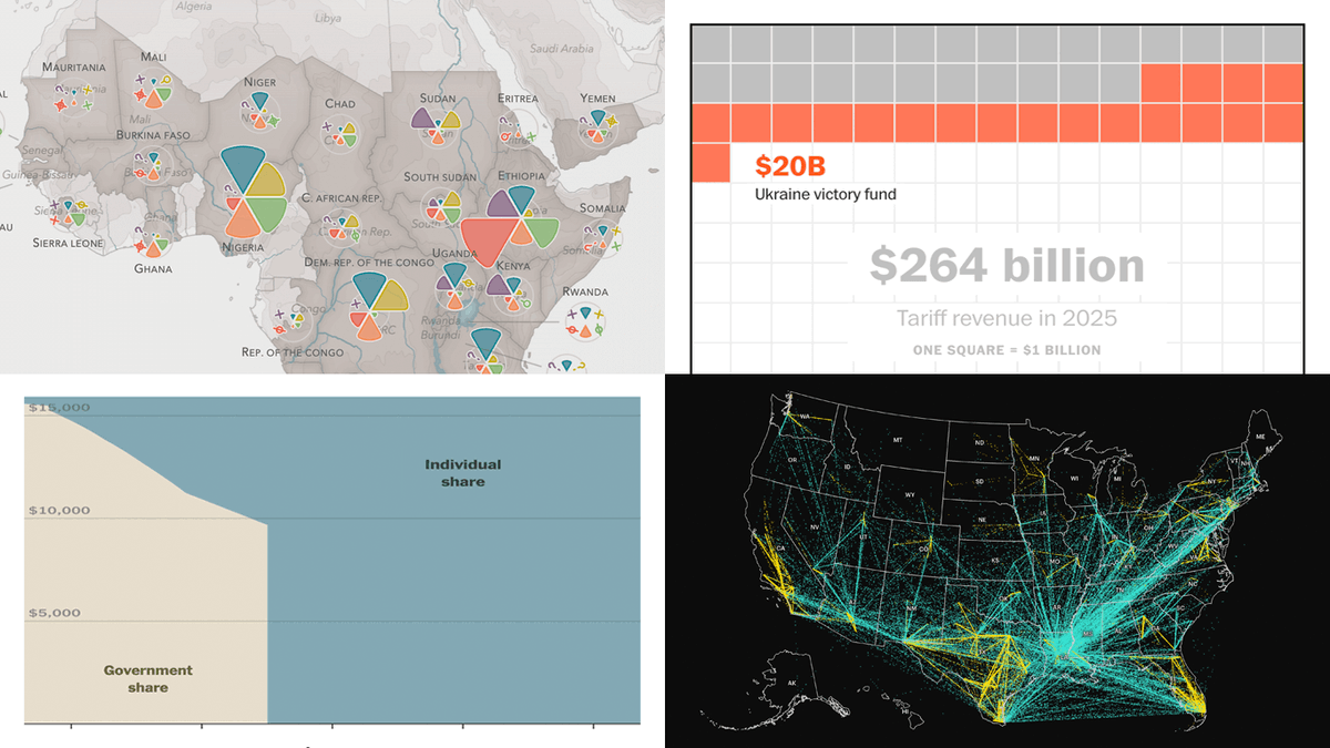
Charts & maps should not just support the text.
In good visual data #storytelling, they do the explaining.
New #DataViz Weekly is live with fresh examples:
🔸 Neglected diseases
🔸 Health insurance subsidies
🔸 ICE transfers
🔸 Tariff promises vs math
Check it out on our blog.
English
AnyChart retuiteado

Data visuals don't have to be complicated to work.
📊 Clear structure does a lot of the heavy lifting.
New #DataViz Weekly is live with fresh examples:
๏ Measles cases rise
๏ Population shifts
๏ Science cutbacks
๏ Food deserts
See the new edition on our blog.
#DataVisualization
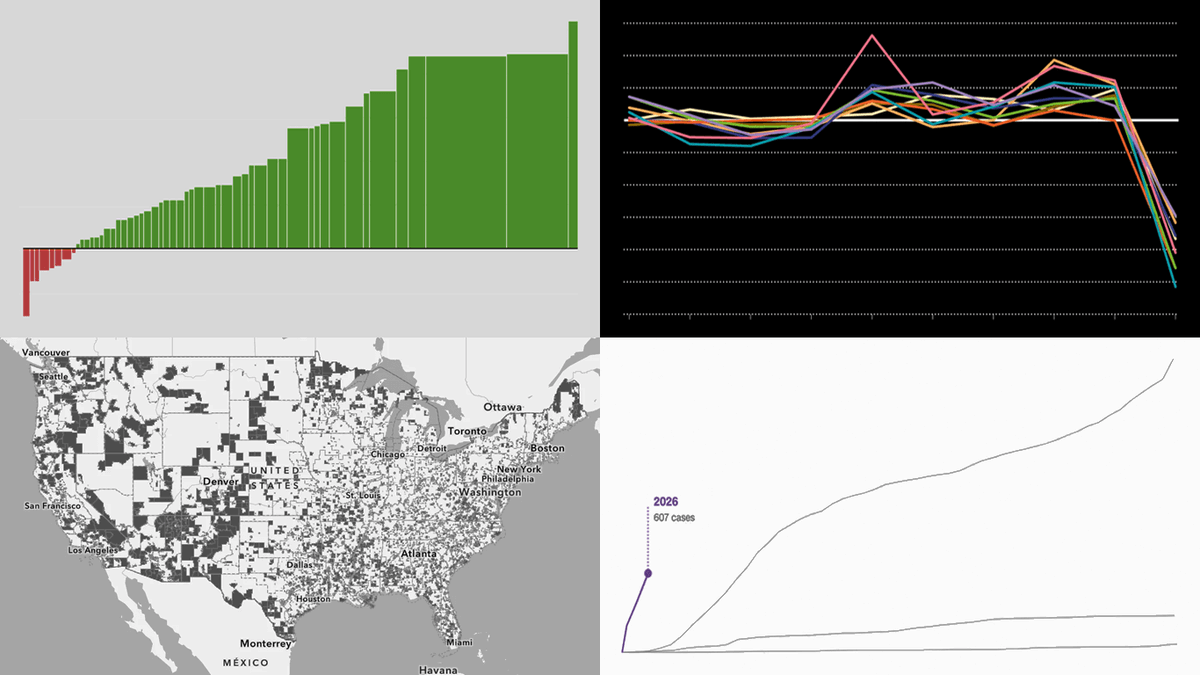
English
Dropping the direct link here just in case: anychart.com/blog/2026/01/2… 📌
English
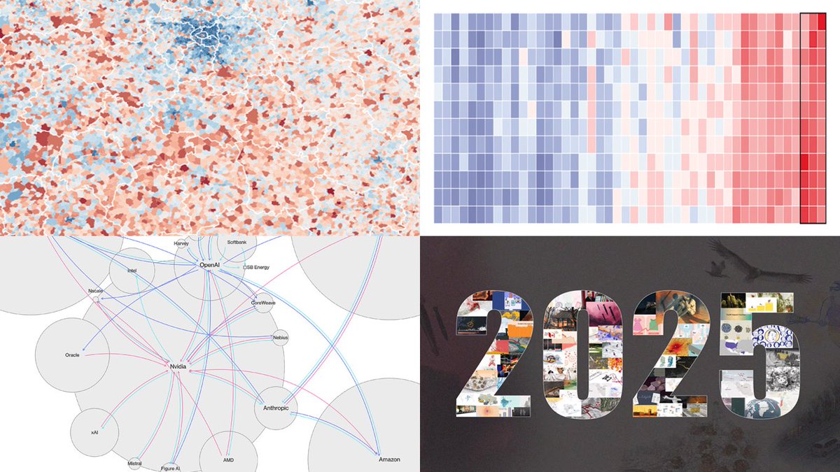
Visualizing data helps stories land faster 🎯
New #DataViz Weekly is live with new examples of visual #storytelling in action:
⭐️ 2025 heat in the global warming trend
⭐️ Circular AI deals
⭐️ Births versus deaths across France
⭐️ 2025 in Reuters graphics
Check it out on our blog.
English