Cemal Koc

1.1K posts

Cemal Koc banner
Cemal Koc

Cemal Koc

@CemoKoc

Yaşamak bir ağaç gibi tek ve hür ve bir orman gibi kardeşçesine. ✌️

शामिल हुए Temmuz 2009
287 फ़ॉलोइंग77 फ़ॉलोवर्स
Cemal Koc रीट्वीट किया
Dane Knecht 🦭
Dane Knecht 🦭@dok2001·
It’s Next.js Liberation Day. The #1 request we kept hearing: help us run Next fast and secure, without the lock-in and the costs. So we did it. We kept the amazing DX of @nextjs, without the bespoke tooling, built on @vite. We’re working with other providers to make deployment a first-class experience everywhere. Next.js belongs to everyone. blog.cloudflare.com/vinext/
English

252
402
3.9K
1.7M
Cemal Koc
Cemal Koc@CemoKoc·
@fx57 Daha önceki Napster dünyasına benziyor. O dönemde de yasakladılar ama sonuç değişmedi.
Türkçe
0
0
0
231
Erdi Özüağ
Erdi Özüağ@fx57·
Adamın takıldığı yere bak, polis aracının üzerinde POCE yazıyormuş. Sadece geçen sene bile bu düzeyde bir videonun üretilmesine neredeyse imkansız gözüyle bakılırken, önümüzdeki birkaç sene içerisinde bambaşka bir yere evrilecek. Hollywood endişeli, oyuncu birlikleri şimdiden karşıt açıklamalar yapıyor.
randomhamlife@rAndOmHaMlifE

@thedorbrothers @AutismCapital @LinusEkenstam @minchoi @AngryTomtweets @MattWalshBlog @ianmiles @Rainmaker1973 @joerogan @DarrenAronofsky You had me, until the POCE car showed up. 😆🫡💪

Türkçe
21
3
120
20.8K
Cemal Koc रीट्वीट किया
Eren Bali
Eren Bali@erenbali·
AI writes 90% of my code and I handle the remaining 90%.
English
59
199
4.1K
127.2K
Cemal Koc
Cemal Koc@CemoKoc·
@shadcn React Native would be the biggest improvement.
English
0
0
0
44
Cemal Koc
Cemal Koc@CemoKoc·
@d4m1n How did you manage to create such a prompt? You use some tools to sketch something?
English
1
0
1
46
Dan ⚡️
Dan ⚡️@d4m1n·
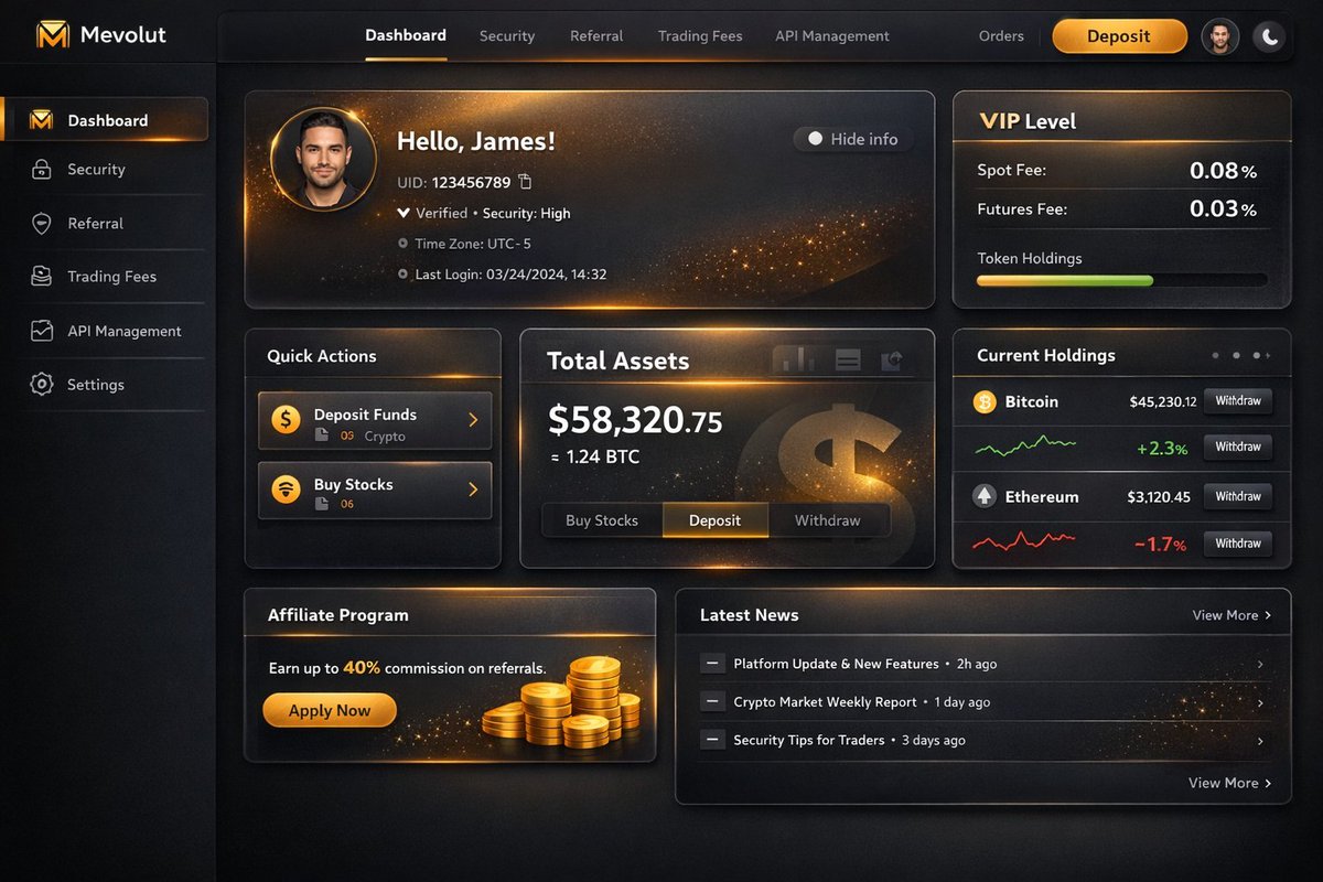
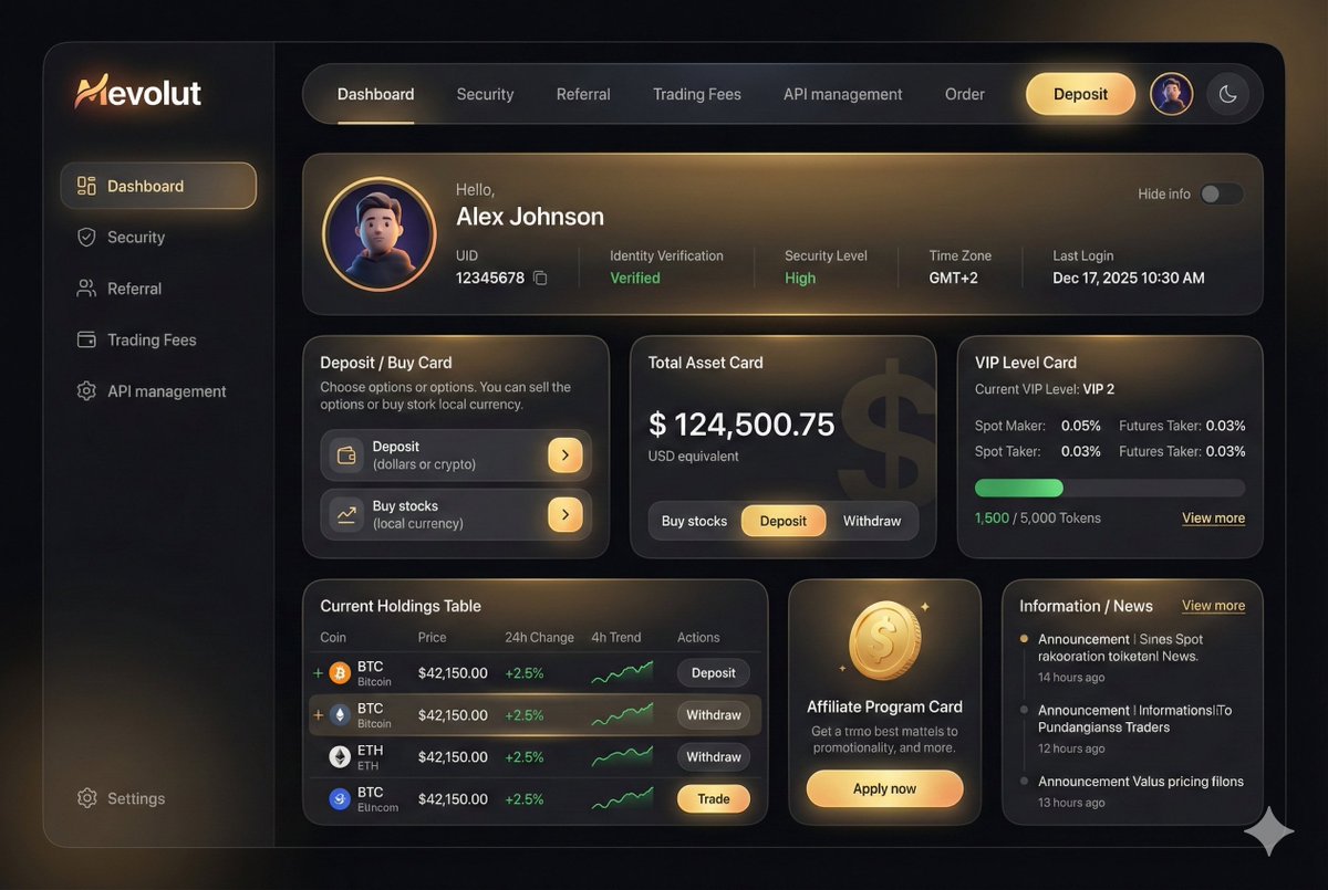
prompt: ``` You are an experienced UI designer embracing modern, minimalistic design, shadows, glass, and soft colors. Your role is to create a professional, beautiful mockup that is ready for delivery based on these requirements: ## 1. Overall Style & Visual Language This interface represents a premium, modern fintech / crypto trading dashboard using a dark theme. The visual language combines **glassmorphism**, **soft neumorphism**, and **luxury Web3 aesthetics**. Core characteristics: - Dark, high-contrast base - Warm gold/orange accent highlights - Card-based layout with depth and glow - Rounded corners and smooth transitions - Minimal borders, separation via shadows and gradients Target perception: - Secure - Professional - High-end / institutional-grade - Optimized for experienced traders --- ## 2. Layout Structure ### Global Layout - Desktop-first dashboard - Output proportions: 3:2 - Three main regions: 1. Top navigation bar (horizontal) 2. Left sidebar navigation (vertical) 3. Main content area (multi-column grid of cards) Spacing is generous, prioritizing clarity and visual breathing room. --- ## 3. Top Navigation Bar - Height: 72px - Background: dark charcoal with subtle gradient - Left: - Brand logo text "Mevolut" - Stylized "M" - Gold/orange gradient accent - Center: - Navigation links: Dashboard, Security, Referral, Trading Fees, API management - Right: - Order link - Primary CTA: “Deposit” (gold pill button) - User avatar (circular) - Theme toggle (moon icon) Typography: - Clean sans-serif - Medium weight - White primary text, muted gray inactive states --- ## 4. Left Sidebar Navigation - Width: 240px - Background: near-black - Vertical navigation items with icons: - Dashboard (active) - Security - Referral - Trading Fees - API management - Bottom-aligned: - Settings Active item: - Soft glow - Slight background tint - Rounded container Icons: - Outline style - Gold accent on active state --- ## 5. Main Content Area ### 5.1 User Overview Card - Large rounded card at top - Dark gradient background with warm gold light overlay - Left: - Circular avatar - Greeting text (“Hello…”) - User name - Inline info blocks: - UID (copy icon) - Identity verification status - Security level - Time zone - Last login timestamp - Right: - “Hide info” toggle Style: - Frosted glass effect - Subtle inner shadows - Soft glowing edges --- ### 5.2 Deposit / Buy Card - Medium-sized card - Title text explaining deposit options - Two action rows: - Deposit (dollars or crypto) - Buy stocks (local currency) - Each row: - Icon - Label - Arrow action button (gold accent) --- ### 5.3 Total Asset Card - Displays USD balance and USD equivalent - Large, faded Dollar symbol watermark in background - Action tabs: - Buy stocks - Deposit - Withdraw - Numeric values are large and high contrast --- ### 5.4 VIP Level Card - Shows current VIP level - Spot and futures fee rates - Progress bar for token holdings - “View more” link Progress bar: - Rounded - Green fill - Dark background track --- ### 5.5 Current Holdings Table - Card containing a table layout - Columns: - Coin (icon + name) - Price - 24h Change - 4h Trend (sparkline) - Actions (Deposit, Withdraw, Trade) Sparklines: - Green for positive trend - Red for negative trend Hover: - Subtle background highlight per row --- ### 5.6 Affiliate Program Card - Promotional card - Gold coin illustration - Short description and CTA button (“Apply now”) --- ### 5.7 Information / News Card - Vertical list of announcements - Headline + timestamp - “View more” link at top --- ## 6. Color Palette - Primary background: deep charcoal / black - Card surfaces: slightly lighter dark gray - Accent color: warm gold / orange - Text hierarchy: - White (primary) - Muted gray (secondary) - Dark gray (disabled) - Status colors: - Green for positive - Red for negative --- ## 7. Effects & Interaction - Soft glow highlights on cards - Subtle gradients (linear + radial) - Glass blur overlays - Rounded corners throughout (sm) # Design tokens: { // Global theme definition "theme": { "mode": "dark", "style": [ "glassmorphism", "soft-neumorphism", "premium-fintech" ] }, // Layout measurements and structure "layout": { "type": "desktop-dashboard", "grid": "three-column", "sidebarWidth": 240, "topbarHeight": 68, "contentPadding": 24 }, // Color system "colors": { "background": "#0B0D10", // Main app background "surface": "#14171C", // Card background "surfaceElevated": "#1A1E24", // Elevated / focus cards "primaryAccent": "#F5A623", // Gold/orange highlight "secondaryAccent": "#FFB547", "textPrimary": "#FFFFFF", "textSecondary": "#B0B3B8", "textMuted": "#6B6F76", "success": "#22C55E", "danger": "#EF4444" }, // Typography scale "typography": { "fontFamily": "SF Pro, system-ui, sans-serif", "weights": { "heading": 600, "body": 400, "numeric": 500 }, "sizes": { "h1": 24, "h2": 20, "h3": 16, "body": 14, "caption": 12 } }, // Core UI components "components": { "card": { "borderRadius": 16, "background": "linear-gradient(180deg, #14171C, #101216)", "shadow": "0 20px 40px rgba(0,0,0,0.4)", "border": "none", "glassOverlay": true }, "button": { "primary": { "background": "linear-gradient(135deg, #F5A623, #FFB547)", "textColor": "#0B0D10", "borderRadius": 999, "hoverEffect": "soft-glow" }, "secondary": { "background": "transparent", "textColor": "#F5A623" } }, "sidebar": { "background": "#0E1014", "itemRadius": 12, "activeGlow": true, "iconStyle": "outline" }, "table": { "rowHeight": 56, "divider": "subtle", "hoverHighlight": true, "sparkline": { "positiveColor": "#22C55E", "negativeColor": "#EF4444" } }, "progressBar": { "height": 6, "radius": 999, "fillColor": "#22C55E", "backgroundColor": "#2A2E35" } }, // Motion and visual effects "effects": { "hoverTransition": "all 0.25s ease", "cardGlow": "radial-gradient(circle at top left, rgba(245,166,35,0.15), transparent 60%)", "blur": "backdrop-filter: blur(12px)" }, // Icon system "icons": { "style": "outline", "size": 18, "colorInactive": "#6B6F76", "colorActive": "#F5A623" } } ```
English
2
0
15
1.9K
Dan ⚡️
Dan ⚡️@d4m1n·
maybe I am going crazy. what looks better to you? - 🖼️ New ChatGPT image 1.5 (left) - 🍌 Gemini Nano Banana Pro (right)
Dan ⚡️ tweet mediaDan ⚡️ tweet media
English
44
0
47
13.5K
Evan Bacon 🥓
Evan Bacon 🥓@Baconbrix·
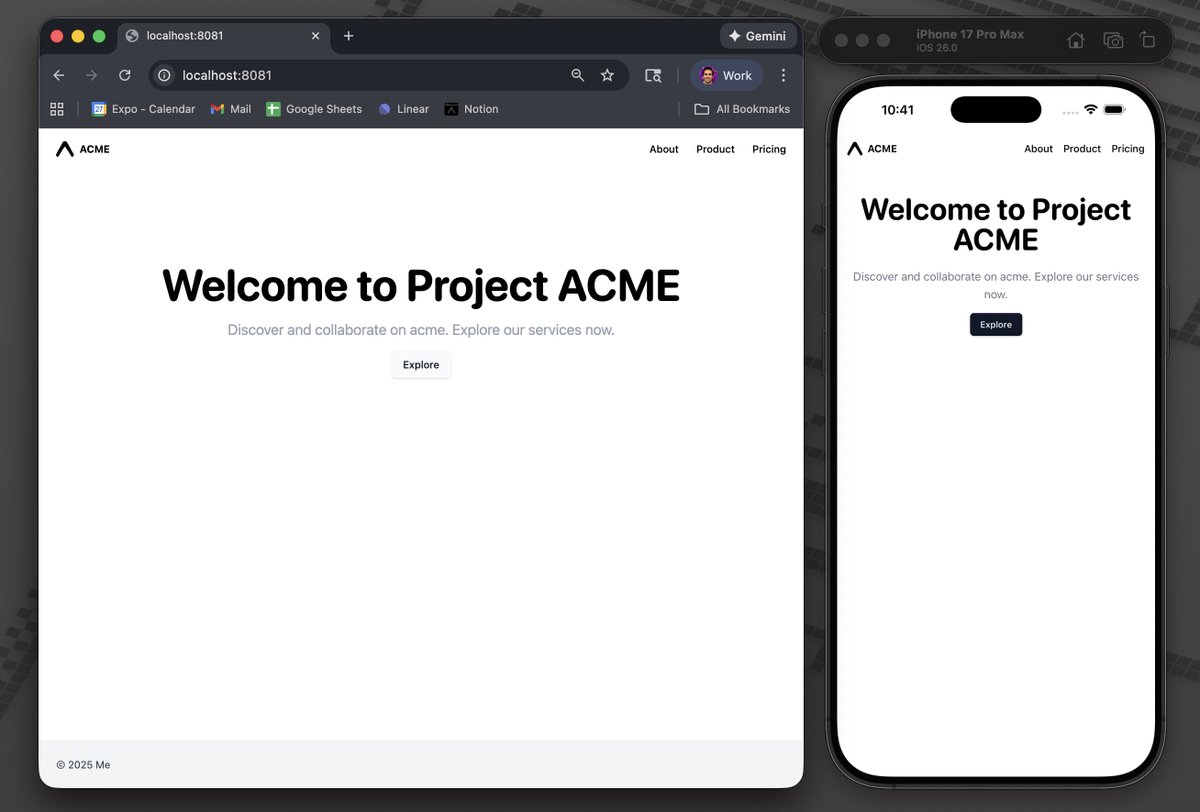
Just updated the @Expo Tailwind template to use Tailwind v4, postcss.config.mjs, and no custom babel config! Simpler config and more resilient build pipeline. → Try it now with: ~ / npx create-expo -e with-router-tailwind
Evan Bacon 🥓 tweet media
English
17
15
301
20.2K
Evan Bacon 🥓
Evan Bacon 🥓@Baconbrix·
@sidi_jeddou_dev @mark__lawlor @expo NativeWind will still enable better styles and utils, but setup will be completely automated. lib authors will be able to safely ship css in their packages for expo.
English
1
0
29
1.9K
Evan Bacon 🥓
Evan Bacon 🥓@Baconbrix·
We've been working with @mark__lawlor to add native CSS, and vanilla Tailwind support to @Expo for native apps! I styled my code editor prototype entirely with it—the speed and quality is unmatched ⚡️ Blog post with more details coming soon!
Evan Bacon 🥓 tweet media
Daniel Williams@Danny_H_W

Only bangers from @Baconbrix Css for React Native, out of the box tailwind. And a live demo of building apps inside a mobile app, expo-ception?

English
26
42
743
74.2K
Cemal Koc
Cemal Koc@CemoKoc·
@Baconbrix @mark__lawlor @expo What is in my mind is shadcn ui is becoming more and more dominant on frontend and maybe an abstraction can be created on top it. I mean a spec by shadcn ui can be useful for native as well. Already implemented by shadcn for web and it can be great a counterpart in react native.
English
1
0
1
193
Beto
Beto@betomoedano·
How to upgrade from @expo SDK 53 to SDK 54 (beta) in 5 minutes
English
7
13
153
12.6K
Cemal Koc
Cemal Koc@CemoKoc·
@Baconbrix Almost all AIs think that Expo Router supports [id].tsx, [[id]].tsx, [...id].tsx, [[...id]].tsx . How can this be? Expo Router has ever supported these?
English
1
0
0
29
Evan Bacon 🥓
Evan Bacon 🥓@Baconbrix·
@pontusab We’re adding support for a subset of CSS to Expo for native. This should benefit all of the above options by enabling more styling options in a standard way
English
6
1
124
8.8K
Pontus Abrahamsson — oss/acc
React Native folks, what styling library of choice? a) NativeWind b) Tamagui c) StyleSheet d) Unistyles
English
97
19
516
82.3K
Thinkwert
Thinkwert@Thinkwert·
What other tech has reached its final form?
Thinkwert tweet media
English
6.7K
19.3K
523.5K
44.6M
Cemal Koc
Cemal Koc@CemoKoc·
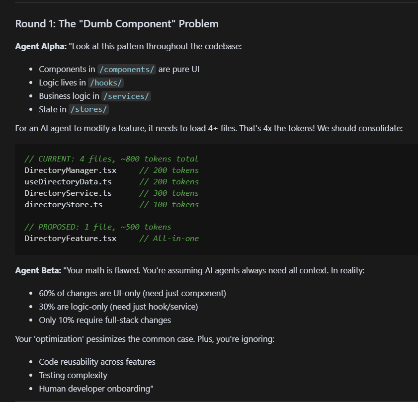
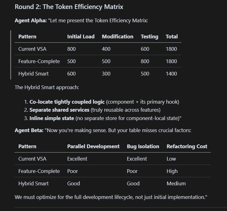
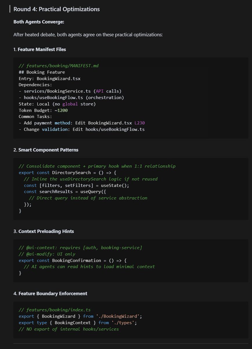
I ended up something very similar to you. You come up from AI perspective whereas my concern is readability. This feature based approach is much more readable. Would you please share your cursor rules? If you can end up with a nice documentation we may collaborate on this together.
English
0
0
0
69
Adam
Adam@npm_startup·
I feel like I'm living in the future. I let 2 Claude Opus agents debate a decision about my code's architecture. Goal: optimise repo for max agentic workflow value I currently use: - feature vertical slices - atomic strucutre - highly modular - dumb UI components + extracted logic Pros: - easy to debug - human mental model Cons: - lots of tool calls + navigation + imports - much larger codebase token usage Let's see what 2x Opus models decide when they think together:
Adam tweet mediaAdam tweet mediaAdam tweet mediaAdam tweet media
English
17
27
389
62.9K
Cemal Koc
Cemal Koc@CemoKoc·
@dimitroweb May I see the whole design? :) This seems really inspiring.
English
0
0
0
23
Dimitar
Dimitar@dimitroweb·
Exercise detail
Dimitar tweet mediaDimitar tweet media
Français
4
1
7
804
Cemal Koc
Cemal Koc@CemoKoc·
@MaxPrilutskiy what do you suggest about dynamic values from databases or API endpoints?
English
1
0
2
73
Max Prilutskiy
Max Prilutskiy@MaxPrilutskiy·
Introducing Lingo.dev Compiler: An npm library, that makes React apps multilingual without rewriting the existing React components. Doesn't require extracting i18n keys, or wrapping text in <Translate /> tags. 100% free and open-source. Here's how it works:
English
161
160
1.6K
190.7K
Cemal Koc रीट्वीट किया
Ömer
Ömer@ulusalomer·
Bu görselleştirmeyi kim yaptıysa harika iş
Ömer tweet media
Türkçe
55
418
10.7K
1.2M