@tilljanek Comes across as composed and credible - the restraint up top gives the headline room to land, and the dashboard preview grounds it in something real. Quietly confident, leaves an impression of a product that knows what it is.
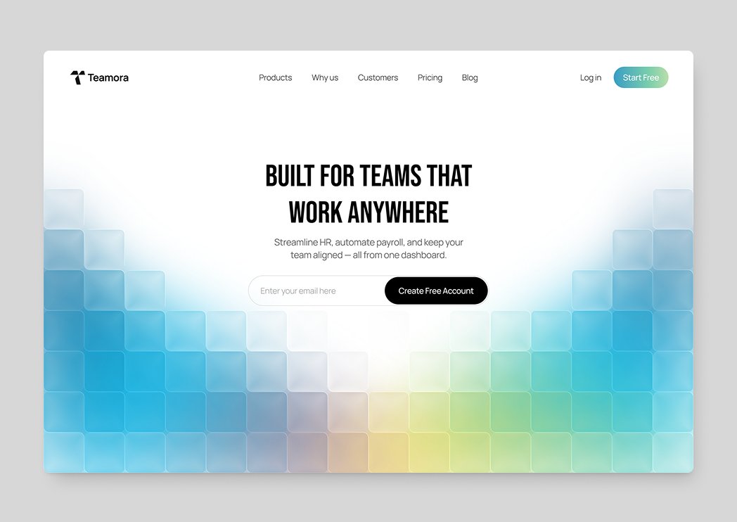
@dakshpixelup This one has a friendly, approachable mood - the soft gradient backdrop keeps it light while the recommendation card carries the focus and the decision logic. Feels modern and easy to engage with, with a calm sense of confidence to it.
I've seen a lot of takes lately about founders building products with AI themselves, and how it pulls them away from sales and their core competency.
True. But it's not just about time.
AI doesn't fully grasp the project context - it doesn't hold the whole architecture, business logic, or where the product is actually heading. So it makes a lot of mistakes in structure, functionality, and design.
And all of those issues end up on me to fix.
That's the part people don't talk about. "The founder built it with AI" is usually only half the story.
@BreejeAnadkat The detail here pays off - the corner radius and contrast give the buttons a tactile, considered feel. Subtle, but you can tell care went into it. Satisfying to look at.
@uxvukm@veloraxstudio@ycombinator This one lands good - the landing section and the dashboard share a consistent visual language, and the dense monitoring view stays legible without feeling overwhelming. The orange accent carries through nicely and gives it a cohesive identity end to end.
@SatyamVyas04 The overall direction reads good - the restraint in the type and palette gives it a considered, editorial feel without trying to do too much. It holds together as a coherent piece.
@jenidesignns A full mobile app flow laid out across the canvas. The dark theme with a green accent stays consistent throughout, and viewing the whole journey in one frame gives a clear sense of the product's overall structure.
Crypto dashboard with a well-balanced three-column layout - watchlist, central chart with the asset table, and a trade panel on the right. The data density stays manageable, and the order flow on the right reads cleanly. Cohesive overall, with a consistent visual language throughout.
@bagus_fikri@FikriStudio Strong work - the "Good morning" greeting sets a nice human tone right off the bat. Workspace rows pack a lot of metadata yet stay readable, and the discovery cards below give the home screen real purpose beyond just navigation. Cohesive and inviting.
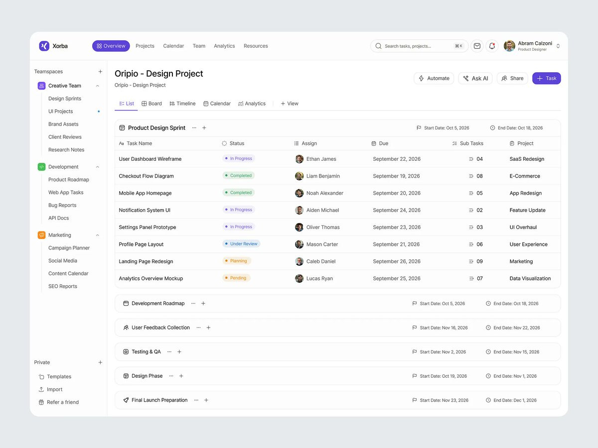
@sujon_co Clean and confident work. The hierarchy nails it - active sprint expanded, phases collapsed is a smart default. Type and spacing show real restraint, status pills and avatars keep it scannable. Solid, polished execution.
Redesigned GlowPulse — an AI-powered health and wellness platform.
Before → After.
I simplified the navigation, improved the content hierarchy, refined the visual language, and added interaction details like the hover effect on the "Download for Mac" tab.
How do you like the updated style as concept?
Working on a new redesign project.
Today I’m sharing one of the UI details built with Codex - a sticky header with a blurred background that stays accessible while keeping the interface clean and lightweight.
This is just a small preview of the work in progress.
Tomorrow I’ll share the complete website redesign.
Stay tuned.