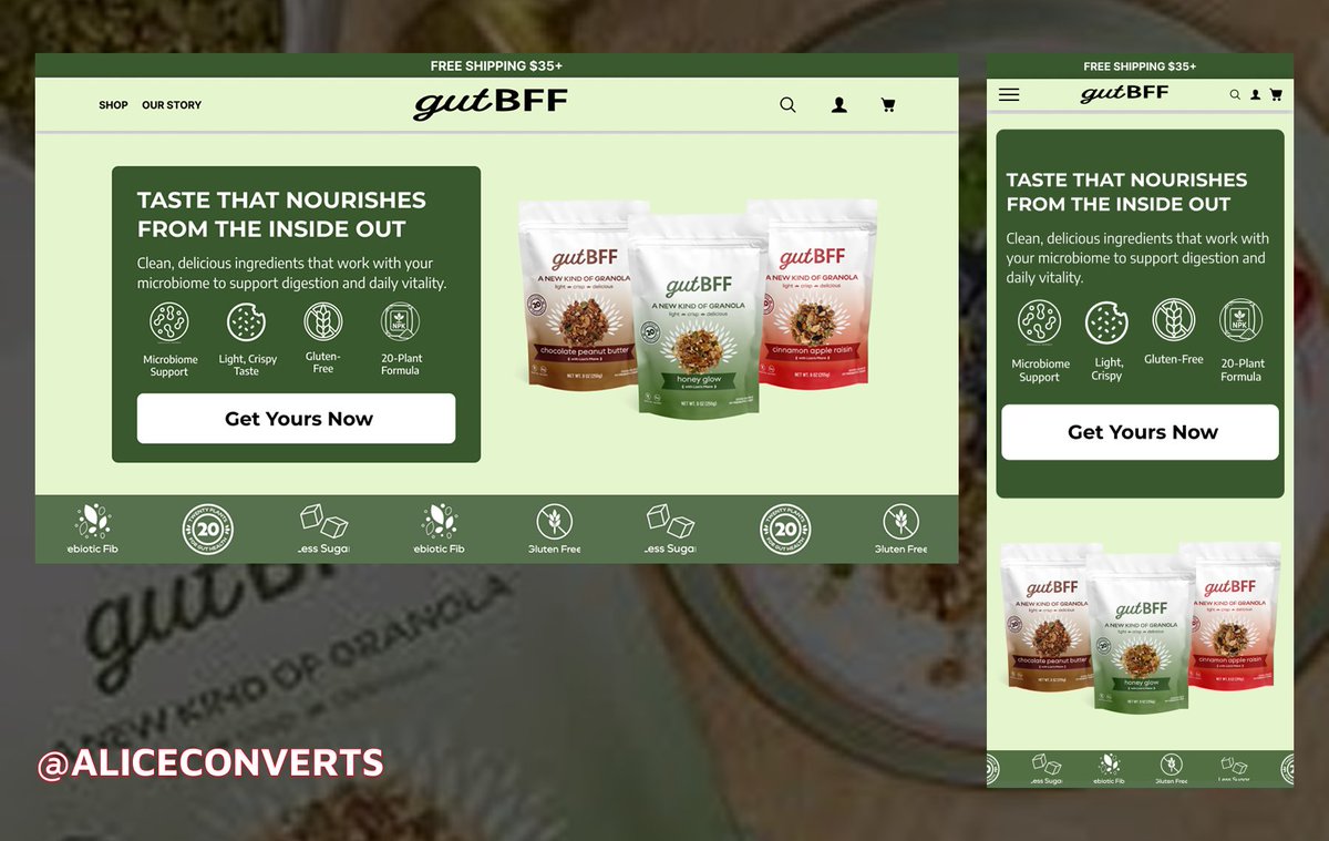
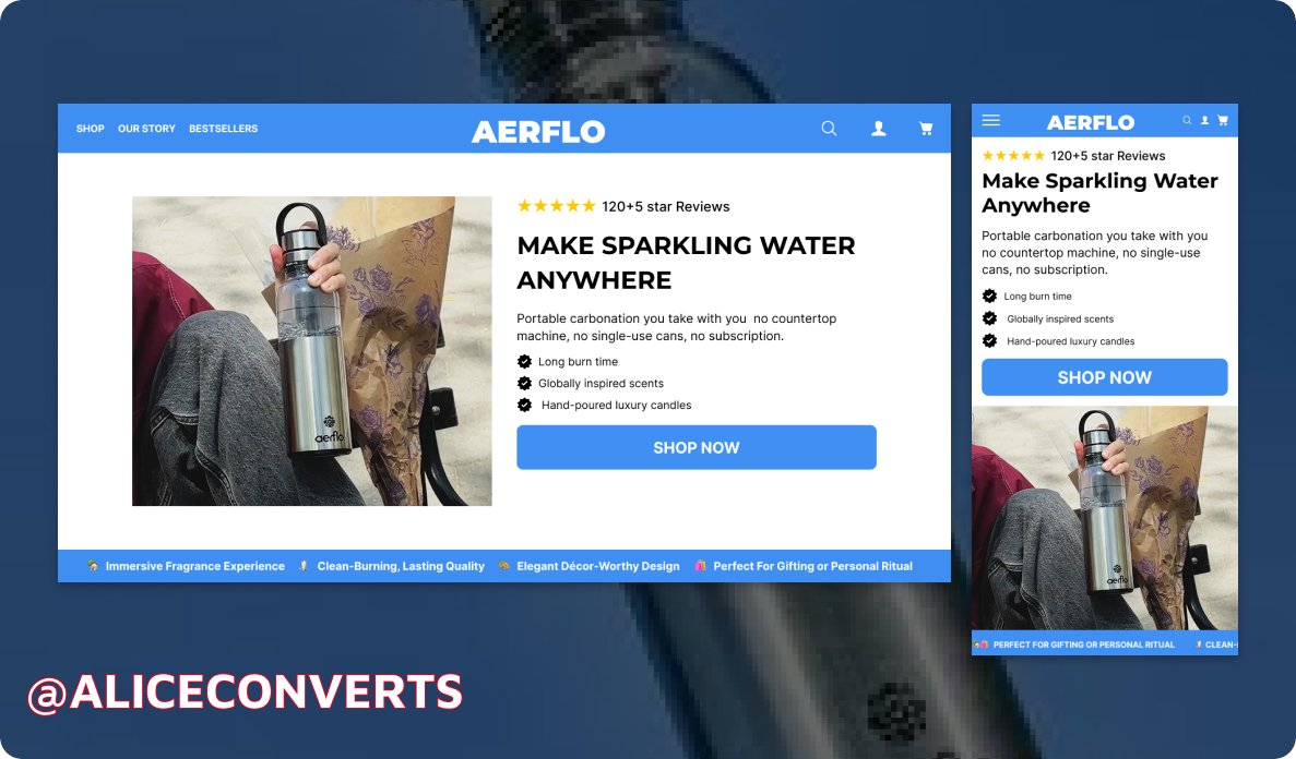
Designed this hero section for GutBFF across both desktop and mobile.
focused on making the message clear from the first glance, with a strong visual hierarchy and a call-to-action that stands out on both versions.
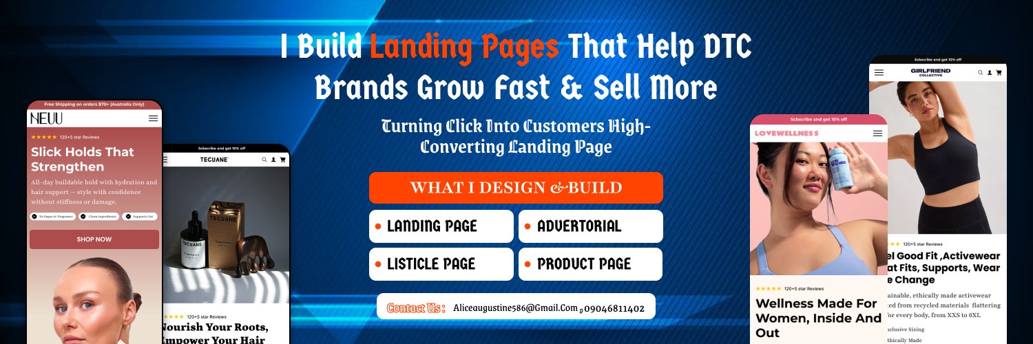
#Landingpage#Figma
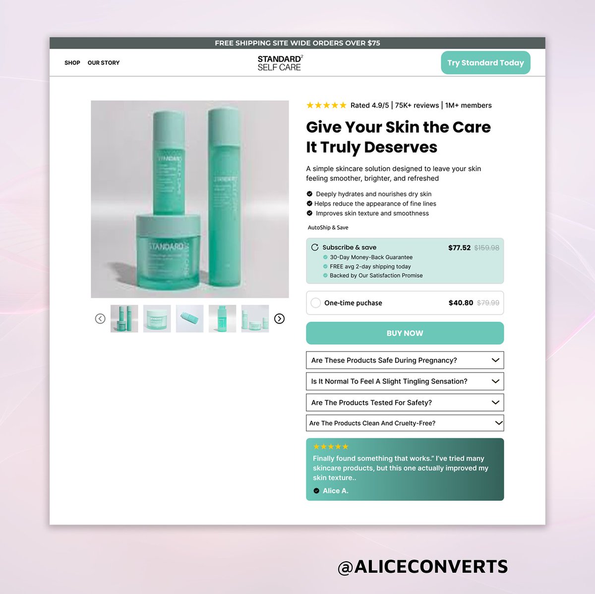
Home page design concept. The idea was to keep the experience simple while highlighting the product value and making the call-to-action easy to find.
#Landingpage#figma
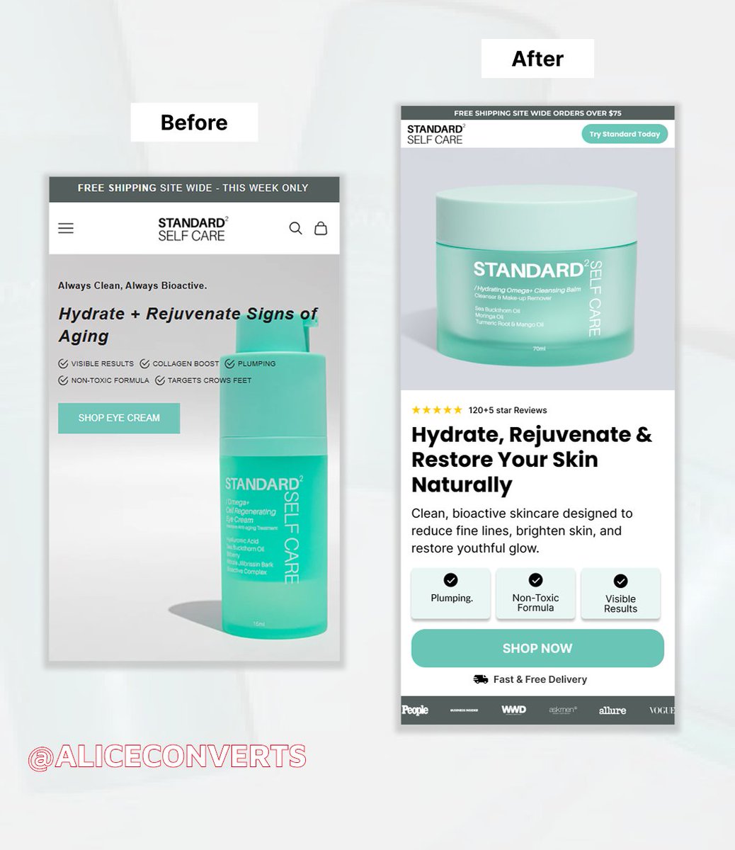
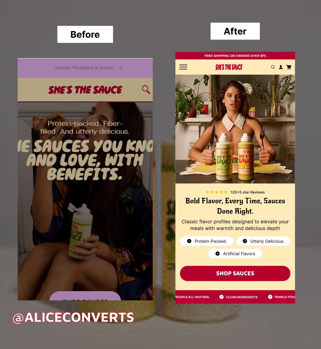
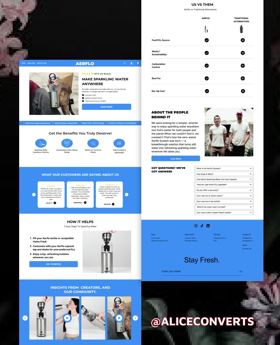
Before → After
Good design isn’t just about looks.
It’s about clarity, hierarchy, and guiding the user to take action.
Mobile hero section redesign.
#Landingpage#Figma
Landing page design concept. The idea was to keep the experience simple while highlighting the product value and making the call-to-action easy to find.
#Landingpage#Figma
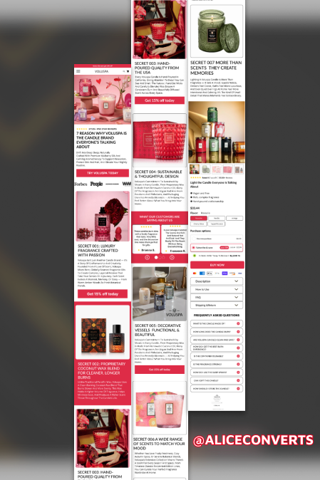
Designed this mobile listicle page with a focus on readability and structure. The goal was to keep the layout simple so users can easily scan each product and understand the key benefits.
#landingpage#Figma
Mobile landing page hero I designed today. The idea was to keep the layout minimal, make the message instantly clear, and highlight the call-to-action. A simple mobile-first design approach that helps improve user experience and conversions.