Aploris
179 posts


Aploris
@Aploris
Clear, insightful PowerPoint charts for Mac or Windows. Create graphs to succinctly communicate data-driven concepts. Legal notice: http://t.co/ADTANIvM2T
Katılım Haziran 2015
23 Takip Edilen35 Takipçiler
@friend_matt Hi @friend_matt - thanks for the note! Could you email us the data set and chart at support@aploris.com? We'll take a closer look and get back to you.
English

Hi @Aploris. I'm trying to create a bar-line chart with c. 3,750 pairs of data points. Chart doesn't work. Is there a limit on the number of data points I can have? I'll be disappointed if I have to go back to ppt or excel charts! Mac using ppt 2011. Thanks.
English
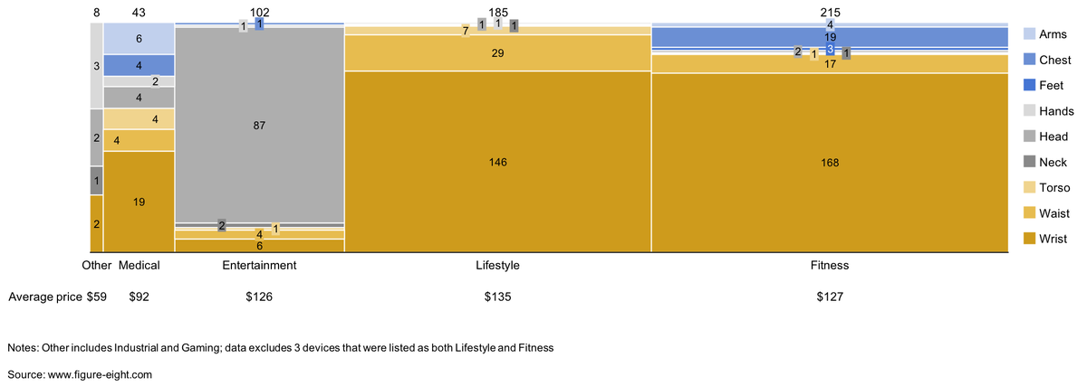
#Mekko #chart showing number of #wearables models available by location on body and purpose; #dataviz #PowerPoint #data by @FigureEightInc
English

Hey @Aploris - are you updating it for Mac OS High Sierra anytime soon? Please say yes!
Sydney, New South Wales 🇦🇺 English
#Mekko #chart showing the number of #wearable models by purpose and location on the body; #WearableTech #PowerPoint #dataviz #data by Figure Eight

English
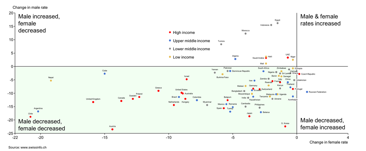
Scatter #plot change in male and female #tobacco #smoking rates in different #countries between 2000 and 2015; #data by @swissinfo_en; #dataviz #Datavisualization #PowerPoint
English
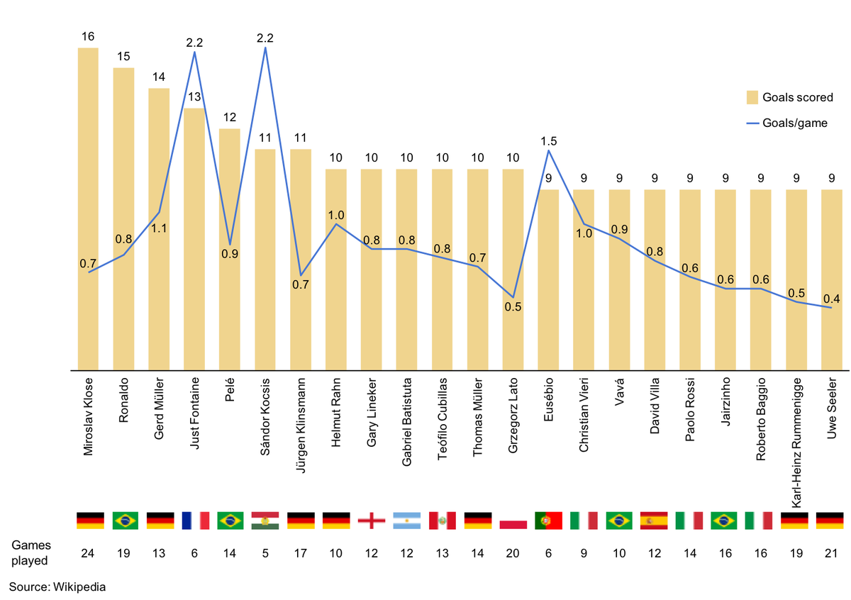
Bar-line #chart showing players with the most #goals scored in #WorldCup matches; @Miro11Klose leads! #data from @Wikipedia
English
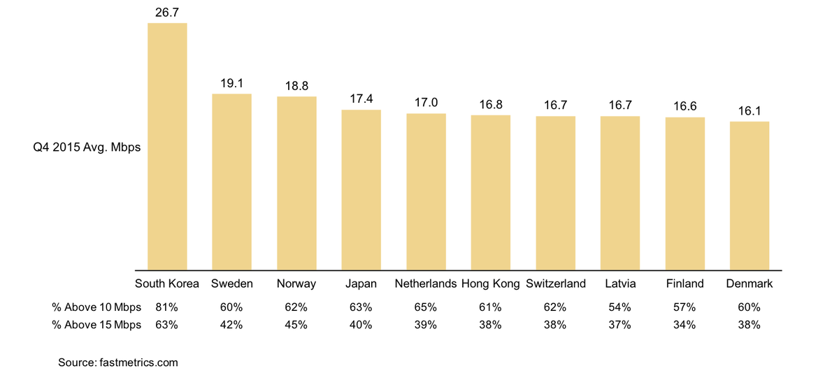
Bar #chart showing top 10 countries by #internet speed; #SouthKorea leads; #data by fastmetrics.com #powerpoint #dataviz
English
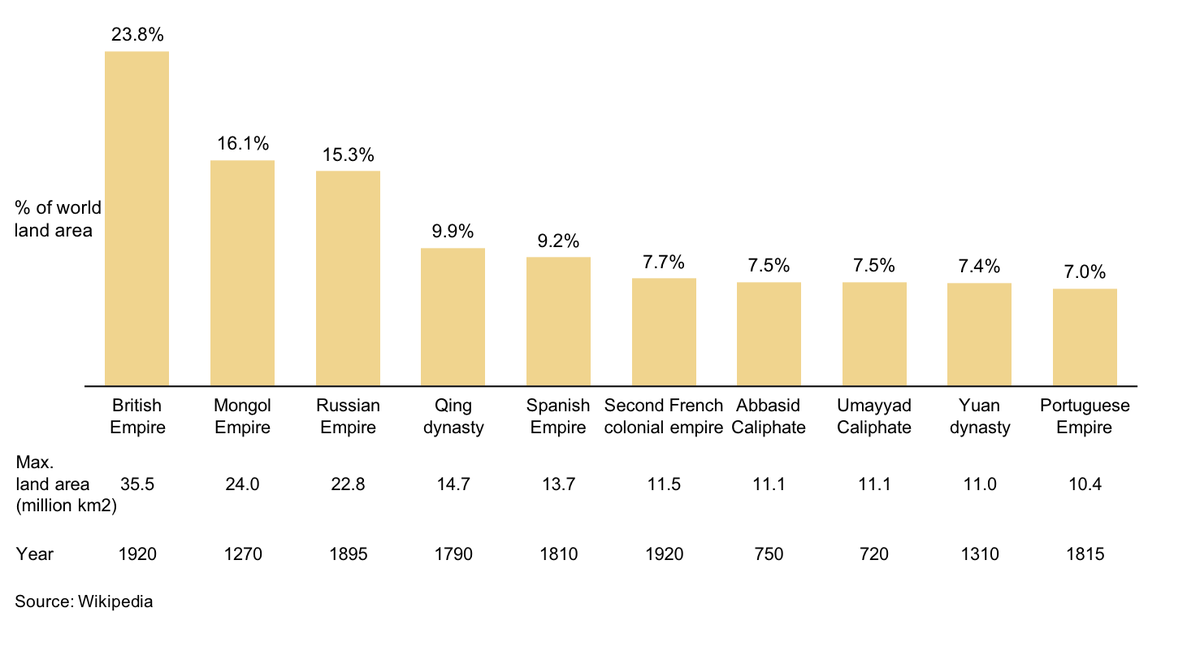
Bar #chart showing largest #empires by percentage of world land area at their peak. #BritishEmpire was largest. #Data by @Wikipedia; #PowerPoint #Mac add-in
English
@GerSmith Sorry for the inconvenience! Please try updating to the latest version: aploris.com/downloads/
If that doesn't work, reach out to support@aploris.com and we'll take a closer look
English

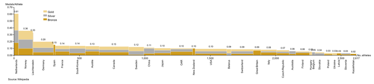
#Mekko #chart showing 2018 #Olympic #medals normalized by team size; #Netherlands leads with dominance in speed #skating; #dataviz #PowerPoint
English
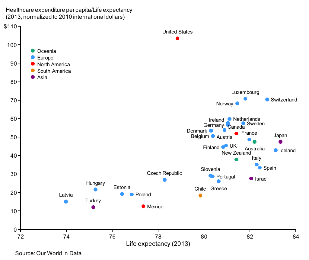
Relationship between healthcare expenditure and life expectancy; #US spends more per year of life than other country; #data from @OurWorldInData; #dataviz #PowerPoint
English
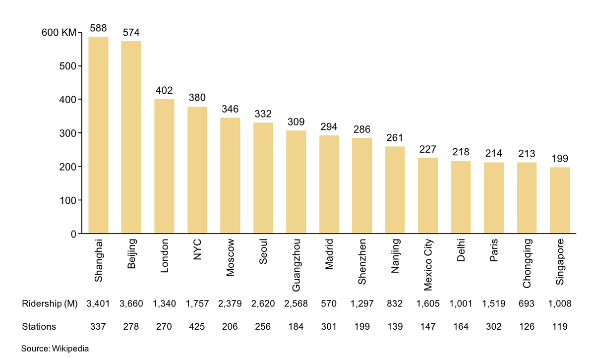
Length of top #metro systems globally; #Shanghai and #Beijing are significantly longer than rest; data from @Wikipedia #powerpoint #dataviz
English
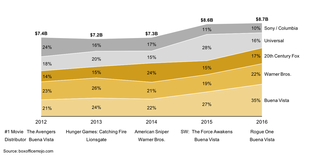
Area #chart showing #movie distributor/studio market share; #data from @boxofficemojo; #dataviz #PowerPoint
English
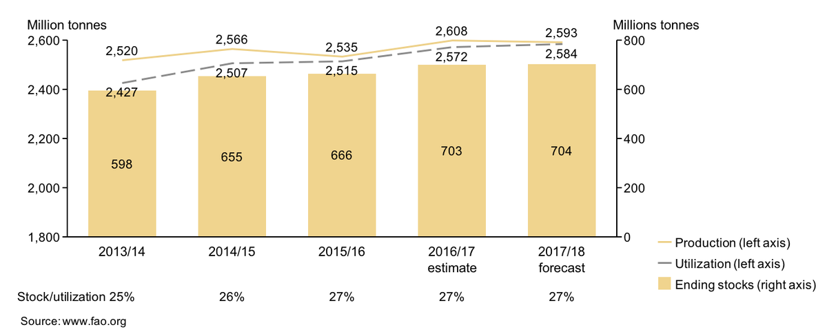
Bar-line #chart showing #worldwide #cereal production, utilization, and stocks; #data from @FAOstatistics; #Dataviz #PowerPoint
English
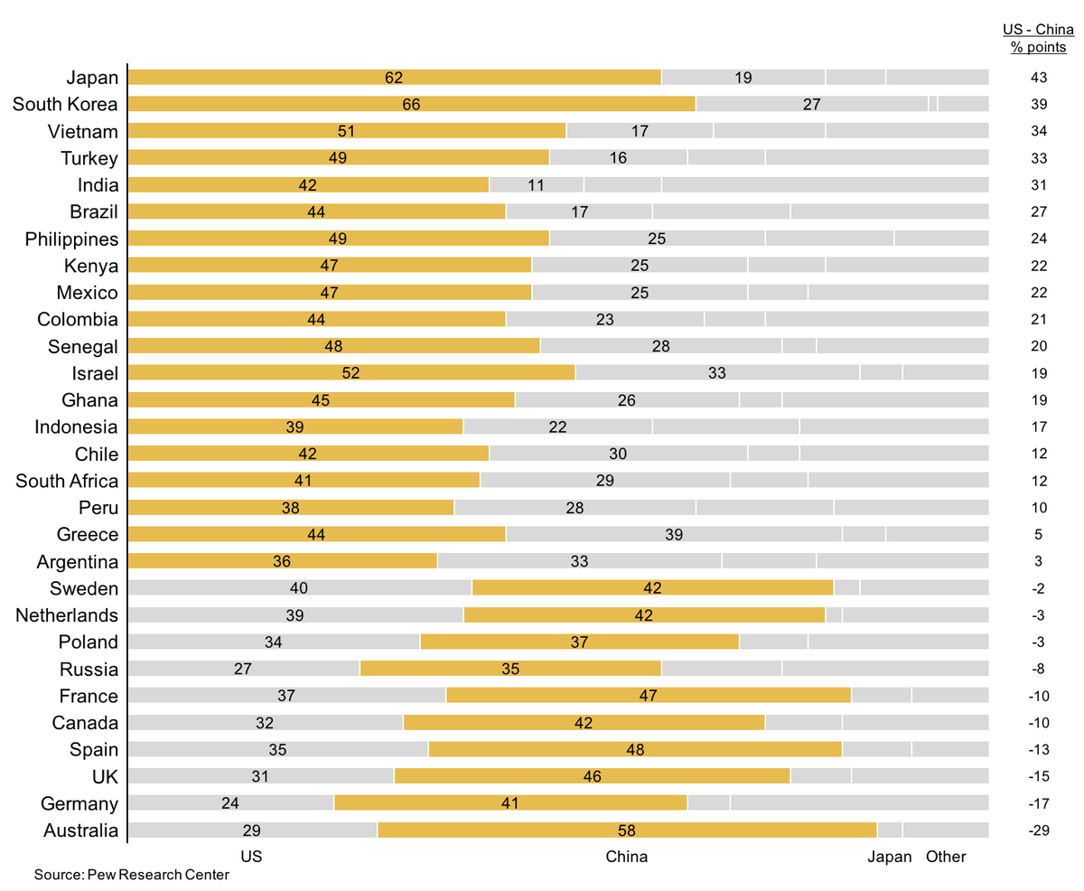
“Today, which one of the following do you think is the world’s leading #economic power?”; #Data by @pewresearch; #dataviz #PowerPoint
English
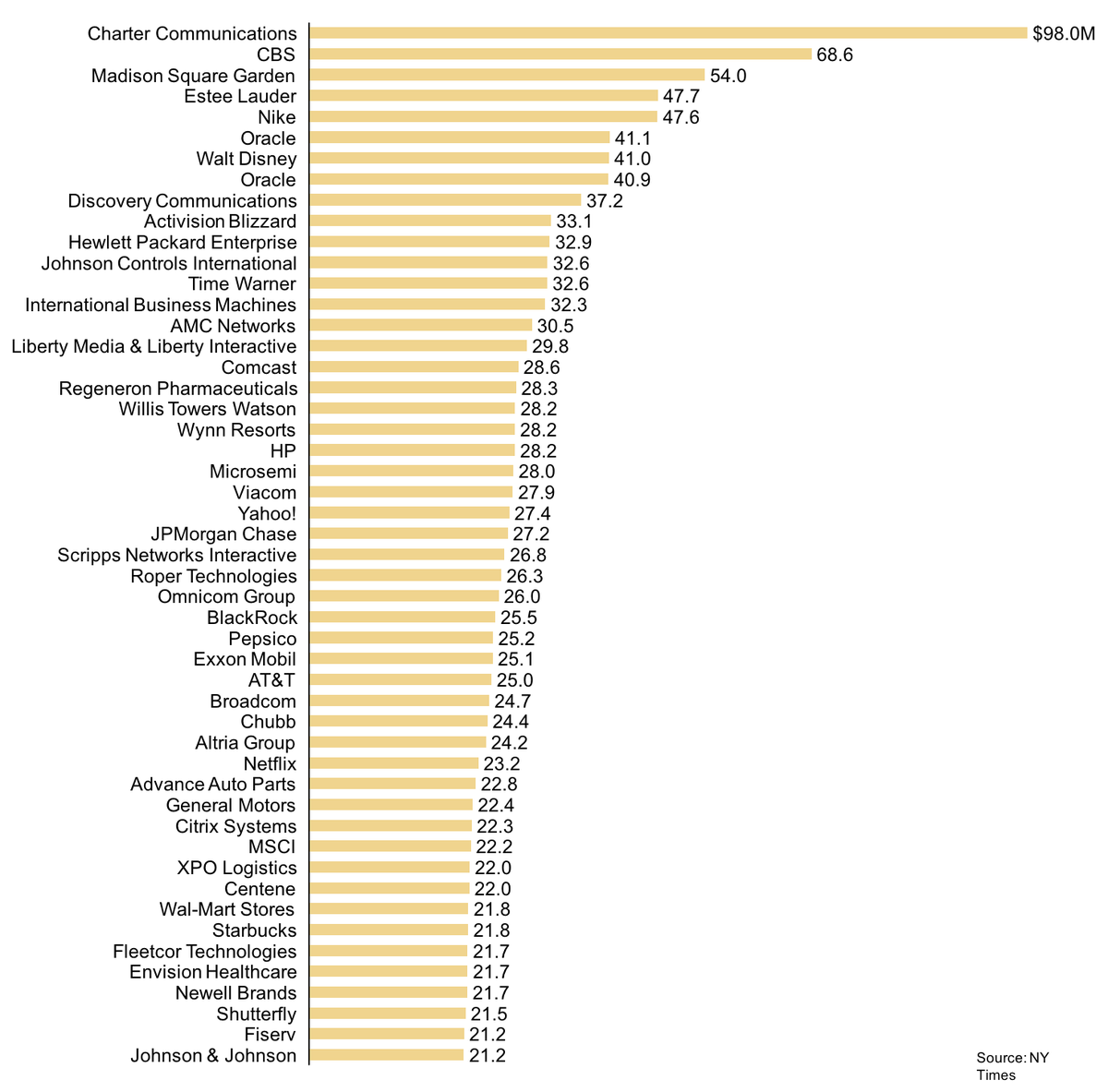
Bar #chart showing the top 50 companies that paid their #CEO the most in 2016; @CharterCom pays the most; #PowerPoint #dataviz
English