ARCHΞTYPE

1.5K posts

ARCHΞTYPE banner
ARCHΞTYPE

ARCHΞTYPE

@ArchetypeThemes

Make premium online shopping experiences accessible to all.

The Internet Katılım Ocak 2017
168 Takip Edilen1.6K Takipçiler
ARCHΞTYPE
ARCHΞTYPE@ArchetypeThemes·
How much conversion are you losing to a homepage carousel that isn't working? 46% of ecommerce sites with carousels have usability issues, and most merchants don't know it. These 10 requirements determine whether your carousel helps or hurts: 
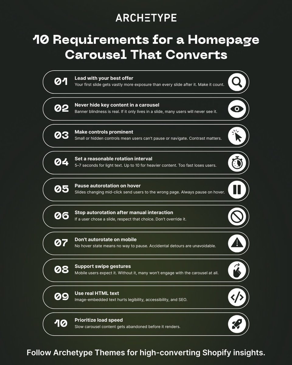
1/ Choose your first slide carefully Most users never see the rest 
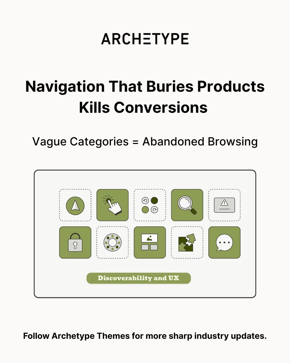
2/ Never make carousel slides the only route to key content Many users skip them entirely due to banner blindness 3/ Make controls prominent Small or hidden controls mean users can't pause or navigate 4/ Set a reasonable autorotation interval 5–7 seconds for light text, up to 10 for heavier content 5/ Pause autorotation on hover Slides changing mid-click send users to the wrong page 6/ Stop autorotation after manual interaction If a user chose a slide, respect that choice 7/ Don't autorotate on mobile No hover state means no way to pause, accidental detours are unavoidable 8/ Support swipe gestures Mobile users expect it and will disengage without it 9/ Use real HTML text, not image-embedded text Legibility and SEO both suffer otherwise 10/ Prioritize load speed Slow carousel content gets abandoned before it renders Why this matters for merchants: Carousels aren't a homepage strategy. They're a feature that requires getting 10 things right simultaneously, on both desktop and mobile. Sites that can't nail all 10 perform just as well with static homepage sections. Users scroll naturally, every offer gets equal visibility, and there's nothing to break. Source: baymard.com/premium/blog/h… Follow @ArchetypeThemes for more ecommerce UX insights.
ARCHΞTYPE tweet media
English
3
2
15
1.2K
ARCHΞTYPE
ARCHΞTYPE@ArchetypeThemes·
Shopify CLI 3.91 just made dev testing a lot cleaner! 💻 The Dev Console now shows all active dev previews and their extensions directly in the admin, no more switching between tools to track what's running. What's new: ✅ See all active dev previews and extensions in one place ✅ View who created each preview and when it was last updated ✅ Access preview links for your app and extensions ✅ Open QR codes for mobile testing directly from the console ✅ Clean up unused dev previews without leaving admin ✅ Jump to your app on the Dev Dashboard in one click Already using Shopify CLI? Run shopify app dev and open the admin to access the Dev Console now. Faster testing. Cleaner workflows. Everything visible from one place. Read the full app testing documentation: shopify.dev/changelog/mana… Follow @ArchetypeThemes for Shopify development updates.
English
3
1
13
1K
ARCHΞTYPE
ARCHΞTYPE@ArchetypeThemes·
How do specialty retailers turn a decades-old catalog into a modern shopping experience? Craft Supplies USA shows us how with their Shopify store powered by the Expanse theme. Their implementation proves what's possible when a 279+ product catalog meets the right theme foundation: → Subcollection tiles that guide beginner and expert woodturners to the right products instantly → Layered homepage promotions spotlighting sales, closeouts, and shipping offers → Volume pricing tables and variant selectors built for technical purchasing decisions → A 4.9-star review section that lets the community do the converting → Classes and blog integration that keeps customers coming back to learn, not just buy For niche specialty retailers balancing depth with discovery, Expanse delivers the structure, merchandising tools, and content flexibility needed to grow. Swipe through to see how Craft Supplies USA built a community hub 👇 See Craft Supplies USA in action: woodturnerscatalog.com Try Expanse for your brand: shopify.pxf.io/mO3RQ1 What feature would make the biggest impact on your store?
ARCHΞTYPE tweet media
English
3
1
15
866
ARCHΞTYPE
ARCHΞTYPE@ArchetypeThemes·
If your customers can't find it, it doesn't exist. Most Shopify stores have a discoverability problem, and merchants don't always realize it. Discoverability isn't just about having a search bar. It's about whether users can locate, understand, and act on what your store offers: without friction, guesswork, or support tickets. Here's what breaks discoverability on most stores: 1️⃣ Navigation that buries products When categories are vague or menus are overloaded, users abandon instead of dig. Clear navigation with predictable structure removes that friction before it starts. 2️⃣ No visual hierarchy on collection pages If everything looks equally important, nothing stands out. Color, typography, and layout cues guide users toward what they're looking for, or toward what you want them to find. 3️⃣ Search that doesn't deliver A search bar that returns irrelevant results is worse than no search at all. Users lose confidence fast and rarely come back. 4️⃣ Features users can't find Wishlists, filters, quick buy, variant selectors, merchants add them and assume customers will discover them. Most won't without intentional placement and visual cues. The pattern: Discoverability is why two stores can sell the same products and convert very differently. The one that wins makes finding and understanding products effortless. Your theme is the foundation. Build it right. Follow @ArchetypeThemes for ecommerce UX insights.
ARCHΞTYPE tweet media
English
3
1
16
917
ARCHΞTYPE
ARCHΞTYPE@ArchetypeThemes·
Shopify just rolled out VAT number validation at checkout for EU and UK merchants! 🙌 Big update for merchants selling B2B across Europe. If you use Shopify Tax in the EU or UK, you can now enable automatic VAT number validation at checkout, applying the reverse charge exemption on eligible orders without manual work. What this means: ✅ VAT numbers entered at checkout are automatically validated ✅ Reverse charge exemption applied automatically on eligible orders ✅ VAT numbers saved to customer profiles for future orders ✅ Correct VAT invoice documentation generated when exemption applies The exemption applies to EU → EU shipments (where destination differs from fulfillment country) and EU → UK shipments. It does not apply to UK → EU or UK → UK shipments. To enable it: go to checkout settings and set the Company VAT number field to Optional. A few things to keep in mind, reverse charge eligibility is based on your fulfillment location country, not your store address. If you have multiple fulfillment locations, changing which location fulfills an order affects eligibility. And while VAT validation confirms formatting and validity, Shopify recommends verifying independently via the EU's VIES service if you suspect fraudulent use. Shopify is rolling this out over the next few weeks. Read the full documentation: changelog.shopify.com/posts/vat-numb… Follow @ArchetypeThemes for Shopify platform updates.
English
3
3
19
1.4K
ARCHΞTYPE
ARCHΞTYPE@ArchetypeThemes·
High-consideration purchases need education, not just product grids. Liberty Safe uses Impulse to transform technical complexity into customer confidence. Here's what stands out: ✅ Homepage establishes authority first Full-width promotional banner, three category tiles for navigation (Gun Safes, Home Safes, Vault Doors), educational sections explaining manufacturing credentials, partnership badges building credibility. ✅ Collection pages teach while customers browse Product grid with star ratings, "What to Consider When Buying a Gun Safe" guidance embedded on page, videos explaining security levels and fire resistance, size comparison graphics with human figures for scale. ✅ Quiz tool eliminates decision paralysis 6-step process starting with value estimation ("Under $3,000" to "$10,000 or more"), clear progress visualization, guided narrowing from broad needs to specific recommendations. ✅ Product pages packed with specifications Key specs prominently displayed (Made in USA, fire rating, security level, locking bars), model/size dropdown, financing messaging with Shop Pay integration, embedded product videos. ✅ Recommendations positioned after confidence is built "You May Also Like" appears after full specification review, USA-made badges for quality signaling, pricing transparency, clear product differentiation. Impulse handles technical products where customers need research and reassurance before purchasing. Education embedded, not hidden. See Liberty Safe: libertysafe.com Try Impulse for your store: shopify.pxf.io/JK0b7E 👉 Follow @ArchetypeThemes for more merchant stories.
ARCHΞTYPE tweet media
English
2
1
14
823
ARCHΞTYPE
ARCHΞTYPE@ArchetypeThemes·
Baymard tested mobile filtering across 80+ product lists and found a critical usability issue. Users apply multiple filters then scroll through results. When they return to check their selections, there's no visible reminder of active filters. They must reopen the filtering interface just to confirm what they filtered by. Real examples of this friction: ➡️ Walmart and Williams-Sonoma hide applied filters. Users reopen the interface repeatedly just to see their selections. ➡️ Nike shows six active filters in the filtering interface but provides no indication on the product list itself. Users who forget what they filtered assume no suitable products exist. ➡️ Amazon closes the interface after deselecting one filter. Removing multiple filters requires reopening it over and over. The fix Baymard validated: Display applied filters above the mobile product list. Users see active filters and understand result scope without leaving the page. Two approaches work: horizontal scrolling (truncate rightmost filter, show total count, include scroll bar) or stacked rows (everything visible, no scrolling needed). Crutchfield and Home Depot both implement this correctly. Users never lose track of what they filtered by. Follow @ArchetypeThemes for UX insights that improve conversion.
English
2
1
15
1.2K
ARCHΞTYPE
ARCHΞTYPE@ArchetypeThemes·
Bounce rate knowledge pays off long after you launch your store. For Shopify merchants, understanding why users leave without engaging helps you build stores that retain attention and convert consistently. Here are 5 optimization areas that reduce bounce rates in ecommerce: 1. Navigation Structure Keep menu categories between 4 and 7 options. Avoid generic "Shop" or "Products" labels with everything underneath. Order categories intentionally since first and last positions get most interaction. Add images to navigation, especially on mobile, to provide visual inspiration alongside category names. 2. Product Media Quality Images capture attention first when users land on product pages. Videos demonstrate how products work and move. Set videos to autoplay and position them in the first gallery slot to maximize engagement immediately when customers arrive. 3. Information Visibility Display key product details prominently without forcing customers to scroll or dig. For accessories: compatibility and battery life matter most. For fashion: sizing, fit, materials, and available colors. Run user testing to confirm customers find critical information easily. 4. Collection Grid Variation Collections pages are typically common landing pages. Break up traditional product grids by splicing larger lifestyle images or videos into the layout. This maintains visual interest and helps stores stand out on otherwise monotonous browsing pages. 5. Review Display 75% of consumers search for reviews and testimonials before purchasing. Show product review ratings on collection page cards to add immediate credibility and encourage click-throughs to product pages. Optimizing for lower bounce rates helps you: ✅ Keep traffic you paid to acquire ✅ Meet user expectations when they land on your store ✅ Showcase products effectively after spending money on ads ✅ Turn single-page visits into engaged sessions The average e-commerce bounce rate sits at 35-45%. Above 50% signals problems worth investigating. Explore Shopify themes built with engagement in mind: archetypethemes.co Follow @ArchetypeThemes for insights on building stores that retain customer attention.
English
3
1
15
705
ARCHΞTYPE
ARCHΞTYPE@ArchetypeThemes·
Building a Shopify store? Your navigation type choice just became critical. Here are the six navigation types and when to use them. 1. Streamlined navigation bars Horizontal, top-positioned, classic approach: → Located on every page with links to top-level pages → Includes search bar, CTA, cart icon, and brand identity → Often sticky, following users as they scroll 2. Dropdown menus Compact and organized: → Houses links, CTAs, search bar, and images in one control → Can include interactive components like sliders, galleries, and videos → Complex yet handy UI element 3. Flyout menus The most popular type today: → Hamburger icon triggers slide-out menu with vertical orientation → May include search bar and CTA button → Numerous brands use this approach 4. Footer navigation Multilevel and content-heavy: → Includes almost all links plus regulatory requirements (Privacy Policy, Cookies) → Features galleries, videos, and subscription or contact forms → Increasingly popular in the ecommerce sector 5. Sidebar navigation Positioned left or right, declining in popularity: → Covers top-level pages, brand identity, search bar, and social media icons → Some brands still benefit from it → Particularly popular seven years ago 6. Sitemap Separate page, hierarchically organized: → Includes links to all pages accessible to crawlers and users → One of the oldest navigation types → Essential for search engine accessibility Archetype Themes support all navigation types with built-in flexibility. Explore themes: archetypethemes.co Follow @ArchetypeThemes for practical insights on building high-performing Shopify stores.
ARCHΞTYPE tweet media
English
1
1
14
897
ARCHΞTYPE
ARCHΞTYPE@ArchetypeThemes·
Shopify just released POS version 11.0 to make in-store checkout faster and less chaotic! 🙌 Here's what it improves during busy selling moments: → Cleaner cart layout that's easier to scan at a glance → Multi-select for editing multiple items at once → Smarter Add customer flow with better matching and autofill → Cart stays visible throughout checkout to maintain context → Larger number pads and simplified split payments → Key actions open in left side panel instead of pop-ups Why does this matter? Because staff need to move fast without losing orientation. With POS 11.0, staff handle transactions confidently even during their first shift. Fewer pop-ups, faster workflows, and clearer actions mean better in-store experiences for customers. Read the full update: changelog.shopify.com/posts/shopify-…
ARCHΞTYPE tweet media
English
2
1
14
940
ARCHΞTYPE
ARCHΞTYPE@ArchetypeThemes·
Your homepage feels chaotic after customization, but you can't explain why… The issue is design balance, how visual elements are distributed across your layout. Balance affects conversion. Well-balanced designs reduce cognitive strain and guide the eye naturally. Unbalanced layouts create frustration and increase bounce rates. Four types merchants encounter: 1. Symmetrical balance Product grids with equal spacing, centered logos, and mirrored navigation. Communicates reliability and professionalism. Used by luxury brands and corporate sites. 2. Asymmetrical balance Large hero image on one side, text and CTA on the other. Creates dynamic compositions without exact mirroring. Guides attention to specific elements. 3. Radial balance Elements radiate from a central point. Useful for circular logos, promotional banners, or featured products that need strong focal points. 4. Mosaic balance Grid-based collection pages where every product card carries equal visual weight. Creates movement without hierarchy. How to maintain balance when customizing: Use darker colors sparingly, they carry more visual weight. Large images need counterbalancing with smaller text elements. Strategic white space prevents overcrowding and draws attention to key information. Archetype Themes use these balance principles by default: symmetrical grids, asymmetrical heroes, and strategic spacing, so customizations start from stable foundations. Explore Archetype Themes: archetypethemes.co Follow @ArchetypeThemes for design insights that improve ecommerce experience.
GIF
English
4
1
16
798
ARCHΞTYPE
ARCHΞTYPE@ArchetypeThemes·
Order metafield definitions now support automatic copying from cart to order! Cart metafield values automatically copy to matching order metafields when checkout completes. How it works: Set capabilities.cart_to_order_copyable = true on your order metafield definition. Values automatically copy when an order is created if namespace and key match between cart and order metafields. Requirements: Only available for order metafield definitions. Cart metafields can be set with Storefront API or Checkout UI Extensions. Why this matters: Gift messages, delivery instructions, or custom cart-level data flow directly to order records without manual transfer logic. Learn more here: #cart-to-order-copyable" target="_blank" rel="nofollow noopener">shopify.dev/docs/apps/buil… Follow @ArchetypeThemes for Shopify updates.
English
3
1
15
1K
ARCHΞTYPE
ARCHΞTYPE@ArchetypeThemes·
How do physical media brands organize 916 releases without overwhelming buyers? Severin Films shows us how with their Shopify store powered by the Expanse theme. Their implementation blends discovery and detail: → Homepage sections organized by buying motivation (Pre-Orders, New Releases, Warehouse Finds) → Sidebar filtering across availability, sale status, and catalog support → 8-image product galleries with extensive technical specifications and edition limits → "You May Also Like" recommendations positioned after product details For physical media brands managing large catalogs, Expanse provides the structure needed to guide discovery without losing depth. See how Severin brings organization and detail together: severinfilms.com Try Expanse for your brand: shopify.pxf.io/mO3RQ1 What section of your catalog would benefit most from clearer organization?
ARCHΞTYPE tweet media
English
0
0
1
334
ARCHΞTYPE
ARCHΞTYPE@ArchetypeThemes·
Merchants test random changes: button colors, hero images, checkout layouts, hoping to copy what worked for other sites, and wonder why results don't translate. Why does that matter? Split testing only produces substantial improvements when you take a data-oriented approach to solving a clearly defined problem. Testing without a hypothesis teaches you nothing. If results improve, you don't know why. If they don't, you've wasted time. Copying what worked for Amazon or another site ignores business goals, traffic sources, and customer expectations that differ from yours. Testing multiple variables simultaneously makes it impossible to identify what drove results. That's why Baymard's framework requires: identify the actual problem using data, define a hypothesis based on observed behavior, test one variable at a time, and run tests long enough for statistical significance. Six research-backed areas to test: CAPTCHA necessity, one-page vs multi-step checkout, security visual cues near payment fields, live chat implementation intrusiveness, static vs dynamic shipping thresholds, and guest checkout prominence. The lesson: Split testing accelerates improvements, but only when you start with a defined problem and control variables. Random tests produce random insights. At @ArchetypeThemes, we build on that principle. Every theme incorporates research-backed UX patterns so merchants start conversion-safe before testing variations. 👉 Explore Archetype's Shopify themes built on proven UX foundations. archetypethemes.co Read the full Baymard split testing guide: baymard.com/learn/split-te…
ARCHΞTYPE tweet media
English
4
2
14
839
ARCHΞTYPE
ARCHΞTYPE@ArchetypeThemes·
Where do customers look first on your homepage? If you can't answer that, your visual hierarchy needs work. Visual hierarchy is the strategic placement of elements to draw attention to key information in order of importance. Poor hierarchy means customers miss your CTA, product benefits get buried, and important information competes instead of being prioritized. What works: 1️⃣ Size and scale create instant priority. Larger elements signal importance. Dramatic size differences create contrast that grabs attention while keeping users engaged. 2️⃣ Color and contrast direct focus. Bright colors on dark backgrounds command attention. Strategic color combinations make secondary elements recede. Heavy, dark typeface on light backgrounds says "look here." 3️⃣ Layout guides the eye. F-pattern layouts place key information along the left with details branching right. Z-pattern layouts arrange content diagonally downward. Both mimic natural eye movement. 4️⃣ Typography establishes order. Bold typefaces dominate. Light typefaces recede. Font pairing and strategic sizing prioritize certain words over others. Test it: Ask customers what they noticed first, second, third. Use heat maps to track where eyes linger. If they're not digesting information in your intended order, adjust. @ArchetypeThemes use visual hierarchy principles by default, strategic sizing, prominent CTAs, natural layout patterns, so customers flow toward conversion actions. Read the full visual hierarchy guide: shopify.com/ph/blog/visual… Follow for more design insights.
English
3
2
15
900
ARCHΞTYPE
ARCHΞTYPE@ArchetypeThemes·
Did you know? AI block generation now works with every Shopify Theme Store theme 🤖 Sidekick's theme block generation just expanded beyond Horizon themes. Now available across all themes, including Archetype Themes. Here's what this means: 1️⃣ Describe what you want in plain language: Sidekick codes it for you on the spot. 2️⃣ Iterate to refine results: If Sidekick's first pass isn't just right, you can iterate on the design to refine your results. 3️⃣ Available now: Theme block generation works on all Theme Store themes. Learn more about theme block generation: changelog.shopify.com/posts/ai-block… Follow @ArchetypeThemes for Shopify updates and theme insights.
ARCHΞTYPE tweet media
English
3
1
13
1K
ARCHΞTYPE
ARCHΞTYPE@ArchetypeThemes·
Category structure for craft supplies isn't just about organizing products. Altenew does it with creative precision. Instead of generic "supplies" categories, it connects products to crafter intent: → Homepage collections organized by monthly releases, not just product types → 15 visual category tiles guiding discovery (Watercolors & Gouache, Stencils, Dies, Embossing Folders) → Collection pages with project-type navigation (Cardmaking Essentials, Coloring Essentials, Scrapbooking) The structure is craft-focused but clear. The tiles feel purposeful, not cluttered. And star ratings earn trust before the product page ever loads. By the end, crafters aren't just browsing paper supplies. They're confident this brand understands their projects. Craft-led navigation handles large catalogs through buyer intent. Explore Impulse here 👇 shopify.pxf.io/JK0b7E Follow @ArchetypeThemes for more ways to structure large catalogs through intent.
English
2
1
16
1.1K
ARCHΞTYPE
ARCHΞTYPE@ArchetypeThemes·
Growing Shopify stores hit the same product data wall. Tags pile up. "Leather," "leather," "material_leather", all three exist, and no one knows which one drives your filters. Uploads slow down. Errors multiply. Your catalog becomes harder to manage, not easier. Here's the taxonomy fix: Use metafields for what doesn't change. Use tags for what does. 1️⃣ Metafields = permanent foundation Material, dimensions, shape, flavor, core attributes. These power automated collections, SEO schema, and AI discovery feeds. Structured data scales. Tag chaos doesn't. Shopify's 2026 Standard Product Taxonomy unlocks Category Metafields (neckline, sleeve length) that feed directly into Google Shopping, Meta, and AI agents without custom mapping. 2️⃣ Tags = merchandising agility "New In," "Sale," "Summer Collection," "Staff Picks." Temporary states. Internal warehouse flags. Badges you only need for a few weeks. Tags let teams move fast without breaking your data structure. ➡️ Migration path: Standardize tags first (snake_case like material_leather). Move one category at a time, start with your best-selling collection. Fill the gaps, AI agents will invent incorrect details if you don't provide structured facts. Migrate incrementally for sustainable change. Follow @ArchetypeThemes for more Shopify insights.
ARCHΞTYPE tweet media
English
4
1
23
1.1K
ARCHΞTYPE
ARCHΞTYPE@ArchetypeThemes·
Research-backed UX analysis pays off long after you launch your audit. For ecommerce teams and agencies, understanding what changes actually improve conversion helps you build sites that perform consistently. Baymard's UX-Ray just expanded to analyze sites across 209 distinct UX parameters. Here's what that means for instant audits: 1️⃣ 5x Coverage Depth From 39 parameters in October 2025 to 209 parameters as of February 1st, 2026. Comprehensive audit scope achieved over four months without sacrificing accuracy. 2️⃣ Documented 95% Accuracy Continuously tested against human UX experts auditing the same sites. Results published directly on Baymard's website for stakeholder verification. Speed without recklessness. 3️⃣ AI-Limited Methodology AI never generates UX suggestions or improvement advice. AI strictly maps your UI patterns to Baymard's 700+ research guidelines developed by human experts. Every recommendation fully traceable. 4️⃣ Prototype Quality Assurance Upload images of upcoming designs for analysis before writing code. Scan competitors to identify research-backed successes or failures. Minutes from design frames to comprehensive audit. 5️⃣ Evidence-Based Recommendations Based exclusively on 200,000+ hours of large-scale UX research. Safe for revenue-generating websites because insights never rely on AI interpretation. Why it matters Expanded UX-Ray coverage helps you: ✅ Move from design to audit in minutes instead of weeks ✅ Verify UX decisions against documented accuracy standards ✅ Analyze competitors with research-backed principles ✅ Catch issues before code is written Research-backed analysis changes how confidently teams ship improvements. Read the full update: baymard.com/premium/blog/u… Follow @ArchetypeThemes for UX research insights that improve conversion.
English
4
2
16
1.1K
ARCHΞTYPE
ARCHΞTYPE@ArchetypeThemes·
Choosing between themes just got simpler! 💪 Gem and Fetch are now available as presets within Expanse, bringing their looks and feature sets into a single, powerful theme. What this means: → One theme, five distinct storefront presets (Expanse, Gem, Fetch, Spritz, Revive). All features consolidated in one place. A simpler path for future updates and improvements. Why this matters: → Less decision fatigue when choosing a theme. Easier to switch visual styles without switching themes entirely. A single, focused codebase we can keep improving faster. If you're considering Gem or Fetch: These themes live on as Expanse presets with the same looks you know, now running on the Expanse foundation with all features available. Take a look at the new Expanse presets and see which style fits your brand best: shopify.pxf.io/OeQOzK Follow @ArchetypeThemes for theme updates and ecommerce insights.
GIF
English
4
1
14
773