Sabitlenmiş Tweet

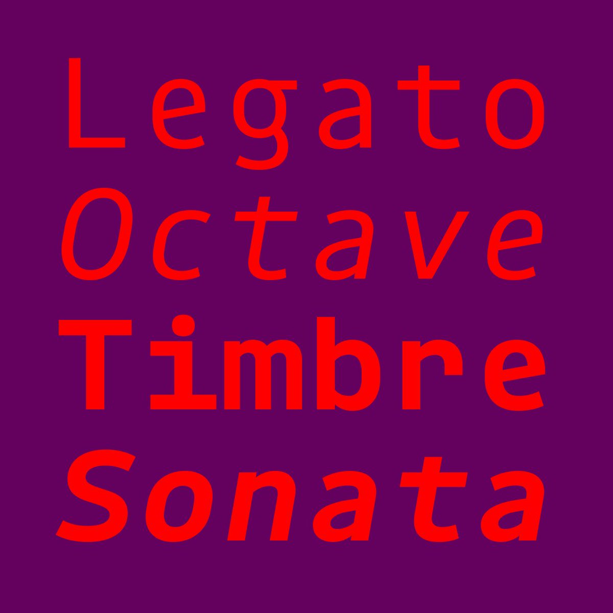
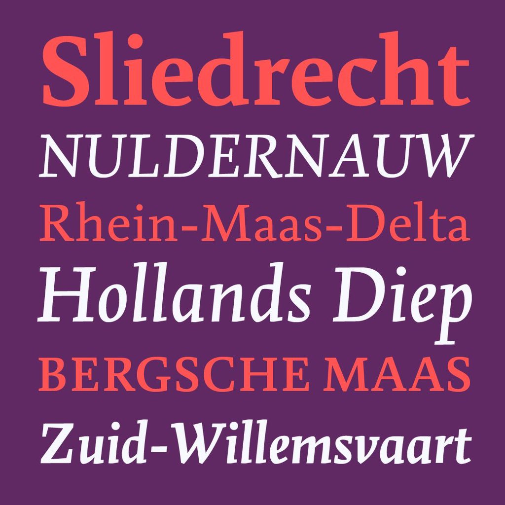
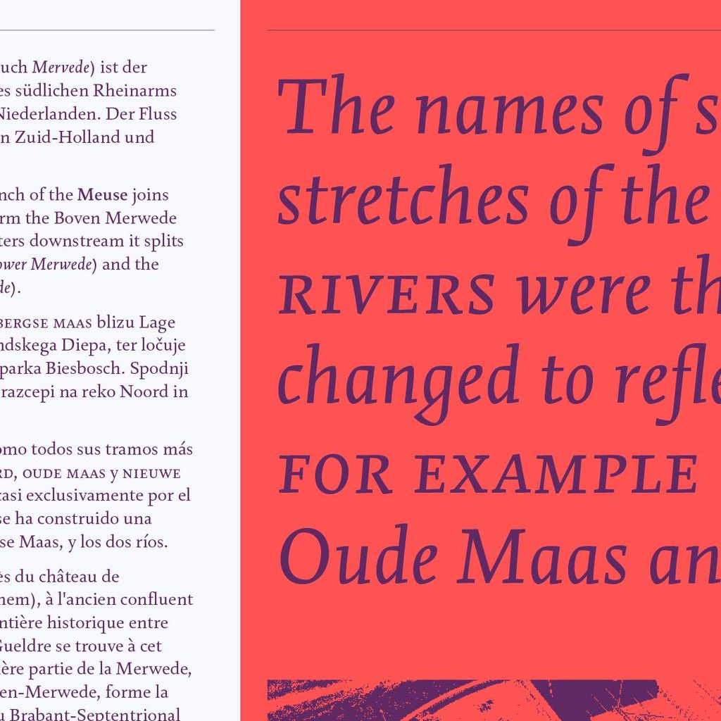
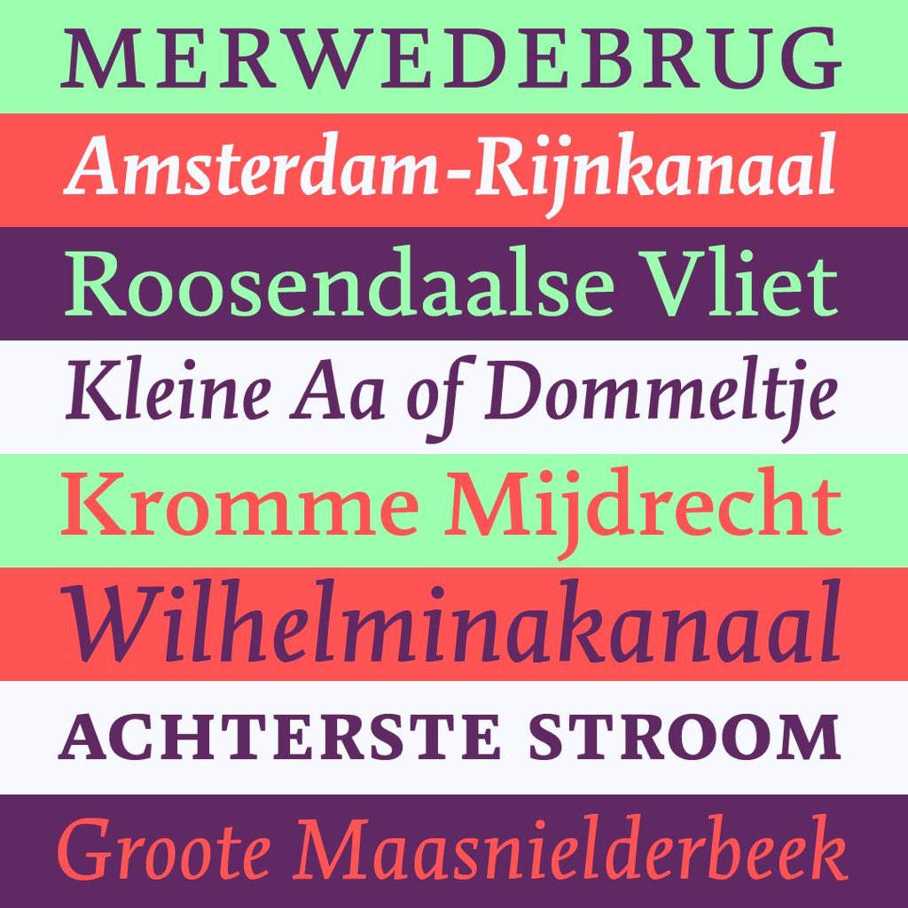
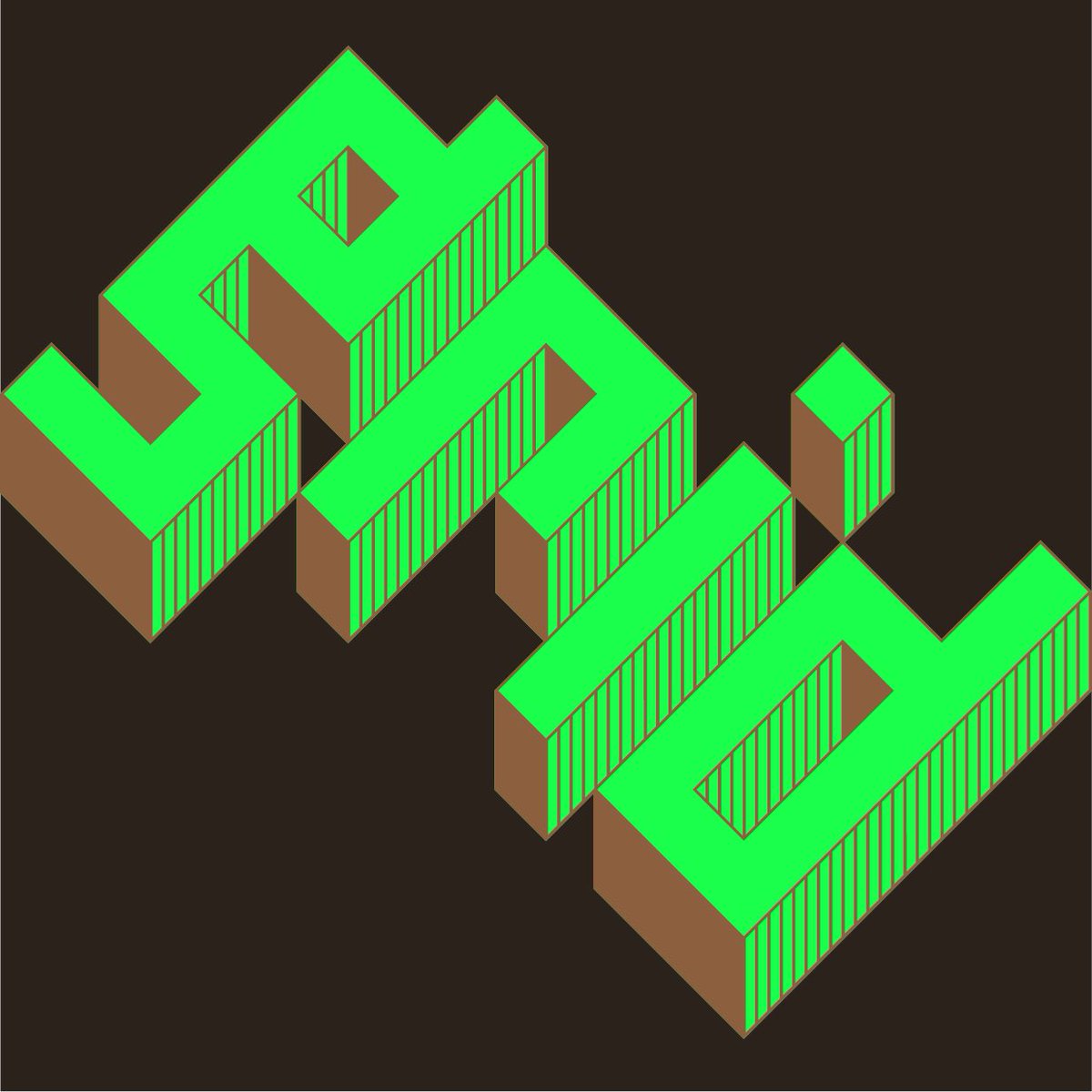
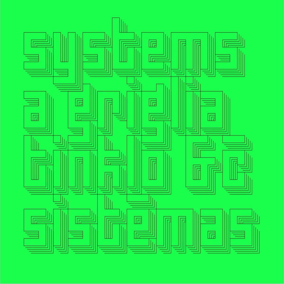
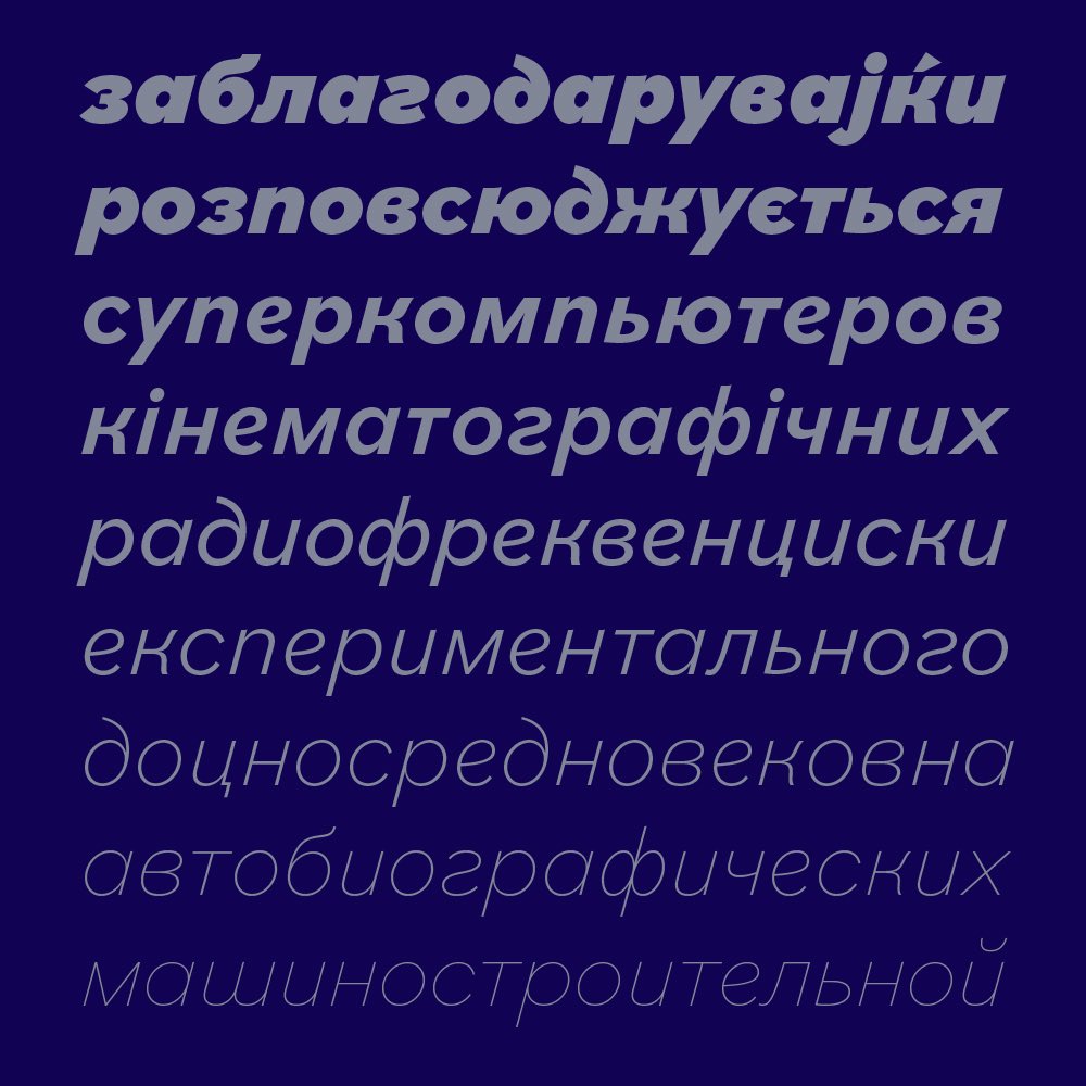
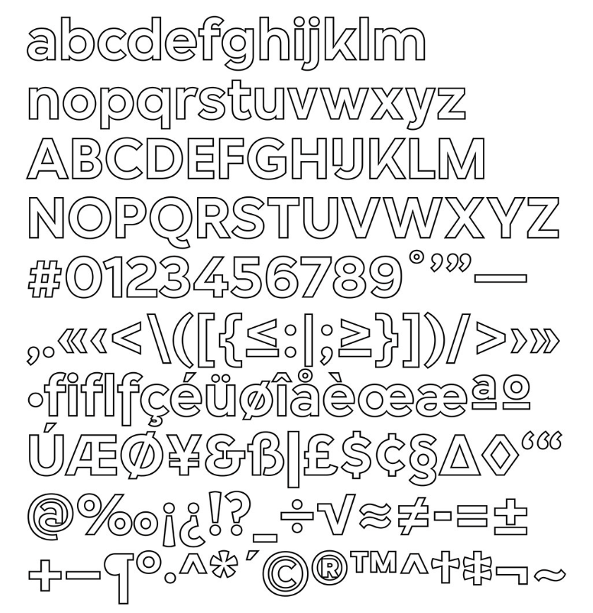
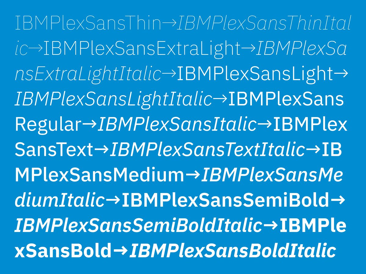
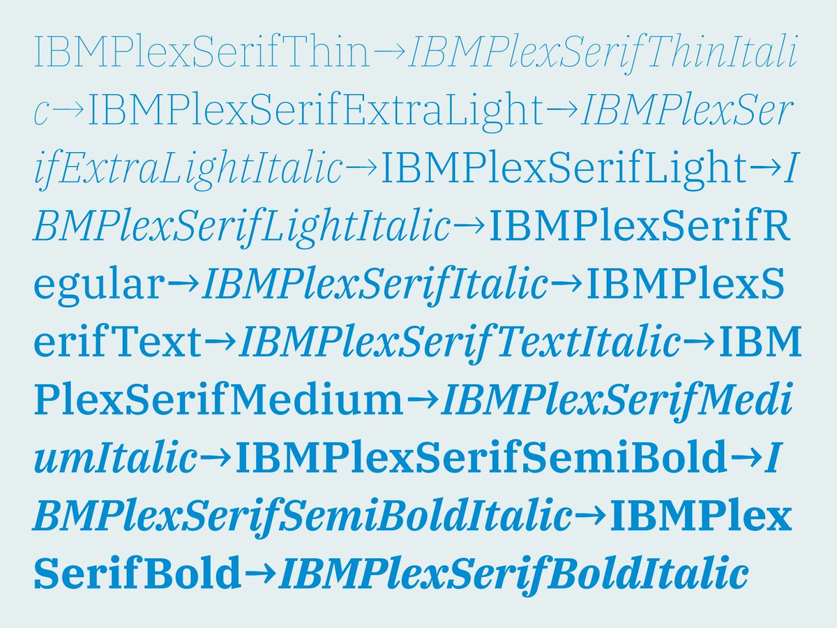
NEW WORK – Please meet IBM Plex, the new open source typeface family we developed for @IBM in collaboration with @mikeabbink.
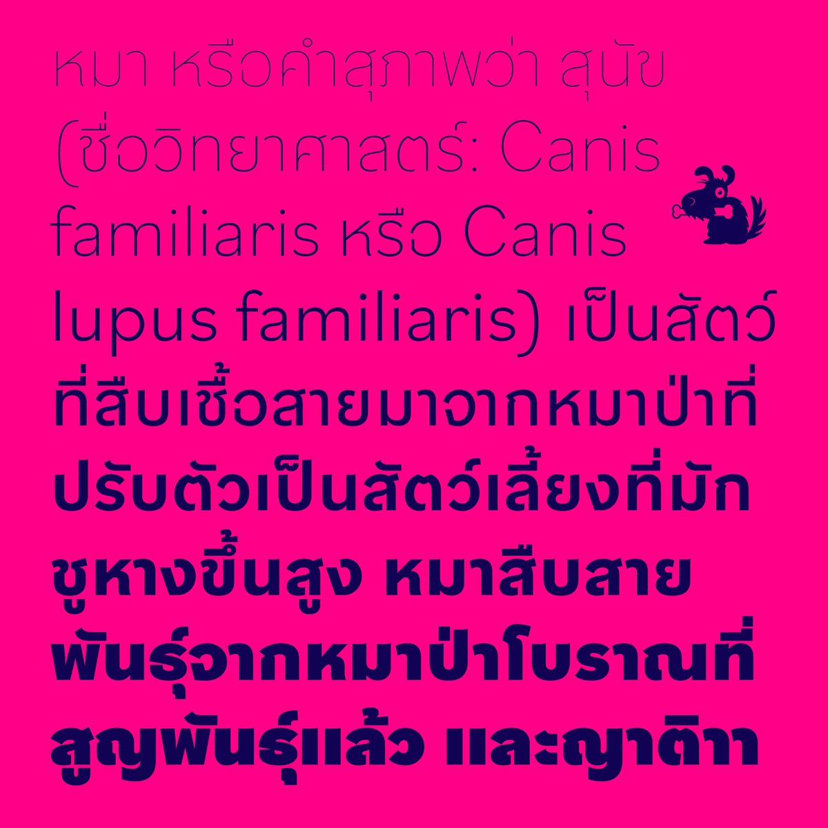
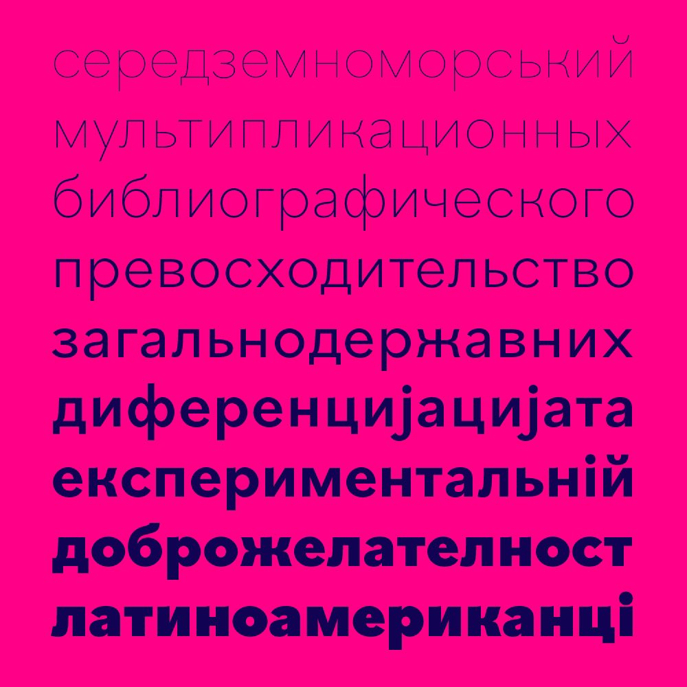
IBM Plex comes in Sans, Mono and Serif versions. All in 8 weights with accompanying italics.
boldmonday.com/custom/ibm/

English