

Dadzilla
4K posts

Dadzilla
@Dadzilla22
#whodey #Isles #Mets
marlboro NJ Katılım Şubat 2012
376 Takip Edilen193 Takipçiler


I respect the #Isles contest and the template they have the fans using, but be fair. some of the AI designs are great. I don't get the anger over it.
English
@regangrimm18 @IslesTerritory Again, learn how to prompt. You obviously don’t know what you’re talking about.
English
@Dadzilla22 @IslesTerritory Or you can just design using your own brain.
English
Alright #Isles fans…
Let’s see your best design for the third jersey ⬇️
English
@regangrimm18 @IslesTerritory Learn how to prompt and get what you want from AI
English
Dadzilla@Dadzilla22
When I started designing my submission for the @NYIslanders Third Jersey Contest, I didn’t want to create another throwback. I wanted to create a jersey that tells the story of the franchise. Every detail has meaning. 🏒 Current Islanders Crest – The logo is timeless. It belongs at the center of the jersey because it’s the identity of the franchise. 🗺️ Embossed Long Island Outline – The Islanders don’t exist without Long Island. Instead of making it loud, it’s woven into the fabric beneath the crest so fans discover it up close. 🗼 Montauk Lighthouse Shoulder Patch – A tribute to one of Long Island’s most recognizable landmarks and a respectful nod to the Fisherman era without recreating the jersey. 🏆 Four Cups Shoulder Patch (80 • 81 • 82 • 83) – A commemorative patch honoring the greatest dynasty in Islanders history. 🟠⚪🔵 Four Sleeve Stripes – Four classic stripes that subtly represent the franchise’s four consecutive Stanley Cup championships while staying true to the Islanders’ traditional uniform design. 🟠 Orange Alternate Version – The same design in orange pays homage to the Islanders’ early-2000s alternate jersey while keeping the heritage theme intact. 🔷 Brooklyn “NY” Logo – Placed subtly on the rear hem as an Easter egg honoring another chapter in franchise history. Not the focus, but part of the story. 🏴☠️ Hidden Fisherman Logo – Instead of putting the controversial logo on the outside, it’s hidden inside the jersey as a tribute to an era that has become part of Islanders culture. 📍 Inside Collar “BUILT ON THE ISLAND” “EST. 1972” The idea wasn’t to pick one era over another. It was to celebrate them all. From Nassau Coliseum… to the Dynasty… to the Fisherman… to Brooklyn… to UBS Arena… One jersey. One history. Every Era. One Island. #Isles #Islanders #IslesThirdJersey #LongIsland #NHL
QME

Islanders' next alternate uniform will come with fan twist: 'Jersey of the people' trib.al/a8h8Z3g

English
Dadzilla@Dadzilla22
When I started designing my submission for the @NYIslanders Third Jersey Contest, I didn’t want to create another throwback. I wanted to create a jersey that tells the story of the franchise. Every detail has meaning. 🏒 Current Islanders Crest – The logo is timeless. It belongs at the center of the jersey because it’s the identity of the franchise. 🗺️ Embossed Long Island Outline – The Islanders don’t exist without Long Island. Instead of making it loud, it’s woven into the fabric beneath the crest so fans discover it up close. 🗼 Montauk Lighthouse Shoulder Patch – A tribute to one of Long Island’s most recognizable landmarks and a respectful nod to the Fisherman era without recreating the jersey. 🏆 Four Cups Shoulder Patch (80 • 81 • 82 • 83) – A commemorative patch honoring the greatest dynasty in Islanders history. 🟠⚪🔵 Four Sleeve Stripes – Four classic stripes that subtly represent the franchise’s four consecutive Stanley Cup championships while staying true to the Islanders’ traditional uniform design. 🟠 Orange Alternate Version – The same design in orange pays homage to the Islanders’ early-2000s alternate jersey while keeping the heritage theme intact. 🔷 Brooklyn “NY” Logo – Placed subtly on the rear hem as an Easter egg honoring another chapter in franchise history. Not the focus, but part of the story. 🏴☠️ Hidden Fisherman Logo – Instead of putting the controversial logo on the outside, it’s hidden inside the jersey as a tribute to an era that has become part of Islanders culture. 📍 Inside Collar “BUILT ON THE ISLAND” “EST. 1972” The idea wasn’t to pick one era over another. It was to celebrate them all. From Nassau Coliseum… to the Dynasty… to the Fisherman… to Brooklyn… to UBS Arena… One jersey. One history. Every Era. One Island. #Isles #Islanders #IslesThirdJersey #LongIsland #NHL
QME

The Islanders have already received over 37,000 designs for their fan-driven third jersey contest, which will decide the team’s official alternate sweater for the 2027-28 season.
Fans have until July 24 to submit their designs before the team selects five finalists for a public vote in August.

English
Dadzilla@Dadzilla22
When I started designing my submission for the @NYIslanders Third Jersey Contest, I didn’t want to create another throwback. I wanted to create a jersey that tells the story of the franchise. Every detail has meaning. 🏒 Current Islanders Crest – The logo is timeless. It belongs at the center of the jersey because it’s the identity of the franchise. 🗺️ Embossed Long Island Outline – The Islanders don’t exist without Long Island. Instead of making it loud, it’s woven into the fabric beneath the crest so fans discover it up close. 🗼 Montauk Lighthouse Shoulder Patch – A tribute to one of Long Island’s most recognizable landmarks and a respectful nod to the Fisherman era without recreating the jersey. 🏆 Four Cups Shoulder Patch (80 • 81 • 82 • 83) – A commemorative patch honoring the greatest dynasty in Islanders history. 🟠⚪🔵 Four Sleeve Stripes – Four classic stripes that subtly represent the franchise’s four consecutive Stanley Cup championships while staying true to the Islanders’ traditional uniform design. 🟠 Orange Alternate Version – The same design in orange pays homage to the Islanders’ early-2000s alternate jersey while keeping the heritage theme intact. 🔷 Brooklyn “NY” Logo – Placed subtly on the rear hem as an Easter egg honoring another chapter in franchise history. Not the focus, but part of the story. 🏴☠️ Hidden Fisherman Logo – Instead of putting the controversial logo on the outside, it’s hidden inside the jersey as a tribute to an era that has become part of Islanders culture. 📍 Inside Collar “BUILT ON THE ISLAND” “EST. 1972” The idea wasn’t to pick one era over another. It was to celebrate them all. From Nassau Coliseum… to the Dynasty… to the Fisherman… to Brooklyn… to UBS Arena… One jersey. One history. Every Era. One Island. #Isles #Islanders #IslesThirdJersey #LongIsland #NHL
QME

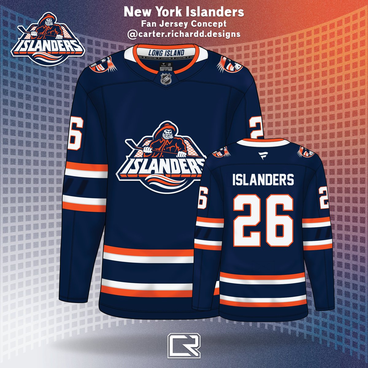
Here's my entry for the New York #Isles Fan Jersey contest. The fans want the Fisherman and I wanted to imagine it in a classic style with modern flair. There's a debossed/embossed pattern in the sleeve striping that has the iconic 4 Stripes design to represent the Islanders 4 cups. Thoughts?


New York Islanders@NYIslanders
The #Isles announced today the launch of a pioneering, fan-driven Third Jersey design contest for the 2027-28 season, marking the first time in National Hockey League history that a franchise has turned to its fanbase to create an official team sweater.
English
Dadzilla@Dadzilla22
When I started designing my submission for the @NYIslanders Third Jersey Contest, I didn’t want to create another throwback. I wanted to create a jersey that tells the story of the franchise. Every detail has meaning. 🏒 Current Islanders Crest – The logo is timeless. It belongs at the center of the jersey because it’s the identity of the franchise. 🗺️ Embossed Long Island Outline – The Islanders don’t exist without Long Island. Instead of making it loud, it’s woven into the fabric beneath the crest so fans discover it up close. 🗼 Montauk Lighthouse Shoulder Patch – A tribute to one of Long Island’s most recognizable landmarks and a respectful nod to the Fisherman era without recreating the jersey. 🏆 Four Cups Shoulder Patch (80 • 81 • 82 • 83) – A commemorative patch honoring the greatest dynasty in Islanders history. 🟠⚪🔵 Four Sleeve Stripes – Four classic stripes that subtly represent the franchise’s four consecutive Stanley Cup championships while staying true to the Islanders’ traditional uniform design. 🟠 Orange Alternate Version – The same design in orange pays homage to the Islanders’ early-2000s alternate jersey while keeping the heritage theme intact. 🔷 Brooklyn “NY” Logo – Placed subtly on the rear hem as an Easter egg honoring another chapter in franchise history. Not the focus, but part of the story. 🏴☠️ Hidden Fisherman Logo – Instead of putting the controversial logo on the outside, it’s hidden inside the jersey as a tribute to an era that has become part of Islanders culture. 📍 Inside Collar “BUILT ON THE ISLAND” “EST. 1972” The idea wasn’t to pick one era over another. It was to celebrate them all. From Nassau Coliseum… to the Dynasty… to the Fisherman… to Brooklyn… to UBS Arena… One jersey. One history. Every Era. One Island. #Isles #Islanders #IslesThirdJersey #LongIsland #NHL
QME
A jersey made for the fans, designed by the fans.
This is your chance to design the #Isles Third Jersey for the 2027-2028 Season!
Enter now ⬇️
English
Dadzilla@Dadzilla22
When I started designing my submission for the @NYIslanders Third Jersey Contest, I didn’t want to create another throwback. I wanted to create a jersey that tells the story of the franchise. Every detail has meaning. 🏒 Current Islanders Crest – The logo is timeless. It belongs at the center of the jersey because it’s the identity of the franchise. 🗺️ Embossed Long Island Outline – The Islanders don’t exist without Long Island. Instead of making it loud, it’s woven into the fabric beneath the crest so fans discover it up close. 🗼 Montauk Lighthouse Shoulder Patch – A tribute to one of Long Island’s most recognizable landmarks and a respectful nod to the Fisherman era without recreating the jersey. 🏆 Four Cups Shoulder Patch (80 • 81 • 82 • 83) – A commemorative patch honoring the greatest dynasty in Islanders history. 🟠⚪🔵 Four Sleeve Stripes – Four classic stripes that subtly represent the franchise’s four consecutive Stanley Cup championships while staying true to the Islanders’ traditional uniform design. 🟠 Orange Alternate Version – The same design in orange pays homage to the Islanders’ early-2000s alternate jersey while keeping the heritage theme intact. 🔷 Brooklyn “NY” Logo – Placed subtly on the rear hem as an Easter egg honoring another chapter in franchise history. Not the focus, but part of the story. 🏴☠️ Hidden Fisherman Logo – Instead of putting the controversial logo on the outside, it’s hidden inside the jersey as a tribute to an era that has become part of Islanders culture. 📍 Inside Collar “BUILT ON THE ISLAND” “EST. 1972” The idea wasn’t to pick one era over another. It was to celebrate them all. From Nassau Coliseum… to the Dynasty… to the Fisherman… to Brooklyn… to UBS Arena… One jersey. One history. Every Era. One Island. #Isles #Islanders #IslesThirdJersey #LongIsland #NHL
QME

UPDATE: The #Isles now have more than 20,000 submissions for the third jersey after design website went live at noon Wednesday. Due date is 7/24.

English
Dadzilla@Dadzilla22
When I started designing my submission for the @NYIslanders Third Jersey Contest, I didn’t want to create another throwback. I wanted to create a jersey that tells the story of the franchise. Every detail has meaning. 🏒 Current Islanders Crest – The logo is timeless. It belongs at the center of the jersey because it’s the identity of the franchise. 🗺️ Embossed Long Island Outline – The Islanders don’t exist without Long Island. Instead of making it loud, it’s woven into the fabric beneath the crest so fans discover it up close. 🗼 Montauk Lighthouse Shoulder Patch – A tribute to one of Long Island’s most recognizable landmarks and a respectful nod to the Fisherman era without recreating the jersey. 🏆 Four Cups Shoulder Patch (80 • 81 • 82 • 83) – A commemorative patch honoring the greatest dynasty in Islanders history. 🟠⚪🔵 Four Sleeve Stripes – Four classic stripes that subtly represent the franchise’s four consecutive Stanley Cup championships while staying true to the Islanders’ traditional uniform design. 🟠 Orange Alternate Version – The same design in orange pays homage to the Islanders’ early-2000s alternate jersey while keeping the heritage theme intact. 🔷 Brooklyn “NY” Logo – Placed subtly on the rear hem as an Easter egg honoring another chapter in franchise history. Not the focus, but part of the story. 🏴☠️ Hidden Fisherman Logo – Instead of putting the controversial logo on the outside, it’s hidden inside the jersey as a tribute to an era that has become part of Islanders culture. 📍 Inside Collar “BUILT ON THE ISLAND” “EST. 1972” The idea wasn’t to pick one era over another. It was to celebrate them all. From Nassau Coliseum… to the Dynasty… to the Fisherman… to Brooklyn… to UBS Arena… One jersey. One history. Every Era. One Island. #Isles #Islanders #IslesThirdJersey #LongIsland #NHL
QME


Dadzilla@Dadzilla22
When I started designing my submission for the @NYIslanders Third Jersey Contest, I didn’t want to create another throwback. I wanted to create a jersey that tells the story of the franchise. Every detail has meaning. 🏒 Current Islanders Crest – The logo is timeless. It belongs at the center of the jersey because it’s the identity of the franchise. 🗺️ Embossed Long Island Outline – The Islanders don’t exist without Long Island. Instead of making it loud, it’s woven into the fabric beneath the crest so fans discover it up close. 🗼 Montauk Lighthouse Shoulder Patch – A tribute to one of Long Island’s most recognizable landmarks and a respectful nod to the Fisherman era without recreating the jersey. 🏆 Four Cups Shoulder Patch (80 • 81 • 82 • 83) – A commemorative patch honoring the greatest dynasty in Islanders history. 🟠⚪🔵 Four Sleeve Stripes – Four classic stripes that subtly represent the franchise’s four consecutive Stanley Cup championships while staying true to the Islanders’ traditional uniform design. 🟠 Orange Alternate Version – The same design in orange pays homage to the Islanders’ early-2000s alternate jersey while keeping the heritage theme intact. 🔷 Brooklyn “NY” Logo – Placed subtly on the rear hem as an Easter egg honoring another chapter in franchise history. Not the focus, but part of the story. 🏴☠️ Hidden Fisherman Logo – Instead of putting the controversial logo on the outside, it’s hidden inside the jersey as a tribute to an era that has become part of Islanders culture. 📍 Inside Collar “BUILT ON THE ISLAND” “EST. 1972” The idea wasn’t to pick one era over another. It was to celebrate them all. From Nassau Coliseum… to the Dynasty… to the Fisherman… to Brooklyn… to UBS Arena… One jersey. One history. Every Era. One Island. #Isles #Islanders #IslesThirdJersey #LongIsland #NHL
QME
GLI designed these night fishing-themed jerseys for the Islanders’ fan jersey contest. 🎣

English
Dadzilla@Dadzilla22
When I started designing my submission for the @NYIslanders Third Jersey Contest, I didn’t want to create another throwback. I wanted to create a jersey that tells the story of the franchise. Every detail has meaning. 🏒 Current Islanders Crest – The logo is timeless. It belongs at the center of the jersey because it’s the identity of the franchise. 🗺️ Embossed Long Island Outline – The Islanders don’t exist without Long Island. Instead of making it loud, it’s woven into the fabric beneath the crest so fans discover it up close. 🗼 Montauk Lighthouse Shoulder Patch – A tribute to one of Long Island’s most recognizable landmarks and a respectful nod to the Fisherman era without recreating the jersey. 🏆 Four Cups Shoulder Patch (80 • 81 • 82 • 83) – A commemorative patch honoring the greatest dynasty in Islanders history. 🟠⚪🔵 Four Sleeve Stripes – Four classic stripes that subtly represent the franchise’s four consecutive Stanley Cup championships while staying true to the Islanders’ traditional uniform design. 🟠 Orange Alternate Version – The same design in orange pays homage to the Islanders’ early-2000s alternate jersey while keeping the heritage theme intact. 🔷 Brooklyn “NY” Logo – Placed subtly on the rear hem as an Easter egg honoring another chapter in franchise history. Not the focus, but part of the story. 🏴☠️ Hidden Fisherman Logo – Instead of putting the controversial logo on the outside, it’s hidden inside the jersey as a tribute to an era that has become part of Islanders culture. 📍 Inside Collar “BUILT ON THE ISLAND” “EST. 1972” The idea wasn’t to pick one era over another. It was to celebrate them all. From Nassau Coliseum… to the Dynasty… to the Fisherman… to Brooklyn… to UBS Arena… One jersey. One history. Every Era. One Island. #Isles #Islanders #IslesThirdJersey #LongIsland #NHL
QME

The #Isles are making #NHL history by becoming the first team to let fans design an official jersey.
One fan's creation will become the club's 2027-28 Third Jersey.
All the details on the contest @TheElmonters [FREE]:
theelmonters.com/p/islanders-ma…
English
Dadzilla@Dadzilla22
When I started designing my submission for the @NYIslanders Third Jersey Contest, I didn’t want to create another throwback. I wanted to create a jersey that tells the story of the franchise. Every detail has meaning. 🏒 Current Islanders Crest – The logo is timeless. It belongs at the center of the jersey because it’s the identity of the franchise. 🗺️ Embossed Long Island Outline – The Islanders don’t exist without Long Island. Instead of making it loud, it’s woven into the fabric beneath the crest so fans discover it up close. 🗼 Montauk Lighthouse Shoulder Patch – A tribute to one of Long Island’s most recognizable landmarks and a respectful nod to the Fisherman era without recreating the jersey. 🏆 Four Cups Shoulder Patch (80 • 81 • 82 • 83) – A commemorative patch honoring the greatest dynasty in Islanders history. 🟠⚪🔵 Four Sleeve Stripes – Four classic stripes that subtly represent the franchise’s four consecutive Stanley Cup championships while staying true to the Islanders’ traditional uniform design. 🟠 Orange Alternate Version – The same design in orange pays homage to the Islanders’ early-2000s alternate jersey while keeping the heritage theme intact. 🔷 Brooklyn “NY” Logo – Placed subtly on the rear hem as an Easter egg honoring another chapter in franchise history. Not the focus, but part of the story. 🏴☠️ Hidden Fisherman Logo – Instead of putting the controversial logo on the outside, it’s hidden inside the jersey as a tribute to an era that has become part of Islanders culture. 📍 Inside Collar “BUILT ON THE ISLAND” “EST. 1972” The idea wasn’t to pick one era over another. It was to celebrate them all. From Nassau Coliseum… to the Dynasty… to the Fisherman… to Brooklyn… to UBS Arena… One jersey. One history. Every Era. One Island. #Isles #Islanders #IslesThirdJersey #LongIsland #NHL
QME


Dadzilla@Dadzilla22
When I started designing my submission for the @NYIslanders Third Jersey Contest, I didn’t want to create another throwback. I wanted to create a jersey that tells the story of the franchise. Every detail has meaning. 🏒 Current Islanders Crest – The logo is timeless. It belongs at the center of the jersey because it’s the identity of the franchise. 🗺️ Embossed Long Island Outline – The Islanders don’t exist without Long Island. Instead of making it loud, it’s woven into the fabric beneath the crest so fans discover it up close. 🗼 Montauk Lighthouse Shoulder Patch – A tribute to one of Long Island’s most recognizable landmarks and a respectful nod to the Fisherman era without recreating the jersey. 🏆 Four Cups Shoulder Patch (80 • 81 • 82 • 83) – A commemorative patch honoring the greatest dynasty in Islanders history. 🟠⚪🔵 Four Sleeve Stripes – Four classic stripes that subtly represent the franchise’s four consecutive Stanley Cup championships while staying true to the Islanders’ traditional uniform design. 🟠 Orange Alternate Version – The same design in orange pays homage to the Islanders’ early-2000s alternate jersey while keeping the heritage theme intact. 🔷 Brooklyn “NY” Logo – Placed subtly on the rear hem as an Easter egg honoring another chapter in franchise history. Not the focus, but part of the story. 🏴☠️ Hidden Fisherman Logo – Instead of putting the controversial logo on the outside, it’s hidden inside the jersey as a tribute to an era that has become part of Islanders culture. 📍 Inside Collar “BUILT ON THE ISLAND” “EST. 1972” The idea wasn’t to pick one era over another. It was to celebrate them all. From Nassau Coliseum… to the Dynasty… to the Fisherman… to Brooklyn… to UBS Arena… One jersey. One history. Every Era. One Island. #Isles #Islanders #IslesThirdJersey #LongIsland #NHL
QME

I can only imagine the hate I’m about to get #isles

New York Islanders@NYIslanders
The #Isles announced today the launch of a pioneering, fan-driven Third Jersey design contest for the 2027-28 season, marking the first time in National Hockey League history that a franchise has turned to its fanbase to create an official team sweater.
English
Dadzilla@Dadzilla22
When I started designing my submission for the @NYIslanders Third Jersey Contest, I didn’t want to create another throwback. I wanted to create a jersey that tells the story of the franchise. Every detail has meaning. 🏒 Current Islanders Crest – The logo is timeless. It belongs at the center of the jersey because it’s the identity of the franchise. 🗺️ Embossed Long Island Outline – The Islanders don’t exist without Long Island. Instead of making it loud, it’s woven into the fabric beneath the crest so fans discover it up close. 🗼 Montauk Lighthouse Shoulder Patch – A tribute to one of Long Island’s most recognizable landmarks and a respectful nod to the Fisherman era without recreating the jersey. 🏆 Four Cups Shoulder Patch (80 • 81 • 82 • 83) – A commemorative patch honoring the greatest dynasty in Islanders history. 🟠⚪🔵 Four Sleeve Stripes – Four classic stripes that subtly represent the franchise’s four consecutive Stanley Cup championships while staying true to the Islanders’ traditional uniform design. 🟠 Orange Alternate Version – The same design in orange pays homage to the Islanders’ early-2000s alternate jersey while keeping the heritage theme intact. 🔷 Brooklyn “NY” Logo – Placed subtly on the rear hem as an Easter egg honoring another chapter in franchise history. Not the focus, but part of the story. 🏴☠️ Hidden Fisherman Logo – Instead of putting the controversial logo on the outside, it’s hidden inside the jersey as a tribute to an era that has become part of Islanders culture. 📍 Inside Collar “BUILT ON THE ISLAND” “EST. 1972” The idea wasn’t to pick one era over another. It was to celebrate them all. From Nassau Coliseum… to the Dynasty… to the Fisherman… to Brooklyn… to UBS Arena… One jersey. One history. Every Era. One Island. #Isles #Islanders #IslesThirdJersey #LongIsland #NHL
QME


Dadzilla@Dadzilla22
When I started designing my submission for the @NYIslanders Third Jersey Contest, I didn’t want to create another throwback. I wanted to create a jersey that tells the story of the franchise. Every detail has meaning. 🏒 Current Islanders Crest – The logo is timeless. It belongs at the center of the jersey because it’s the identity of the franchise. 🗺️ Embossed Long Island Outline – The Islanders don’t exist without Long Island. Instead of making it loud, it’s woven into the fabric beneath the crest so fans discover it up close. 🗼 Montauk Lighthouse Shoulder Patch – A tribute to one of Long Island’s most recognizable landmarks and a respectful nod to the Fisherman era without recreating the jersey. 🏆 Four Cups Shoulder Patch (80 • 81 • 82 • 83) – A commemorative patch honoring the greatest dynasty in Islanders history. 🟠⚪🔵 Four Sleeve Stripes – Four classic stripes that subtly represent the franchise’s four consecutive Stanley Cup championships while staying true to the Islanders’ traditional uniform design. 🟠 Orange Alternate Version – The same design in orange pays homage to the Islanders’ early-2000s alternate jersey while keeping the heritage theme intact. 🔷 Brooklyn “NY” Logo – Placed subtly on the rear hem as an Easter egg honoring another chapter in franchise history. Not the focus, but part of the story. 🏴☠️ Hidden Fisherman Logo – Instead of putting the controversial logo on the outside, it’s hidden inside the jersey as a tribute to an era that has become part of Islanders culture. 📍 Inside Collar “BUILT ON THE ISLAND” “EST. 1972” The idea wasn’t to pick one era over another. It was to celebrate them all. From Nassau Coliseum… to the Dynasty… to the Fisherman… to Brooklyn… to UBS Arena… One jersey. One history. Every Era. One Island. #Isles #Islanders #IslesThirdJersey #LongIsland #NHL
QME
The New York Islanders letting the fans design the next third jersey is just awesome.
What would you like the next third jersey to look like? #Isles
English
Dadzilla@Dadzilla22
When I started designing my submission for the @NYIslanders Third Jersey Contest, I didn’t want to create another throwback. I wanted to create a jersey that tells the story of the franchise. Every detail has meaning. 🏒 Current Islanders Crest – The logo is timeless. It belongs at the center of the jersey because it’s the identity of the franchise. 🗺️ Embossed Long Island Outline – The Islanders don’t exist without Long Island. Instead of making it loud, it’s woven into the fabric beneath the crest so fans discover it up close. 🗼 Montauk Lighthouse Shoulder Patch – A tribute to one of Long Island’s most recognizable landmarks and a respectful nod to the Fisherman era without recreating the jersey. 🏆 Four Cups Shoulder Patch (80 • 81 • 82 • 83) – A commemorative patch honoring the greatest dynasty in Islanders history. 🟠⚪🔵 Four Sleeve Stripes – Four classic stripes that subtly represent the franchise’s four consecutive Stanley Cup championships while staying true to the Islanders’ traditional uniform design. 🟠 Orange Alternate Version – The same design in orange pays homage to the Islanders’ early-2000s alternate jersey while keeping the heritage theme intact. 🔷 Brooklyn “NY” Logo – Placed subtly on the rear hem as an Easter egg honoring another chapter in franchise history. Not the focus, but part of the story. 🏴☠️ Hidden Fisherman Logo – Instead of putting the controversial logo on the outside, it’s hidden inside the jersey as a tribute to an era that has become part of Islanders culture. 📍 Inside Collar “BUILT ON THE ISLAND” “EST. 1972” The idea wasn’t to pick one era over another. It was to celebrate them all. From Nassau Coliseum… to the Dynasty… to the Fisherman… to Brooklyn… to UBS Arena… One jersey. One history. Every Era. One Island. #Isles #Islanders #IslesThirdJersey #LongIsland #NHL
QME

The @NYIslanders are turning to fans to design a new third jersey for the 2027-28 season!
Read more about the contest ⤵️ nhl.com/news/new-york-…
English
Dadzilla@Dadzilla22
When I started designing my submission for the @NYIslanders Third Jersey Contest, I didn’t want to create another throwback. I wanted to create a jersey that tells the story of the franchise. Every detail has meaning. 🏒 Current Islanders Crest – The logo is timeless. It belongs at the center of the jersey because it’s the identity of the franchise. 🗺️ Embossed Long Island Outline – The Islanders don’t exist without Long Island. Instead of making it loud, it’s woven into the fabric beneath the crest so fans discover it up close. 🗼 Montauk Lighthouse Shoulder Patch – A tribute to one of Long Island’s most recognizable landmarks and a respectful nod to the Fisherman era without recreating the jersey. 🏆 Four Cups Shoulder Patch (80 • 81 • 82 • 83) – A commemorative patch honoring the greatest dynasty in Islanders history. 🟠⚪🔵 Four Sleeve Stripes – Four classic stripes that subtly represent the franchise’s four consecutive Stanley Cup championships while staying true to the Islanders’ traditional uniform design. 🟠 Orange Alternate Version – The same design in orange pays homage to the Islanders’ early-2000s alternate jersey while keeping the heritage theme intact. 🔷 Brooklyn “NY” Logo – Placed subtly on the rear hem as an Easter egg honoring another chapter in franchise history. Not the focus, but part of the story. 🏴☠️ Hidden Fisherman Logo – Instead of putting the controversial logo on the outside, it’s hidden inside the jersey as a tribute to an era that has become part of Islanders culture. 📍 Inside Collar “BUILT ON THE ISLAND” “EST. 1972” The idea wasn’t to pick one era over another. It was to celebrate them all. From Nassau Coliseum… to the Dynasty… to the Fisherman… to Brooklyn… to UBS Arena… One jersey. One history. Every Era. One Island. #Isles #Islanders #IslesThirdJersey #LongIsland #NHL
QME

NHL team jerseys as Islanders jersey contest submissions, a thread.
🧵
English
Alright #IslesNation, we have over 36,000 submissions for the 2027-28 Third Jersey Design Contest.
Drop your best design 👀⬇️
English
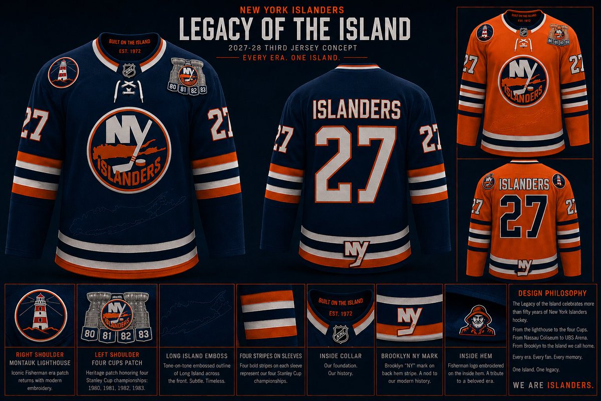
When I started designing my submission for the @NYIslanders Third Jersey Contest, I didn’t want to create another throwback. I wanted to create a jersey that tells the story of the franchise.
Every detail has meaning.
🏒 Current Islanders Crest – The logo is timeless. It belongs at the center of the jersey because it’s the identity of the franchise.
🗺️ Embossed Long Island Outline – The Islanders don’t exist without Long Island. Instead of making it loud, it’s woven into the fabric beneath the crest so fans discover it up close.
🗼 Montauk Lighthouse Shoulder Patch – A tribute to one of Long Island’s most recognizable landmarks and a respectful nod to the Fisherman era without recreating the jersey.
🏆 Four Cups Shoulder Patch (80 • 81 • 82 • 83) – A commemorative patch honoring the greatest dynasty in Islanders history.
🟠⚪🔵 Four Sleeve Stripes – Four classic stripes that subtly represent the franchise’s four consecutive Stanley Cup championships while staying true to the Islanders’ traditional uniform design.
🟠 Orange Alternate Version – The same design in orange pays homage to the Islanders’ early-2000s alternate jersey while keeping the heritage theme intact.
🔷 Brooklyn “NY” Logo – Placed subtly on the rear hem as an Easter egg honoring another chapter in franchise history. Not the focus, but part of the story.
🏴☠️ Hidden Fisherman Logo – Instead of putting the controversial logo on the outside, it’s hidden inside the jersey as a tribute to an era that has become part of Islanders culture.
📍 Inside Collar
“BUILT ON THE ISLAND”
“EST. 1972”
The idea wasn’t to pick one era over another.
It was to celebrate them all.
From Nassau Coliseum…
to the Dynasty…
to the Fisherman…
to Brooklyn…
to UBS Arena…
One jersey.
One history.
Every Era. One Island.
#Isles #Islanders #IslesThirdJersey #LongIsland #NHL

English
The #Isles announced today the launch of a pioneering, fan-driven Third Jersey design contest for the 2027-28 season, marking the first time in National Hockey League history that a franchise has turned to its fanbase to create an official team sweater.
English