
Danielito
204 posts
Danielito
@DanielChGo
PhD student
Acapulco de Juárez, Guerrero Katılım Eylül 2020
253 Takip Edilen85 Takipçiler

3時間待機の末に来たあああああああああああ
やったあああああああああああああああ‼️‼️‼️‼️‼️‼️‼️‼️‼️‼️‼️‼️‼️‼️‼️‼️‼️

日本語
Danielito retweetledi

🦠 ¡Estrenamos temporada! Acompáñanos a descubrir a los microbios que viven en las plantas crudas en #TuMundoConCiencia con la doctora Esperanza Martínez del @ccg_unam.
🗓️ Jueves, 14 agosto
⏰ 18 h
⭕️Transmisión por FB y YT: bit.ly/TMCCago25
@lorealmexico @UNESCOMexico

Español
Danielito retweetledi

RIP Data Scientists.
The Generative AI Data Scientist is NOW what companies want.
This is actually good news. Let me explain:

English
Danielito retweetledi

La pérdida de grasa es lo más fácil del mundo.
Te hicieron creer que era complicado para venderte programas y dietas sin fin.
Aquí tienes 8 estrategias basadas en evidencia que usé para perder 9 kg en 65 días (según mi experiencia):🧵
1. Dejé de hacer cardio interminable
Español
Danielito retweetledi

Hilo de las playas más surrealistas del planeta: 🧵
1. Camino a la Atlántida, Tailandia

Español
Danielito retweetledi


Danielito retweetledi

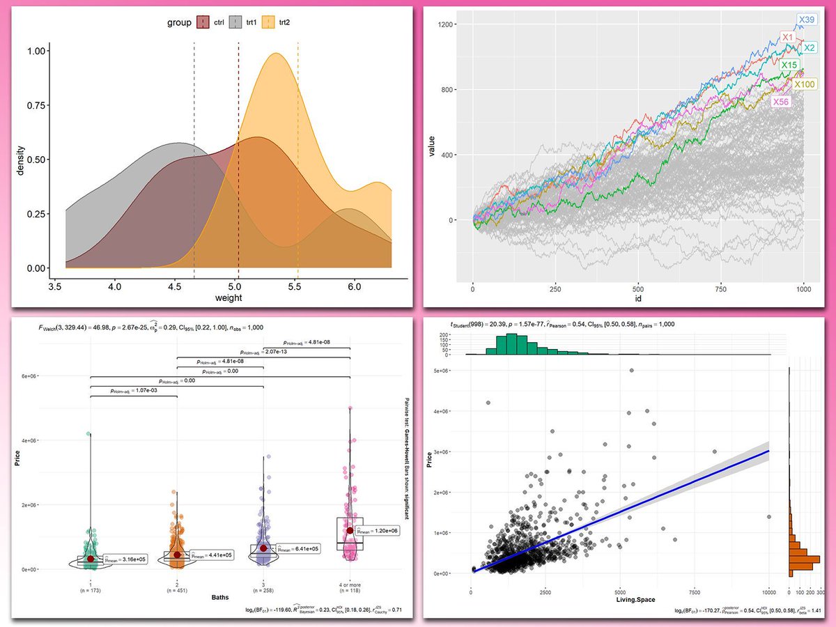
Adding statistical metrics to your plots can transform your visualizations from basic to highly informative. With ggplot2 in R and its versatile extensions, incorporating features like p-values, confidence intervals, and regression lines becomes both straightforward and visually appealing.
These are my top 5 packages for adding statistical metrics in ggplot2:
1️⃣ ggstatsplot: Combines statistical analysis and visualizations, displaying p-values, confidence intervals, and effect sizes directly on your plots.
2️⃣ ggpubr: Simplifies the process of adding p-values, statistical comparisons, and summaries to boxplots, bar charts, and more.
3️⃣ ggsignif: Adds significance brackets with p-values to plots like boxplots and bar charts, making statistical comparisons easy to interpret.
4️⃣ stat_poly_eq: Annotates regression equations, R² values, and p-values on scatter plots, ideal for showcasing relationships in linear models.
5️⃣ gghighlight: Highlights specific data points or groups in plots, drawing attention to key statistical trends or outliers while maintaining context.
With these tools, integrating statistical insights into your ggplot2 visualizations becomes both effective and effortless. In the graph shown here, you can see examples of how these packages enhance your plots: a density plot with group means marked by vertical lines, a crowded line plot with selected series highlighted for clarity, a violin-boxplot hybrid with p-values annotated for group comparisons, and a scatter plot featuring a regression line, confidence intervals, and marginal histograms for added context. These enhancements demonstrate the power of ggplot2 extensions for making statistical insights visually accessible.
If you’d like to learn how to use ggplot2 and these extensions, join my online course, Data Visualization in R Using ggplot2 & Friends. I’ll guide you step-by-step to create visualizations packed with statistical insights! More info: statisticsglobe.com/online-course-…
#R4DS #datastructure #RStats #tidyverse
English
Danielito retweetledi

A fourpartite protist-bacteria-fungal-plant symbiosis as a driver of the mycorrhizal symbiosis?
our study indicates that mycorrhizal fungal hyphae not only associate with specialised bacterial communities (see link.springer.com/article/10.118…) but also associate with specific protist communities.
See: rdcu.be/dTuof
doi.org/10.1007/s00572…
By Changfeng Zhang; @RL_Berendsen;
@stefan_geisen

English
Danielito retweetledi

Multiple Postdoctoral Fellowships, Research Assistant, & Research Jobs at Emory University, Atlanta, Georgia, United States
#opportunities #scholarship #research #Postdoctoral #Postdoc #job #UniJobs

English
Danielito retweetledi

📢 Applications open!
🎓 Scholarships available
⏳ Deadline: April 30th, 2025
🧫🧬🧑💻🧫🧬🧑💻🧫🧬🧑💻
Next-gen sequencing is vital for developing bioproducts but requires bioinformatics expertise. This course closes the gap for Illumina and Nanopore platforms go.unu.edu/PUlEu

English
Danielito retweetledi
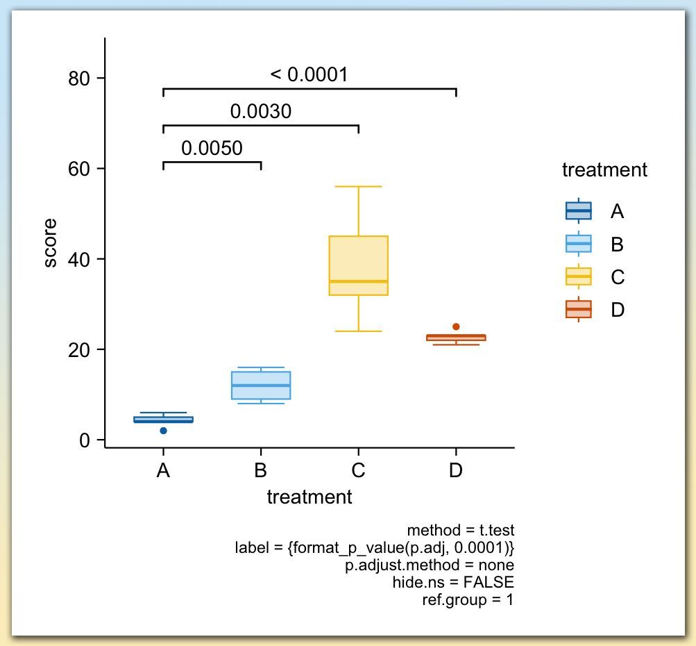
Adding statistical test results directly to your plots is a powerful way to make your findings clear and accessible at a glance. With tidyplots, functions like add_test_pvalue and add_test_asterisks make it easy to display p-values or significance levels on your charts, helping viewers quickly understand the statistical differences between groups.
Using add_test_pvalue, you can place exact p-values between groups, as shown in the example plot, where p-values highlight the differences between treatment groups A, B, C, and D. Alternatively, add_test_asterisks enables you to display significance levels with asterisks, conveying statistical insights without detailed numbers.
✔️ Quick Setup: With just a few lines of code, you can emphasize significant differences between groups.
✔️ Clear Communication: These functions enhance readability by allowing viewers to easily interpret the significance of results.
✔️ Flexible Options: Customize the format, choose specific groups for comparison, and display either exact p-values or simplified asterisks.
The example plot shown here illustrates the use of add_test_pvalue to show p-values between treatment groups. Each line represents a comparison, with p-values displayed above. This example is taken from the tidyplots website: jbengler.github.io/tidyplots/
To dive deeper into data visualization in R, consider joining my Data Visualization in R Using ggplot2 & Friends course. Check out this link for more details: statisticsglobe.com/online-course-…
#DataScience #VisualAnalytics #DataVisualization #ggplot2
English
Danielito retweetledi
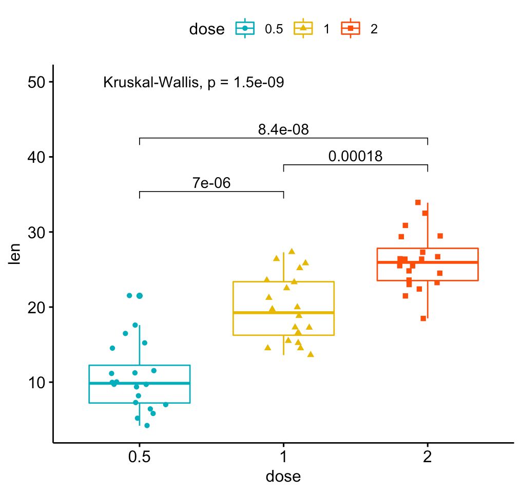
Create clear and informative box plots with added statistical insights using ggpubr! This package makes it easy to design polished plots that effectively showcase group comparisons and data distributions.
✔️ Visualize Group Comparisons: Box plots are ideal for comparing distributions across categories, showing medians, quartiles, and outliers. Combined with dot plots, they provide a detailed view of individual data points and variability.
✔️ Comprehensive Statistical Annotations: Add statistical comparisons, such as p-values and significance brackets, directly on the plot. The example here includes results from a Kruskal-Wallis test, with pairwise comparisons displayed above to indicate where significant differences exist between groups.
✔️ Customizable Design: Adjust colors, shapes, and labels to make your plots visually appealing and easy to interpret, ensuring they convey the right message.
✔️ Seamless Integration with ggplot2: Works directly with ggplot2, letting you build on your existing plots and enhance them with statistical details without the need for complex syntax.
The visualization shown here is from the package website, demonstrating how ggpubr can create polished, publication-ready plots with detailed statistical annotations: rpkgs.datanovia.com/ggpubr/
Ready to master ggplot2 and its powerful extensions to create stunning visualizations? Enroll in my online course, “Data Visualization in R Using ggplot2 & Friends!”
See this link for additional information: statisticsglobe.com/online-course-…
#DataViz #Rpackage #R #Statistical #DataAnalytics #RStats #ggplot2
English
Danielito retweetledi
Visualize genomic data with ease using gggenomes, an R package that extends ggplot2 to handle and display genomic information intuitively. Whether you’re comparing genomes, analyzing features, or showcasing synteny, gggenomes provides the tools you need to turn complex genomic data into clear, informative visualizations.
Why use gggenomes?
✔️ Genomic-focused visualizations: Specifically designed for handling genomic data, including features, alignments, and comparative analysis.
✔️ Versatile and modular: Create detailed and layered plots for diverse genomic scenarios with flexibility for customization.
✔️ Built on ggplot2: Leverages ggplot2’s familiar framework, making it easy for users to adapt and enhance their visualizations.
The example visualization shown here is taken directly from the gggenomes GitHub repository, demonstrating how it transforms genomic data into compelling plots: github.com/thackl/gggenom…
Curious to learn more about creating data visualizations in R and using tools like ggplot2 and its extensions? Check out my online course, "Data Visualization in R Using ggplot2 & Friends!" Take a look here for more details: statisticsglobe.com/online-course-…
#datascienceeducation #Statistical #datastructure #RStats

English
Danielito retweetledi

🚀 ¡Crea tablas de datos profesionales en R listas para publicar! 📊
📦 tbl_summary() crea resúmenes descriptivos con una sola línea de código
✨ Divide las estadísticas por grupos (con by=) y agrega pruebas estadísticas para comparar grupos con add_p()💥
buff.ly/3Z6HvyR

Español
Danielito retweetledi

#Rstats: datapasta is SO COOL! Easily copy data from excel (or even html tables from the web) & paste in R as fully-formatted dataframes!
1. install.packages("datapasta")
2. Set a useful keyboard paste shortcut
cran.r-project.org/web/packages/d…
With thanks to @FaustoBustos :)
#phdchat
English
Danielito retweetledi
The ggplot2 package has become so popular over the years that there are now over 100 extension packages specifically designed to enhance ggplot2 visualizations. These extensions make the ggplot2 syntax even more efficient and help create stunning graphs with ease.
In the upcoming Statistics Globe online course, we’ll explore some of the most useful extensions. I’ve created dedicated course modules on the following:
- geomtextpath: Combines text and paths for creative labeling along lines.
- gganimate: Adds dynamic animations to your visualizations.
- ggdist: Enhances visual representation of distributions and uncertainty.
- gghighlight: Highlights specific data points or groups in your plots.
- ggiraph: Makes your plots interactive with hover and click features.
- ggpubr: Simplifies publication-ready plot creation with user-friendly functions.
- ggrepel: Improves readability by preventing overlapping text labels.
- ggstatsplot: Integrates statistical tests directly into your visualizations.
- ggtext: Adds rich text formatting capabilities to your plots.
- patchwork: Easily combines multiple plots into cohesive layouts.
To give you a sneak peek of my favorite extensions, I’ve created a new YouTube video introducing my personal Top 5. Do you agree with my list? Let me know in the comments!
Watch the video here: youtube.com/watch?v=44hTsl…
Interested in diving deeper? Join the comprehensive Statistics Globe online course on Data Visualization in R Using ggplot2 & Friends, starting November 25.
More information about the course: statisticsglobe.com/online-course-…
Talk to you soon.
Joachim
#rstats #ggplot2 #dataviz #statistics #datascience
YouTube

English
Danielito retweetledi

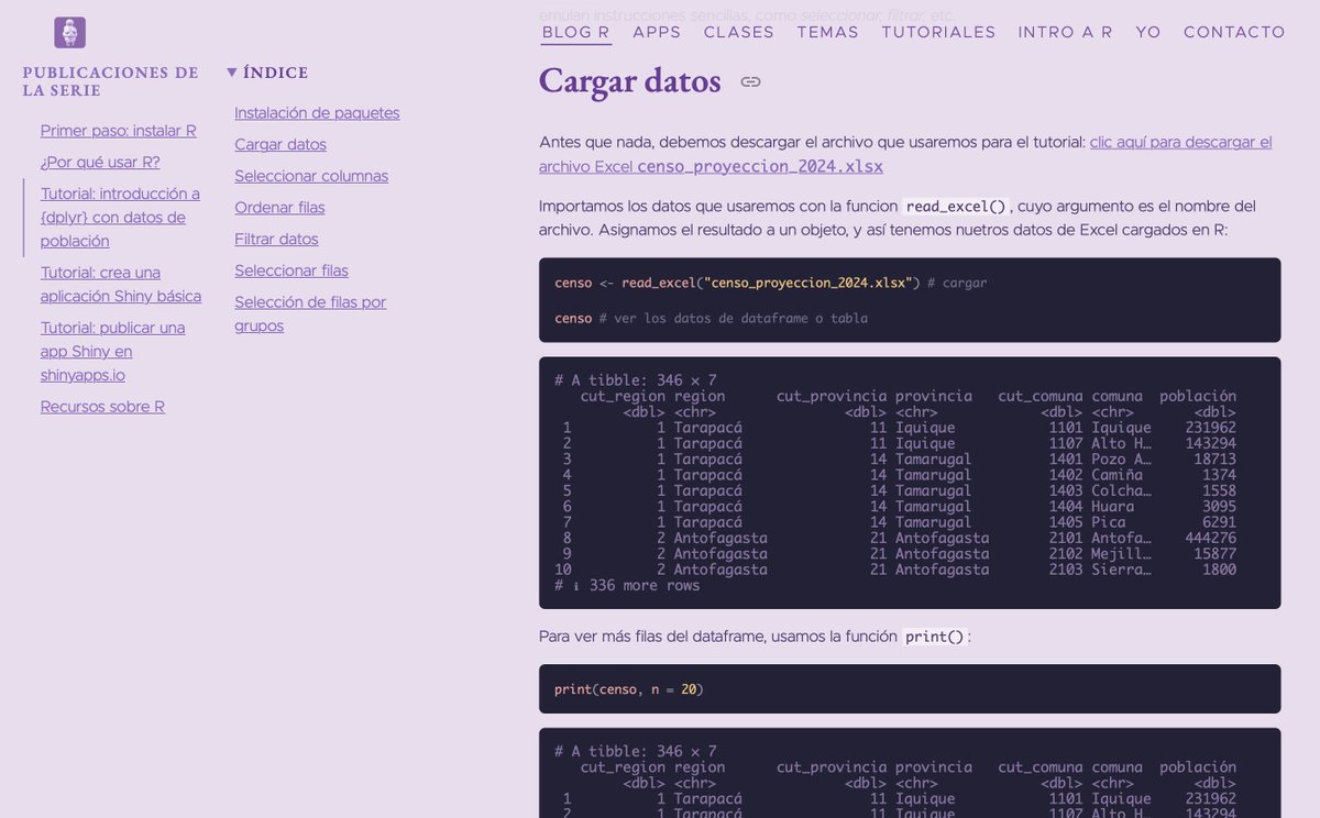
Estoy empezando a subir tutoriales de R para principiantes! Dentro de estos días también voy a subir unos para empezar R desde cero, sin conocimiento previo 🫢 Por ahora, hay sobre manipular datos con {dplyr} y hacer apps con {shiny} 👩🏻💻 bastianolea.rbind.io/blog/r_introdu…
#rstats

Español
Danielito retweetledi
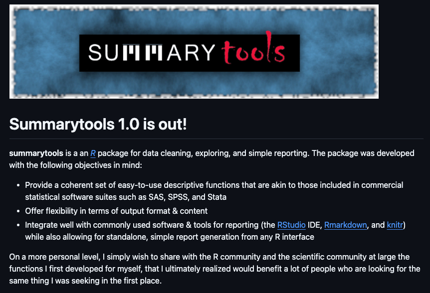
Fortunately, I stumbled upon this new R package to help.
I made a full tutorial here: business-science.io/code-tools/202…
English