Darling
12.2K posts


Darling
@DarlingFromEth
Seeing the world in Pixels | Pixel artist | Artist @NightGlyders 🎨


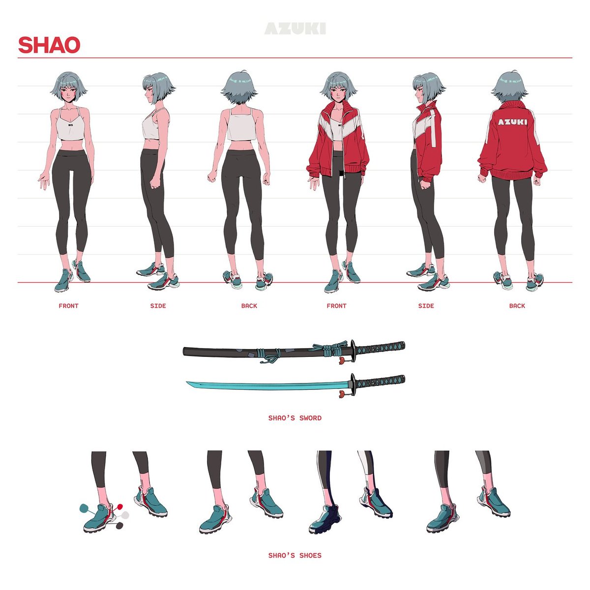
People always asked who my favorite Overwatch hero was. I'd say "I love playing Pharah" or "I like drawing Genji." The truth is, it's always been Tracer - one of the earliest characters I designed, and the foundation for everything that followed. I see Shao the same way. Tracer embodies the spirit of Overwatch: bright, hopeful, heroic. She became the visual DNA of the world: electric orange, sleek white, futuristic grey. Shao embodies the spirit of Azuki: bold, sharp, elegant. She defines its visual identity: punchy red, striking black and white. But Shao is more than just aesthetics - there's a whole story we haven't explored yet. One I've been working hard on and am eager to share soon. I still remember designing Shao in our PFP editor over 4 years ago and bringing her to life in our first announcement trailer. It felt right for her to be the first Portrait Rare in the Azuki TCG. When @_Tomugi first came to me about creating the most sought-after card in Azuki TCG, it felt daunting. We wanted something unmistakably ours - the kind of card where, like the manga rare in One Piece TCG, you instantly know what it is. We set out to hit 3 things: Stand out among the best TCG rares Feel unmistakably Azuki Look awesome Early concepts didn't quite land, especially on the second point. How can we make it uniquely Azuki? So we worked with @Zagabond to find an idea that brought us back to our roots: the PFP. Azuki was born from a collection of PFPs, and what better to represent our identity than the thing that gave us our identity in the first place? But this wasn't about dropping an OG PFP onto a card. It had to feel intentional and crafted. The OG collection used bold lines and simple colors to pop at a small PFP scale. With TCG, we're still working small, but we have more to play with in terms of materials and finish. We set out to create a holofoil treatment that feels uniquely ours - something you don't typically see in other TCGs. If you've seen the digital version of the Shao Portrait Rare on tcg.azuki.com, you'll notice a holographic pattern layered across the entire card. We call this the "Red Bean Soup" pattern. It represents the in-between void that characters pass through when traveling between gates in the Garden - something we'll explore further in the Azuki manga. It was important to us that this wasn't just visual, but rooted in the story itself. I'm excited to share this new expression of Shao with the world. She's such an important character to me and to Azuki. More of her story is coming soon.


Never one to get involved in CT drama. Never one to air my disappointments either—life’s too short for that. I’ve always been a community person from the start. It was never about floor prices or how the roadmap changes, fk i mostly never even question. But it’s honestly sad when you no longer feel like part of a community. And when you try to find one where you can just fit in and have fun, you end up getting all sorts of… comments. “wEeE lovEEe euUuxxx noOo maTTtRR thHhe pfp. Right. I may not be the biggest financial supporter, and I may never be the brightest one contributing to the project’s growth. But I know I have the biggest heart when it comes to calling this a family, not just a community. But that ends now—and it ends with the biggest disappointment I’ve experienced in web3. Good luck with the toxic positivity. I genuinely hope the community flourishes. Maybe next time, try to understand why people are really leaving before jumping on them. Or maybe it doesn’t matter, because it’s “just one person.” Funny how it ends up feeling like your presence was never appreciated, just because you weren’t seen as adding value.


Advice to the younger generation: Skip the degree. Buy land. Become a farmer.


Without saying anything.. how long have you been playing video games? Reply with a GIF