
🇹🇷
237 posts

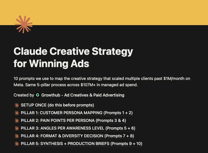
Claude is INSANE for ad creative strategy.
I've built a file with 10 prompts that map your entire creative strategy in 30 minutes.
The same 5-pillar process we used to manage $107M+ in ad spend last year.
Personas, pain points, awareness levels, formats, analysis.
Inside the mini-guide:
- The 10 prompts
- The 5-pillar strategy map template (Notion-ready)
- Worked examples
Want a copy? Like + Comment "MAP" and I'll send it over ASAP
(Must be following)
English

This pixar-style animated Lymphoria liver ad has been printing for 58 days as the #1 top-performing ad at scale because it took an invisible internal problem and turned it into a detestable cartoon villain you actively want to defeat.
Plus the fact that it's still scaling in the supplement space (which is the most ruthless, fatigue-prone vertical there is) tells me the underlying psychology is so dialed in that the algorithm just keeps feeding it new audiences without burning out.
Let me break this down piece by piece so you understand what's actually happening here.
(If you’re interested in making pixar-style animated ads like this, DM me ‘PIXAR’)
Initially, the hook makes the invisible enemy visible.
"Liver Congestion" personified as a yellow, lumpy little villain saying "nothing flows, nothing heals."
This isn't generic "support your liver health" bullshit.
This is the entire problem most supplement brands struggle with, solved in 3 seconds.
And the people who see this hook are:
⦁ Already worried about their organ health
⦁ Already frustrated by supplements that don't work
⦁ Already aware something is off but can't see it
If you've ever felt that dull ache under your ribs and didn't know what it was, you're stopping your scroll right here.
This is textbook problem-aware messaging for an INVISIBLE problem, which is the hardest thing to pull off in supplements.
Most brands try to show a doctor in a white coat and lose. These guys gave the disease a face and made you hate it.
Then, they do something most brands are too scared to try.
They take down the competitors by name.
⦁ Milk Thistle (can't help when drainage is blocked)
⦁ Detox Tea (just makes you run to the bathroom)
⦁ NAC (boosts glutathione but misses drainage)
Why does this work so well?
Because it's:
⦁ Specific (real products people have already tried)
⦁ Empathetic (you weren't stupid, the products were incomplete)
⦁ Educational (here's the biological reason why they failed)
Where most brands say "we're better than the rest" and nobody believes them,
These guys are saying "here's exactly why what you tried before couldn't work" and that's a completely different conversation.
This is the "throw rocks at their enemies" framework executed at the highest level.
And that builds insane trust before you've even pitched your product.
It also introduces a brand new mechanism.
Drainage.
This is the epiphany bridge.
You're shifting the entire conversation from "protect your liver" to "drain your liver" and now they're the only ones selling that solution.
That's how you escape the supplement commodity trap.
Another thing is the ingredients are personified as ACTIONS, not features.
⦁ Red Clover physically pushes through blocks
⦁ Stillingia drains lymphatic buildup with long roots
⦁ Cleavers vacuums smaller congestion pieces
⦁ Prickly Ash clears remaining blockages
Instead of just listing ingredients and percentages like every other supplement brand, these guys are SHOWING the ingredients doing the work.
Because when you watch Red Clover physically shove a yellow congestion blob out of the way, your brain stops asking "does this work?" and starts asking "where do I buy this?"
This is also why the retention rates on this video are crushing.
Every 2-3 seconds there's a new character, a new action, a new visual.
Your dopamine doesn't have time to drop.
You can't scroll because you want to see what happens next.
Then they drop a sniper-level pain callout.
"Aching liver enzymes under their ribs."
That's not a generic "feel better" claim. That's a hyper-specific physical sensation that people with actual liver issues experience.
This is dog-whistle copy.
When you describe someone's exact physical pain better than they can describe it themselves, their brain automatically assumes you have the solution.
Most brands write copy that could apply to anyone. This line could only apply to someone who actually has the problem.
Another upside is, the back-end conversion mechanics are airtight.
⦁ 60-day guarantee (removes the "another failed supplement" objection)
⦁ 43,000 people (turns it from gamble to mainstream)
⦁ 40% off (urgency to click now, not later)
By the time you hit the landing page, every objection has been pre-handled inside the creative itself.
That's why the conversion rate stays high.
It's built for cold traffic too.
This ad works on people who've never heard of Lymphoria because:
⦁ Visualizes a problem they couldn't see before
⦁ Validates every failed thing they've tried
⦁ Introduces a completely new mechanism (drainage)
That's why it scales without burning out.
It's not dependent on brand recognition as the creative does all the heavy lifting.
So what should you steal from this?
If you're selling supplements or any internal health product:
1. Personify the problem (give the disease a face)
2. Take down competitors by name (with biological reasoning, not just bashing)
3. Introduce a new mechanism the category isn't using yet
4. Show ingredients as ACTIONS, not features
5. Use hyper-specific physical pain callouts
6. Stack risk reversal + social proof + urgency on the back end
7. Build retention with a new character every 2-3 seconds
8. Stop running boring "doctor in a white coat" creative
If your supplement ads are still listing ingredients with bullet points and showing stock footage of healthy people jogging, you're getting destroyed by ads like this that turn the problem into a movie villain and your product into the hero that defeats it.
This ad works because it doesn't sell a supplement.
It sells a story where the buyer is the protagonist who finally figures out why nothing else worked.
Most ads try to convince.
This one just tells a story so good that the buyer convinces themselves.
That's why it's been running for 58 days as their top converting ad at scale.
English
🇹🇷 retweetledi

$47k/day brands are using ai visuals like this to multiply one winning idea
not by reinventing the ad every time
but by changing the pain point around the same concept
the glowing skeleton does the heavy lifting
it makes the problem feel physical, urgent, and easy to understand in one second
posture
gut stress
neck tension
joint pain
headaches
lower back strain
slow recovery
same visual language
different hooks
different buyers
different offers
that’s how one creative direction turns into an entire testing system
claude writes the angles and scripts
seedance 2.0 turns them into batches of videos
then the winners get expanded into more variations before fatigue hits
one concept
50 hooks
hundreds of tests
rt + comment “skeleton” and i’ll send the full setup
(follow for dm)
English

"Here's the thing" "Skyrocketing" "Cutting Edge" "—"...
You're writing copy with AI with basic prompts and IT SHOWS
So I've made a Playbook on how to turn AI copy into HUMAN SOUNDING COPY in literally 5 minutes
Want it? Like + Comment "AI" & I'll DM it to you for FREE


English
🇹🇷 retweetledi

We quietly ran a consulting program 🤫
We took 35 brands at $100k+ a month,
& worked with them for 90 days.
4 hit their first $1M+/mo
6 scaled past $2M+/mo
Multiple crossed $10M+/mo
I filmed the exact playbook.
Like, RT, comment "Playbook" (must follow) & I'll DM it.
English

I got absolutely screwed by Shopify Payments… multiple times.
Funds on hold & No clear answers.
Endless back & forth with support just to get MY money released.
Tried every “template” out there.. none worked.
👉 Until now. 👈
My SP got hold on March 15… and released on March 17!!! 🔥
No stress. No chasing. Just worked.
I sent this exact template to a few friends… same result lol. 🤝 If you want to see my whole video about Shopify Payments, check my IG called @furkeess. 🥷🏼
If you’re dealing with Shopify Payments holds, this will save you HOURS (and headaches).
Want it?
👉 Like this post
👉 Comment “SP”
👉 Follow me on X.
I’ll send it over‼️🚀

English

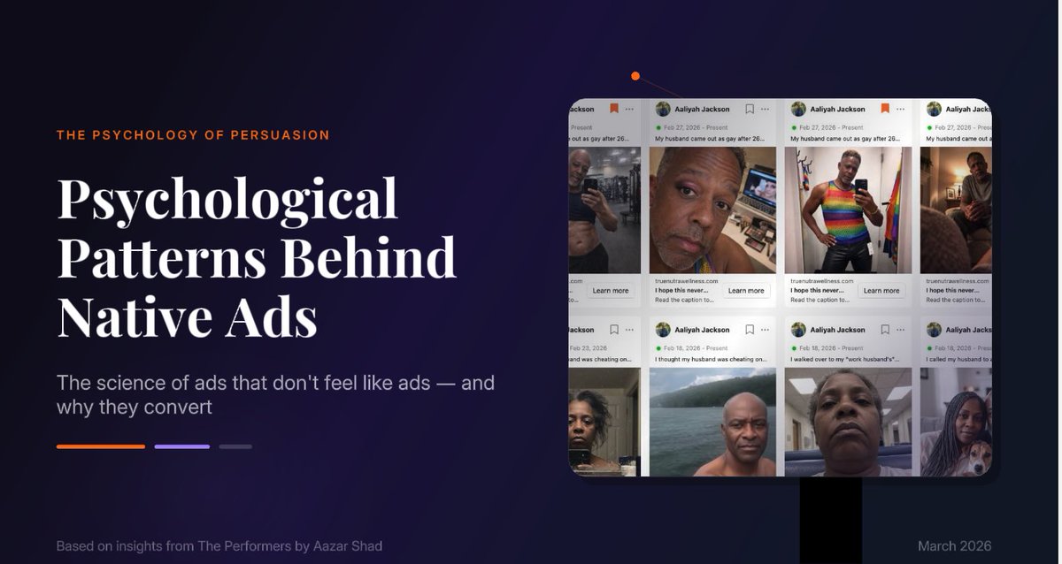
Native ads are crushing it on ad accounts.
I figured out how to make them with prompts.
Instead of 50+ hours analyzing winning hooks, copy them in a few clicks.
I made a deck of all of them with Moda.
(Usually charge $1000 for this)
Like and comment "Moda" and I'll send it.
English
🇹🇷 retweetledi

Okay time to break silence. Here is the dumbest mistake I’ve made this year.
Every ecom founder should do deep research and write ads every single day.
I made the mistake of leaving everything to my creative team and just focus on new brand launches and product development. (will be brutally honest - I didn’t like writing scripts or doing boring research)
It failed miserably and I had to fire my entire creative team and shut down a store.
Went back to the trenches like the old days where right now I research and do the copywriting.
For my new brand I found avatars and angles my strategists never ever tapped into through deep research and right now it’s killing it.
Don’t even want to mention how doing this daily for a month made me an insanely better marketer and operator.
Once you see your research and ideation comes to life and helps you scale 5x with higher profit margins, you get the best fucking dopamine hit of your life.
Plus you just get addicted to writing more ads and doing more research and you just become better and better at advertising.
If you are just relying on your “creative team” get a grip and write some new ads.
You’ll thank me later.
English

We killed a $750K/yr content team.
Replaced it with Nano Banana + VEO 3 → pumping out 350+ AI UGC ads/month.
- 25M+ organic views
- $272K tracked revenue
- 0 paid ads, 0 creators, 0 editors
It’s fully automated. 24/7. Faceless. Scalable.
Want the full blueprint? Comment ''VEO''.
(must be following)
English
🇹🇷 retweetledi
$200,000+ in a day.
In Q4, $100k+ days can be the norm…
If you nail 5 levers.
I filmed a 40-min breakdown.
Like + RT + comment “Q4” and I’ll DM you the video.

English
Educational VSL ads are killing it.
They’re secretly becoming one of our best formats for our partner brands.
So I've created a mini-guide on how you exploit them:
- Winning examples
- Why they're working
- Steps to follow when creating them
Want a copy? Like + Comment "VSL" and I'll send it over ASAP
(Must be following)
GIF
English
🇹🇷 retweetledi
Making $46K/month with AI affiliate accounts
No product. No face. No ad spend.
→ Fully automated AI content
→ 2K+/week in under 30 days
→ Scaled with faceless TikTok + Shorts
AI + affiliate = insane margins.
Want the system?
RT + comment “2K” — I’ll send the breakdown.
(Must be following)

English
Just launched an AI-powered gummy brand — and already pulled in $42K in sales.
3-day breakdown:
Day 1: $2.5K
Day 2: $10K
Day 3: $29.5K
No team. No ad spend. No filming.
AI marketing is the cheat code to $100K/month.
Comment “GUMMY” and I’ll send you the full strategy.
(Must be following)

English

Gemini + Veo 3 + Arcads
this ai workflow is insane for ads:
> takes any video
> describes what happens scene by scenes
> recreates the scenes in Arcads
comment arcads, and I'll tell you how to do this
English

$40k month in June with my AI Supplement brand
No team, no agency - just 7 AI creators.
- Spot a trending product
- Build a Shopify funnel
- Apply Script (30-45 sec vids)
- Generate 200+ UGC videos/day automatically
Comment “AI” & I’ll DM the strategy
(Must be following)
English
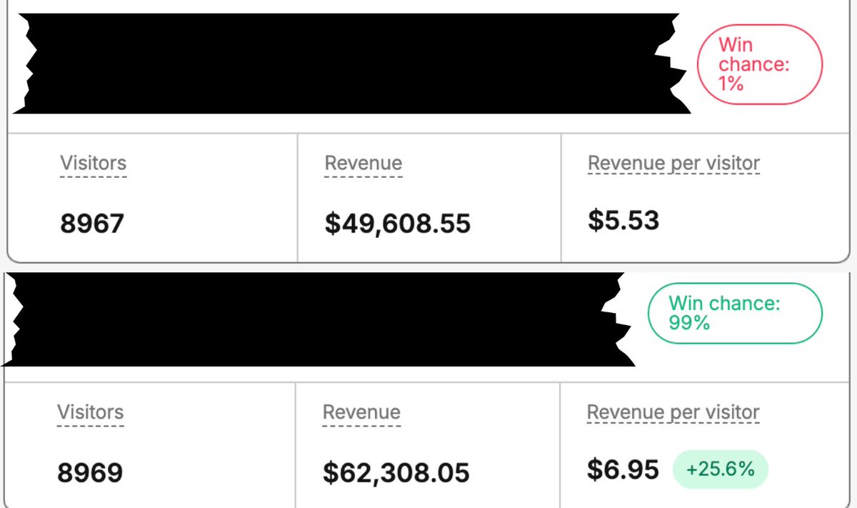
This 1 split test will make me millions.
Most founders never run it
It impacts CVR, AOV, LTV, & more
Takes 10 mins to implement,
& it’s the most impactful test you can do.
Just dropped a full breakdown
Like + RT + comment “Test” (must be following) and I’ll DM it to you.
English