FINARKY

88 posts

FINARKY

FINARKY

@FinarkyApp

Portfolio tracker for stocks, crypto... with Personal Rate of Return 📈, taxes 💸💡, and Future Calculator 🔮.

Katılım Haziran 2023
0 Takip Edilen7 Takipçiler
Sabitlenmiş Tweet
FINARKY
FINARKY@FinarkyApp·
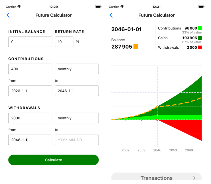
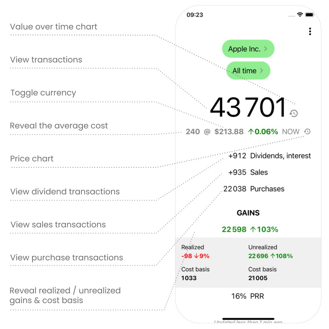
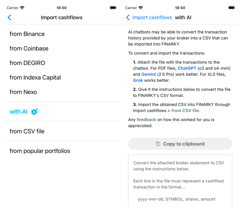
Privacy-first portfolio tracker for stocks & crypto with Personal Rate of Return 📈 (like APY for investments), taxes 💸💡, and Future Calculator 🔮. Track your way to, and through, financial freedom. 📲 iOS & Android, finarky.com #fintwit #investing
FINARKY tweet mediaFINARKY tweet mediaFINARKY tweet mediaFINARKY tweet media
English
0
1
1
1.9K
FINARKY
FINARKY@FinarkyApp·
With the new support for Forex 💱 in FINARKY 1.15, you can now track the performance of: – Cash you hold in foreign currencies (e.g. if your currency is USD, track EUR cash with the Forex symbol EURUSD) – Physical gold (XAUUSD 🟨) – Physical silver (XAGUSD ⬜️)
FINARKY tweet media
English
0
2
0
841
FINARKY
FINARKY@FinarkyApp·
...and see if you're hitting that 10% by checking your PRR (Personal Rate of Return, a.k.a. MWRR/IRR) in FINARKY. 📲 finarky.com
English
0
0
0
53
FINARKY
FINARKY@FinarkyApp·
Get the details with your own numbers in FINARKY's Future Calculator. Screenshots are for a $2,000/month income, investing $400/month (20%) for 20 years, then withdrawing $2,000/month. Try it yourself!
FINARKY tweet media
English
1
0
0
66
FINARKY
FINARKY@FinarkyApp·
If you invest 20% of your income every month and achieve at least 10% yearly returns, your monthly returns will match your income in less than 20 years... actually, 18 years and 10 months! From then on, you could live entirely off your returns, as long as you can keep getting 10% a year. I call this the 20-20-10 rule of financial freedom :)
FINARKY tweet media
English
1
1
1
1.5K
FINARKY
FINARKY@FinarkyApp·
@RohitCrypto100 Or, if you want a simple but effective tool to track both stocks and crypto, you should try this mobile app😊 finarky.com
English
0
0
0
7
Rohit Lodhi (💙,🧡)
Rohit Lodhi (💙,🧡)@RohitCrypto100·
❌ Mistake 8: Not tracking portfolio If you don’t track, you’ll never know what’s performing and what’s draining your capital. Many investors forget coins until they hit zero. ✅ Use free tools like: • DeBank • Zerion • CoinGecko portfolio tracker A portfolio without tracking = blindfolded driving.
Rohit Lodhi (💙,🧡) tweet media
English
2
0
3
35
Rohit Lodhi (💙,🧡)
Rohit Lodhi (💙,🧡)@RohitCrypto100·
99% of beginners LOSE money in crypto. Not because of bad projects… but because of stupid mistakes. Here are the 10 costly mistakes that drain portfolios (and how you can avoid them) 🧵👇 #LearnKaroCryptoKaro
Rohit Lodhi (💙,🧡) tweet media
English
2
1
6
934
FINARKY
FINARKY@FinarkyApp·
FINARKY's UI is designed from first principles to be simpler and more powerful than typical portfolio trackers. It uses assets and time periods as a contextual lens for everything. All metrics (value, IRR, gains...) are filtered through that context. This keeps the interface consistent and predictable, so it's easy to navigate and explore a portfolio without feeling overwhelmed or lost. And everything is just one tap away...
FINARKY tweet media
English
0
1
0
1.1K
FINARKY
FINARKY@FinarkyApp·
The new value charts 📈 in FINARKY 1.16 show the value of your portfolio, or individual assets, over time. The minimum and maximum values of the selected period are highlighted. Tap the history icon next to the main value on the home or asset screen to see the chart. Check it out!
FINARKY tweet media
English
1
1
0
722
FINARKY
FINARKY@FinarkyApp·
⚠️ Beware of incorrect YTD gains from apps like @perplexity_ai, @tradingview, or @getdelta! They calculate YTD gains from the first price of the current year, instead of the last price of the previous year. @FinarkyApp does it right ✅
FINARKY tweet media
English
0
1
0
655
FINARKY
FINARKY@FinarkyApp·
Some notes on the design of the new price charts in FINARKY 1.14... I wanted a minimalist chart (consistent with the app's design) that shows only maximally useful info and is easy to interact with (keeping in mind what Marko Ahtisaari called "better sloppy interactions" when designing for true mobility). It should make full use of the small mobile screen by displaying the chart edge to edge. When looking at stock or crypto price charts, what actually matters is the percent change over time, not the raw price. In most apps, if stock A went from $95 to $102 and stock B from $650 to $697.89, those price points are plotted on the y-axis, leaving it up to the user to infer the key insight that both rose by 7.37% (did you notice that?). So, I decided that the price charts in FINARKY would focus on displaying price variations, not absolute prices. This also makes comparisons between different assets less misleading. Wanting to keep a clean, minimalistic design, I considered removing the y-axis labels altogether. But then the only reference left for interpreting the chart’s price variations was the total percent change shown in the screen header. With just that, it was hard to interpret the magnitude of the variations at a glance. I was glad to find a better alternative: showing labels only for the minimum and maximum values, directly on the corresponding dots in the line chart, along with a horizontal line at y=0 as another reference. This preserves the minimalist look while making it easy to interpret the size of the variations. It also has the added benefit of directly showing the user the maximum gain and loss relative to the starting price. Moreover, the difference between them (called the high-low range or amplitude) is easy to calculate mentally and gives a quick sense of the asset's volatility. Interactivity allows exploration of daily prices and variations by tapping or dragging on the chart. A tooltip is shown, always at the same height but without occluding the chart, displaying all the data for the selected point: date, price, and daily variation. (Again, the focus on variation instead of just price is something most other apps skip.) I've seen other price charts where the tooltip moves up and down as the highlighted value changes, sometimes partially covering the chart (Google does this). Others scatter the detailed info across different parts of the screen. I think that’s quite annoying and makes it harder to skim and explore, so I made sure FINARKY avoided all that. Also, if there’s been a stock split during the selected period, an "S" pin appears on the corresponding date. Tapping it, or selecting that point while dragging, shows the split details in the tooltip (e.g., "4:1 split"). In the future, this could include other events like dividends. If you invest in stocks traded in a different currency, exchange rates can significantly affect the price for you, as Europeans investing in U.S. stocks know well from this year’s USD/EUR moves. To make it easy to see the effect of exchange rates on the price, the chart’s currency can be toggled between the stock currency and your own by tapping on any price. I realize there's no visual affordance for this, but the same interaction works on the asset's main screen and is easy to remember, so I'm fine with that. The chart may not be perfect, but overall I think it’s better than any other I've seen :) If you have any feedback, please let me know!
FINARKY tweet media
English
0
1
0
503
FINARKY
FINARKY@FinarkyApp·
Of course, you can check your PRR with FINARKY 😊 finarky.com
English
0
0
0
83
FINARKY
FINARKY@FinarkyApp·
In his plan to solve America's debt crisis, @VivekGRamaswamy asks us to suppose that every newborn gets a $10,000 investment account, invested in assets that compound at a rate of 15% a year, which he says is "Ambitious but not impossible to achieve." What do you think? Is your PRR (aka IRR or MWRR) around that? youtube.com/watch?v=Euod20…
YouTube video
YouTube
English
1
0
0
95
FINARKY
FINARKY@FinarkyApp·
FINARKY 1.13 is out, and with that a new option to import cashflows with AI that provides a ready-to-use prompt for ChatGPT/Gemini/Grok/... to convert transactions from many brokers (hopefully!) to FINARKY's CSV format, making the process of bringing your transactions to FINARKY faster and easier. If you check it out, please let me know how it goes! #FinTwit #AITools
FINARKY tweet media
English
0
0
0
106
FINARKY
FINARKY@FinarkyApp·
You might want to check out finarky.com, a mobile portfolio tracker app that calculates XIRR (shown as PRR, Personal Rate of Return) and includes short-term/long-term capital gains analysis in its Taxes feature. It focuses on privacy and also includes a retirement calculator.
English
0
0
0
13
Ravichand
Ravichand@stocknladdr·
@FI_InvestIndia @dmuthuk @Gautam__Baid @RichifyMeClub Dear FI, sorry if the requirement was not clear. Let me be clear. I am not looking for stock analysis. i am looking for stock tracker which can do portfolio analysis from basic CAGR, XIRR, short term / long term cap gains to more advanced like : performance attribution analysis..
English
2
0
2
0
Ravichand
Ravichand@stocknladdr·
Need suggestion pls🙏 Looking for a cutting edge Portfolio tracking + Analytical software for tracking Equities India market. Portfolio slicing/dicing /analytic reports . Any Fintechs in that space? Need not be free (No Moneycontrol, valueresearch, yahoo, equitymaster, ET pls)
English
12
1
20
0
Kiran Rajput
Kiran Rajput@_KiranRajput·
Common Sense & Simple Investing! It’s not necessary we need sound fundamental & technical skills to build a portfolio. Sometime common-sense & doing simple things does help create Wealth. Very Importantly Behavioural Skills. My investments in ‘Direct Stocks’ is 90-95% though I keep writing about Mutual Funds. My expectations from this portfolio is 20-25% only. Here are the list of my stocks in alphabetical order:
English
26
46
433
112.2K